Color in the dining room has shifted from an afterthought to a shaping force. No longer limited to accent walls or seasonal tableware, today’s color use goes deeper—embedded in surface, reflected in finish, echoed in material.
From ceiling tones that pull space inward to wall hues that blur with outdoor views, the role of color has expanded into structure, layout, and rhythm. Current approaches to dining room paint schemes favor nuance over drama.
Muted greens with garden influence, warm neutrals edged in pink or gold, and adaptable tones that shift with the light are being used not to stand out, but to hold everything together. Texture, undertone, and placement now play a larger part than high-contrast pairings.
A soft mushroom tone can bring more visual depth than any bold red; a matte lavender can ground a space more effectively than a bright primary.
This article looks at how subtle decisions in hue, finish, and repetition can quietly define a dining area, guide sight lines, and create balance without obvious tricks. From colors that respond to daylight to furniture that carries pigment in its grain, each idea is rooted in the way color behaves—not just how it looks in a sample.
Whether building tone-on-tone layers or centering a plan with circular rhythm, these insights rethink how dining paint color ideas can support comfort, structure, and atmosphere all at once.

Hue Used as Architecture, Not Decoration
There’s a subtle design shift that turns color from background into structure, and it’s surprisingly effective when used in unexpected places like the ceiling. In certain spaces, applying a tone like soft celadon above the eye line reshapes the room’s form.
The effect isn’t visual weight, but a quiet enclosure, almost like a cloud resting over the table. It creates a soft “lid” that anchors the dining area, giving a sense of place without pressing the walls in.

In deeper tones, the method becomes even more immersive. Using one consistent paint across walls, trim, beams, and shelving builds something closer to a sculpted enclosure.
A deep olive room wrapped from floor to ceiling doesn’t read as painted—it reads as carved from a single material, the same way stone or plaster might feel. This approach works especially well in spaces that already have strong shadow play, where texture takes over as the source of contrast.
Even lighter neutrals behave differently when they interact with architectural features. A soft wheat-cream used across a paneled wall appears to shift tone with every groove and ridge.
There’s no second color involved—just light bending across surface detail, revealing dimension through shadow alone. In this context, dining room paint colors aren’t accents or decorative choices—they’re shaping tools, helping define mass, void, and visual rhythm in the room.

Tone-on-Tone Layering for Quiet Depth
There’s a particular kind of richness that doesn’t come from contrast, but from slight tonal shifts within a tightly held palette. Instead of pairing opposites, this approach leans into near matches—a wall in muted green, cushions a breath lighter, a rug that shares the hue but drops in saturation.
These shifts may not register immediately, but together they build a layered atmosphere that feels dense without being busy. What makes this technique so effective in dining spaces is how it allows form and material to take the lead.
A chair in soft oatmeal linen echoes the wall, but its weave brings texture to the foreground. Pottery arranged on shelves might all share a similar undertone—warm, cool, or earthy—but each piece catches the light differently, introducing soft variation without straying from the core color family.
This kind of tone-on-tone layering doesn’t chase attention. Instead, it draws people into the space slowly, letting the eye adjust and notice the shifts.
It’s especially relevant in rooms where the design aims for calm cohesion over visual statement. Among all color ideas for dining room interiors, this technique offers depth without contrast, atmosphere without noise.

Chameleon Neutrals that Drift with Light
Some hues change as the sun moves, subtly shifting their identity through the day. Mid-range tones with a slight bias—toward green, red, or violet—create some of the most interesting effects in a dining area.
A wall painted in blue-gray-green may look cool and airy under midday brightness, then pick up more earthy undertones by sunset. This gives the space a sense of motion, not through decoration, but through how color reacts to light.
A similar effect can happen with muted indigo, which might lean into violet when touched by warm sun, then fade into smoky blue under dimmed evening bulbs. These tones don’t overwhelm—they adapt.
That’s why they often show up in homes that favor natural materials or filtered light: they carry complexity without looking busy.

Even soft neutrals like camel can respond to their surroundings. Paired with pale wood and glass, the tone may stay muted and quiet during the day.
But as the light warms, it deepens into something closer to golden suede, adding a glow to otherwise quiet walls. These subtle transformations are why dining room colors with this kind of range are so often used in transitional spaces.
A single swatch, chosen with care, can become three different moods, depending on time of day and surrounding materials. For homes where light plays a major role, color becomes a quiet participant, changing with the sky rather than standing against it.
This layered approach to dining room paint colors proves that bold isn’t the only route to atmosphere. Sometimes, the most effective colors are those that whisper instead of shout—colors that move with the day, deepen with shadow, and support the forms around them.

Finish as a Color Tool
Color isn’t only about hue—it’s also about how the surface handles light. The same green can behave completely differently depending on whether it’s finished in gloss or matte.
A glossy celadon on the ceiling, for example, reflects daylight with precision, helping a narrow dining room feel taller and brighter. It bounces light back into the space, amplifying any architectural curves or textures around it.
On the other hand, a chalky lavender in a matte application will do the opposite. Instead of reflecting light, it softens it, taking brightness down and giving walls a blurred, powder-like presence.
In these cases, color takes on a textural role, creating calm or energy long before furnishings come into play. This subtle use of finish becomes one of the smartest dining room paint ideas—not loud, but deeply effective.
The power of finish lies in how it changes perception, not just of light, but of scale and mood. Gloss draws attention and energy; matte absorbs and quiets.
Playing with this balance can create rooms that feel taller, softer, more grounded, or more expansive—using only the sheen of the surface.

Pigment that Talks to the Landscape
In homes where nature plays a visible role through windows or sliding doors, the wall color has the chance to echo what’s outside—not replicate it, but match its energy. Brushed sage, for instance, pairs seamlessly with garden tones seen just beyond the glass.
Its earthy depth speaks to herbs and bark, letting the interior feel linked to what’s growing nearby. Moss green brings something similar to spaces surrounded by dense foliage.
Its slightly blue undertone connects to shaded evergreen leaves, and when light filters through nearby trees, the wall color appears rooted in place. Deep olive, especially when applied across beams and trim, can pull the eye toward the outdoors even in enclosed rooms.

These shades become visual bridges. Rather than requiring large folding doors or floor-to-ceiling glass, they merge the interior and exterior quietly, through tone and temperature.
In this sense, ideas for dining room walls don’t always need to be attention-grabbing. Sometimes the strongest choice is one that almost disappears—until you realize how effortlessly it blends the view inside with what’s beyond the pane.

Charcoal & Black as Precise Frame Lines
Neutral rooms with soft whites or pale woods can sometimes feel a bit loose unless something grounds the visual flow. That’s where subtle black framing comes in.
Whether it’s thin window trim, a curved black pendant, or the legs of a chair, a slim black detail brings definition without loudness. These lines behave like the outlines in a sketch—tightening up shapes, giving structure to open plans.
In rooms where the palette leans light, these black touches act as punctuation. A bouquet of yellow wildflowers might seem random in a pale space, but against a charcoal-framed window, the color feels placed, not accidental.

The same idea works in overhead lighting or chair spindles—anywhere a dark stroke can sharpen the contrast just enough to add clarity. These aren’t statements; they’re compositional lines, giving the eye something to follow.
In many interiors today, where soft neutrals dominate, this is how good dining room colors take shape—not only in pigment but in the way deeper tones are positioned to define the rest. They don’t overpower; they balance.
A few dark marks in the right place, and the whole space comes into focus.

Re-spun Heritage Colors
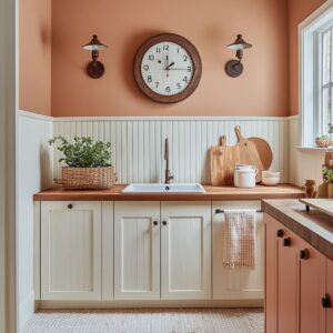
Some colors arrive with history, but that doesn’t mean they have to stay tied to the past. Clay pink, for instance, carries echoes of Mediterranean plaster, but it doesn’t fall into nostalgia when combined with clean lines and modern finishes.
Paired with slatted wood tables and cane-back chairs, it leans into tradition without falling into mimicry. The color brings warmth with a quiet depth, softened by the surrounding materials that steer it away from theatrical styling.
Powder blue tells a similar story. It’s rooted in early-20th-century palettes, but in the right company—light birch wood, soft textiles, unpolished metals—it sheds any sense of formality.
The tone plays with daylight gently, opening up smaller spaces and echoing pale sky through soft gradients on curved surfaces. It holds familiarity but lands fresh.

Then there’s muted apricot, which offers walls a touch of peach, but in a grown-up way. Not sweet, not retro, but sun-warmed and grounded—especially when used alongside textured materials like travertine or boucle.
These heritage colors work well because they don’t dominate. They frame the furniture and surfaces, letting their pigment support the space instead of starring in it.
Among many dining room paint color ideas, these grounded pastels serve as both backdrop and quiet character—especially effective where tradition meets soft modern.

Material Echo—Pigment Repeated in Surface Grain
Sometimes the most cohesive rooms don’t rely on matching colors but matching warmth. A wall painted in deep olive doesn’t need an olive table to feel complete.
A black-stained table with a hint of warmth in the grain will echo the same undertone, creating harmony through relationship rather than repetition. This subtle coordination ties everything together in a way that feels natural and balanced.
A dusty teal wall might seem like a statement at first, but look closer—its tone may already live in the terrazzo flooring, quietly picked up in a speckle of green or a gray-flecked swirl. Similarly, moss green upholstery on a chair doesn’t have to copy the wall.
If it shares the base temperature, the two elements sync without feeling too deliberate. These subtle repetitions aren’t loud.
They’re built into the room’s DNA. Undertone becomes the connecting thread, allowing furniture and finishes to play along the same color line without being identical.
In the best accent walls in dining room setups, this undertone mirroring adds depth without drawing attention to itself—it creates a kind of quiet cohesion that feels both layered and complete.

Color Applied as Texture
Not all color is about flat application. Sometimes, it behaves like surface movement—more like plaster, cloud, or brushed linen than simple pigment.
Slight tonal shifts, swirl marks, or subtle brush trails on a painted wall turn that surface into something almost atmospheric. Chalky finishes work especially well for this.
Instead of blanketing the space in color, they let the wall breathe. Light bounces differently depending on angle and distance, and suddenly what felt like a flat tone becomes a textured skin.
This kind of treatment gives the room motion without clutter, almost like a mural made from nothing but light and subtle pigment shifts. These effects can be especially striking in small or narrow dining areas.
Without needing artwork or bold shapes, the walls themselves carry presence. They offer a kind of muted animation, as if the color is gently shifting in place.
For rooms that lean on soft material palettes, this kind of painted texture adds another layer—something that sits between architecture and finish. It’s one of the most underrated dining area paint ideas, offering atmosphere without visual noise.

Seating as Movable Saturation
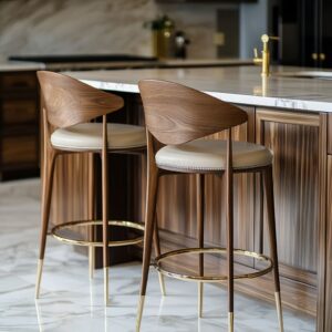
There’s a certain advantage to letting the chairs carry the boldness. Mustard velvet seating, for example, brings richness and saturation to a room that might otherwise stay safely within walnut, cream, or soft gray territory.
This kind of deep color doesn’t need to be painted on the wall to have presence. It floats mid-space, drawing attention without anchoring it to any permanent element.
Because chairs can be reupholstered or replaced entirely, they offer a flexible way to introduce high-impact color into the room without long-term commitment. In open dining areas, where colors from adjacent rooms bleed visually into the dining space, movable saturation through textiles allows for precision tuning of intensity.
It lets the dining area speak in a stronger voice without disrupting everything else nearby. Among today’s more adaptable dining paint color ideas, using bold fabric on furniture rather than paint on the walls gives both visual punch and future freedom.

Under-celebrated Hues Worth Testing
Some colors live in that space between familiar and underused—and that’s exactly what makes them valuable in a modern palette. Chalky lavender, for instance, avoids the sweetness of lilac while staying cooler than mauve.
It settles beautifully alongside warm woods like oak, and even soft metals like brushed brass or muted bronze. This makes it a compelling choice for those who want a muted atmosphere with just a hint of color character.
Then there’s dusty teal, a green-blue hybrid that feels grounded without being heavy. It borrows quietly from mid-century tones but fits into contemporary spaces without feeling retro.
It works especially well with clean lines, soft leather, or textured upholstery—supporting them without overwhelming.

Soft putty, meanwhile, behaves like a friendly neutral with depth. Not too gray, not too beige, it outlines curved furniture and trim without pulling attention.
It’s subtle enough to allow materials and shape to lead, but still provides a warm base tone that supports natural finishes. All three sit outside the common paint formulas, offering a quieter kind of freshness—exactly the kind of nuance that’s often missing from more expected dining room paint schemes.
They don’t push for contrast—they bring balance.

Shadow as Palette Partner
Color doesn’t always need to do all the work. In many dining spaces, shadow can act as a built-in accent, especially where surfaces are sculpted.
Wall treatments like shiplap, coffered ceilings, and vertical grooves bring dimension even if painted in a single tone. What happens is this: light bends, shadow deepens, and suddenly one color behaves like several.
This kind of visual layering is especially effective in rooms with large windows or overhead light fixtures. The shifting light throughout the day means the same section of wall changes tone without ever changing color.
You end up with texture made entirely from shadow, without needing contrasting trim or secondary hues.

The idea shines in soft neutral rooms where tonal variation is more important than contrast. A single shade of cream, beige, or mushroom applied across a paneled wall will reveal its hidden depths as the light changes.
For more structured or traditional interiors, this can be one of the smartest dining room wall paint ideas—keeping the palette simple while letting the structure speak through light and shadow. It’s the kind of quiet drama that ages well and adapts easily to new furniture or decor.

Round Plans & Color Centering
Circular layouts in dining areas create more than just visual interest—they organize how space and color behave. When a round table, a drum-shaped pendant, and a ceiling accent align vertically, the entire room feels anchored.
That alignment pulls the eye to the center and gently steers visual movement outward. It also supports how people interact in the space—conversation feels more shared, more balanced, because the structure reinforces connection.
This centered approach to layout isn’t only about form. The color within the stacked elements—whether it’s a muted ceiling tone, a pendant echoing wall paint, or wood stain on the tabletop—radiates in layers, building depth from the middle out.
In open floor plans, this helps the dining zone define itself without needing bold contrast or physical partitions. Among today’s most subtle dining paint color ideas, this method doesn’t rely on statement walls—it builds from the center, creating visual rhythm through cohesion and placement.

Neutral Comfort Tones—Oatmeal, Mushroom, Camel
Not all neutrals are created equal. Some fade into the background without effect, while others shape a room through tone and warmth alone.
Soft browns with a pink or golden edge—like oatmeal, mushroom, and camel—do exactly that. They’re not beige, and they’re not gray.
They sit quietly between, and that makes them ideal for creating softness without washing out the character. What’s more, these tones bring an earthy comfort that crisp white can’t offer.
They carry natural depth, which gives structure to curves, texture to walls, and an overall sense of relaxed cohesion. They also serve a practical role that’s often overlooked: they hide wear gracefully.
Fingerprints on a camel-toned wall, or subtle marks on a mushroom-painted bench, disappear more easily than on lighter colors. These hues are especially effective in rooms where materials like rattan, oak, boucle, and linen are already present.
They absorb those natural textures without competing, making them ideal for layered dining room paint schemes where balance is more important than contrast.

Summary
Color in dining spaces doesn’t always shout. Often, it shapes the atmosphere through quieter methods—matched undertones, softened edges, reflected texture.
It might show up in the luster of a ceiling, the powdery grain of a wall, or the warm velvet of a chair. A full wrap of olive or a hint of apricot blush can guide how a room feels far more than a single accent strip ever could.
What this reveals is that the most successful dining room wall paint ideas aren’t just about choosing a “color” but about understanding how that color moves—how it holds light, how it echoes furniture tones, how it settles into shadow. Whether subtle or rich, the choices that linger are those calibrated by placement, finish, and surrounding material, not simply brightness or boldness.
This is where color stops acting like decoration and begins shaping the way the space works.