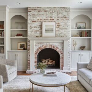
Painted brick fireplace designs shape the entire atmosphere. Their color doesn’t simply tint the surface—it changes how large the structure feels and how every material around it is read.
The brick color can become the anchor that sets the palette, controls warmth and coolness, guides the role of wood tones, and determines how textiles, ceramics, and artwork behave beside it. There are quiet strategies behind those colors, showing how subtle undertones, texture softness, and value shifts turn different painted brick fireplace ideas into the core color element that defines the design character.
Painted Brick as a “Mass Tuner”: How Color Changes the Apparent Weight of the Fireplace
One of the strongest hidden themes is how color is used to change the weight and volume of the chimney mass without changing its shape.
- Pale, powdery tones lighten large volumes
In the soft whitewashed, stone, greige, clay-beige, sandstone-beige, mushroom, and stone-white fireplaces, the brick is painted in light but not pure white. Each of these colors is tuned with a trace undertone: a hint of grey, blush, clay, or sand.- This stops the chimney from reading as a stark block and instead makes it feel almost porous.
- The slight color impurity keeps shadows soft, so the chimney looks tall but gentle, rather than rigid and monumental.
- The texture of the brick remains visible, but it never becomes noisy. The paint functions like a very thin veil that calms the masonry without flattening it.

In the deep cocoa grey, charcoal, earth-charcoal, cocoa-plum, umber-clay, graphite-brown, midnight, iron-graphite, storm-slate, and pewter fireplace design ideas, dark paint makes the chimney feel denser and more sculptural. The non-obvious trick is how the rest of the palette is adjusted, so the design does not feel heavy:.
- Dark brick can be paired with low-sheen or matte finishes, so the surface absorbs light instead of producing sharp reflections. The mass feels solid but quiet.
- The darker the brick, the more the design leans on thick pale textures (bouclé, wool rugs, creamy sofas) to visually “pad” the weight and keep it from feeling strict.
- The chimney merges into paneling, adjoining walls, or shelving rather than standing apart.
.

Subtle Wall–Fireplace Relationships: Three Recurring Strategies
These design ideas keep repeating three wall-and-fireplace pairings that are easy to miss but crucial for the final mood.
a. Tone-on-tone integration
In the greige, clay-beige, mushroom, pewter, graphite-brown, and dusty grey stone design ideas, the wall and brick colors are only a shade or two apart.
- The fireplace reads like a thicker section of the wall rather than a contrasting insert.
- Decor on the mantel becomes the real focal point, while the chimney itself behaves like a soft backdrop.
- This approach produces a feeling of architectural calm: the eye is not interrupted by hard color breaks.
b. Soft framing through slightly deeper walls
In the stone-white with olive-grey wall designs, sandstone-beige with olive cabinetry, earth-charcoal with smoky wall designs, and cocoa-plum with dusty mauve wall ideas:.
- The fireplace is lighter than the walls behind it, even when the brick is not truly “light.”
- The deeper surrounding tone acts like a color shadow that pushes the fireplace forward gently, without high contrast.
- This is a quieter version of an accent wall: the wall darkens to support the fireplace instead of competing.
c. Deliberate contrast for sharp definition
Design schemes can use clear contrast:.
- Deep charcoal with lighter walls on one side and darker grey on the other.
- Midnight brick against warm grey-beige walls.
- Storm-slate against almond-toned walls.
- Two-tone pale stone and dusty graphite where the wall stays lighter.
The key nuance: contrast is always softened by temperature balance. If the fireplace appearance is cool and dark, the walls tend to be warm and light, and vice versa.
That contrast in temperature stops the pairing from feeling graphic in a harsh way; instead it feels like a deliberate dialogue between warm and cool.

Wood Tones as Color Bridges, Not Just “Warm Accents”
Wood often doesn’t simply “add warmth” – it is carefully tuned in tone and placement to mediate between the fireplace and the rest of the design elements.
- Pale sandy or honey wood as a bridge for cool dark brick
In iron-graphite, deep charcoal, midnight, storm-slate, dusty grey stone, and soft pewter examples:- Mantels and coffee tables use light oak, honey, or driftwood tones.
- These woods sit in the middle between cool dark brick and pale textiles, acting like a hinge: dark → warm wood → light fabrics.
- Because the wood is warm but not orange or red, it pulls cool brick into the neutral family instead of fighting it.

In the soft clay fireplace design with walnut, umber-clay with oak, sandstone-beige with pale wood, and greige with blond wood:.
- The brick is already warm and mid-value. Deep walnut or strong oak is used to reinforce the structure rather than soften it.
- Here, wood behaves more like a visual frame: it defines mantel lines, slatted panels, or shelving as strong, warm strips that anchor the design.

Designs can use a gradation from one wood tone to another:.
- Driftwood mantel → slightly warmer coffee table → pale floor.
- Warm oak mantel → similar but smoother coffee table → slightly cooler wood bowl.
This internal wood gradient echoes the color progression in the brick (from lighter faces to darker mortar), creating a hidden harmony of small value steps.

Textiles as Color “Softeners” and Echo Chambers
The palettes rely heavily on upholstery and rugs to tune how the brick reads.
- Bouclé and thick textiles as visual acoustic panels
The repeated use of cream and oatmeal bouclé is not accidental:- The fuzzy surface diffuses light, preventing the eye from bouncing straight from brick to brick.
- Against dark brick, these textiles function like quiet halos, softening transitions between heavy masonry and the human body.
The rust, terracotta, cinnamon, cocoa, honey, and caramel pillows do a subtle job:
- With pale fireplaces, they resonate with unpainted firebox brick and clay pots, giving the pale chimney a small internal “spark.”
- Thick, pale rugs under very dark brick (earth-charcoal, graphite-brown, cocoa grey) keep the room from sinking visually. The dark chimney feels complex rather than oppressive.
- Rugs with a mix of cool and warm threads (wheat, grey, brown) are used when the palette is very layered – they act as a color mixer that makes different tones coexist without feeling split.

Multi-Zone and Multi-Tone Fireplace Color: Sophisticated Layering Tricks
Some design concepts use more than one color on the fireplace, not just around it.
a. Two-tone vertical strategy: pale upper brick + darker lower brick
In the pale stone and dusty graphite combination:.
- The darker base visually anchors the firebox and keeps the chimney from feeling top-heavy.
- The pale upper portion works with high ceilings and large windows, catching light and preventing vertical mass from feeling like a wall of stone.
- The mantel is placed exactly at the color break and painted in a mid-light tone, so it becomes a “buffer” between light and dark zones – neither aligning fully with the top nor the bottom.
b. Layered surrounds and interior brick rings
The midnight fireplace with taupe surround and pale interior brick uses a ring-within-ring color logic:.
- Outer ring: deep cool midnight brick establishes strength and crisp outline.
- Middle ring: taupe surround offers a warm intermediary.
- Inner ring: pale whitewashed firebox brick mimics embers at rest – visually lighter, closer to textiles, and linked to ceramics and art.
- Center: black firebox gives maximum depth.
This nested palette makes the center of the room feel almost sculpted in color layers, without any extra decoration.

c. Fireplace as color bridge in open layouts
The pale stone double-sided column in the open living-kitchen layout concepts shows another move:.
- The brick tone is selected so it is equally comfortable beside warm wood cabinetry, pale flooring, and creamy furniture.
- Rust accents in the living area are repeated in dried stems in the kitchen, so the column becomes the “neutral hinge” around which both spaces rotate.
- The color is not chosen to dominate either function (living or kitchen) but to belong to both.
.

Temperature Weaving: Cool–Warm–Neutral Triads
A recurring, less obvious structure is the consistent use of three temperature roles: one cool hero, one warm support, and a neutral peacemaker.
- Cool fireplace, warm wood, neutral textiles
Can be used in storm-slate, midnight, charcoal, iron-graphite, soft pewter, dusty grey stone:- Brick sets a cool, defined tone.
- Wood mantels, tables, and rust accents supply warmth in carefully dosed amounts.
- Creams, linens, and greys sit between them and keep everything cohesive.

In umber-clay, cocoa-plum, clay, sandstone-beige:.
- Brick leans decisively warm (brown, clay, plum, sandstone).
- Sofas and chairs lean slightly cooler grey or “dusty” rather than golden, to keep the room from feeling overly toasty.
- Wood tends to be mid-value and restrained, more soap-toned oak than orange oak.
Colors like mushroom, taupe-stone, greige, and pewter hover in the middle:
- Beside olive or mauve they read warmer.
.

Vertical Rhythm: Mantels, Vases, Branches, and Art as Color Tools
The treatment above the firebox does as much color work as the brick itself.
- Mantels as color punctuation marks
- Pale mantels on dark brick (charcoal, iron-graphite, storm-slate, cocoa-plum) prevent vertical mass from becoming a single dark slab.
- Dark mantels on mid or warm walls (cocoa-plum, graphite-brown, clay) sharpen the transition between chimney and architecture, like an underline.

These objects are almost always:.
- Slightly lighter than the fireplace when the chimney is dark, or slightly deeper when the chimney is pale.
- Positioned to pull the eye upward, carrying small key tones (rust, cocoa, olive, tawny brown) from floor level to the top of the chimney.
This makes the palette feel continuous from rug to ceiling.
- Pale backgrounds with line work or soft strokes in beige, grey, rust, or gold.
This buffers the jump from severe brick color to open wall, so you never have brick → blank wall. There is always a mediating layer of softened color.
.

Three Nice Palette Families
a. Airy mineral neutrals
Fireplace designs: soft whitewashed, pale stone, stone-white, light clay-beige, sandstone-beige, mushroom, soft greige, taupe-stone, pewter. Shared traits:.
- Brick colors that look like stone or plaster rather than paint.
- Very small steps of value between brick, walls, seating, and rugs.
- Wood and art used to add warmth, but gently: driftwood, blond oak, minimal sketches, thin frames.
These schemes give the impression of light that has been softened, not bounced, by the fireplace.

b. Deep grounded earth and shadow tones
Fireplace designs: deep cocoa grey, earth-charcoal, graphite-brown, umber-clay, cocoa-plum.
Shared traits:
- Brick hues that mix brown and grey in different proportions, sometimes with plum or clay undertones.
- Dark walls or shelving nearby in closely related tones, so dark is not limited to a single block.
- Light, thick textiles and pale rugs used in large scale to counter the weight, plus strong wood or leather notes to keep the room feeling purposeful rather than gloomy.
These palettes make the fireplace feel more like a hearth in the old sense: the center of the home’s visual gravity.

c. Expressive cool structures
Fireplace designs: deep charcoal, midnight, storm-slate, dusty grey-green stone, iron-graphite.
Shared traits:
- Clearly cool or cool-leaning darks with blue or green threads.
- Warm wall colors, almond or warm grey, and golden or honey wood to prevent a chilly mood.
- Strong black lines from window frames, lamps, picture lights, or the TV, so the cool brick feels like part of a graphic system, not an isolated dark slab.
These schemes feel contemporary and crisp but softened by careful injection of warm, tactile materials.

Painted Brick as a Light Filter: How Sheen and Texture Affect Color Perception
There is a consistent visual effect from finish choice:.
- Matte and powdery finishes
If brick is visually matte. This:- Makes shadows along mortar lines soft and velvety.
- Prevents specular highlights, so the fireplace resembles natural stone or limewashed surfaces more than painted masonry.
- Allows subtle undertones (green, blush, clay, taupe) to be perceived as tone, not glare.

In storm-slate and similar finishes, a very low sheen encourages gentle glints:.
- The chimney looks deeper or lighter depending on angle, giving a sense of movement without any pattern change.
- This is particularly smart in rooms where the fireplace is the only very dark element; the tiny shimmer stops it from feeling like a flat cut-out.
- Pale paints with slight undertones preserve brick outlines but mute color noise, so the texture feels refined.
.

Fireplace Color as Palette “Key”
Probably the deepest idea: the brick color is treated as a key note that defines what can and cannot exist comfortably in the design.
- Once the brick color is set, every other element is chosen as either:
- A close neighbor (same undertone, slightly lighter or darker),
- A mediator (wood or textile that sits midway between two extremes), or
- A carefully rationed contrast (rust pillow, gold frame, olive stem, caramel leather).
- Taupe-stone brick receives shelving in dusty cocoa, herringbone interiors in warm beige, and driftwood mantels that echo the mid-tones embedded in the brick.
.

Emotional Coding Hidden in Color Choices
- Soft stone and greige palettes suggest quiet continuity and calm, especially where brick nearly merges with walls and paneling. These schemes feel like interior designs are lowering visual noise.
- Earth-dark browns and charcoals add seriousness and rootedness, but their warmth and matte surfaces keep them feeling intimate rather than severe.
- Cool charcoals, midnight blues, and slate greys bring clarity and definition. They make lines sharper and designs feel organized, but they are always softened by tactile fabrics and warm wood, so the design doesn’t slip into sharp minimalism.
- Clay, mauve, and cocoa-plum tones introduce a more emotional warmth – a sense of wrapped gentleness – because they sit close to skin and natural earth colors. Paired with pale stone and beige fabrics, they create spaces that feel enveloping and quiet.
.

Closing Note
Taken together, these fireplace color ideas show painted brick fireplace designs working as precise color instruments rather than quick makeovers. The brick tone decides how heavy the design feels, how soft or crisp edges appear, what kind of wood, metal, textile, and artwork can live nearby.
The color is never isolated; it is always in conversation with walls, floors, mantels, fabrics, decor, and frames – a complete visual system built around one textured vertical surface.