A lot of concrete counter ideas succeed or fail on one simple thing: concrete is a mid-tone material with its own mood. If the rest of the interior design doesn’t “carry” that mood with it—through warmth, rhythm, and lighting—concrete can slip into the wrong story (garage, basement, workshop).
Modern kitchen design ideas often treat concrete like a material system with a job: it sets a steady base tone, and everything else is chosen to control temperature, glare, and visual weight.
Below are pairing options and design tactics that make concrete feel intentional without relying on one specific look.

Control “temperature” with warm materials placed where the eye lives
Concrete often feels cold because the warm elements are too low (floors only) or too small (a single bowl). A reliable strategy is to place warmth at eye level and hand level, so the interior design reads hospitable before you even notice the counter material.
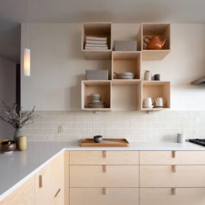
- Wood at eye level: upper cabinets, shelf backings, a wood niche, window trim, or a wood “band” running through an otherwise quiet wall. This makes concrete feel like a calm base, not the main personality.
- Wood at touch level: stool seats, a wood bench edge attached to the island, or a wood panel on the seating side of the island. It changes the emotional read of the island from “block” to “furniture.”
- Leather as the softener: caramel/tan seating works like edible warmth—especially strong beside grey concrete because it looks clean, not busy.

This is the core behind many concrete countertop kitchen ideas that feel upscale rather than industrial: concrete stays mineral and steady, while wood and leather handle comfort.

Metal as “warm punctuation,” not sparkle
Concrete becomes more refined when warm metal shows up as a repeated note (not a one-off accent).
- Brass/copper interiors on pendants are powerful because they paint warmth onto a matte grey surface at night.
- Repeating that warm metal again (faucet, pulls, pot-filler, or small shelf brackets) makes the palette feel designed.
- Pairing warm metal with black (frames, pulls, faucet) keeps the look crisp, so the room doesn’t drift into “gold theme.”
Concrete reads tailored, when warm metal appears like controlled commas in the composition—small, consistent, and placed in a rhythm.

Tile do the “movement,” so concrete can stay calm
Concrete looks good when it doesn’t have to provide all the surface excitement. That’s where backsplash choices matter.
Many concrete countertops kitchen ideas work because the backsplash supplies either texture or reflection while concrete remains the quiet plane.

Strong options that keep the interior design edited:.
- Vertical rib tile (terracotta or warm clay tones): gives lively texture; concrete then looks cleaner and smoother by contrast.
- Glossy grid tile (terracotta, soft pink, or warm neutrals): the grid brings order; the gloss adds small highlights that keep grey from feeling flat.
- Dark horizontal tile: reads like a calm shadow plane; concrete looks brighter and sharper against it.
- Reflective strip or mirrored mosaic (used carefully): reflection adds depth without needing pattern—concrete’s low sheen keeps the reflections from turning into glare overload.
A helpful rule: if the wall is visually active, concrete can be plainer; if the wall is plain, concrete needs light and texture tactics.

Quiet texture
Convincing cement kitchen countertop ideas aren’t perfectly uniform. They often rely on gentle clouding, tiny specks, or faint pinholes that give depth without turning the surface into a pattern.

A few finish-and-light tricks that make that depth show up:.
- Matte or low-satin finish to prevent bright windows from creating harsh reflections.
- Grazing light (under-shelf strips, under-cabinet lines, or side daylight) to reveal soft surface variation.
- Warm underlighting on a concrete-look wall panel to create a gradient—this makes concrete read velvety and intentional, especially in the evening.

Concrete often feels “dead” when it’s evenly lit from above only. Side light and grazing lines are what give it that calm, mineral richness.

Thickness and end-panels make concrete feel architectural
A common reason concrete reads expensive is simple geometry: a substantial edge and a finished termination. Many concrete countertop designs look purposeful because the counter doesn’t stop like a thin lid on top of cabinets—it ends like a designed object.

High-impact moves:.
- Waterfall end panels: they “cap” the run and make the counter feel carved rather than assembled.
- A thick edge used as a silhouette: even with minimal cabinets, thickness creates visual authority.
- Concrete used as a clean L-shape or U-shape outline: the counter becomes the line that draws the plan of the kitchen.
This is also why “one continuous decision” often reads more premium than several countertop changes. Continuity makes the room feel resolved.

Concrete as a “horizon line” instead of a spotlight
Concrete can feel heavy when it shows up as a tall mass everywhere. It feels calmer when it behaves like a horizontal stabilizer.

Design tactics:.
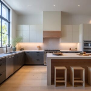
- Concrete can be concentrated in long horizontal bands (counter run, low backsplash band, one waterfall end) rather than many separate blocks.
- Pairing it with visually quiet cabinetry (flat fronts, minimal hardware, fewer contrast lines) so the eye lands on the concrete edge first, then travels through the room.
- Using open shelving with a deliberate rhythm—repeated pale dishes, then glass, then a few darker accents—so the wall reads curated, not cluttered.
This “horizon line” approach is one of the most dependable concrete kitchen countertop ideas for kitchens that want calm without feeling empty.

Small-space tactics
In smaller footprints, concrete can either tighten the room or give it clarity. The difference is whether the concrete becomes:.
- a perimeter frame (continuous U-shape/L-shape outline), or
- a destination block (a compact peninsula with a bold thick lip).
Both approaches show up often in kitchen ideas with concrete countertops because they solve two quiet layout problems at once:
- They stop the kitchen from reading like scattered parts.
- They give the eye a single calm route to follow, which makes the space feel more stable and less corridor-like.

A subtle but effective move: place seating right at the concrete “corner” or end-panel. It turns the concrete mass into a social landing zone instead of a hard object you walk around.

Color parings
Concrete is unusually good at sitting between styles: rustic brick, crisp white cabinetry, dark modern slabs, and bold color blocks. The trick is to treat concrete as the bridge color, not the headline.

Pairing sets that repeatedly feel coherent:.
- Charcoal/black + pale concrete + warm oak: concrete becomes the mid-tone that prevents the dark wall from feeling severe.
- All-white + concrete + warm wood bands: concrete gives weight; wood keeps it human.
- Exposed brick + concrete + white planes: concrete relates to brick as a mineral cousin; white cabinetry becomes visual silence.
- Bold color blocks (yellow/ochre) + concrete + quiet grey wall planes: concrete grounds the color so it reads graphic, not chaotic.

These are the kinds of cool concrete countertop ideas that feel confident because concrete isn’t fighting for attention—it’s organizing the interior design.

Styling tactics
Concrete counters shine when the interior design allows a large surface to stay mostly clear. A big, open plane signals control: storage is working, the layout is planned, and the design doesn’t need props to feel finished.

A consistent styling logic that keeps concrete looking high-end:.
- Group objects tightly (a tray + one vessel + one organic element), then leave breathing space.
- Use greenery where it matters: at the end of a run, near the sink, or near a window to soften hard geometry.
- Echo bold colors with natural items (lemons, flowers) rather than adding more colored decor—this makes the palette feel intentional.

Putting it together: a practical “pairing map” for concrete counters
Think of concrete as a calm center and choose one role for each supporting element:.
- Warmth carrier: wood (eye level) + leather (human level)
- Depth carrier: glossy tile, subtle reflection, or ribbed texture
- Crisp outline: black hardware/frames
- Night mood: warm metal glow and grazing light
- Finish signal: thickness + a clean end-panel
This is why concrete countertop kitchen ideas can look wildly different yet still feel cohesive: the material roles stay consistent even when the style changes.