Modern cottage kitchen style has shifted its focus from decoration to atmosphere. What once relied on patterned tiles and rustic ornament now builds its identity through quiet material combinations, thoughtful gaps, and light that moves with the day.
Rather than mimic tradition, these kitchen designs reinterpret it—simplifying shapes, softening edges, and letting natural finishes carry the emotion.
Every surface plays a role in setting the tone. Plaster walls might catch the light like cloth, while fluted panels and raw timber introduce rhythm without needing bold moves.
Color often falls into muted ranges—fog, sand, chalk—allowing shadows and reflections to take over where pigment might have once done the work. This modern approach doesn’t shout for attention.
It holds it—through balance, alignment, texture, and restraint. Each element fits within a larger system where stillness feels considered, and composition replaces ornament.
In this atmosphere, nothing seems forced, yet nothing is accidental either. The result is a room that feels complete—without appearing overly finished.

Soft Geometry as a Substitute for Ornament
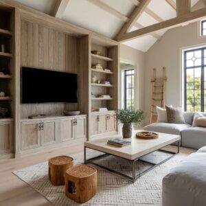
Rounded massing replaces carved trim in today’s cottage modern kitchen design. Instead of scrolls or dentils, the room leans on volume: an island swells into a gentle curve that echoes a nearby arch, while its stone top rolls over the edge like softened clay.
Fluted panels add a reed-like cadence, their shallow ribs catching side light so the face seems to breathe rather than sit flat. Pillowy counter edges further the mood, letting stone look almost upholstered—an optical twist that feels tactile before a hand ever makes contact.
Together these moves build a visual fabric of bends and ripples, allowing the room to read as relaxed even when the palette stays pared back.

A second layer of subtlety comes from how these forms converse across planes. A bowed peninsula might mirror the radius of a dome pendant, and that shared curve sets up a silent loop that guides the eye without overt pattern.
Because nothing is carved or painted on, the softness feels inherent, as if the cabinets were shaped by wind and time rather than tools. The result is a kitchen that whispers cottage character through silhouette, proving that volume can be decoration in its own right.

Illusion Through Light and Shadow
Surface and light trade places as the true color palette in modern cottage kitchen ideas. Hand-troweled plaster walls move from matte to a low satin wink as daylight shifts, creating the impression of woven fabric one moment and morning fog the next.
This mutable skin turns a simple wall into a quiet theater where sun and shadow stage a slow performance, subtly changing the room’s mood hour by hour.

Reflective balance is just as deliberate. Satin lacquer on cabinetry returns a soft glow, while honed stone stays absorbent, preventing glare.
Even metallic taps play a role, their arcs catching pinpoint highlights that mark time like a sundial across the counter. By letting brightness rather than pigment map the space, designers craft depth without extra layers—light gradation becomes the artwork.
In practice, this means the kitchen feels alive yet grounded, its atmosphere tuned through shade and sheen rather than hue.

Vertical Rhythm = Modern Beadboard
Lines that once served as cottage trim now move like tempo in a quiet melody. In many modern cabin kitchen ideas, vertical details such as fine fluting, battens, or narrow tongue-and-groove take over the visual role beadboard played in older spaces.
But their use shifts from ornament to movement through repetition. These grooves don’t aim to decorate—they pull the gaze upward, draw attention along cabinetry, and break up flat planes with a pulse.

What makes this tactic effective is scale and restraint. The spacing of each groove is calculated so light catches one ridge and skips the next, forming alternating ribbons of brightness and shadow.
As a result, walls and panels gain depth without bulk, and the kitchen gains presence without noise. It’s a type of rhythm that feels rooted in the natural world—more like the cadence of reeds along a stream than the symmetry of old paneling.
Especially in a modern cottage style kitchen design, these lines echo the tall profile of windows, the trunk lines outside, and even the grain of nearby wood, tying the interior together in vertical harmony.

Material Matchmaking as Visual Poetry
Surface pairings speak through tone rather than contrast. The most quietly captivating kitchen designs use close-range color coordination, not to blend everything into sameness, but to let materials speak in soft chorus.
A plaster wall might pick up the warmth of the cabinetry’s satin finish. A limestone counter might hold just enough of the ceiling’s wood tone to feel connected.
These moments of near-match aren’t accidents—they’re visual decisions that let the room hum rather than echo.

The success lies in the nuance. Rather than staging big color moves, such kitchens opt for tone-on-tone pairings that feel more like conversation than statement.
You’ll see a cabinet tone repeat itself in the glow of a light fixture, or the subtle pink of terracotta reappear in a floor’s pale grain. These aren’t obvious matches—they’re slight tonal echoes, the kind a viewer may not notice consciously, but that build calm and cohesion beneath the surface.
In this approach, material becomes atmosphere, and the difference between plaster and stone or wood and metal becomes about rhythm and touch more than contrast. It’s one of the quiet signatures of modern cottage visual thinking, especially in homes where mood is shaped by texture over color.

Precision Without Rigidity
Structured looseness turns order into character. Rails, stiles, and shelf edges fall on the same invisible grid, yet a clay jug tilts off-centre and a stack of bowls stops short of symmetry.
The dialogue between tidy lines and casual placement keeps the eye moving, preventing the layout from feeling frozen. In many examples of modern cabin kitchen design, this approach dials up a relaxed mood while proving that accuracy can live happily beside improvisation.
Cabinet seams align with shelf brackets to form a calm backbone, but the display itself shifts left or right, creating a gentle syncopation that feels lived-in rather than staged. Repetition replaces mirror-image symmetry.
Drawer pulls repeat at equal intervals, pendant lights march in measured spacing, and floorboards run in continuous lengths—yet no pair of objects sits in perfect reflection. This balance of discipline and freedom draws on classic cottage casualness while presenting it through a sharper lens, resulting in a space that feels composed without looking rehearsed.

Floating Horizons: The Shelf as Architectural Line
Slim ledges act as visual commas across tall walls. A pencil-thin plank, chamfered underneath, casts a soft shadow that reads louder than the timber itself.
This shadow becomes the true graphic element, slicing through vertical panel grooves and providing a pause line for the eye before the ceiling resumes the climb. In many rooms following modern cottage kitchen design principles, these ledges replace bulky upper cabinets, letting wall texture breathe while still framing small groups of ceramics or herbs.

Horizontal bands tame vertical energy. Where fluted fronts or bead-like battens pull sightlines up, floating shelves rein them in, setting a steady horizon that anchors the composition.
Because the boards are often planed to wafer thickness and coloured to match nearby stone or plaster, they feel more like a drawn line than a physical object—restraint turned into punctuation, depth turned into quiet shadow.

Soft Tension Between the Primitive and the Polished
Contrast builds presence without noise. In many kitchen designs that balance warmth and clarity, the dialogue between untreated materials and smoother finishes is what gives the space its quiet tension.
Knotty timber planks meet fine-grain limestone; coarse plaster walls rest beside brushed brass. These pairings don’t compete—they shape one another by opposition.
Rough meets smooth, and matte meets gentle sheen. Each texture clarifies the next, not through drama, but through edge and light response.

This approach avoids visual clutter while still delivering tactile interest. Instead of adding more detail, contrast does the work—one slab of hand-troweled plaster holds its own beside a polished counter because their finishes tell different parts of the story.
In some of the most restrained rooms, this is the only move being made—and it’s enough. The material itself becomes the decoration.
Many modern cottage kitchen design images show how this kind of balance replaces color or pattern entirely. It’s not about spotlighting any one surface.
The effect comes from how they sit together, defined more by what they’re not than what they are.

Color as Shadow, Not Statement
In this approach, color isn’t a hue—it’s a layer of light. Shades like sage, ash-white, clay blush, or soft fog do more than fill space—they shift with the day.
They don’t announce themselves. Instead, they absorb light at dawn, reflect it by midday, and blur into their surroundings at dusk.
This palette doesn’t define the room. It responds to it.
The space feels calm not because of any single tone, but because each surface reacts subtly to changes in brightness.

This effect only works when color takes on the role of shadow—marking form, tracing depth, softening transitions. Walls hold a hint of earth tone that catches a warm glow without glare.
Cabinets hover in greige that mirrors the undertone of plaster next to them. These small calibrations let the structure come forward without needing decoration.
Color becomes the quiet boundary that helps light sculpt the shapes. It’s a technique that works especially well in rooms where ornament is limited, and shape and texture carry the design.

Curated Incompleteness
Deliberate casual placement turns display into storytelling. A single stone bowl set a little off-centre on a slim ledge, a pair of candles that refuse to stand in line, a linen runner with loose fibers skimming the oak floor—these small departures from perfect order suggest life in motion rather than showroom freeze-frame.
Gaps between objects are part of the arrangement; empty space lets textures breathe and light pool around them, so each item feels chosen, not cluttered.
Frayed edges echo plank knots, mismatched heights keep the eye alert, and slight shifts in object alignment break visual predictability.
The discipline sits beneath the surface: shelf brackets align with cabinet rails, runner width matches the island overhang, candle flames fall on the same sightline as sconce glow. This hidden grid grounds the vignette, allowing relaxed styling to read as confident rather than careless.
The effect is lived-in charm sharpened by precision—nonchalance measured to the millimeter.

Architecture Inside the View
Exterior scenery becomes an interior layer rather than a distant backdrop. Tall glazing frames treetops so leaf silhouettes ripple across plaster at midday, while polished terrazzo echoes those shapes in faint reflection underfoot.
Vent hoods catch branch shadows, turning utilitarian planes into moving artwork that changes with passing clouds.
Materials and sightlines reinforce this dialogue: floorboards run toward the window wall, shelves stop exactly where a horizon of mountain ridges meets the glass, and pendant stems line up with mullions, creating a quiet sync between built form and landscape.
Heavy upper cabinets step aside, allowing daylight to sweep across counters and pull garden tones onto limestone and brushed metal. Without stating it outright, the kitchen feels stitched to its setting—walls, shadows, and reflections folding the outdoors inward until boundary lines dissolve.

Negative Space as Quiet Decoration
Leaving room to breathe turns absence into artwork. A shelf floats with no visible bracket, casting a slim shadow that reads louder than any hardware ever could.
Walls meet floors through a crisp shadow line rather than a baseboard, letting light carve a fine groove that doubles as trim. Crown moldings pull back into a recess, so the ceiling appears to hover, edged by darkness rather than wood.
These small subtractions give the scene its charge: the eye registers what isn’t there and finds calm in the pause. In this deliberate quiet, textures and objects gain extra presence, their outlines sharpened by the surrounding stillness.
A side effect of these gaps is emotional depth. By stripping away framing pieces, the kitchen hints at openness without claiming extra square footage.
A plain plaster surface feels richer once relieved of trim; a timber panel gains weight when it stops short of touching the floor, its lower edge outlined by light. Silence becomes a design tool, allowing the space to speak through shadow instead of ornament.

Furniture Logic in Architectural Masses
Sculptural blocks anchor the room like oversized furnishings. A marble counter drops straight to the floor, veining rolling uninterrupted from worktop to toe, so the slab behaves more like a monolithic table than part of the cabinetry run.
Across the aisle, a chunky pine island rises on broad legs, its grain and knots telegraphing craft lineage even as soft-close drawers whisper modern ease. Both elements stand apart from the perimeter, giving the eye a clear read of each form before the gaze moves on.

This standalone approach loosens the kitchen’s relationship with its walls. Big pieces read as objects placed in a room rather than surfaces fixed to it, breaking the boxy feel often found in older layouts.
Volume, scale, and material depth do the heavy lifting, creating furniture that happens to prepare food. The effect is confident and grounded: stone and timber carry their own weight, while slim hardware and clean lines keep the composition from feeling bulky.
In short, cabinetry becomes architecture, and work surfaces become sculpture—proof that utility and art can share the same footprint without compromise.

Conclusion
Modern cottage kitchen designs speak through composition instead of decoration. Planed timber, slim shadow gaps, and counter edges line up with quiet exactness, allowing the room to communicate in pauses and echoes rather than loud color shifts or ornate trims.
Every choice—groove spacing, shelf alignment, the tilt of a single ceramic—contributes to a larger rhythm that only reveals itself after a second glance. Light finishes the story.
Morning rays skim matte plaster, afternoon gleam slides across satin cabinetry, and dusk settles into fluted fronts, producing micro-shadows that redraw forms throughout the day. Because the palette stays hushed, these changes feel like gentle edits, not dramatic scene changes, keeping the atmosphere calm yet always in motion.

The result is a space that rewards patience. At first glance it feels effortless; with time, the layers of proportion and tone emerge, showing how restraint can create depth.
In this way the kitchen moves beyond surface appeal, offering a living study in balance, texture, and quiet tension that unfolds—slowly, confidently—as the light shifts and the day passes.