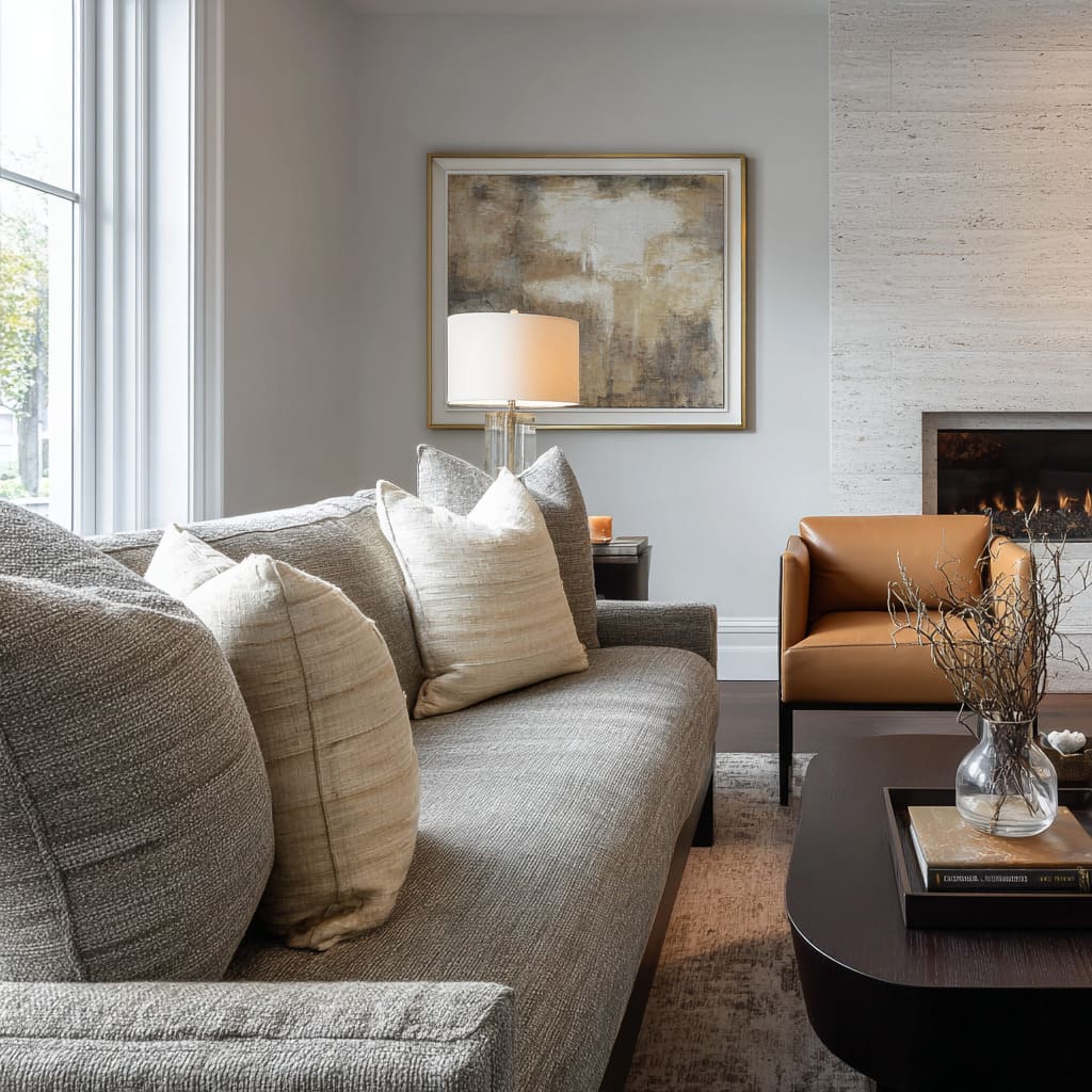
Often, a grey sofa behaves like a neutral background that can either look calm and finished or slightly flat and chilly. The difference often comes from how cushions are treated: not as add-ons, but as the main tools for setting the room’s emotional tone, visual depth, and sense of completion.
That is why so many decorating concepts revolve around grey sofa cushion ideas as the fastest way to change the “read” of a space without changing major furniture. The strongest approaches tend to control three things at the same time:
- Visual temperature: the room’s warm–cool balance at eye level
- Visual weight: whether the sofa feels grounded, airy, heavy, or light
- Readability: whether the sofa’s shape, comfort, and depth are instantly clear
Starter Map on Grey Sofa Cushions: Looks + Effect
Grey sofa cushion styling often reads like a small, controlled palette placed on a neutral base, where the materials and value shifts do the emotional work. Each combination solves specific visual goals.
Airy tonal layering
Quiet depth, soft transitions, very low contrast.
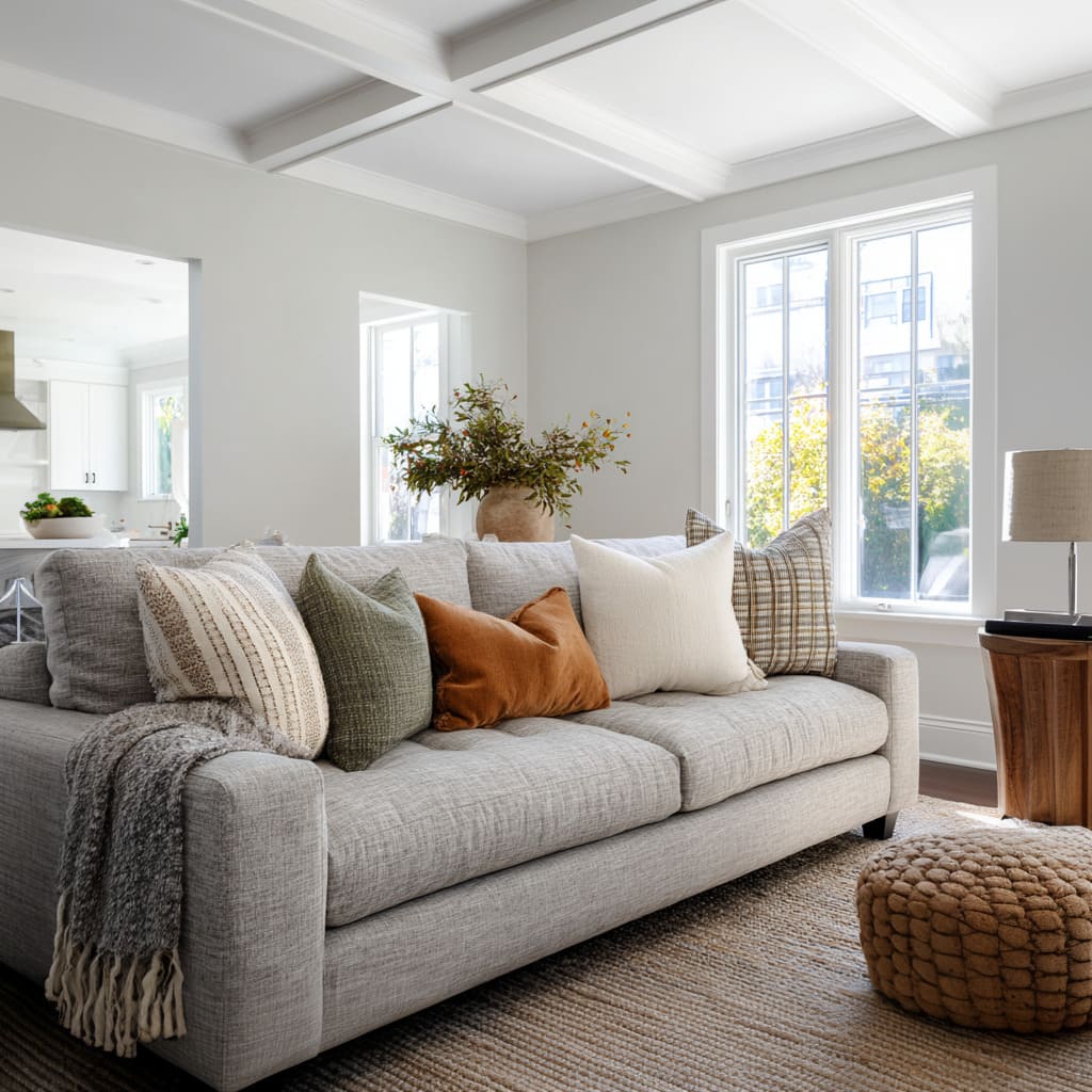
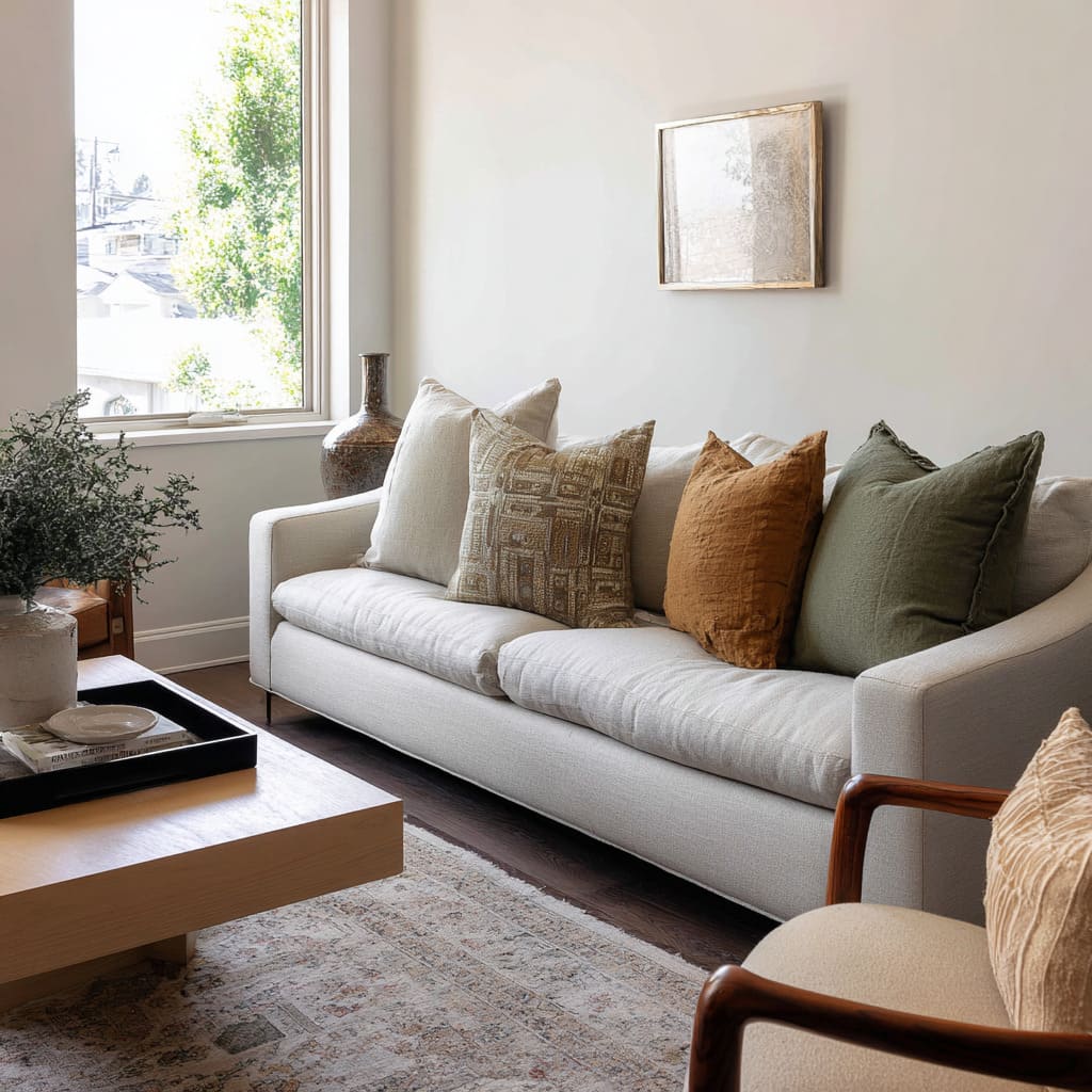
- Olive-grey + steel-blue grey + creamy off-white + caramel trim
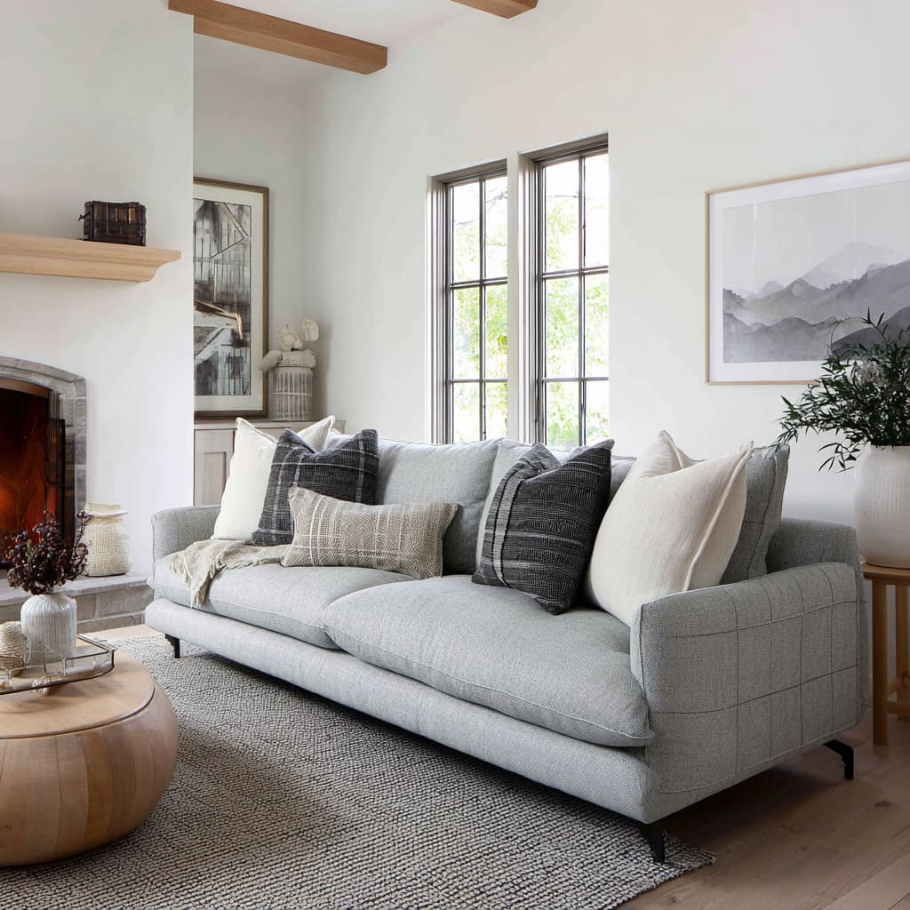
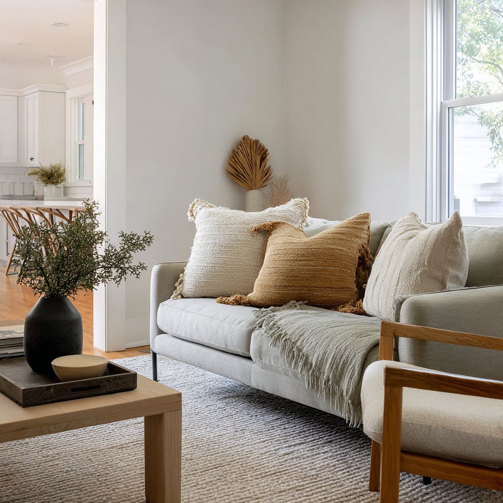
- Sandy beige + soft stone-grey + dusty blue-grey or blue-green lumbar
- Two pale sand neutrals + muted blue-grey lumbar
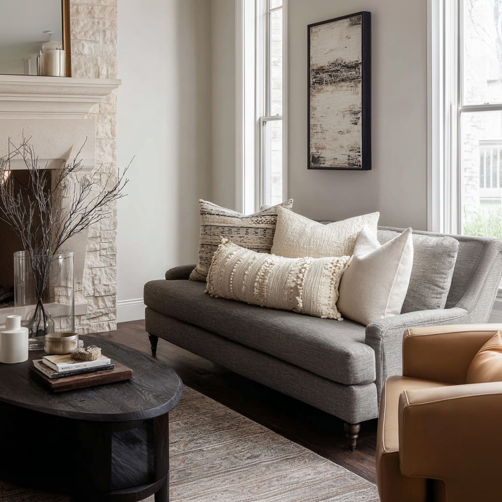
- Pale stone + off-white + deeper grey subtle pattern + textured lumbar
- Soft beige + warm taupe + slightly deeper micro-pattern neutral
Grounded, nature-leaning calm
Earthy, organic, view-friendly tones that feel settled.
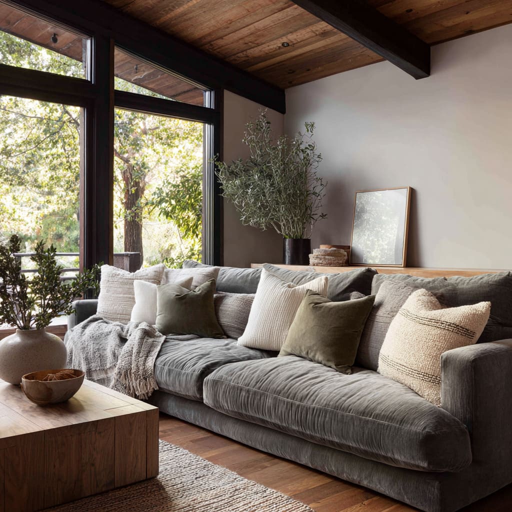
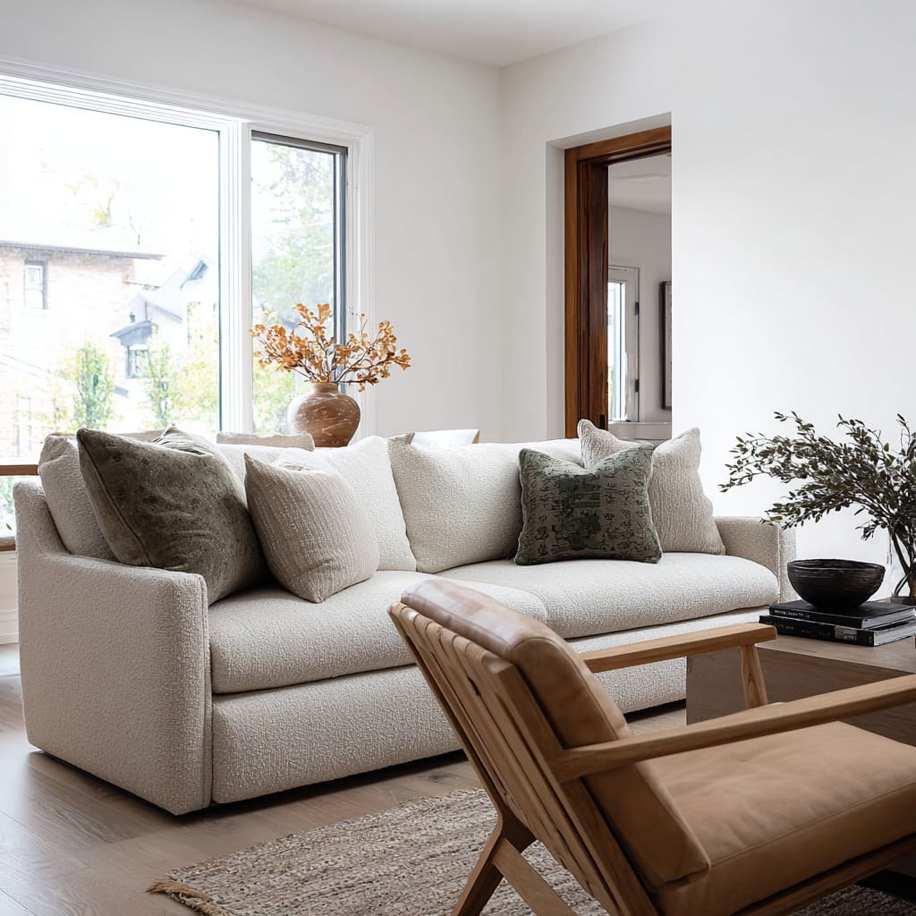
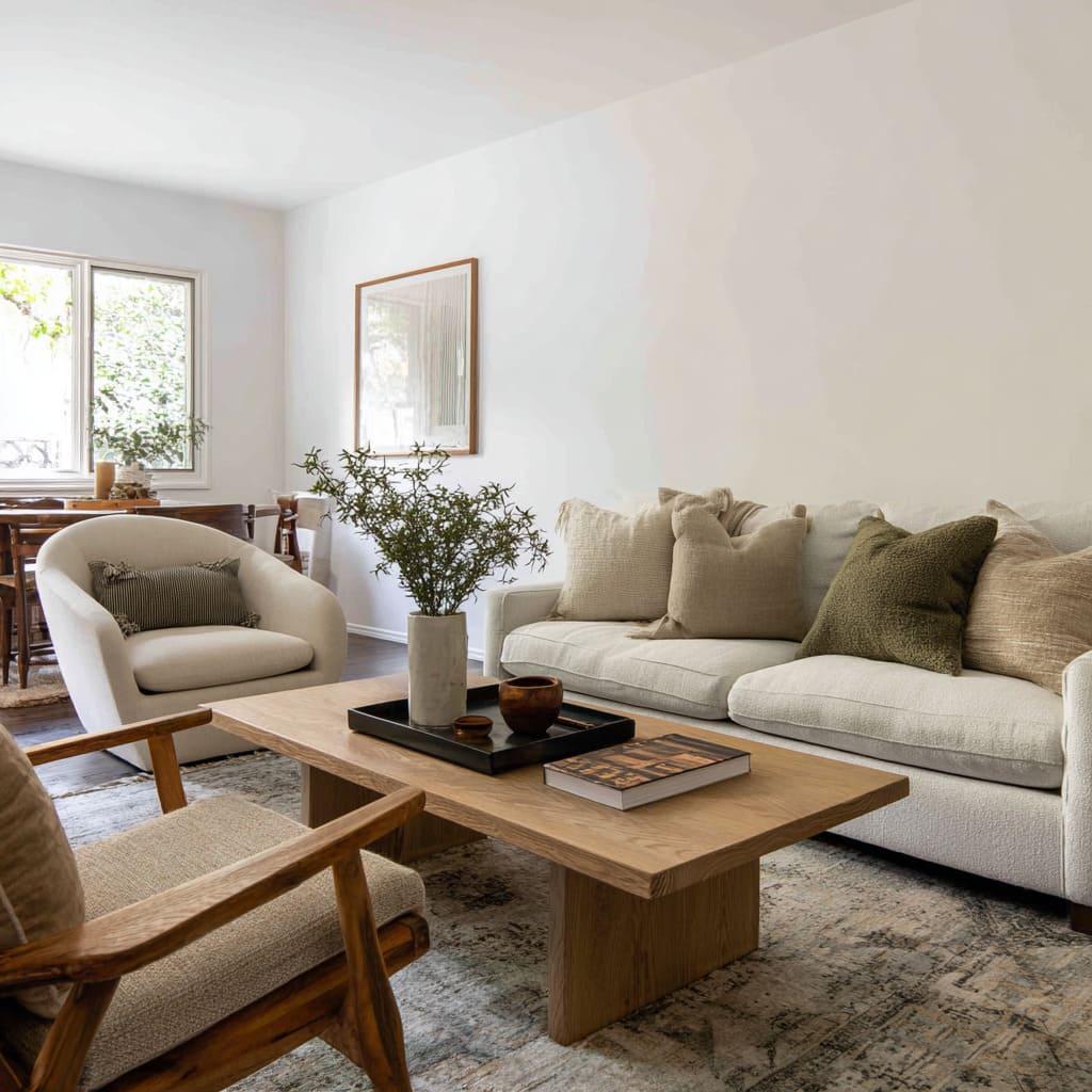
- Dusty olive or moss + creamy off-white + warm beige + soft neutral stripe
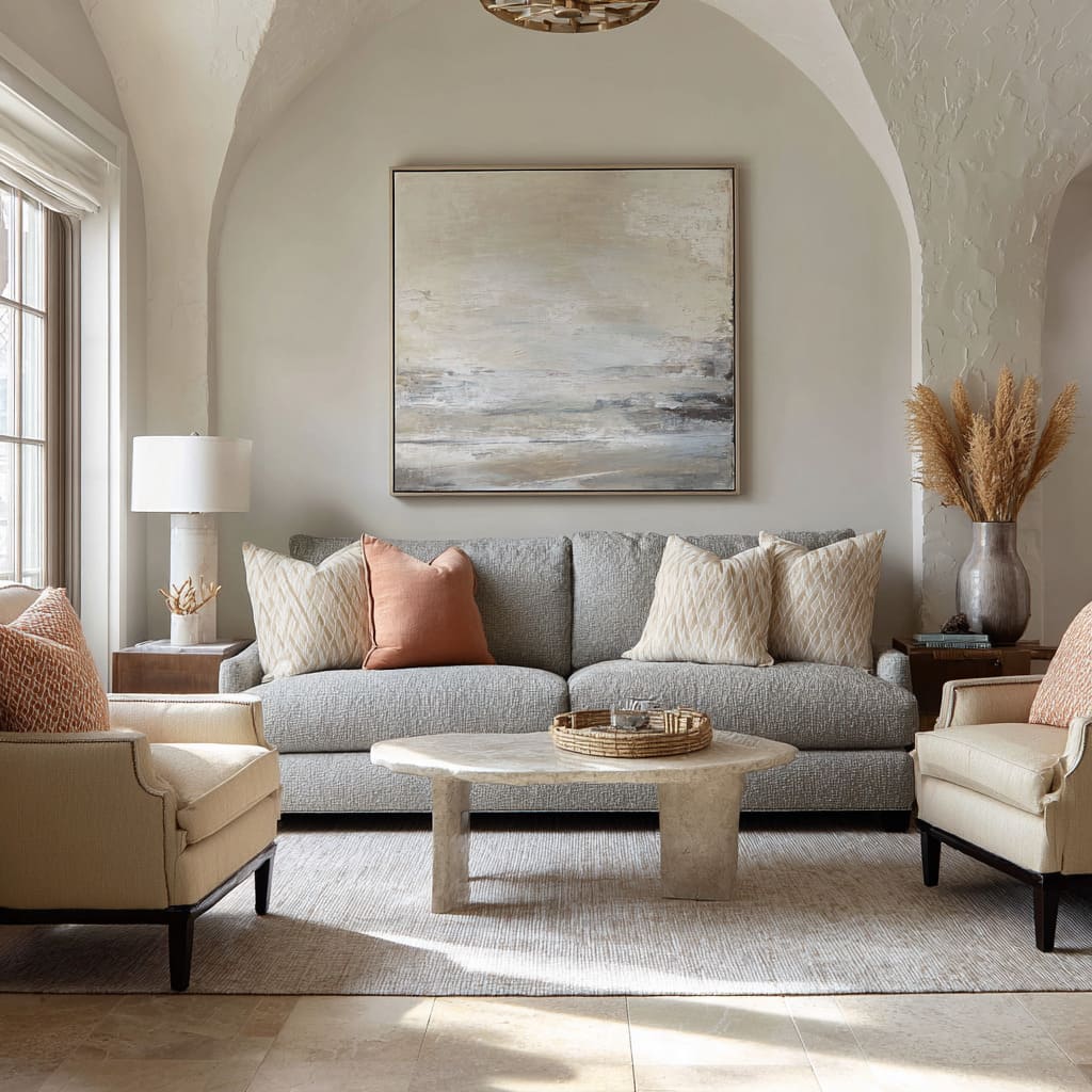
- Off-white + warm-beige pattern + rusty clay + muted olive
- Creamy neutrals + charcoal-olive + faded blue-grey pattern
- Oatmeal + soft beige + pale stone + muted olive green
Warm–cool balance with a clear center
Comfortable, composed, warm note held in check by cool grey-blue.
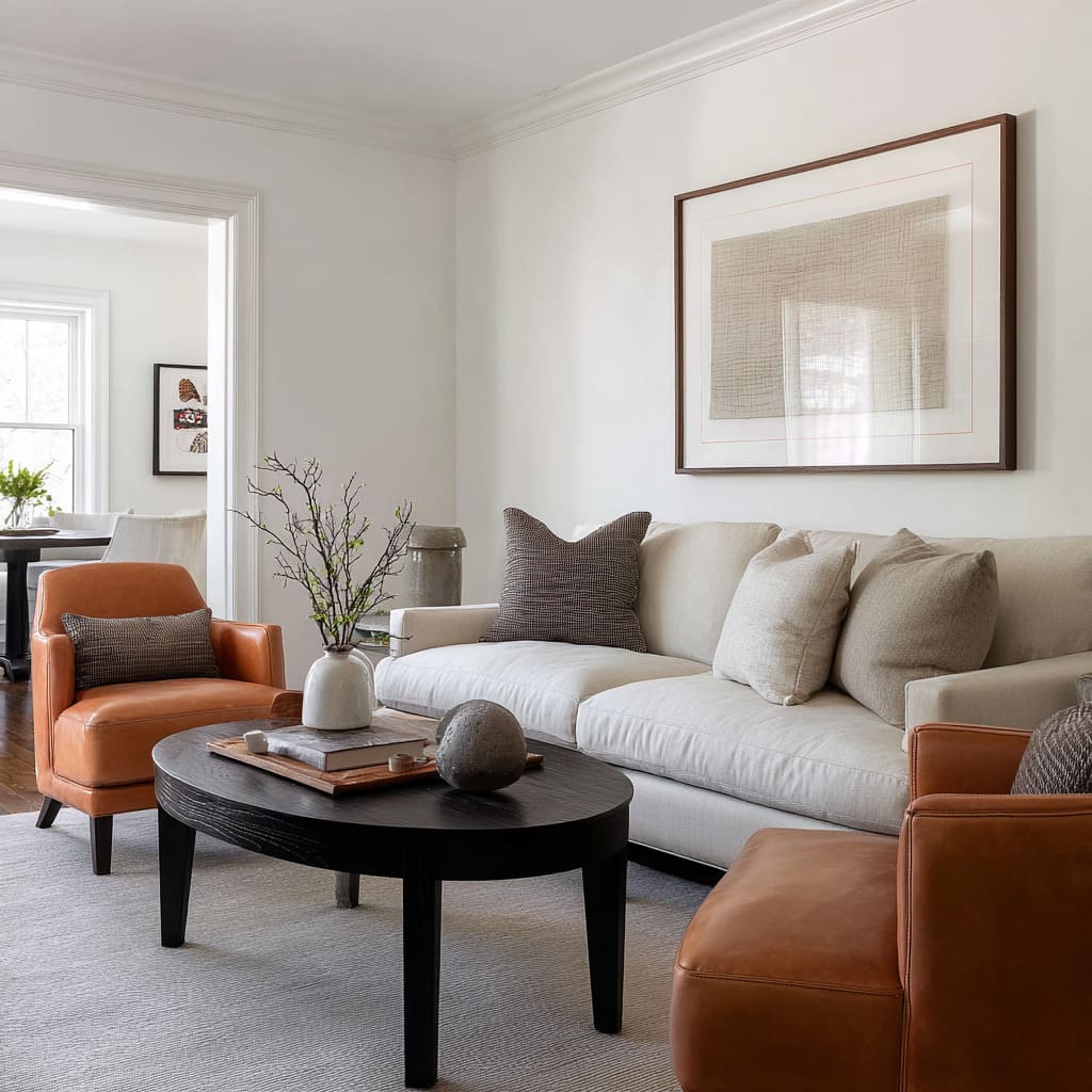
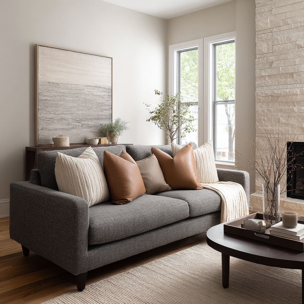
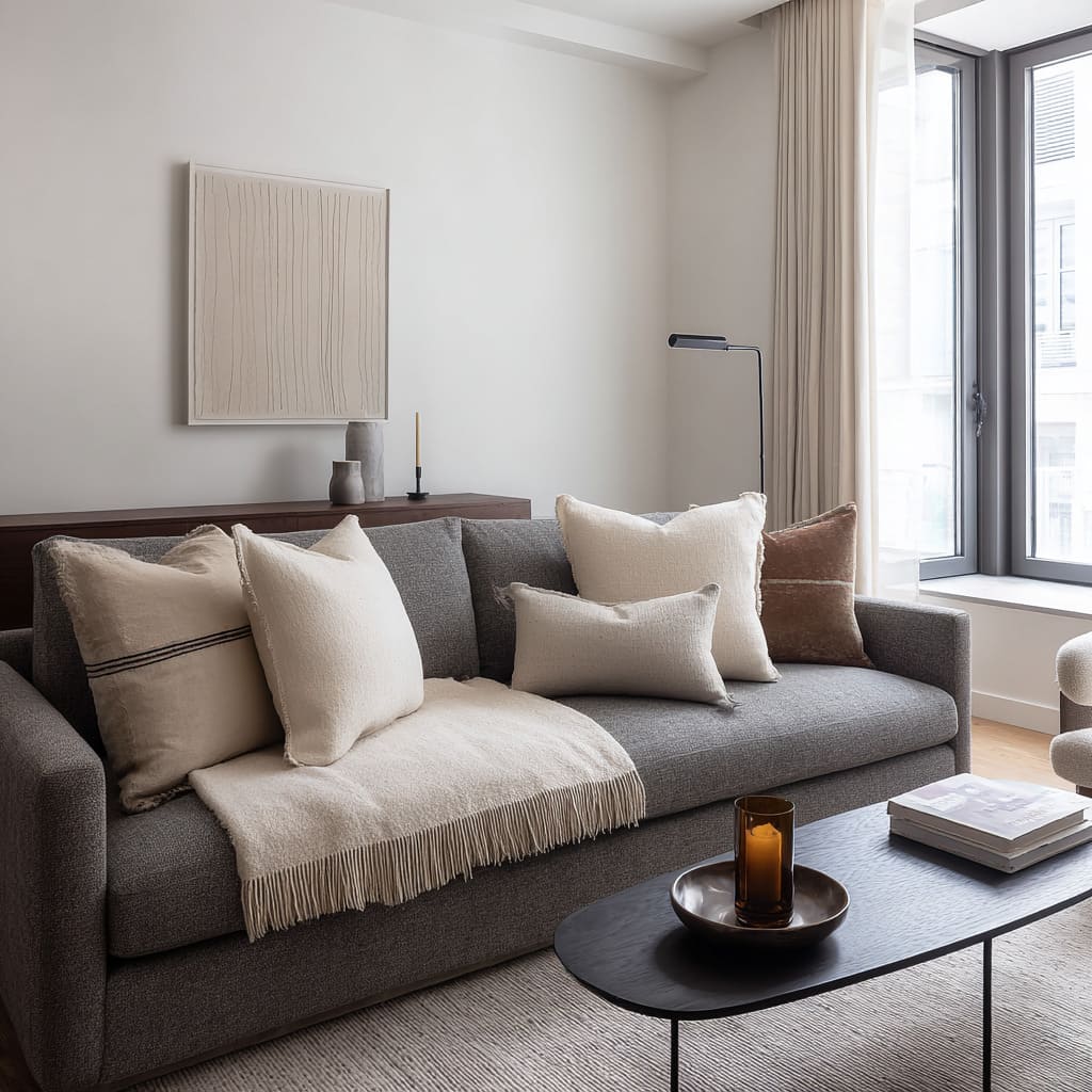
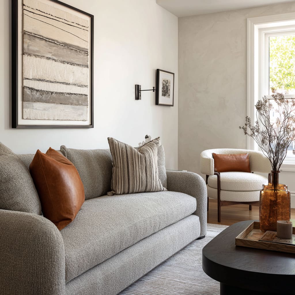
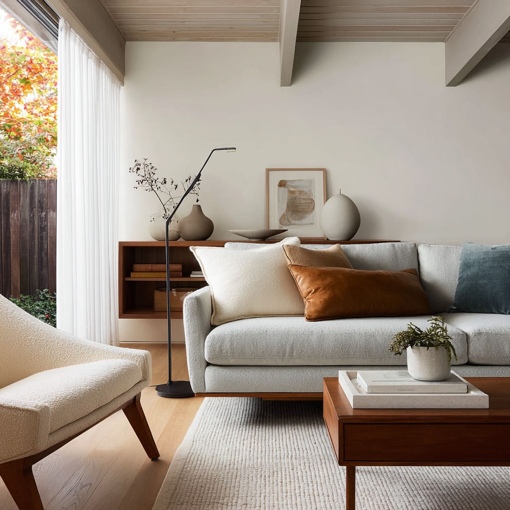
- Cream bouclé + caramel leather + muted blue-grey
- Caramel leather + soft grey and off-white ticking stripe + warm neutral base
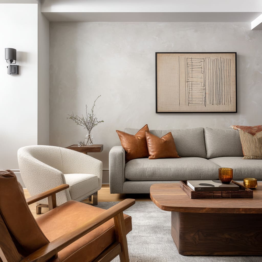
- Two caramel leather squares + rust-beige woven stripe buffer
- Soft caramel + warm clay + grey and off-white stripe + one darker patterned cushion
- Warm ochre + soft sand + pale neutral transition
Rustic-modern warmth
Heavier warmth that pairs well with wood, stone, beams.
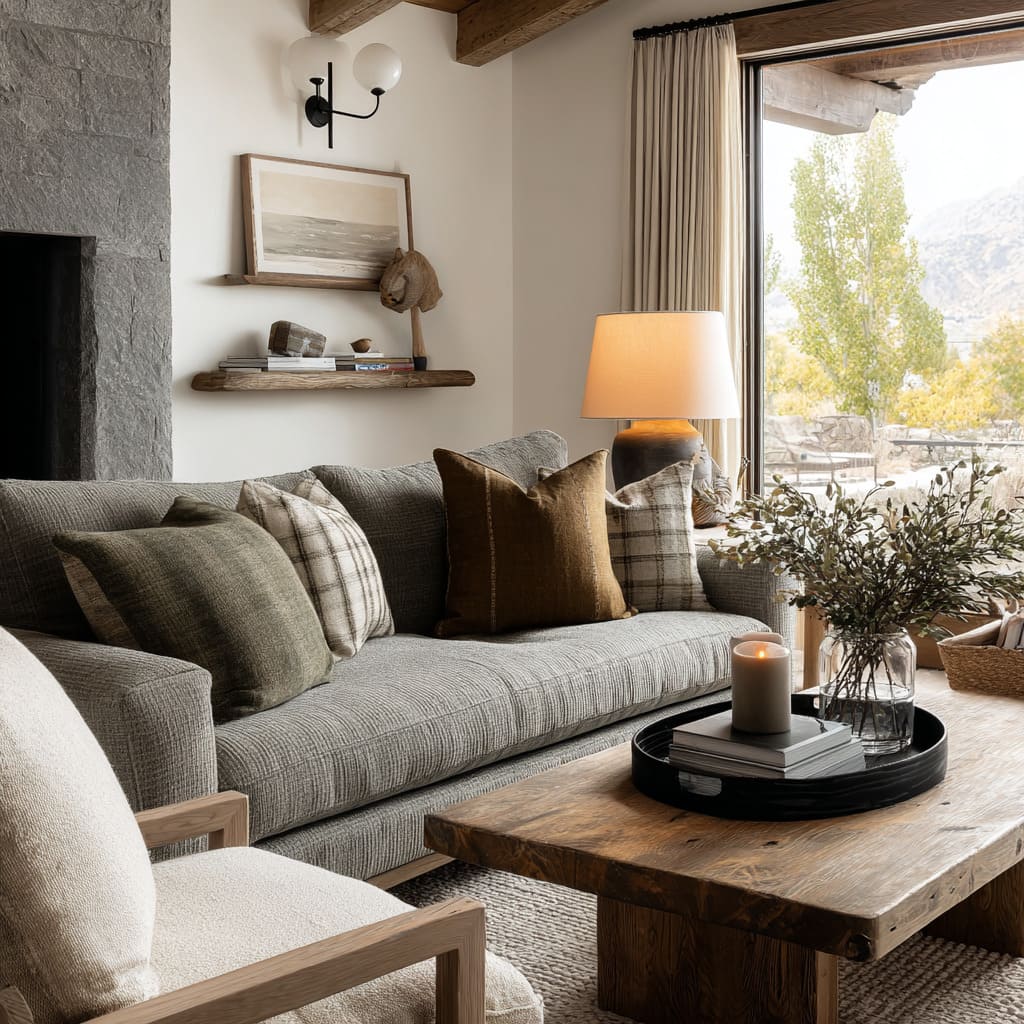
- Soft neutral plaid + deep warm brown + muted olive-grey
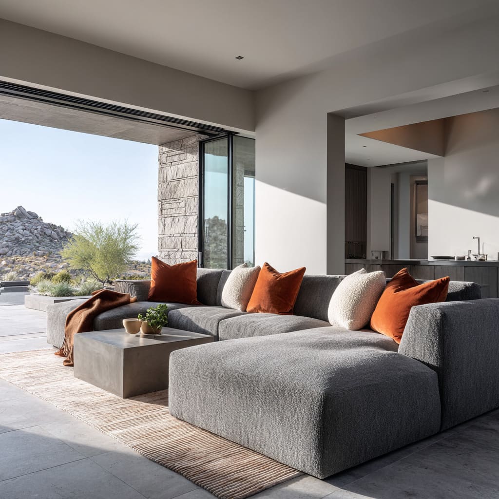
- Terracotta or clay velvet squares + pale textured neutrals
- Soft white + warm beige + muted plaid + central rich rust
Bright-room contrast and clear structure
Stronger graphic edges, sharper rhythm, high clarity.
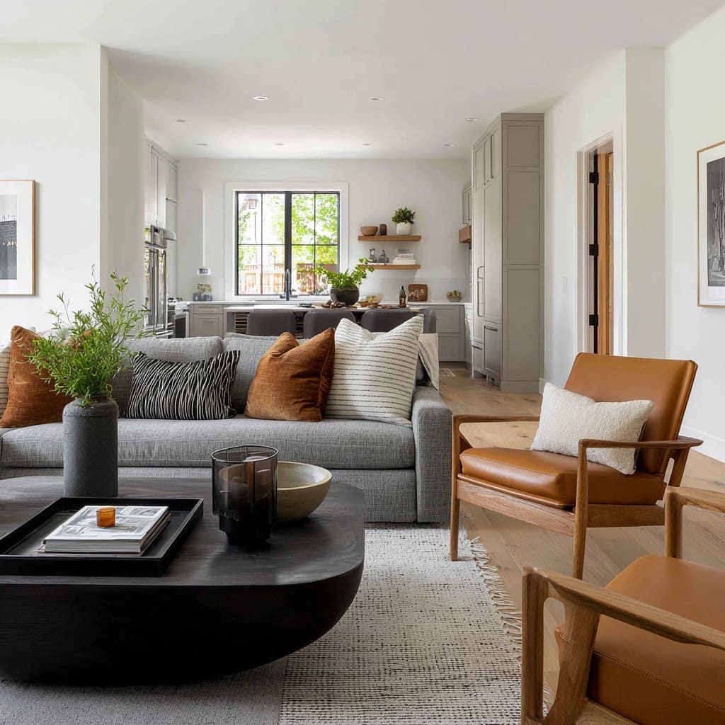
- Off-white with thin dark stripe + creamy textured neutral + pale greige lumbar + cinnamon-caramel velvet
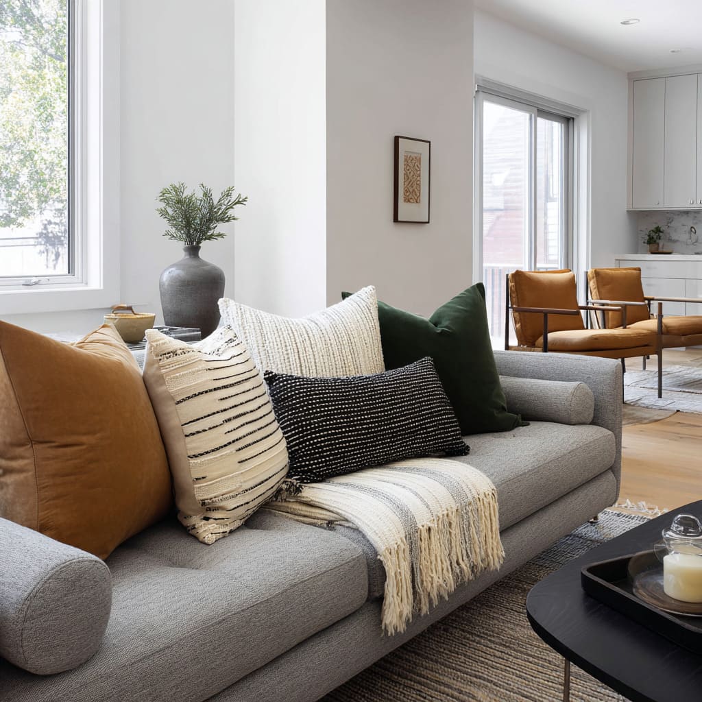
- Camel + cream with irregular black lines + black lumbar + cream textured + deep green
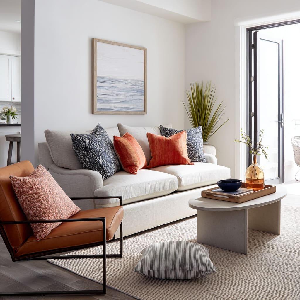
- Navy patterned ends + soft neutral buffer + rust or coral center
Dark base made lighter
Lifts visual weight and keeps a charcoal or cooler sofa from feeling dense.
- Ivory textured ends + caramel leather accents + small pale buffer
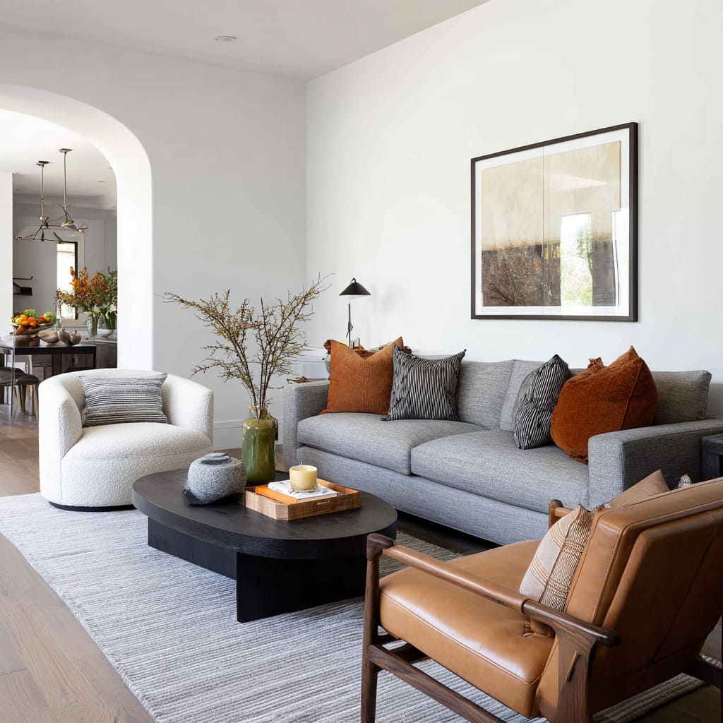
- Warm rust ends + charcoal or black ribbed or subtly striped centers
- Crisp off-white + charcoal-toned textured pillows + low rectangular neutral
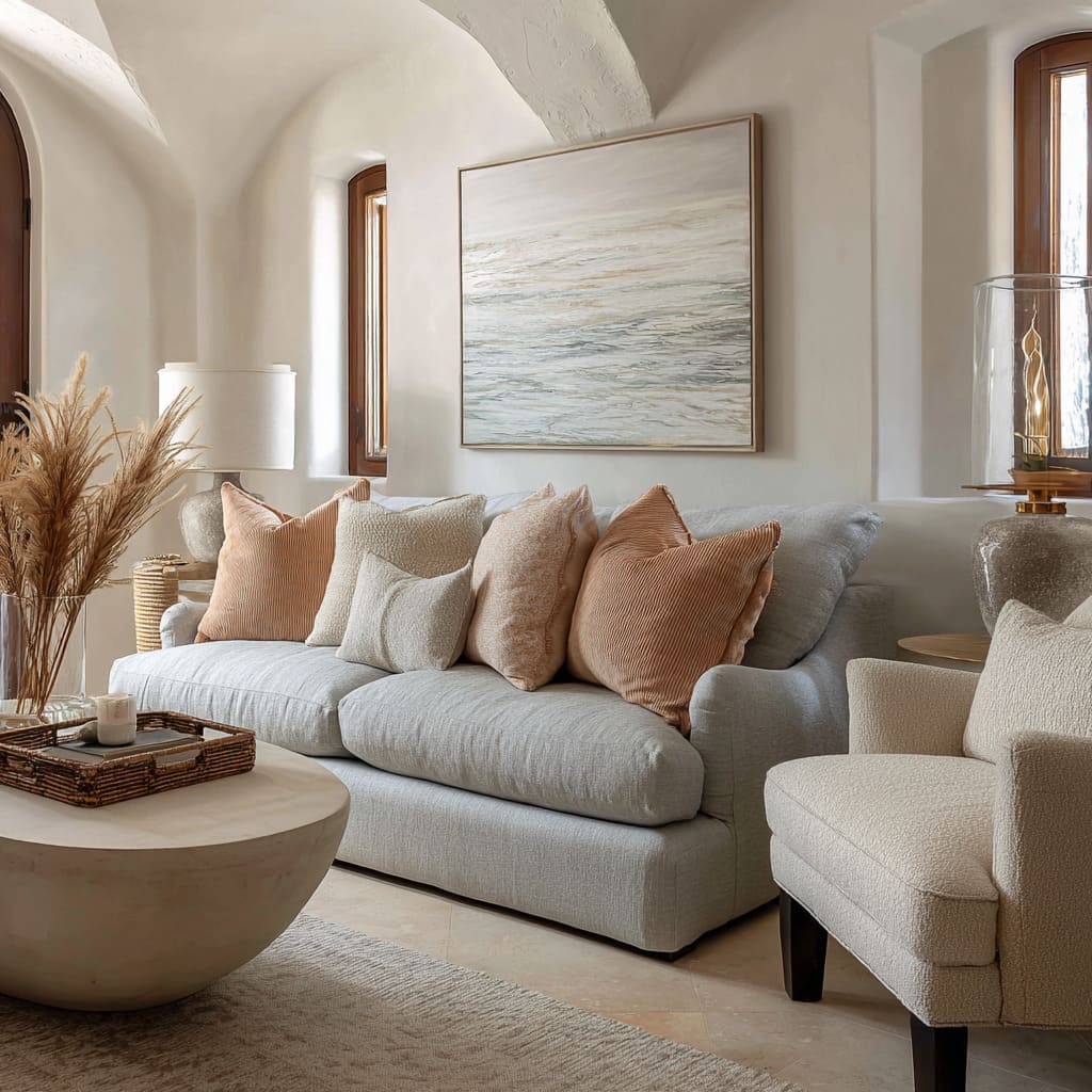
Soft warm glow
Gentle warmth, plush textures, relaxed and soothing mood.
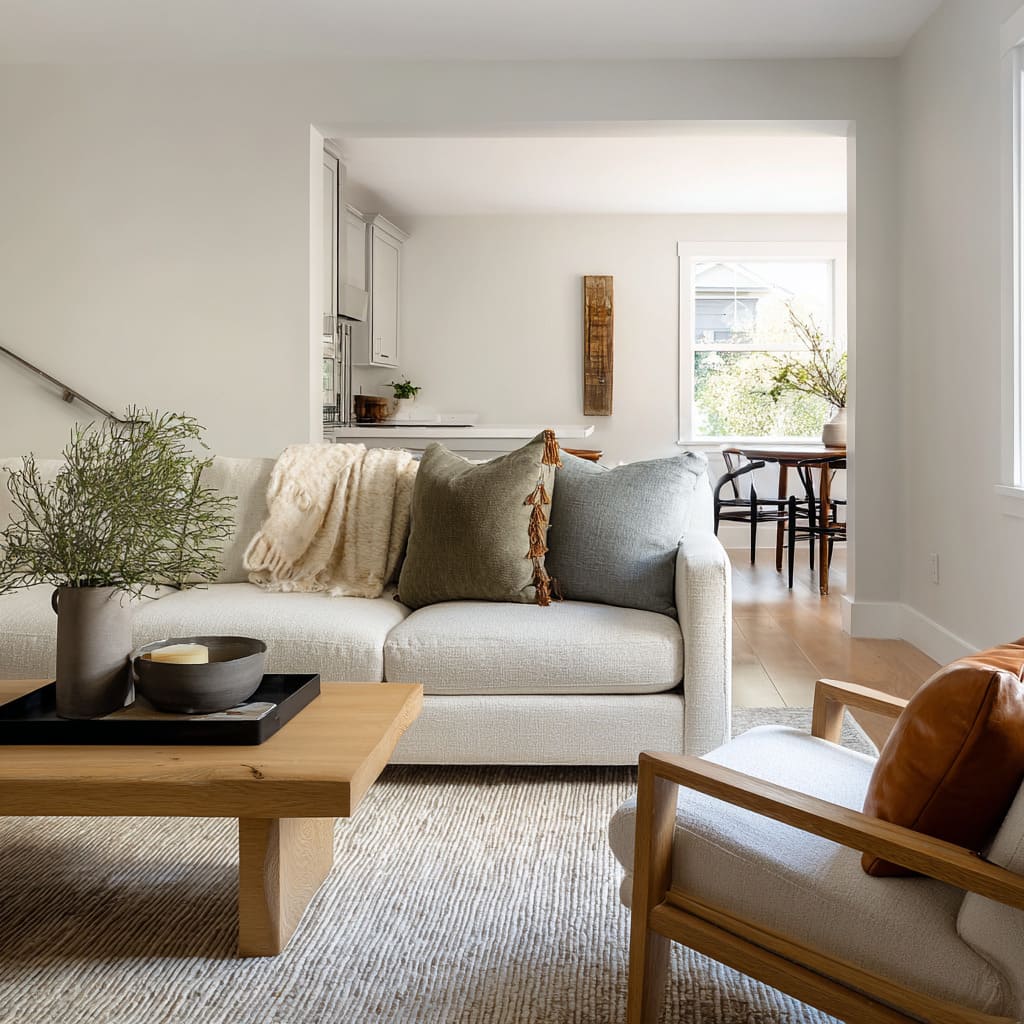
- Creamy off-white + warm wheat or honey-beige + creamy ribbed neutral + pale grey throw
- Cream + light beige + peach-caramel ribbed corduroy-like texture
- Tonal cream lattice pattern + single warm peach or clay accent
- Off-white textured cluster + cinnamon or toasted amber accent
Pillow roles and layout templates
Successful groupings tend to work because each cushion plays a clear role, and the layout creates an easy rhythm of light, warmth, coolness, and line.
Common templates that show up in finished-looking rooms:.
Cheat sheet: pillow formulas to try
3-pillow set
A) Light + warm line + cool counterweight
- Left: oversized cream boucle square
- Center: caramel leather lumbar (the main line)
- Right: muted blue-grey square
B) Two light backers + one calm front band
- Back left: sandy beige or pale sand square
- Back right: soft stone-grey or mottled pale neutral square
- Front center: dusty blue-grey or blue-green lumbar
C) Soft neutrals + one warm mood shift
- Left: cream lattice or tonal patterned square
- Middle: warm peach/clay square (slightly off-center)
- Right: matching cream lattice or tonal patterned square
5-pillow set
A) Light ends + warm center with a buffer
- End left: ivory textured square
- Inner left: caramel leather square
- Center: small pale buffer square
- Inner right: caramel leather square
- End right: ivory textured square
B) Warm–pattern–dark line–soft height–cool end
- Left: warm camel square
- Next: cream square with black hand-drawn lines
- Center: black lumbar with tiny dotted/raised texture
- Next: large cream textured square behind
- Right: deep green square
C) Warm ends + dark “ink” near center
- End left: warm rust square
- Inner left: charcoal/black ribbed or subtly striped square
- Center: grey/neutral square (keeps the set calm)
- Inner right: charcoal/black ribbed or subtly striped square
- End right: warm rust square
End-framing formulas (make the sofa look lighter or more “finished”)
1) Bright ends on a darker sofa
- Put the lightest textured pillows at both ends first (ivory/cream).
- Keep warmth closer to center (caramel leather).
- Add a small pale buffer between warm pieces.
2) Strong ends for a light sofa
- Ends: deep navy patterned squares.
- Middle: warm rust/coral squares.
- Slip a pale neutral square behind the warm pillows so navy and rust do not touch.
3) Warm bookends + dark center weight
- Ends: rust or off-white squares (pick one direction).
- Near center: charcoal-toned textured squares.
- Add one low rectangular pillow to break the wall of squares.
One-lumbar focus (the lumbar does the “design job”)
A) Leather lumbar as the hero line
- Backer: oversized cream bouclé square
- Hero: caramel leather lumbar (front, centered)
- One side pillow: muted blue-grey square to keep the warmth controlled
B) Cool dusty lumbar on pale neutrals
- Two pale back squares (sandy + stone)
- Hero: dusty blue-grey or blue-green lumbar (front, centered)
C) Dark lumbar for structure in an airy room
- Warm camel square + cream striped/line pillow as the lead-in
- Hero: black lumbar (front, low)
- Finish with a calm cream textured square and a deep green square
D) Textured long lumbar + light squares
- Hero first: long textured lumbar placed along the back (bands/knots texture)
- Then: two light squares (pale stone + off-white) angled inward
- Optional “depth” layer: a deeper grey subtle pattern pillow tucked behind
Temperature is handled like a mood dial, not a color theme
A grey sofa can lean cool, warm, or neutral depending on its undertone, fabric texture, and daylight. Cushion styling often acts as the small “thermostat” that keeps the seating zone from feeling cold, dull, or overly beige.
Warm notes that connect rather than shout
Many designs place warmth in cushions as a linking device instead of a spotlight. A caramel, rust, clay, cinnamon, wheat, or peach tone tends to appear in limited doses, placed where it naturally connects to nearby warmth already present in the design: wood floors, oak tables, honey trim, leather chairs, amber glass, warm ceramics, or lamplight.
This approach reads cohesive because the warm cushion does not feel imported; it feels echoed.
Cool notes that prevent heaviness
Cool blue-grey, steel-grey, or blue-green cushions often appear as quiet stabilizers in otherwise warm-neutral mixes. Their role is subtle: they keep the composition from turning overly warm and dense, and they preserve the calm, airy character that makes grey seating popular in the first place.
That is why many palettes use warm and cool together rather than choosing one side only.
Color logic borrowed from outside
Another strategy is desaturated, nature-based tones that quietly match what the windows already show: bark-beige, leaf-olive, dusty moss, cloudy stone, and shadowy grey. When cushions borrow from the view, the result feels natural and grounded, even if the palette is clearly curated.
Contrast works best as a ladder, not a single jump
Grey sofas often look unfinished when contrast is handled in one blunt move: one dark pillow on a pale sofa, or one bright pillow on a charcoal sofa. Many refined concepts build contrast in small, controlled steps, so the sofa gains depth without harsh edges.
The brightness ladder on pale greys
A common approach in light grey sofa cushion ideas is to create gentle rungs of value and texture rather than adding one dramatic dark note. Creamy texture might sit near the sofa fabric, then a midtone (warm taupe or dusty olive), then a cooler midtone (blue-grey), supported by thin dark accents elsewhere in the room (lamp stems, trays, frames).
The sofa stays bright, but it stops looking washed out.
Framing at the ends reduces visual mass
Placing lighter cushions near both ends of the sofa changes the perceived heaviness of the entire piece. Even a darker sofa can feel less blocky when its edges are “lifted” by pale texture.
This becomes especially effective in open-plan rooms where a long seating line can otherwise look like a single dense band.
Dark notes used as structure, not bulk
In many modern designs, dark accents appear as thin lines and small objects rather than large dark cushions. The result is a softer kind of contrast: the sofa stays calm, while the room gains crispness from outlines.
This is why throw pillows for grey couch ideas often pair pale textiles with small black or charcoal details, such as a narrow stripe, a thin border, or a low-contrast rib.
Texture behaves like a shadow engine
Texture is often the real reason cushion arrangements look rich even with restrained color. The most effective mixes usually combine surfaces that catch light, hold shadow, and reflect subtly.
Textures that glow
Bouclé, teddy, chunky knits, and nubby weaves tend to catch light even in partial shade. They create “soft highlights” that make a sofa feel inviting without needing brighter color.
Textures that absorb
Dry linens, matte cottons, and washed weaves absorb light and read grounded. They calm down busy backgrounds and prevent the sofa area from feeling overly styled.
Textures that reflect in a controlled way
Leather or leather-like cushions introduce gentle sheen. That sheen acts like a small highlight system that shifts through the day, making the sofa corner look alive and dimensional.
This is one reason grey sofa pillow ideas often include a single smooth, warm material among woven neutrals: it changes the light behavior of the whole grouping.
Tonal depth without tonal drama
Two cushions can be nearly the same color and still create depth if their textures respond to light differently. One might look evenly bright while another holds shadow in a mottled surface.
That creates layered light without adding louder contrast.
Shape and placement decide whether the sofa feels wide, calm, or social
Color may catch attention first, but shape often controls the overall impression.
The long lumbar creates width and calm
One elongated cushion placed low creates a strong horizontal band. It visually widens the seating zone and reduces the “wall of squares” effect.
It also changes the tone: a long shape reads deliberate and modern even in cozy materials.
Squares provide stability
Square cushions create a steady, grounded back line. When everything is square and evenly filled, the result can read crisp and formal; when fullness varies slightly, the same squares read relaxed and collected.
Fullness variation produces a lived-in rhythm
Mixing upright, packed cushions with slightly slouchy ones creates a gentle unevenness that feels comfortable and human. This is especially important in rooms with strong architecture (stone, beams, black window frames), where perfect symmetry can make the seating look stiff.
Warm placement changes the room’s emotional focus
Warm tones placed nearer the center tend to pull attention inward and make the sofa feel like the main destination. Warm tones placed toward the ends tend to frame the sofa and emphasize balance.
Both approaches appear in grey couch cushion ideas, but the emotional read is noticeably different.
Pattern is treated as quiet information, not noise
Patterns in grey sofa styling often succeed when they behave like texture from a distance and reveal detail up close.
Low-contrast plaid and ticking stripes
Soft plaid adds depth without turning graphic. Ticking stripes (especially softened, woven ones) add structure and gentle lift, particularly when the room already has many horizontal lines.
These patterns feel calm because they stay close in value and avoid harsh contrast.
Pattern as a bridge between wall and seating
Some compositions use patterned cushions to link wall art to the sofa area, so the artwork feels integrated rather than floating. This is a major reason throw pillow ideas for grey couch frequently include a pattern that quietly echoes an artwork’s strokes, tones, or rhythm.
Irregular lines feel relaxed
A cream pillow with imperfect dark lines reads artisanal rather than sharp. The “imperfect” quality softens contrast, which suits grey sofas in bright rooms where crisp black-and-white can feel too strict.
The surrounding room is tuned to support cushions without competing
A cushion arrangement looks intentional when the room quietly protects it: backgrounds stay calm, major surfaces avoid high-contrast pattern fights, and small accents repeat the cushion logic at different heights.
Rugs as low-contrast texture fields
Rugs often carry fine linear texture or faded pattern so they ground the sofa without becoming the loudest surface. This gives cushions permission to be the main readable detail.
Coffee tables as contrast regulators
Light wood tables keep the zone airy. Thin black tables provide crisp framing so pale cushions look purposeful.
Dark wood adds warmth in a deeper, steadier way than a bright accent pillow. Small dark trays and bowls frequently appear because they “outline” the vignette and keep soft palettes from drifting into blandness.
Lamps and thin black lines frame softness
A black sconce, lamp stem, or window trim can make cushion textures look even softer by contrast. It is not about adding darkness; it is about adding definition.
Distinct visual looks and the effects they create
Many cushion concepts repeat the same deeper strategies but produce different moods. The difference comes from where warmth is placed, how contrast is stepped, and which textures are allowed to dominate.
Quiet gradient calm
- Effect: airy, subtle depth, no harsh edges
- Key moves: close midtones (olive-grey, steel-blue grey), one tiny warm trim detail, creamy layers behind cushions.
Cream highlight with a structured line
- Effect: modern comfort with control
- Key moves: one bright cream texture as the “light catcher,” one smooth warm material for focus, one cooler grey to keep balance.
Earthy landscape layering
- Effect: organic, grounded, naturally cohesive
- Key moves: desaturated tones borrowed from outdoor view, varied fullness for relaxed rhythm, a mix of straight and curved decor to soften architecture.
Rustic-modern warmth against stone and beams
- Effect: cozy but refined
- Key moves: soft plaid for pattern depth, one warm velvet-like cushion as the emotional anchor, olive-grey as a nature link.
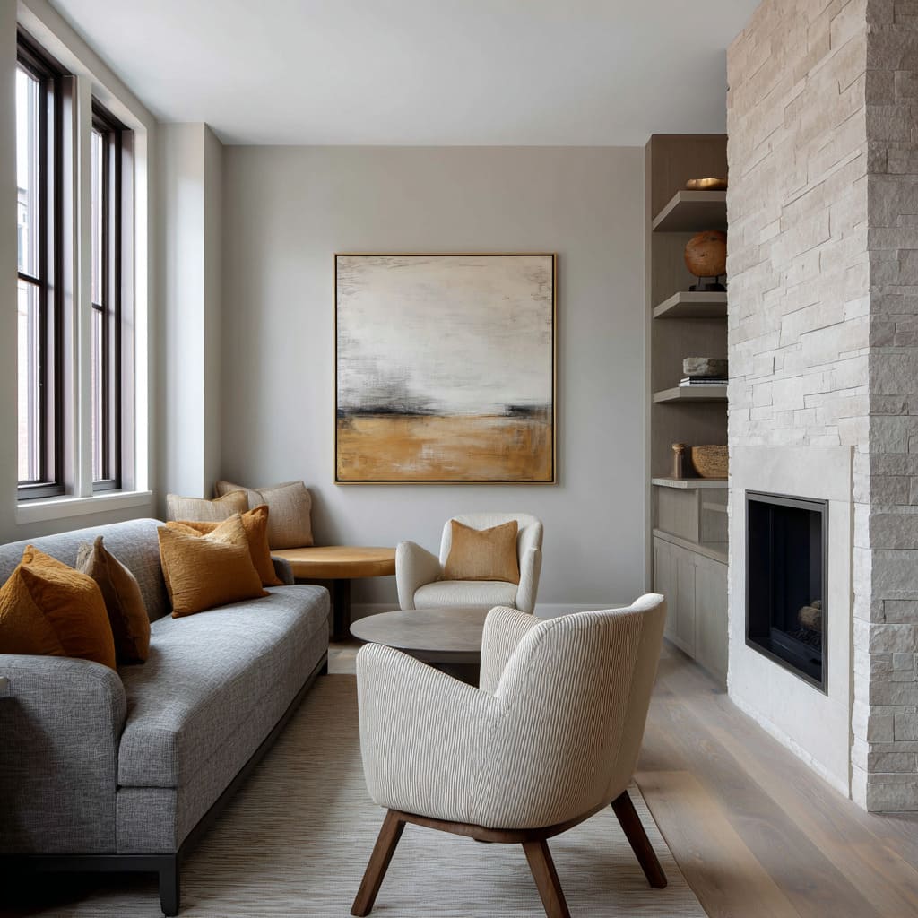
Warm-minimal with one bookend accent
- Effect: neat, calm, finished without loud color
- Key moves: pale pillows with tiny dark details, low lumbar for structure, a single cinnamon or caramel accent placed as a boundary note.
Open-plan statement mix
- Effect: dynamic, still coherent
- Key moves: warm at one end, cool at the other, neutrals and black lines connecting the middle, repeated warm tones deeper in the room so the sofa does not carry the whole palette.
Light vs dark grey sofa situations
The same cushion color can feel completely different depending on whether the sofa is very light, mid-grey, or deep charcoal, because the sofa itself controls the background value and how shadows read on fabric.
- Very light greys and off-white greiges: cushions carry the contrast job. Depth comes from a contrast ladder rather than a single dark hit, meaning midtones plus one slightly deeper accent read softer than two heavy dark squares. Texture also matters more here, since nubby weaves and boucle catch light and keep pale seating from looking flat in daylight.
- Mid-greys: the challenge is avoiding one-tone sameness. Warm accents (caramel leather, clay, wheat beige) prevent the sofa from reading cold, while a cool counterweight (blue-grey) keeps the palette from leaning too warm and dense against white walls.
- Dark greys and charcoal: the challenge is visual weight. Light framing pillows at the ends lift the silhouette, and a small buffer pillow can stop warm accents from clumping into one heavy block. Smooth surfaces like leather or velvet add controlled highlights that break up the mass without needing bright color, while soft throws can act as a light bridge between dark upholstery and lighter cushions.
Notes on darker grey sofas
Darker grey seating adds another layer: visual mass. Cushion styling often shifts from simply adding interest to actively managing weight.
- Light pillows placed at ends can reduce heaviness and make the silhouette feel clearer.
- Warm accents (caramel, rust, clay) tend to look richer when paired with charcoal rather than mid-grey.
- Leather or velvet-like finishes read especially intentional on dark upholstery because their light response contrasts with matte weaves.
That is why cushion ideas for dark grey sofa usually point toward the same deeper aim: keeping a strong, grounded sofa from turning into a single dark block, while still preserving the calm that grey is chosen for.
Failure modes and why they happen
Most grey-sofa cushion setups look off for the same few reasons: the value steps are missing, the textures fight the upholstery, or the shapes create the wrong kind of symmetry.
- Two heavy blocks on a pale sofa: dark cushions placed without a light bridge can read like weight dropped onto the seat, especially in bright rooms with pale rugs and walls. A throw or a pale textured pillow often acts as the missing transition layer.
- Flat and unfinished look: sofa and cushions sit in the same value range with similar smoothness, so nothing creates readable edges or shadow depth. The eye has nowhere to land because the surfaces behave the same in light.
- Too warm, starts feeling dense: caramel and rust tones stacked together without a cool stabilizer can make the seating feel visually thick against white walls and daylight, especially when the room already has warm wood.
- Wall of identical squares: same size, same fullness, same height creates a rigid back line that can clash with relaxed upholstery. One lumbar or one smaller scale shift usually prevents that boxed-in feeling.
- Mismatched character: very crisp pillows on a slouchy, linen-like sofa can feel stiff, while overly wrinkled pillows on a cleaner sofa can feel messy. The most believable setups match the level of softness in the sofa fabric, then add contrast through surface type (nubby vs smooth, matte weave vs subtle sheen) rather than forcing a different vibe.
The deeper takeaway: cushions act like composition, not accessories
The most successful cushion styling on grey sofas tends to follow a consistent set of compositional behaviors:.
- Contrast is built in steps rather than one dramatic jump
- Surfaces are mixed by how they handle light: glowing texture, absorbing texture, controlled sheen
- One elongated shape often signals intention and increases the sofa’s perceived width
- Warmth is used as a connector to woods, leathers, lamp glow, and ceramics, then repeated in smaller echoes
- Patterns behave like calm texture first and readable detail second
- Thin dark accents in the room provide definition so pale palettes look deliberate
This is why categories like cushions for grey sofa ideas and grey sofa pillow ideas often circle the same core moves: they solve the same visual problems—flatness, chilliness, and lack of definition—while producing very different moods.

