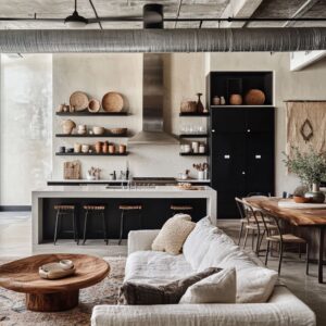
A dark setting forms the quiet frame that supports every layer in a moody boho living room design, shaping how softness, texture, and earthy materials appear. In these ideas, deep tones—charcoal, cocoa, espresso, slate, mossy green, and muted blue—are never a single flat field.
Instead, they act as a soft environment where woven pieces, dried botanicals, pottery, and handcrafted textures stand out gently.
The value of this darkness comes from its ability to hide unnecessary edges, soften reflections, and bring stability to all organic elements. When the walls absorb light rather than bounce it, the focus moves naturally toward textiles, wood grains, relaxed silhouettes, and subtle shifts in tone.
This creates a calm atmosphere where every object feels slowly revealed instead of brightly exposed. The effect is not theatrical; it’s measured, atmospheric, and steady.
In darker environments, negative space holds as much importance as visible objects, allowing seating, rugs, or timber surfaces to feel grounded without needing high contrast.

Soft Horizontal Anchors and the Power of Long, Low Lines
Horizontal elements in dark boho style interior designs are more than furniture—they behave like anchors that stabilize the room. Long window benches, extended sectionals, stretched consoles beneath a TV recess, and full-length rugs work together to create a calm, continuous base at eye level.
Above these horizontals, shadows, stems, and subtle panel grooves create gentle vertical shifts, allowing the composition to feel balanced.

This mix of horizontal grounding and vertical lift creates quiet structure without visual heaviness. In some designs, a long sofa runs parallel to softly lit windows, while in others, the bench under a wide bay window forms a natural horizon.
These lines help unify the entire room by connecting seating, tables, and surrounding surfaces. They also serve as a soft link between dark architectural planes and lighter boho textiles.
When combined, these low lines give the eye restful points before moving upward to beams, battens, or dried foliage placed in tall vases.

The Hidden Structure of Vertical Rhythm: Panels, Battens, Grooves, and Beams
Vertical elements offer a slow, steady rhythm that adds visual interest without pattern overload. Narrow panels, grooved battens, or long slats cast soft shadows that change throughout the day.
These surfaces remain visually quiet yet constantly active due to the way light touches them. Above, angled beams on sloped ceilings continue this sense of movement, introducing diagonal direction without feeling busy.

Such architectural lines help prepare the room for the layered boho textures that sit in front of them. Instead of competing, the grooves and the furniture work together: woven chairs echo panel lines; tall dried botanicals stretch upward, mirroring the rhythm; and slim artworks align with the structured wall behind them.
Because these vertical features are tonal rather than high-contrast, they feel like part of the room’s shadowed environment rather than extra decoration. They allow the darker palette to stay calm but never static.

Sofas as Quiet Foundations, Textures as the Main Story
Sofas in moody boho living room designs rarely function as loud focal pieces; instead, they carry a calm, grounded presence that supports the surrounding palette. A wide range of tones appears across different concepts: charcoal, sage-brown, pale beige, warm oatmeal, dusty gray, linen white, or muted olive.
Their silhouettes stay relaxed—soft folds, slightly sunken cushions, stonewashed surfaces, linen-like fabrics—giving each seating area a casual ease. From here, pillows take over the expressive role with layers of slubbed linen, heavy woven stripes, subtle tribal hints, ribbed cotton, open-thread designs, tufted edges, or clay-toned accents.
This combination forms a tactile universe that adds emotion to the otherwise hushed background.

Typical textile layers include:
- pillows in muted rusts, creamy neutrals, and clay-inspired hues
- throws with loose knits or tasseled edges
- coarse linen covers with dry texture
- thick boucle fabrics offering visual warmth
These ingredients bring softness into the environment without depending on bright color. Each sofa becomes a base for these layers to build upon, creating warmth inside shadow.

The Gravity of Dark Timber and Sculptural Coffee Tables
Centered in the seating zone, coffee tables act as steady, grounding shapes—often presenting the room’s strongest silhouette. Thick raw timber blocks with carved markings, dark cube tables with a charred-like effect, pale stone surfaces, or drum-style forms work as anchors.
Their presence is weighty but not harsh thanks to matte finishes that reduce reflection. These tables are not intended to dominate; they exist to hold the collected compositions placed upon them.

Common table-top stories include:
- rounded pottery in clay or sand tones
- wooden bowls with irregular edges
- woven trays adding warm straw-like texture
- stacked books placed in a casual way
These small scenes introduce slow, earthy rhythm and reinforce the room’s natural direction. Their simplicity stands out against the darker palette, proving that subdued tones gain strength through form and texture rather than color contrast.

The Subtle Intelligence of Woven Materials
Cane, rattan, and other woven components serve vital roles in dark bohemian living room design without overwhelming the scene. Their airiness lets light pass through, creating small patterns of shadow that soften the room.
Chairs with cane backs, ottomans shaped from natural fibers, bench surfaces with woven details, bar stools connecting to kitchen zones, and console doors with rattan fronts create harmony through repetition rather than matching.

These woven surfaces bridge the gap between textiles and hard materials. They hold the warmth of natural fiber but maintain structure that complements the heavier coffee tables and dark walls.
Because woven pieces glow subtly against charcoal or cocoa tones, they brighten the room without using bright colors, helping the palette stay grounded yet lively.

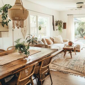
Dry Botanicals and the Role of Airy Silhouettes
Dried stems, wild grasses, delicate branches, berry clusters, or palm fronds appear repeatedly because they provide height without visual noise. Their colors—soft wheat, faded copper, muted brown, dusty beige, or earthy gold—sit gently inside dark palettes.
Instead of dense bouquets, the arrangements often use sparse silhouettes that allow negative space to play an active role. This creates gentle movement in an otherwise still room.

Because the stems echo vertical and diagonal directions already established by battens and beams, they blend seamlessly with the architecture. Clay or matte ceramic vases further emphasize the natural story while maintaining the room’s calm atmosphere.
These elements connect indoor and outdoor zones in a subtle way, especially when the outside landscape appears through large windows, giving the room a sense of quiet continuity.

Light as Texture: Soft Grazing, Framed Openings, and Gentle Transitions
Natural light can behave like a material rather than a spotlight. When sunlight enters through tall windows, it skims over jute rugs, linen upholstery, or textured walls, revealing depth in slow gradients.
In some layouts, bright kitchens behind darker living rooms create a layered visual sequence where light shifts in controlled steps, giving the space a collected calmness.

Light strategies often include:
- windows framed in deep tones so the outdoor greens appear vivid
- daylight grazing grooves in wall panels rather than flooding them
- soft reflections on boucle chairs, woven seats, or matte pottery
- lighter ceilings lifting the upper part of the room without breaking the mood
These strategies keep the room shadowed yet never flat. The contrast between dark walls and gentle light creates a sense of shelter while still letting textures breathe.

Organic Forms and Rounded Silhouettes as Gentle Counterpoints
Curved seating, rounded poufs, sculptural chairs, and smooth-edged tables appear repeatedly because they soften the straight lines of paneling and window frames. Rounded shapes introduce a calm sense of motion without needing color.
Heavy boucle chairs, pebble-like lounge seats, curved sofas in muted velvet, circular ottomans, and thick knitted poufs all create softness within the dark palette.

These shapes offer visual relief in spaces dominated by straight architectural lines. Their silhouettes feel familiar and comforting, encouraging slow interaction with the room.
Rounded forms also complement pottery, carved bowls, and dried botanicals, creating a language of gentle curves that repeats across multiple scales—from side tables to small objects.

Transitions in Open Concepts: Shared Materials Across Zones
Open layouts join living rooms and kitchens with shared material palettes rather than mirrored decorations. Wood grains shift from dark cabinetry to warm seating, woven stools connect visually with cane chairs, and pottery pieces echo across different surfaces.
When a kitchen carries deeper tones—charcoal walls, muted cabinetry, or darker shelving—it allows the living area to feel lighter even when using soft neutrals. Conversely, a brighter kitchen can stand behind a moody seating area, forming a layered composition where the living room feels cocoon-like.

Connecting features often include:
- clay-colored vases in both zones
- woven stools paralleling woven lounge chairs
- pottery grouped loosely in the kitchen, echoing living-room arrangements
- consistent matte finishes across counters, tables, and decor
This approach keeps open layouts unified without overwhelming the visual field.

Earthy Palettes and the Depth of Warm Neutrals
Across all interiors, the palette relies on earthy tones that feel calm in low light. Rust, clay, terracotta, camel, wheat, muted copper, soft sand, and dry beige appear as steady accents.
These tones warm up charcoal walls, soften espresso surfaces, and enhance deep greens or slate blues. Warm neutrals also make natural fibers more noticeable.

Common palette layers include:
- rust pillows acting as warm anchors
- sand-toned sofas balancing darker walls
- terracotta pottery connecting to dried botanicals
- caramel or camel leather chairs bringing rich warmth
- beige and wheat jute rugs expanding the room visually
Each of these hues works with the darker envelope instead of competing with it. Tone becomes the main tool for harmony, allowing a layered scene that feels grounded and cohesive.

The Gravity of Sofa Color Combinations in Shadowed Settings
Seating choices become pivotal when darkness surrounds them, shaping how color and texture settle into the room. Earth-toned textiles pair quietly with deeper backgrounds, creating soft comfort.
When a room includes a sofa in a heavier color, like in boho living room with dark brown couch settings, the overall palette becomes warmer and more shadowed, forming visual unity.

In designs where a muted neutral sectional appears, surrounding textiles introduce variety through raised stitching, soft stripes, or nubby weaves. Such designs rely on thoughtful placement of materials rather than bright accents, focusing on warm clay pieces, relaxed fabric folds, and organic silhouettes.
Layering is done through softness and natural tone shifts, letting each living room keep a calm depth that fits a quiet interior environment.

Color Families and Subtle Shifts That Shape the Mood
Color decisions in such interior designs quietly steer the atmosphere, even when tones stay within a shadowed palette. Deep greens create a woodland-like calm, settling into the darker edges of the room with ease.
Rich browns and cocoa tones move the mood toward warmth, while charcoal and slate lean cooler and more architectural.

Within these ranges, slight variations change the entire reading of the space. Some designs use near-monochrome seating to let sculptural furniture and textured surfaces take the lead.
Others introduce soft stonewashed fabrics, muted pillows, or dusted earth tones that gently brighten the layout without breaking its calm character.

Natural fibers, aged timber, woven forms, and layered textiles adapt differently depending on the surrounding shade. A rug may feel more tactile under charcoal walls, while pottery stands out more against olive or slate.
These subtle interactions show how the palette works not as a backdrop alone but as an active partner in shaping depth, softness, and visual rhythm throughout the room.
Conclusion
Together, these ideas show that boho style can carry a dark mood and that a deep palette can act as a gentle framework rather than a dramatic gesture. Every element—whether woven fiber, softened textile, sculptural furniture, or muted botanical form—works within that framework to build depth without noise.
The combinations of tone, texture, and relaxed silhouettes create designs that feel grounded and calm, allowing each surface to stand out through material rather than brightness. This balance of shadowed atmosphere and natural warmth defines the character of the style: a space where quiet layers carry more meaning than contrast, and where subtle choices shape an environment that feels steady, tactile, and thoughtfully composed.