A dark grey sofa is often treated like a safe neutral, yet the interior designs that look calm and expensive don’t treat it as neutral at all. They treat it as a light-and-shadow object: a large form that needs temperature at eye level, readable edges, and a supporting cast that carries the second and third notes.
In the strongest designs, the sofa doesn’t do all the talking; it becomes the anchor that makes other materials look sharper, softer, or richer.
Fast clarity checks to recognize in seconds
If a dark grey sofa reads cold or bluish after sunset, the room is usually missing a warm reference at eye level—something that casts a soft, creamy glow onto the wall and the sofa’s upper planes. In setups where a lamp near the sofa corner and warm materials (oak, walnut, brass) sit in the same zone, charcoal keeps its depth instead of tipping into “almost black.
”.

If the sofa looks like a heavy block, the interior design is usually missing a bright base and a breathable center. The interior concepts that feel lighter do two things at once: they place the sofa on a pale, expanded rug field, so the underside shadow isn’t dramatic, and they keep the middle visually open with thin frames or glass tops so you still read the rug through the center.

If the sofa looks flat, dusty, or tired, the issue is rarely “not enough color. ” It’s usually a missing ladder of contrast and surface behavior.
Spaces that feel rich use a step-down sequence (soft black outlines → charcoal sofa → mid-tone texture → warm whites) and then let texture create micro-shadow detail: tufting, nubby weaves, subtle checks, or a knit throw that breaks the surface into quieter light and dark.

If the sofa suddenly looks greenish, purple, or muddy, the room is usually giving it competing temperature cues. A calm, balanced off-white nearby and a medium natural wood partner tend to stabilize grey; sharp, cool whites and very golden woods often push the grey toward odd shifts because your eye tries to “average” the temperature.

Quiet high-end signals in dark grey living rooms
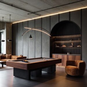
The most refined rooms treat the sofa as a large shadow form and build a clear hierarchy around it: big quiet planes (walls, rug field, sofa mass) and small crisp notes (thin black frames, a few sculptural objects, one defined lamp silhouette). That hierarchy is why a leather sectional with a gentle sheen can look expensive even with very few colors—the light catches the edges, so the outline stays clean instead of dull.
Another consistent signal is edited repetition. When dark elements repeat as slim lines—window grids, stair spindles, table bases—the room feels intentional rather than severe.
The darkness stops being one big heavy thing and becomes a rhythm. Warmth then shows up as a measured counterweight (oak treads, walnut table, brass glow), placed in a few strong locations instead of spread everywhere.

A third cue is silhouette variety without clutter. Rectangles (sofa, fireplace box, rug) feel calmer and more premium when one or two rounded forms interrupt the geometry: a curved chair, a drum table, rounded vases, or tall branches that pull the eye upward.
It’s the same reason sculptural cream chairs make a deep charcoal sofa feel softer—large light shapes change the emotional temperature without adding new colors.
Finally, high-end rooms often rely on negative space and breathing room.
Open-leg tables, glass tops, and spacing between major pieces keep the center from becoming a dense, dark rectangle. The effect is subtle but powerful: the room reads composed, not crowded.
Below is a deeper exploration that pulls out the less obvious patterns behind dark grey couch living room ideas: leather and woven upholstery, open-plan and fireplace rooms, bright window walls and low-light corners, and both straight and curved seating shapes.

Warmth can be created by warmth at contact points
The most successful designs don’t warm the whole room; they warm the places the eye lands. Dark grey can feel cold when the only warm element is the floor, because the eye reads the seating zone at a different height band.
The version that keeps the palette controlled is to place warmth in three specific zones:
- Touch warmth (hand-height): warm wood on a coffee table top, a walnut tray, or a side table that sits close enough to read as part of the seating bundle.
- Glow warmth (lamp-height): a shade that throws creamy light onto the sofa arm and back cushion area, which keeps the grey from turning bluish after sunset.
- Ember warmth (low-height): a fireplace opening, a candle cluster, or a low object in an earthy tone that sits inside the rug boundary so it reads as part of the same story.
Small warm accents work best when they sit on a “neutral carrier. A camel note reads deliberate when it sits on a deep grey sofa next to an off-white, not when it floats alone.
This is why a design can include a single tan pouf or one warm pillow detail without drifting into a beige-forward mood.

Visual weight is reduced by slicing the sofa into legible parts
A dark sofa feels “heavy” when its outline reads like one unbroken block. Interior designs that avoid that effect don’t rely on making the sofa smaller; they rely on making the shape easier to read.
Three quiet moves repeat again and again:
- A light field under the seating: a pale rug that extends beyond the sofa’s front edge, so the bottom of the sofa is seen against a brighter plane. This creates a “lift” even if the sofa is low.
- An airy center object: glass or thin-framed tables allow the rug to stay visible through the middle, reducing the sense of mass in the center.
- A deliberate gap strategy: a small negative space between the sofa and another major element (fireplace surround, shelving wall, or stair wall) so the sofa reads as a placed object, not glued to architecture.
This logic explains why dark grey sectional living room ideas can feel lighter than a smaller sofa: the sectional can be big, but the eye still finds breathable edges, a clear floor boundary, and a center that doesn’t turn into a dark rectangle.

The flat grey problem: a missing contrast ladder
Grey looks dull when everything around it sits at the same value or carries the same surface attitude. Strong designs build a contrast ladder: not one big jump from dark to white, but a set of steps that makes the grey feel planned.
A typical ladder looks like this:
- Soft black used as outline (window frames, table frame, a few small objects)
- Charcoal on the sofa (the main mass)
- Mid-grey in one or two textured items (a tweedy chair, a woven throw, a subtly patterned pillow)
- Warm white or cream in larger quiet areas (walls, rug base, lamp shade)
- A single warm note (wood tone, brass detail, or a restrained camel accent)
Texture behaves like shadow detail. A nubby chair fabric next to a smooth leather sofa creates tiny shadow breaks that make the deep grey look richer.
The soft layers can be chosen less for color and more for how the weave makes the sofa surface feel alive.

Undertones are stabilized by pairing grey with a truth-teller material
Undertone confusion happens when grey sits next to two competing temperature cues. A room that combines cool white walls with very warm orange wood can make charcoal look slightly greenish or muddy, because the eye is trying to reconcile two temperatures at once.
The most stable interior designs use grey next to a material that tells the truth about temperature:
- A calm off-white (not icy blue-white) that keeps grey neutral
- A medium natural wood that is neither red nor yellow-heavy, so it reads like “warm neutral”
- A metal with controlled warmth (brass or aged gold) that warms the scene without repainting the whole palette
This is why a living room with dark grey couch can handle a teal built-in wall or deep blue-green paint: the teal acts like a controlled filter, while wood shelving and warm metal lighting add a measured counterweight. The grey stays clear because it isn’t asked to compete with too many strong undertone signals at once.

Quick undertone-reading in real room light
Grey undertones become easier to judge when you compare them to two truth-tellers already present in many rooms: a calm off-white and a natural wood. When a dark grey sofa sits next to a balanced off-white (not icy) and a medium wood that isn’t overly yellow or red, the grey usually reads cleaner and more stable.
This is why rooms with soft white walls, oak tones, and small brass notes often keep charcoal from drifting into strange color shifts.

A simple read is to notice what happens in two conditions: bright daylight and evening lamp glow. If the sofa looks clean in daylight but turns bluish or too inky at night, the interior design often lacks a warm reference close to the seating zone, so the grey has nothing warm to “bounce” against.
If the sofa looks muddy, it often means the nearby whites and woods are pulling in opposite directions—one cool and one very warm—so the grey becomes the middle compromise and loses clarity. Interior designs that stay calm keep the neighbors consistent: soft off-white, controlled wood warmth, and dark accents used as thin outlines rather than large solid blocks.

Wall color works when it behaves like a filter
Walls fight dark grey when the wall color is too loud in value or too uncertain in undertone. Wall color can be chosen for how it changes the grey’s read.
Three wall directions often work:
- Quiet warm whites: sharpen the sofa outline and make the grey look clean, not dusty
- Greige and soft taupe: soften contrast, so the room feels gentle, while still allowing dark accents to read crisp
- Moody blue-greens: create depth behind the sofa, so the sofa doesn’t dominate; instead, it becomes one layer in a deeper background
This is where the color scheme for a dark grey couch living room becomes a balancing act: the wall sets the temperature filter, while smaller objects set the accents. If the wall is moody, accents can be fewer and quieter; if the wall is pale, accents can carry more of the mood.

Black + grey = harsh is prevented by distributing black as lines
Harshness usually shows up when black appears as large, solid surfaces. Softer designs keep black in line form: thin frames, window grids, a linear light fixture, small objects grouped on a tray.
This gives edge definition without turning the room into a severe contrast grid. A second softening move is shape contrast.
Rounded pottery, a curved chair, or a cylindrical pouf interrupts strict geometry. The coffee table can be low and substantial, while the table frame stays thin—so the room has weight without sharpness.

Lighting is the color editor, and the sofa is the biggest color sample
Deep grey shifts dramatically with light, which is why it can look perfect at noon and too blue or almost-black at night. Interior designs that keep the sofa stable don’t rely on one ceiling light; they create overlapping pools of warm light.
- A table lamp near the sofa gives a consistent warm reference point at eye level
- A floor lamp placed slightly behind the sofa edge creates a soft halo on the wall, separating the sofa silhouette
- A warm focal glow (often near the fireplace zone) stops the room from reading like a cool box in the evening
The less obvious move is that light is aimed at surfaces, not the seating itself. When a lamp lights the wall behind the sofa, the wall becomes brighter than the sofa, and the sofa stops feeling like a void.
This is one of the quiet engines behind dark gray couch decorating ideas that feel comfortable at night without changing the palette.

Cleanliness through pattern density and landing zones
Lint and pet hair show most on smooth, dark surfaces. Some designs quietly solve this by surrounding the sofa with textures that can visually absorb minor contrast noise: a heathered rug, a tweed chair, a chunky knit throw, or a plaid pillow that already contains multiple values.
Another non-obvious strategy is the creation of landing zones—areas where throws and soft layers naturally live, so the interior design looks styled rather than constantly “corrected. ” When a throw sits on a chaise corner or drapes along one arm, it becomes a built-in buffer between daily life and the most visible sofa surfaces.

Floors are translated into the sofa story with a bridge trio
Existing floors often carry a strong message: yellow oak, dark walnut, grey vinyl, beige tile. Interior designs that connect floor and sofa successfully do it with a three-part bridge:
- The rug base references the floor’s lightness (or darkness) without matching it exactly
- A wood element in the seating zone echoes the floor temperature, often through a table or shelving
- A small dark element repeats the sofa tone, so the sofa doesn’t feel like the only dark object
This is where dark grey couch rug ideas become less about pattern preference and more about translation: the rug becomes the interpreter between floor color and sofa value. A pale rug with slight warmth can soften yellow oak while keeping charcoal clear; a slightly greyer rug can calm a cooler floor so the sofa doesn’t look brownish by comparison.

The design feels finished when the rug creates a stage
An inteiror deign looks unfinished when the rug reads like a small patch under the table. In the best interior design concepts, the rug behaves like a stage: it frames the front legs of seating and extends enough on the sides that the group reads as one composition.
The rug as a connector, not a mat
In the strongest interior design ideas, the rug behaves like a single stage that links the whole seating group, not as an accessory placed under the table. When the rug extends far enough that the sofa and the nearby chair both sit inside the same calm field, the layout reads as one scene—even in open-plan spaces with a kitchen behind the seating area.
That’s why a pale rug under a dark sectional feels “finished”: it creates one continuous base that ties sofa, chair, and table into a clear zone.

This connecting role is also what reduces visual weight. A large, light rug makes the sofa’s underside shadow less dramatic and stops dark upholstery from “sinking” into warm wood floors.
Even when black details exist (window frames, table bases), the rug keeps the room from stacking dark on dark at floor level. And when the rug itself has subtle movement—soft stripes, heathered texture, low-contrast patterns—it becomes a quiet blender that helps the sofa look crisp while still hiding everyday visual noise in the floor plane.
The not-so-obvious part is that the rug also controls the sofa’s shadow. A larger, lighter rug makes the underside shadow less dramatic, which visually lightens the sofa mass.
This is why interior designs can look airy even with a deep charcoal sofa and black table frames.

Accent colors look planned when they sit at hinge points
Accent colors feel random when they are sprinkled as many tiny items. Strong designs place a single accent at a hinge point—where the eye naturally changes direction: the corner of an L-shape, the meeting point of sofa and chair, or the centerline between sofa and fireplace.
A muted mustard line, a camel note, or a rust tone appears once in a strong position, then quietly repeats in a smaller way (often through wood tone, a warm metal, or a small object). That repetition turns “a color” into a system.
It answers the question of colors that go with dark grey couch without forcing the room into a themed palette.

Small or low-light rooms need a second anchor
In compact rooms, a dark sofa can feel like it shrinks the space because it becomes the main visual mass. Strong designs often solve this not by adding lots of light pieces, but by adding one clearer object that competes in presence.
A second anchor can be:
- A substantial coffee table with a strong top surface (dark wood, stone-like tone, or a large tray composition)
- A tall vertical element that pulls the eye upward (a slim lamp, a tall plant, or a vertical slat feature)
- Large artwork that carries mid-tones so it doesn’t disappear on the wall
When the second anchor exists, the sofa stops being the only statement. The focus can shift between table, fireplace, and window wall, and the seating reads grounded rather than dominant.

The opposite of showroom
Interior designs feel staged in a basic way when every item is centered, matched, and symmetrical. It can be avoided by using controlled irregularity:
- Books stacked in uneven heights, but within one color family
- Objects grouped on a tray with varied silhouettes (round, tall, squat) while keeping the material family consistent
- A throw placed slightly off-center to break the perfect sofa line
- Art that is calm in color but not perfectly mirrored left to right
These moves add life without adding more colors. They’re especially effective in dark grey couch interior design, where the sofa’s seriousness can otherwise make the room feel too formal.

Style flexibility
Rather than forcing the sofa into a named style, strong design approaches choose a geometry language and repeat it:
- Line-forward rooms: black window grids, linear chandeliers, rectangular tables, straight sofa arms create a crisp, clean mood that suits leather and charcoal
- Curve-forward rooms: rounded chairs, circular tables, soft-edged rugs, a slightly curved sofa shape create a softer modern-organic mood even with dark seating
- Mixed geometry rooms: one dominant line element (like a stair rail or shelving wall) paired with one dominant rounded element (like a thick round table) creates a balanced transitional feel
This geometry approach explains why color alone never carries the full story. The same palette can read modern, cozy, or formal based on whether the room repeats lines or curves.

A material mix keeps dark grey from looking lonely
A dark sofa looks too dominant when it is the only strong material. In the most layered designs, the sofa participates in a conversation:.
- Leather paired with woven textures so it feels softer
- Smooth upholstery paired with grainy wood so the room has depth
- Matte black objects paired with one gentle reflective surface (glass table top or warm metal) so the room has sparkle without loudness
This is why a strong room can keep the palette limited and still feel complex: the complexity is carried by surface behavior.

Calm: a visible hiergrey behaves like a responsive materialarchy of big quiet and small crisp
- Big quiet: wall color, rug base, sofa mass
- Small crisp: table frame, window frames, a few small objects, a defined lamp silhouette
When big quiet and small crisp are both present, the interior design reads finished and deliberate. That quiet hierarchy is what prevents the common “everything grey” feeling and makes the whole composition feel composed.

Closing note
When grey is treated as responsive—changing with light, neighbors, and texture—the design becomes easier to control. A room doesn’t need more color; it needs clearer steps, warmer contact points, and a second anchor so the sofa can settle into the composition.
This is the essence of treating dark grey seating as a visual system rather than a single furniture choice.