Walk-in wardrobes are no longer treated as hidden utility zones—they’ve taken on the visual weight of full rooms. Surfaces once chosen for durability alone are now selected for how they catch light, absorb shadow, or interact with other textures in the space.
It’s not about filling every corner, but about shaping a space that feels structured, grounded, and visually clear.
What makes modern storage layouts stand out isn’t one signature move but a blend of smaller, intentional choices. Thin lines repeat across panels, handles become part of the surface rhythm, and open zones balance the filled ones.
Light moves through such spaces carefully—sometimes soft and diffused, sometimes sharply placed to catch a grain or define a gap. This article breaks down the parts that often go unnoticed at first glance—the rhythms, absences, contrasts, and framing moves that quietly shape the feel of a modern closet.
Each section takes a closer look at how visual order and calm can be built, not with more, but through control, proportion, and detail.

Vertical linework
Vertical linework in a modern walk-in closet design does more than decorate—it organizes space through rhythm. Repeating lines like full-height timber handles, fine brass inserts, or slatted wall panels behave almost like notation marks on a score.
The viewer’s eye reads the repetition as structure. But what keeps the look from feeling mechanical is its controlled irregularity.
No two stripes are exactly alike.

Wood grains shift subtly across doors, lighting accentuates shallow grooves unevenly, and an offset handle—placed just out of center—catches the eye enough to break the uniformity. These lines often extend from floor to ceiling without interruption, visually stretching the room’s proportions even in narrow corridors.
In some examples, even ceiling edges or LED strip channels echo this rhythm. This vertical emphasis pulls the gaze upward, giving a taller, more open feeling without modifying the physical dimensions.
It’s a visual technique that stays quiet but does a lot of work.

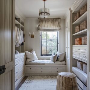
Gaps speak louder than objects
In some of the most refined modern walk-in closet ideas, the standout feature is what isn’t there. Empty cubbies, unfilled shelves, and floating benches framed in shadow become part of the design language.
These designs aren’t left blank by chance—they’re shaped to hold pause. Instead of rows packed with clothing, there might be just a few folded knits with precise edges or a ceramic bowl sitting alone.

These negative zones act like punctuation marks, slowing down the pace of visual intake and allowing the material qualities of each item to stand on their own. Even a deep drawer unit might float slightly above the floor, creating a shadow line that breaks its bulk and adds a sense of lightness.
The overall effect feels calm, but never cold or empty. That’s because these gaps follow their own rhythm—mirroring the proportions of adjacent shelves or aligning with architectural lines.
They exist to be noticed and to let the rest of the space breathe.

Timber Harmony Without Repetition
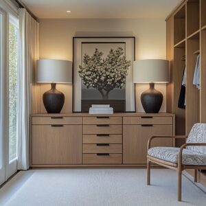
A standout approach in modern walk-in wardrobe design is the use of near-match timber finishes—a move that prevents the visual fatigue often triggered by uniformity. Floors, walls, doors, and shelves often stay within the same warm tone but never repeat the exact texture or gloss level.
It’s a coordinated variation: the grain on a drawer front might run tighter than the one on the flooring beneath it, or a cabinet face might carry a drier, more matte finish compared to the softly buffed planks underfoot.

This related but not identical strategy works like a refined interior rhythm—the visual version of harmony without monotony. Subtle changes in reflectivity help light dance across surfaces, offering soft shifts in texture without needing to add more color.
The technique can be traced to how galleries pair wooden frames with display tables—not to match, but to coexist within the same visual temperature. That shared warmth, paired with intentional differences, keeps the eye moving without fatigue.

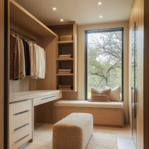
Framing Nature as Part of the Layout
In many high-end walk-in closet ideas, outdoor views are treated like part of the design—framed with the precision usually reserved for artwork. Full-height glass at the end of a corridor might line up exactly with a row of tree trunks, or center a tight grouping of green fronds, allowing nature to behave like a built-in mural.
It’s not accidental—the cabinetry on both sides often echoes what’s seen through the glass, whether that means repeating vertical proportions, mimicking the rhythm of foliage, or reinforcing symmetry with lighting.

Even a smaller feature, like an arched window tucked between shelves, becomes impactful if the leaves outside have been trimmed to fully fill the view. This technique strengthens the relationship between indoor space and the outside world without distraction or noise.
It’s a grounded approach that expands the room visually, pulling daylight and organic movement into an otherwise controlled space—especially effective in warm-climate inspirations or locations with year-round green. In this way, a modern walk-in closet design can feel connected without feeling exposed.

Curved Elements as Visual Breaks in Structured Spaces
In spaces built with order and alignment, even the smallest introduction of a curve carries noticeable effect. Soft bends—arched niches, subtly bowed window walls, or rounded rugs—insert themselves into a rectangular layout like a breath between tightly spaced beats.
These elements are not meant to take over the rhythm, but to bend it briefly. Because curves appear only once or twice within most modern walk-in wardrobe ideas, they avoid turning decorative and instead stay sculptural.

An arched recess, especially if finished in textured plaster, reads less like a flourish and more like a quiet shift in tempo. The strength of these gestures lies in their rarity.
One rounded form tucked into a sharp-edged corridor provides contrast in tone and contour, offering visual relief without compromising the overall grid. This kind of softness isn’t casual—it’s placed where the eye needs pause.
The result is a space that maintains its structure while still feeling physically and visually generous.

Light Treated as Surface, Not Just Source
Lighting, when composed carefully, stops being a tool and starts reading as part of the material mix. It becomes a layer in its own right, adding visual depth the same way wood grain or stone texture would.
In many modern walk-in wardrobe setups, strip LEDs are tucked into places where they can’t be seen—beneath benches, behind vertical rails, above shelves. This hidden placement makes surfaces float, edges glow, and corners soften.
What looks like architecture is often just a carefully measured wash of warm light.

Even daylight enters with purpose. Skylights are rarely centered; instead, they slide to the side and cast long shadow paths that change through the day.
Recessed windows, especially when paired with textured materials like fluted wood or rough plaster, allow light to skim across surface ridges, revealing every dip and rise. In effect, the glow itself becomes part of the composition, adding motion and shadow without any extra detail.
This control of brightness and direction is where light stops functioning purely as illumination and starts behaving like a textured visual element—one of the strongest ideas shaping modern walk-in wardrobe ideas today.

Texture Clash: Roughness Grounding the Polished
Closets that lean into material contrast often find their strength not through color differences but through touchable opposites. A wall of exposed concrete—marked by slight imperfections and visible seams—can sit right across from brushed oak panels that run with the grain.
Where the wood is dry and fine, the concrete feels weighty and raw. This isn’t random; it’s built on control.
One rugged surface is allowed to dominate only if it’s balanced by several smoother ones. Slate floor tiles with matte texture might frame the base, while thin brass pulls catch the light softly above.
Together, they strike a tension—grounding the visual without making it feel cold or uninviting. The eye might first register symmetry or proportion, but it’s the texture that gives dimension.
The room doesn’t try to look untouched or staged. It feels real because the finish mix keeps it from slipping into polished sameness.
This balance is quietly defining many of today’s walk-in wardrobe ideas, especially in homes where raw materials are part of the visual DNA.

Monochrome Depth Through Texture Variety
One of the more subtle design tactics is stacking texture within a tightly controlled palette. A room might be entirely beige or entirely charcoal, yet it doesn’t fall flat because of what’s layered into those tones.
Ribbed plaster, open-weave linen, brushed matte metal, smooth leather, and softly structured baskets—all land within the same color family but feel distinctly different in how they catch light or react to shadow. What keeps this approach from fading into the background is how each surface handles light differently.
The plaster wall absorbs it; the brushed metal shelf edge throws a slight reflection; the linen bench cushion adds a bit of softness without shine. There’s no need for contrast in hue when contrast in feel is handled this sharply.
Even the smallest gap between materials allows shadows to build quiet outlines. This kind of tactile variety is especially powerful in walk-in wardrobe ideas where calm is key but monotony is not welcome.
The room speaks softly, but every surface still has something to say.

Breaking the Corridor: How Horizontal Lines Slow the Eye
In narrow layouts, one of the most overlooked visual tools is the horizontal interruption. Low drawer banks, counters in stone or wood, and lowered ceiling soffits cut across vertical cabinetry, creating resting lines that slow down the visual rush.
These bands don’t only bring balance—they hit right at the point where the hand would naturally land, making them feel both purposeful and connected to the way the body moves through the room.

The effect is subtle but sharp: instead of the eye shooting straight down a long aisle, these layered lines give it something to pause on. A dropped soffit, if backlit softly or framed in timber, flattens the vertical thrust just enough to feel grounded.
Drawers that sit wider than the wardrobe towers above them act like ledges within the design’s rhythm, interrupting the climb and adding structure across the midline. In long, tunnel-like layouts, this tactic becomes essential.
Without adding noise, these breaks shift the pace and bring a sense of balance between function and spatial rhythm.

Foliage with Purpose: Plants Treated Like Elements of Structure
Greenery, when placed with care, does more than decorate—it acts as a spatial counterbalance to wood massing and vertical joinery. A single olive tree placed in line with a corridor opening, or a palm visible through a tall window, holds far more weight than multiple scattered pots.
These plants aren’t added as afterthoughts—they’re positioned to create dialogue with the room’s built forms. Even a sprig in a narrow vase or a soft trailing leaf at the edge of a bench is given space to breathe.
That space matters—it allows the organic form to read clearly, to cast a shadow, to reflect daylight, and to push back gently against the structure of shelves and doors. It’s a tactic often seen in walk-in wardrobe layouts where material richness dominates and movement needs softening.
Instead of layering in too many items, one or two strong plant placements are given full presence, like columns in an open floor plan. They act as punctuation marks—light, green, and sculptural—in a room that’s otherwise rooted in line, weight, and stillness.

Small-Scale Objects That Shift the Mood
Even the most structured spaces benefit from tension—and in many closets, that tension comes from well-placed micro-objects that gently loosen the grip of symmetry. A cylindrical stool tucked at the end of a straight corridor, a folded textile in rust leaning slightly off-center, or a sculptural vase resting alone on an open shelf—all of these details act like visual commas.
They break the pattern just enough to let the room breathe.

What keeps these gestures successful is that their forms still align with the larger space: the round stool echoes the arc of a ceiling curve; the soft textile hue relates back to the timber undertone; the vase shape mirrors negative space between cabinets. These aren’t random accessories—they’re inserted with restraint, serving as contrast and pause at once.
It’s a method of adding character without overwhelming clarity. The result is a layout that reads considered, yet not over-controlled—visually fluent but never stiff.

Closet Panels That Hide More Than Storage
Some of the most thoughtful wardrobe interiors rely on what isn’t seen. Doors that conceal hardware, panels that wrap around utility elements, and grooves that double as handles all work together to make the storage look continuous.
The impact is especially strong where finger-pull details replace knobs or bars, allowing cabinet faces to stay uninterrupted from top to bottom. A vertical rhythm is established—consistent in spacing and grain—and then preserved across the entire elevation.
Behind this facade, the practical functions remain intact: outlets, hidden hampers, or even control panels might sit just behind the slatted face of what looks like decorative paneling. This kind of visual silence doesn’t remove utility; it folds it into the architectural language of the room.
In spaces where joinery sets the tone, the ability to mask function inside form without cutting corners is what creates visual continuity. The result is seamless, but far from blank.
Every line has a purpose, even if the contents stay out of view.

Glass Panels with Control: Reflections Without Clutter
There’s a specific kind of transparency that doesn’t show everything—but shows enough to shift how a space feels. Black-framed glass doors in walk-in storage layouts provide a way to layer depth without exposing disorder.
These doors often shield only the most intentional zones: rows of jackets spaced with care, folded garments lit from above, accessories sitting on aligned trays. What isn’t meant to be seen—overflow items, bins, utility compartments—sits behind opaque panels, out of view.
This gives clarity to the visible parts while protecting the rhythm of the room. The glass itself adds a secondary benefit: reflections double the corridor’s perceived width and allow light to bounce through the space, softening dark finishes or dense materials.
With the help of integrated LEDs placed behind the frames, the clothing begins to glow in controlled slices, almost like framed still life. The transparency never overwhelms because it’s guided—a measured reveal, not a full exposure.
That balance is what keeps the room sharp, yet grounded.

Conclusion: The Space Becomes a Composition
Across all of these approaches—vertical patterning, restrained accents, natural textural shifts, hidden function, and filtered light—closets stop being storage and start behaving like spatial compositions. These are not silent rooms, but rooms that speak in a lower register.
They don’t shout for attention, yet every edge is placed with care. The success of these interiors lies not in their materials alone, but in how they’re spaced, balanced, and lit.
It’s a language of rhythm and subtraction, where emptiness holds as much presence as the filled shelf. And through that, the environment begins to feel tuned—quietly structured and visually steady, with nothing accidental in its stillness.