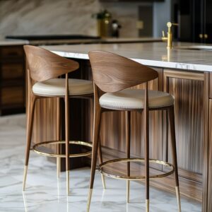
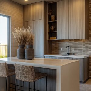
Brown cabinetry has always carried visual weight. Whether in walnut, oak, cherry, or maple, these surfaces anchor a kitchen with tone and texture—but that strength also brings a design challenge.
Once the cabinets set the rhythm, every surface around them must either hold its own or quietly support. This is where the backsplash takes on more than a protective role.
It becomes a tool to direct the eye, stretch light, shift the mood, or settle the palette.
The most impactful kitchen designs using brown cabinetry rarely rely on contrast alone. Instead, they use composition— slab vs.mosaic, gloss vs. matte, continuous line vs. broken rhythm—to create spaces that feel shaped rather than filled. Some backsplash styles mimic natural grain, others cut across it.
Some act like shadow catchers, while others throw back reflection. What matters is how these choices shape what we notice first, what fades back, and what moves across the surface through the day.

In this article, several standout backsplash ideas for brown cabinets are examined not by material list, but by how they behave visually. Texture, tone, scale, and direction come into focus, each one playing a role in adjusting balance—whether to calm, sharpen, brighten, or deepen a kitchen built around rich wood cabinetry.

Seamless Stone Slabs — Monoliths That Quietly Command
In kitchens with brown cabinets, full stone slabs bring a calm intensity that tiled patterns often dilute. These surfaces act less like cladding and more like sculpted backdrops, where scale and finish control both light and presence.

- Weight without clutter. A single slab drops the tile grid, so the wall reads as one calm shape. That enlarged canvas gives heavy walnut or cherry fronts room to breathe instead of fighting for attention.
- Vein choreography. Book-matching or strong diagonal streaks act like giant brushstrokes. When cabinet grain runs horizontally, angled veining creates a subtle cross-current that keeps the scene from feeling boxed in.
- Finish as mood dial. Flamed granite swallows glare and makes neighboring cherry glow deeper; honed soapstone turns daylight into a soft vignette; satin-sheen porcelain barely mirrors, letting thin wood grain speak.
- Edge interaction. Where slab meets counter in the same material the line between horizontal and vertical almost vanishes, so the joinery looks carved rather than assembled.
Take-away: A monolith isn’t just sleek; its uninterrupted field sets a photographic backdrop that can either spotlight cabinet grain or subdue it, depending on sheen and vein energy.

Reflective Glass Sheets — Light Multipliers
Glass backsplashes bring clarity and movement to darker wood kitchens, shifting with light and angle rather than sitting still. Their mirrored softness makes spaces feel more open, while adding just enough sheen to animate what surrounds them.

- Chameleon color. Bronze tint steals warm tones from walnut by day and lantern glow at night, shifting through amber, copper, and smoky gray within hours. Pale gray lifts the wall like fog, mirroring sky light so the gap between upper and lower blocks seems airy.
- Depth illusion in tight plans. The faint mirror doubles space without showing a literal reflection; outlines blur, making the cook line appear further back.
- Surface motion. Because glass reacts to the viewer’s movement, cabinetry that is otherwise flat gains a kinetic partner—nothing on the wall is ever visually still.
- Metal accents softened. Brushed faucets or pulls melt into the glaze; their shapes reflect once, then fade, preventing metal from looking noisy.
Insight: Glass slabs convert the backsplash from a color field into an ever-changing light device—crucial when brown cabinetry risks feeling heavy or static.

Sculptural Relief — Walls That Cast Shadows
Texture becomes performance when relief backsplashes interact with light. These designs rely on shape and shadow, turning the backsplash into a changing surface that adds rhythm without overwhelming the cabinetry.
- Shadow as ornament. Triangular stone folds and ribbed travertine rely on depth, not pattern, for drama. As under-cabinet LEDs graze the ridges, shadows lengthen or contract, meaning the décor refreshes itself every hour without new accessories.
- Counter-texture interplay. Matte beech and espresso veneer are visually soft; the carved backsplash adds crispness, so the overall scheme balances plush and sharp.
- Silent color harmony. Both relief surfaces stay within two or three related neutrals, proving that shape alone can supply excitement when hue is restrained.
Main point: High-relief backsplashes behave like three-dimensional art, letting brown wood stay understated while the wall carries movement.

Directional Mosaic — Rhythm & Motion
- Line alignment games. Vertical glass strips echo oak grain; horizontal stacked glass counters vertical grain, flattening perceived height; upward chevron breaks tradition and visually stretches the wall.
- Scale as texture. Coin-sized hex marble turns reflective sparkle into a soft haze—tiny tiles behave like pixels, smoothing cabinet weight rather than competing with it.
- Tone linking. In every mosaic example, at least one tile hue copies a cabinet undertone. That single echo makes even busy herringbone feel tied to coffee-stained maple instead of floating separately.
- Pattern pacing. A border course lines up with drawer breaks, creating an architectural beat so the eye rests where function changes.
Take-away: Direction, scale, and a pinpoint color echo are the real drivers; the material itself (glass vs. porcelain vs.
marble) matters less than how those three cues sync with cabinet grain.

Linear Boards & Planks — Familiar but Fresh
- Perpendicular tension. Horizontal shiplap collides with vertical oak grain at perfect right angles, locking the scene like floor joists meeting a beam—subconsciously stable.
- Brightness without gloss. Matte white boards bounce light diffusely, so rich brown oak reads crisper while the room stays glare-free.
- Wrap-around continuity. Running the boards behind windows removes dead spots and turns the backsplash into pure architecture rather than a protective panel.
Design Idea: Simple boards can out-perform exotic tile when their lines articulate spatial geometry and soften reflections simultaneously.

Lighting as a Surface Partner
In kitchen design, lighting does more than provide visibility—it shapes how every surface behaves. This is especially true in kitchens with brown cabinets, where material richness and texture already set a deep visual tone.
The way light interacts with the backsplash can shift the entire look of the space, subtly adjusting mood and perceived depth without changing a single finish.

LED lighting, especially when tucked beneath upper cabinetry, rarely aims light directly forward. Instead, it’s directed sideways or downward in a narrow band that glides across the backsplash surface.
This narrow beam isn’t about brightness—it’s about angle. The direction of that light can graze across uneven textures, skim high points, and drop soft shadows into low ones.
On a flamed granite slab, for example, these shadows read as depth, emphasizing the dry volcanic-like pitting that otherwise might fade into the background. On handmade Zellige tile, the irregular glaze catches a twinkle, changing throughout the day like candlelight reflected in a bowl of water.

Highly reflective surfaces like back-painted glass shift with the time of day. In the morning, LED strips might barely catch their surface—just enough to soften the border between wall and counter.
By late afternoon, the same light source might bounce daylight back toward the user, amplifying both the gloss and the tonal richness of bronze or pale gray. This shifting interplay makes the backsplash feel like an active element, not just a covering.

What’s often overlooked is how lighting helps avoid visual dead zones. Without these strips, darker backsplashes—soapstone, deep travertine, or charcoal-toned mosaics—can disappear into the cabinetry.
With it, they become layers. The eye perceives subtle variation in tone and sheen, and suddenly, even the most understated wall becomes dimensional.
In spaces where kitchen backsplash ideas with brown cabinets are explored, this kind of lighting can be the single most effective tool for making texture visible without exaggeration.

There’s also a visual rhythm at play. A low-angle light can stretch horizontally, repeating the grain lines of walnut or cherry cabinetry.
It also creates a pause between base and upper units—a glow line that keeps the kitchen from reading as a solid mass. This thin layer of illumination makes the room feel open, even when the palette is rich and the finishes matte.

In essence, surface lighting is part of the material palette. It shapes tone perception, emphasizes relief, and sets a quiet tempo.
Without it, even the most finely chosen backsplash could flatten into background. With it, the wall steps forward—still subtle, but never silent.

Metal Temperatures & Minor Accents
- Warm metal in cool stone scenes. Brass or copper introduces a narrow color band that hints at the cabinet’s warmth without repeating brown directly—like a bridge note in music.
- Black hardware in textured walls . Matte black reads as silhouette, sharpening the edge between busy wall texture and calm cabinet planes.

Overarching Visual Strategies
| Strategy | Subtle Result |
|---|---|
| Match direction, contrast finish | Cabinet grain vertical + glass strip vertical keeps flow; gloss vs. matte gives depth |
| Oppose direction, match undertone | Horizontal wood + vertical chevron in wood-look porcelain; tones shared, movement crossed |
| Keep wall quiet, let grain speak | Large taupe slab almost featureless, walnut grain becomes star |
| Make wall art, mute doors | Dramatic marble bookmatch + flat slab fronts, hardware thin |
| Use micro-pattern to soften mass | Mini hex mosaic blurs reflections; walnut looks lighter |

Final Thoughts
A kitchen framed by brown cabinetry walks a fine line—tilt too far into uniform wood tones, and the space can feel overly dense; swing too sharp in contrast, and the cabinetry begins to blur into background. What separates a visually rich kitchen from a muddled one is not the choice of material alone, but how each surface is asked to perform in relation to the others.
Across the range of backsplash ideas with brown cabinets, five visual tools surface repeatedly: continuity, relief, reflectivity, direction, and lighting. Each acts like a dial—some turned up high, some kept low, depending on what the space needs.
A matte slab stretches the eye horizontally. A zigzag tile adds motion where the cabinets are still.
A polished glass field reflects warmth where the wood absorbs it. A ribbed surface breaks shadow across a smooth wall.
A quiet LED strip holds the light exactly where texture waits to catch it.
It’s the balance that counts—not a stacking of features but a selection of two or three that work in harmony while the others step back. In spaces where the palette leans dark or earthy, these decisions don’t shout; they modulate.
And that modulation is where the room takes on depth.
So whether the setting leans rustic, modern, or something in between, these kitchens prove that subtle adjustments—not reinvention—can shift the atmosphere entirely. Color may stay still, but texture, pattern, and shadow keep the composition alive.