Grey kitchens are everywhere lately, but the farmhouse-style versions carry something quieter and richer beneath the surface. This piece looks closely at farmhouse grey kitchen cabinets as used by top designers—not to highlight the obvious, but to point out the hidden layers in form, proportion, material, and layout.
From how a plaster hood lines up with floating shelves to why the sheen of paint matters more than you think, the aim here is to pull out smart ideas that many would overlook. This isn’t about big statements—it’s about all the subtle cues that make a grey country kitchen feel thoughtfully crafted and long-lasting.
Grey as a Versatile Anchor
Grey cabinetry continues to hold ground in farmhouse-inspired kitchens because of its balance. It quietly connects rustic character with modern precision.
Depending on the mix, it can lean soft and sandy, echoing stone walls and natural linen, or shift toward a moodier slate tone that holds its own next to black fixtures or heavy oak beams. What’s interesting is how carefully designers test shades before locking in a finish.
A paint that looks like gentle greige in a showroom might read as greenish under cool LED lights or turn pinkish in a bright sunlit kitchen. That’s why the best spaces featuring grey country kitchen ideas often involve dozens of test panels viewed throughout the day.
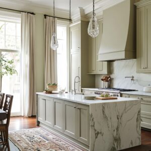
The right grey can bridge aged wood tones, matte stone countertops, or a custom vent hood wrapped in plaster or iron.

The real strength lies in how grey supports the rest of the space. It lets dramatic veined marble or strong ceiling beams take center stage, while the cabinets hold the room together without shouting for attention.
The difference between a kitchen that feels inviting and one that falls flat can come down to the smallest shift—from a foggy soft grey with warmth to a bold, deep charcoal with blue hints.

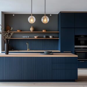
Textural Dialogues: Grain, Reeded Panels, and Open Shelving
One of the most effective ways to add depth in a farmhouse kitchen with grey cabinets is through texture. This isn’t about busy design—it’s about the smart use of contrast in material finishes and subtle shifts in dimension.
Many designers start with wood grain as the base. Vertical grain in rift-sawn oak or ash, for example, creates a soft, linear movement that gives cabinet fronts more presence without adding visual noise.
Reeded or fluted panels often show up on the island, where they instantly draw attention and give the base more weight. They’re usually paired with simpler upper cabinets, which keeps the look from feeling heavy.
The change in texture helps light move across the surface differently, giving the grey finish more life throughout the day.

Another trick used in grey kitchens is breaking long cabinet runs with open shelving. Floating wood shelves in a contrasting finish—like blonde oak or black walnut—introduce warmth and offer a break from solid doors.
Even glass-front cabinets can open things up when placed carefully. In many designs, these shelving moments double as styling spots, but they also function as intentional visual breathing zones.

Key takeaway:
Keep bold texture in the right places. Use deep wood grains or fluted details low to the ground, then balance them with clean doors or open shelves above.
That contrast brings rhythm without making the space feel over-styled.

The Hood as a Focal Feature
In almost every standout farmhouse kitchen grey cabinets serve as a calm base, but the hood often steals the spotlight. It’s the part of the room that pulls the eye first—and designers use that to their advantage.
Some hoods are built from plaster, sculpted with soft edges or angled tapers. Others take on a more industrial feel with matte metal finishes in blackened steel or aged bronze, sometimes with riveted seams or banded trim.

But what really makes a hood feel intentional is how it relates to what’s around it. A plaster hood that echoes the arch of a nearby doorway, or a metal one that lines up with the edge of the cabinetry—it’s these decisions that keep everything connected.
Even in bold kitchens, the most successful hoods feel like part of the original plan, not added later. Size also plays a role.
In small kitchens, the hood might be compact and understated, often painted the same tone as the wall or cabinets. In more open layouts, the hood becomes a sculptural feature that adds height and anchors the cooking zone.
In both cases, the trick is in the alignment—matching top heights, framing it evenly, and keeping nearby elements proportional.

Quick summary:
Let the hood stand out without floating alone. Its size, shape, and position should respond to the surrounding layout.
Whether it’s stone, plaster, or metal, a strong hood only works when it’s clearly part of the bigger structure.

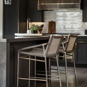
Minimalist vs. Traditional Hardware Choices
Hardware plays a quiet but important role in shaping the personality of a grey kitchen. In more streamlined versions, you’ll often find doors that open with a push or slim edge pulls hidden along the cabinet line—these solutions support the clean surface look designers are after, especially with flat-panel doors.
This style works particularly well in smaller spaces where visual clutter needs to be kept to a minimum.

In more traditional builds, hardware choices lean tactile. Think solid brass pulls, aged bronze knobs, or polished nickel handles that add a glint of warmth without fighting the rest of the materials.
Bigger drawers, especially on islands or lower storage, usually get larger pulls for easier use—sometimes doubled up to help with symmetry or just to balance the scale visually. One thing that stands out in many grey farmhouse kitchen ideas is how consistent the hardware finish tends to be across the space.
If the faucet is burnished brass, the cabinet pulls match. That kind of harmony helps keep the palette focused, though some kitchens mix finishes—a brass light fixture with black drawer pulls, for example—to gently break the rhythm without losing control.

Core idea:
Shape and placement matter. While larger bar pulls make everyday cooking easier, round knobs or low-profile pulls let the cabinets fade back visually.
Designers often think about whether they want the hardware to blend in or stand out, and then choose based on that anchor point.

Subtle Spatial Illusions
Some of the smartest grey kitchens aren’t flashy—they’re quiet, and they feel cohesive even if you can’t put your finger on why. Much of that comes down to the way space is handled through hidden tricks.
A wall of grey panels that runs from floor to ceiling might be hiding a fridge, storage tower, or even a full pantry. What looks like a single continuous wall often contains layers of purpose.

One trick used often is the shadow gap—a thin recess around a cabinet panel or where it meets the ceiling. That break in surface reads as intentional and architectural, not just a construction detail.
Another smart move is extending crown molding beyond the cabinetry, so everything feels built in, almost as if it was designed at the framing stage. Flat finishes help, too.
The lower the sheen, the more forgiving the color transitions become. It lets one surface run into the next without stopping the eye, which is why some farmhouse kitchen grey cabinets appear softer and more unified than others—even if the layout is busy.

Design principle:
Visual flow makes the kitchen feel whole. Grey finishes paired with tight construction lines, repeated heights, and nearly invisible transitions keep things feeling crisp.
These are the choices that help a kitchen look planned down to the inch rather than built in parts.

Countertop Decisions: Waterfall Edges and Thick Profiles
The countertop isn’t just a work surface—it shapes how the whole kitchen feels. In a lot of farmhouse designs, the island becomes the anchor, and the counter choice there makes the difference between understated and dramatic.
Waterfall edges are showing up more often in designer kitchens—where the stone drops down the sides like a curtain—and they work especially well when the veining in marble or quartz runs cleanly from top to side. That smooth continuation gives the island a sculptural presence, like it was carved from a single block.

Thicker countertops are also on the rise. They bring balance to tall cabinets, especially if the kitchen uses full-height storage or dark wood beams overhead.
A heavier stone edge grounds the island and plays nicely with the proportions of nearby features like range hoods or ceiling treatments. On the material side, there are two distinct paths.
One is to choose something quiet—limestone, honed marble, or soft quartz in light grey—to almost disappear into the cabinetry. The other approach goes bold: a stone with large veining, a deep base tone, or hints of gold or green to spark interest.
In kitchens with modern farmhouse rustic grey kitchen cabinets, both options work. The quiet route adds softness, while a high-contrast counter becomes the hero of the room.

Practical takeaway:
Contrast or blend—it’s all about balance. Let the countertop either disappear into the cabinetry or speak louder than anything else, but don’t land in the middle.
Each choice brings its own kind of harmony.

Ceiling Treatments and Beams
Often overlooked, the ceiling ends up doing a lot of visual work in a farmhouse-style kitchen. Especially with taller cabinetry or open layouts, what happens above eye level helps set the tone.
Designers are using beams, planked panels, and coffered layouts not only for warmth but for rhythm. These elements create a kind of overhead map that subtly directs how the rest of the space is read.

Reclaimed beams—left natural or oiled lightly—bring texture and history. They pair especially well with smooth grey cabinetry by cutting the coolness with wood grain and tone.
If the kitchen already has contrast in other areas, some go for painted ceiling treatments instead, often in a shade slightly darker or lighter than the cabinets themselves. This move works well with ceiling height and sightlines.
Planks running parallel to the island can elongate the room visually. Beams that match up with cabinet edges or window frames bring cohesion without being obvious.
Especially in kitchens with full wall vent hoods or tall display shelving, overhead detailing makes those vertical lines feel complete.

Point to remember:
The ceiling can guide the room without taking center stage. A few well-placed beams or a subtle change in ceiling tone can carry the visual structure from top to bottom, helping the rest of the kitchen settle into place.

Backsplashes for Dimension and Tonal Play
Backsplashes in grey kitchens often walk the line between blending in and subtly standing out. The smartest designs don’t fight the cabinetry—they work alongside it using tone, texture, and pattern.
In some kitchens, designers go for a large continuous slab in soft limestone or honed marble that wraps the wall in a single sweep. The lack of grout lines keeps things calm and lets the material texture speak on its own.

In others, handmade tiles add rhythm. Whether it’s a stacked brick layout or a mosaic with subtle irregularities, this approach introduces character without going overboard.
Light reflects differently off these surfaces compared to smooth cabinetry, which gives the space quiet movement. Even tiles in the same color family as the cabinets can break up the run just enough to keep it from feeling flat.
Some kitchens shift from horizontal to vertical tile orientation depending on the wall. A vertical layout near the hood can echo cabinet lines, while horizontal stacking near prep areas grounds the visual weight.
These patterns are simple but help define different zones of the space.

Good to know:
Tone-on-tone doesn’t mean lifeless. Texture and finish—matte, glazed, or honed—bring light and shadow into play, even when the color stays close to the cabinets.
That’s where a backsplash quietly earns its place.

Clever Organization Behind the Scenes
A clean kitchen doesn’t happen by accident. Behind many of the calm, neutral cabinet faces in these kitchens is smart planning that makes daily life easier.
One of the standout features in well-thought-out layouts is oversized drawers. These aren’t just for pots and pans—they hold stand mixers, blenders, even entire cutlery systems tucked into custom trays.
That frees up the counters and keeps everything within easy reach. Panel-ready appliances are another key detail.
A fridge might be completely hidden behind a grey door that looks no different from the pantry next to it. That visual continuity is part of what makes these spaces feel unified.
And even the narrowest spots are put to work. Pull-out spice drawers, tray slots, hidden trash bins—all of it reflects a layout planned to reduce clutter while staying visually quiet.
This kind of storage isn’t always visible, but it’s one of the main reasons these kitchens feel balanced and easy to live in.

Worth noting:
Good storage supports good design. Smart layouts with deep drawers and fully integrated pieces let the kitchen stay open, tidy, and free from clutter—even on a busy weekday.

Mixing Wood Tones Within a Single Layout
Blending grey cabinetry with natural wood is one of the most effective ways to keep a farmhouse kitchen from feeling flat. The contrast creates warmth and depth—but only if it’s handled with care.
Designers are using light-toned oak for floating shelves, vent hood framing, and trim around upper cabinets. This works because the grain brings in a subtle texture, and the color variation keeps the space from looking too uniform.

Walnut is another favorite, especially for accents like bar stools, ceiling beams, or banquette seating. It adds richness and pairs well with cooler grey cabinetry without overwhelming it.
The key here is in the undertones—warm greys match better with honey or driftwood shades, while cooler greys sit more comfortably next to chocolate or espresso finishes. In kitchens that use this mix, you’ll notice a common trick: designers often reserve wood tones for areas near eye level or slightly above, while the base cabinets stay grey.
This keeps the palette grounded while letting the natural grain play a more decorative role.

Keep in mind:
Smart layering keeps contrast in check. By placing natural wood accents where they can shine—and keeping the base structure consistent—designers maintain balance without losing warmth.

Handling Scale: Compact vs. Grand Spaces
Grey cabinetry adapts well to different layouts, whether the kitchen is tucked into a small footprint or stretched across an open floor plan. The difference lies in how the scale is handled.
In tighter spaces, flat panel doors and subtle hardware keep the look clean and tall. Long vertical lines—like stacked drawers or full-height pantry doors—help stretch the room visually and avoid a choppy feel.

In large kitchens, it’s a different approach. Tall ceilings call for stronger visual anchors, and that’s where wider trim, bold range hoods, and large islands come into play.
Grey works well here because it tones down mass—an oversized cabinet run in white might glare, but grey adds just enough shadow to settle the space. The smartest grey kitchens—no matter their size—don’t repeat for the sake of symmetry.
Instead, they follow a rhythm. That means aligning door edges, spacing floating shelves evenly, and mirroring shapes across the layout without forcing uniformity.
Design note:
Scale needs pacing, not duplication. Whether the room is narrow or wide, it feels better when proportions follow a rhythm.
That’s how large kitchens stay inviting and smaller ones stay open.

Long-Lasting Appeal of Grey Farmhouse Style
Despite modern influences, farmhouse grey kitchens maintain a sense of warmth and timelessness. This is partly because:.
- Grey paint ages gracefully, especially if it has subtle earthy or natural undertones.
- Wood beams, rustic hardware, and plaster hoods never feel out of date in a farmhouse setting.
- Tactile surfaces like reeded cabinets and handcrafted tile add enduring character beyond mere trend.
The farmhouse approach, updated with minimal lines and thoughtful proportions, delivers a look that transcends short-lived fashion.

Concluding Insights
Designer kitchens featuring grey farmhouse cabinetry are about more than color. They illustrate how detailing, layout, material interplay, and even millimeter-level alignments can transform a space into a cohesive, functional centerpiece of the home.
Dark charcoal or pale driftwood greys all serve as neutral backdrops that can be layered with stone, wood, or metal features. The real difference lies in the thoughtful arrangements: symmetrical cabinet towers, carefully sculpted hoods, layered textures, and subtle hardware choices that keep the eye engaged.
For anyone seeking a grey farmhouse aesthetic, the depth lies in intentionality—knowing where to introduce contrast through wood tones, choosing the perfect grayscale stain, aligning hardware placement, and shaping each structural element to complement the overall vision. That level of refinement lifts these kitchens from conventional to memorable, ensuring the farmhouse grey look continues to be admired for its effortless adaptability and quiet sophistication.