Dining room designs have a strange visual problem that many people feel: the table can look “temporary” even when the furniture is beautiful. A dining chair pushed slightly out of line, an empty tabletop, a big open-plan sightline from the living room—suddenly the whole area reads like it’s waiting for a decision.
The problem can be solved with strong dining room wall decor ideas, which are treated as the background system that gives the table a home, sets the mood, and fixes scale in a way the floor plan alone can’t.
What follows reads the wall as a set of visual jobs—foundation, center of gravity, rhythm, and night personality—then explores how different ideas solve those jobs with very different looks: two-tone backdrops, mirrors that behave like a second window, ledges and leaning art, slat panels that turn awkward wall elements into a feature, and grids that read like architecture.

The dining wall: making the table stop “floating”
A dining table is a large object with a quiet surface. When the wall behind it is blank, the eye reads the table as a standalone island.
Many wall decor for dining room ideas succeed because they create a hierarchy that the table can attach to:
- A base that holds weight (often a long credenza, a floating ledge, or a darker lower wall band).
- A center that the eye lands on (one large artwork, a mirror, or a clustered field).
- A top edge behavior that keeps the wall from feeling tall and empty (sconces, picture lights, or a vertical anchor that stops the gaze from drifting upward).
Quietly effective examples usually do not “decorate the wall. ” They complete the dining zone so it reads finished even when the table is bare.

Backdrop walls that do the work before any art goes up
Some of the strongest dining area wall decor ideas start by changing the wall’s behavior itself, so decor becomes optional rather than necessary.
Two-tone walls: a seated-height band that makes everything feel intentional
A two-tone wall with a clear horizontal division does something that feels simple but is actually powerful: it creates a human-scale midline that matches the seated view. The darker lower band acts like a soft visual cushion behind chairs and a sideboard, giving furniture edges more clarity.
The upper lighter field stays airy. The result is a dining wall that looks designed even if the tabletop is empty, because the wall already has a “base and top” logic.
The deeper trick is that a two-tone line behaves like an invisible measuring stick. It stops the interior design from feeling like a tall blank climb, and it makes the art placement feel automatically “right,” because the artwork can sit inside a pre-made zone.

Panel moulding: a calm grid that organizes the wall without feeling busy
Panelled walls (rectangular moulding outlines) create a gentle map. Even when the art layout is varied, the eye senses underlying order first, then reads the frames.
That’s why a wall can carry multiple pieces without turning messy: each piece feels like it belongs to a “slot,” even when the arrangement is not symmetrical. The key is that the wall becomes the organizer, not the frames.
The frames can stay restrained, and the wall still feels rich.

Soft plaster-like texture: depth without adding objects
A mottled, cloud-soft wall finish changes the rule of “blank wall. ” It adds depth through tonal variation, so one wide artwork and a few sculptural pieces can feel complete.
This is one reason modern dining room wall decor ideas often lean on texture: the wall contributes richness in daylight and holds warm gradients from lamps and sconces at night.

Upholstered panel walls: “wall softness” that makes a nook feel custom
A panelled textile wall acts like visual padding. In a dining nook, where chair backs, table legs, and window trim can make the area look busy even with minimal decor, a soft wall field calms everything behind it.
It’s not “art” in the usual sense; it’s a background that makes the whole corner look finished before you add a single frame. It also creates a rare effect: the wall feels cozy without relying on lots of small accessories, because the surface itself reads warm and tactile.

The horizon line strategy
One popular pattern in dining wall decor ideas is the long, calm horizontal band: low credenza + wide art, or floating ledge + centered art, sometimes with very restrained styling. This works because horizontals do three quiet jobs at once:
- They match the table’s width, so the wall and table feel like one planned pair.
- They calm the room, because the eye gets one stable line to rest on.
- They make the wall feel wider, so the dining zone feels more grounded, less like a narrow vignette.
A wide artwork with a crisp frame turns into a “boundary line” that gives the wall edge clarity. When the art interior is soft (misty marks, horizon-like gradients), the frame does the definition work while the artwork does the calm work.

This is why many wall decor dining room ideas look composed even with very few objects: the band provides structure, so the styling can stay low and sparse without feeling unfinished.

Mirrors that behave like architecture, not accessories
A mirror in a dining room can feel like a simple choice—until it is noticed what the strong interior design solutions do with it. In strong dining room wall decor ideas, mirrors aren’t used as shiny add-ons.
They are used as depth tools, light tools, and shape-correction tools.

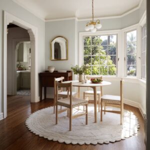
Round mirrors: the “soft center” that fixes rectangle overload
Dining room designs are full of rectangles: table, chair backs, window grids, sideboards, frames, doorways. A large circle brings relief without adding clutter.
It also creates a focal point that feels calm rather than loud. Round mirrors often succeed because they are visually neutral: they don’t introduce a new style theme.
They simply soften the composition and pull attention to the center.

The chandelier reflection trick: doubling glow without doubling objects
When a chandelier reflects inside a large mirror, the wall becomes a second light event. This makes the dining zone feel more luminous and “occasion-ready” at night without filling the wall with decor.
The mirror holds the chandelier glow at seated eye level, which is where people actually experience the interior design during dinner.
A subtle discipline makes this work: setups can protect the mirror’s clear space.
Sideboard objects stay low or sit to the sides so the mirror can remain a calm window of light.

Grid mirrors: turning reflection into a structured wall field
A mirror divided into panels (a faint grid) reads more like architecture than a plain reflective sheet. It can stand next to strong modern elements—black window frames, bold lighting—without feeling like a soft accessory.
The grid also adds quiet rhythm, so the mirror feels like a designed surface even when it’s reflecting bright daylight.

Mirrors inside arches: layering curves without turning sweet
An arch is already a major curve. A round mirror placed inside that arch can feel too “matchy” if it simply copies the shape.
The strongest compositions use the circle as a contained curve inside a larger curve, then stabilize it with tall vertical art panels on both sides. The result reads like a calm monument: structured, but not stiff.
This is a key move in dining wall decor for dining room ideas that need to feel formal without feeling cold: symmetry on the outside, subtle differences inside (artwork marks that don’t perfectly match).

Eye-level warmth: the reason these walls feel good at night
Many dining room designs look fine in daylight and suddenly feel flat or chilly after sunset. Some dining area wall decor ideas treat lighting as wall decor—not as an afterthought.
Sconces as “mood brackets”
Sconces flanking a mirror or artwork act like parentheses. They create a framed center without needing more objects, and they put warm light at eye level, which makes the room feel welcoming with minimal styling.
A not-obvious benefit: sconces also pin the wall height. They give the eye a landing point so tall walls feel balanced.

Candle rhythm: thin verticals that feel ceremonial but modern
Grouped candles create a “ritual” note—like the wall is ready for evening even on ordinary days. The key is restraint: thin, tall candles give height without bulk, and matte, blocky holders keep the look modern rather than traditional.
When candle glow lands on a darker wall band or a textured surface, the wall gains a warm gradient that reads high-end because it looks intentional, not accidental.
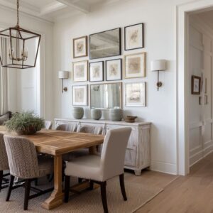
Picture lights: turning a grid into a gallery moment
Even a perfectly aligned photo grid can look flat without the right glow. Picture lights create pooled light that makes the wall feel curated at night.
They also reinforce the grid’s discipline: the wall reads like one complete field, not a set of separate frames.
Spotlights washing shelves: making a “display wall” feel calm
A shelf wall can look cluttered fast. When small spotlights wash the upper wall, the shelves stop feeling like storage and start feeling like a staged composition.
The light creates depth behind objects and helps negative space read intentional rather than empty.

Curated without clutter
A common fear behind small dining room wall decor ideas is “I’ll make it too busy. ” Some examples don’t rely on fewer items alone.
They rely on height staging, weight balance, and planned gaps.
The tall → low → tall height story
When sideboard styling moves from tall forms (vases) to a calm low middle (tray, bowls), then back to tall (candles), the eye relaxes. It reads like a composed skyline rather than a lineup.
This is why a wall can handle multiple objects and still feel calm: the heights are not random.
Asymmetry that still feels stable
Some walls avoid perfect symmetry but still feel settled because the “visual weight” is balanced. A large pale artwork on one side can be countered by two smaller frames on the other if one has a dark frame that carries extra edge weight.
A lamp can break symmetry on purpose, adding a human note so the wall doesn’t feel like a showroom.

Layering art on ledges: depth without commitment
A floating ledge that allows leaning and overlapping frames changes the emotional tone of the wall. Hung art can feel final; layered art feels curated and relaxed.
It also solves a common dining wall anxiety: wanting the wall to look intentional while still feeling flexible. Some ledge setups use depth as the main interest: a textured piece in back, a framed piece in front, then a small sculptural object that gives the arrangement “real-life” presence.

Material choreography: matte, clear, and warm metal
Shelf walls and sideboards often look most refined when materials play distinct roles:.
- Matte ceramics = quiet weight
- Clear glass = air and light without visual noise
- Warm metal = small points of glow that connect to sconces or a chandelier
This is why wall decor can feel rich without being busy: the variety is in surface behavior, not in quantity.

Problem walls: vents, grilles, awkward elements
Some of the most useful wall decor for dining room ideas don’t start with art. They start with the reality of the wall: vents, odd placements, doors, and interruptions.
The “problem” can be part of the geometry
A vent can stop reading like a mistake when it’s pulled into a planned horizontal band—aligned visually with the bottoms of frames or the line of a floating shelf. Once it belongs to a compositional stripe, it becomes one calm rectangle among other rectangles.

Decor can be stronger than the vent
Vertical slat panels are especially good at this visually (without turning into “too decorated”). The slats create a dominant rhythm.
The vent becomes visually secondary because the eye reads pattern first. Add a warm wall light on the slats, and the panel becomes the destination, not the interruption.
Lighting shifts attention
Warm glow near a vent changes what the eye prioritizes. The gaze goes to the warm gradient, then to the framed art or mirror, and the vent fades into background.
This is not hiding; it’s re-ranking what the wall feels like.

Small dining room wall decor ideas
Smaller dining areas have a specific challenge: it needs presence, but it also needs breathing room. Small dining room wall decor ideas often use one of these moves:.
A soft-backed “art stage”
A fabric-backed panel behind a cluster acts like a silent frame. It allows small art to feel important without needing large frames all over the wall.
It also ties the wall to seating comfort, making the nook feel like a destination instead of a leftover corner.
Off-center shelves for a modern, grown-up tone
Centered shelves can feel cute. Off-center shelves often feel more current because the composition has tension.
The wall stays light, but it doesn’t feel like a symmetrical display.
Keep the upper wall calm, especially with angled ceilings
When a ceiling slopes, clutter near the slope line can make the wall feel anxious. The strongest compact dining wall decor ideas keep decor in the stable lower zone, letting the angled upper plane stay quiet and clean.
One light source that signals evening intention
In small dining corners, a single black sconce with a long arm can do enormous mood work. It brings a sharp graphic note, provides warm light at night, and makes the wall feel “planned,” even if the rest of the styling is minimal.

Statement walls that don’t rely on framed art
Not every dining wall wants frames. Some of the most memorable dining wall decor ideas replace art with texture fields.
Ceramic clusters: soft impact through repetition
A constellation of ceramic rounds creates a statement without harsh edges. The wall becomes lively through shadow and highlight rather than strong contrast.
When a nearby lamp washes warm light upward, the ceramics gain subtle rings of shadow that change after sunset—so the wall becomes atmospheric, not static. This approach is especially effective when the dining room design wants to feel family-friendly but still curated: it feels artistic without feeling formal.

Three-piece calm: avoiding the gallery-wall mess without going lonely
A row of three large, quiet artworks can read like a single panoramic rhythm. The repetition creates calm, and calm often reads upscale in dining room designs because it supports conversation rather than competing with it.
This is a quiet solution for people who want wall decor dining room ideas that feel complete but fear a salon wall will look scattered.

Modern dining room wall decor ideas that feel bold but livable
Modern looks often fail in dining room designs when they become too sharp or too empty. Modern decorating concepts often use drama with control:.
- Dark feature walls paired with oversized, light-toned or gradient artwork so the wall feels like a stage, not a cave.
- Slim black sconces that read as silhouettes rather than loud shapes, keeping the wall calm even with contrast.
- Warm metal overhead lighting as a temperature corrector, so dark tones feel inviting at night.
- A pale top surface on a sideboard to break heaviness near the bottom, giving objects a clean platform.
The strongest modern wall designs are not minimal because they lack ideas. They are minimal because the ideas are concentrated into a few high-impact moves: scale, glow, and texture.

Wall decor that supports dining life
The wall can be designed to look good in three states:.
- Table empty (the wall still makes the zone feel finished).
- Table set (the wall doesn’t fight the dishes, glass, and chair rhythm).
- Evening light (warmth appears at eye level through sconces, candles, lamps, or reflection).

That’s why such dining wall decor ideas often look “expensive” without being complicated: they use structure (bands, grids, panels), a clear center of gravity (mirror or major art), and a night personality (warm glow and controlled shadow). The wall becomes the dining area’s steady background—calm enough for daily meals, special enough for guests—without needing clutter to prove it’s decorated.
And that is the logic underneath wall decor for dining room ideas: the wall is where the dining zone gets its sense of being placed on purpose.