Interior doors used to blend into walls with little thought, but in today’s elevated homes, door frame color ideas play a surprising role in shaping how spaces feel, flow, and carry identity. It is not about decoration in a loud sense; it is about how thin lines of paint or timber guide sightlines, anchor corners, form rhythm, and set a mood even before furniture enters the story.
The beauty sits in the fact that door frame colors touch both architecture and style — they sit right between structure and visual softness — and that makes them one of the most useful, subtle tools in contemporary interiors.
Modern spaces often rely on clean planes, open layouts, and gentle textures. In that type of setting, colored door frames become visual punctuation.
They mark endings, announce transitions, and can even hint at a zone change without signage. A slim charcoal edge around a pale door reads like a sharpened pencil line; a warm maple outline around a creamy slab feels like sunlight in wood form.
These are not loud gestures. They are quiet marks that adjust the emotional tone of a passage or entry, often doing more than a rug or a console table ever could.

Why Color Around a Door Changes the Mood of a Room
The emotion of a frame tone depends on contrast, temperature, and adjacency. Warm pale timber brings ease, as though the outline is part of a calm natural story.
Deep charcoal trims bring discipline and definition. Dusted muted blues lend cool composure and pair beautifully with soft stone and diffused light.
Soft greens wrap spaces into garden-like pockets, making circulation areas feel grounded and easy.

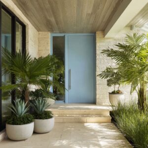
The frame often speaks first, before faces of doors, flooring, or shelves. In many modern homes, doors carry neutral slabs — creamy off-white, warm stone-gray, soft greige — while the frame holds personality.
This approach keeps the room bright, yet allows edges to guide the eye. In this context, door frame paint ideas that combine matte textures with thoughtful color make the lines feel drawn by hand rather than added by standard trim routines.

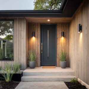
Consider how the frame tone collaborates with the wall. When exploring door frame color for white wall, dark frames sharpen the architecture.
Pale wood frames soften it. A dusty blue outline against soft white brings a calm, measured kind of color.
The surface is still quiet, but the line has presence. And when that same blue reappears around a nearby window reveal, the color becomes a structure, not an isolated detail.

How Colored Frames Shape Space: Architecture Through Hue
A clever detail in many modern interiors is the wrap — where color extends beyond the frame. Instead of stopping at the jamb, the paint travels along reveals, soffits, sometimes even up onto a ceiling zone.
That move turns interior door frame colour ideas into spatial shaping tools. Instead of simply surrounding a door, the hue forms a micro-portal or a compact nook.

Examples include:.
- frames that turn into ceiling patches at a hall end, making the corridor feel intentional
- frames that wrap a mudroom pocket, forming a landing spot for coats and daily items
- tone that continues across baseboards, making a band that travels through a corridor
This is where painting ideas for door frames cross into architecture — color becomes a way to “cup” a moment in the plan, like a pause or a soft threshold.

The Calm Logic Behind Color Coordination
Well-designed door and frame color ideas do not exist alone. They connect with other elements so the eye sees a coordinated language rather than a random mark.
Three-point repetition works especially well: frame tone, a nearby shelf or bench detail, and a small accessory or handle accent. That triangle makes the color feel like part of the room’s DNA.

Certain pairings appear repeatedly in thoughtful modern spaces:.
- maple frames + creamy door + dried plant stems + brass accents
- charcoal frames + honey-oak door + slim console in warm timber
- slate-blue frames + pale stone + black hardware + diffused glass
- muted green trim + warm cream door + woven jute underfoot
- cocoa-brown frame + grainy gray door + limestone + walnut
These are combinations, not formulas. They work because the eye can find anchors — subtle but deliberate harmony that balances warmth, coolness, softness, and depth.

Light, Shadow, and the Thin Line That Holds Form
Light decides whether a frame reads as crisp or soft. In a bright hallway, black or near-black frames hold edge clarity throughout the day; they stay exact even as sunlight shifts.
In softly washed corridors, slim charcoal lines become razor-like contours that give shape to otherwise smooth plaster. Meanwhile, dusty garden-greens and washed blues gain gentle shade variation in daylight, developing nuanced depth without shouting for notice.

This interaction means colours for doors and frames must consider how the room receives daylight and artificial wash. Timber frames catch sun in a pleasant way, showing grain without becoming rustic.
Pale pinks and blush-tones glow warmly when touched by indirect light, perfect for calm everyday paths.

Neutral Door, Intentional Frame: A Core Modern Principle
Modern interiors often rely on restraint. Doors stay neutral — soft off-white, stone-gray, warm greige, pale wood — and frames add the story.
This keeps brightness high and maintains visual calm. It also allows door frame colour ideas to change mood by tone alone.
A single dark line can carry sophistication. A warm pine outline can keep a minimal room from feeling too chilly.
A dusty green frame can bring a walk-through area closer to nature.

Neutral doors also give space flexibility. Furniture and art can change; the structural lines remain steady.
This is helpful in living areas, entry halls, and long corridors where consistency matters more than occasional accents.

Zones, Rhythm, and Flow in Modern Homes
Spaces with multiple doors benefit from recurring outlines. When the same tone marks different openings, a rhythm forms.
It guides sightlines the way trim once did, only with more intention. This rhythm works especially well when paired with natural materials — jute, linen, brushed metal, light timber, stone tiles — giving soft tactility to counter clean lines.

Frames also help create wayfinding in open plans. Families often use coral or warm reddish-tones near entry utility spots, letting the color gently hint at the “busy zone.
” Meanwhile, pale wood outlines in circulation hallways feel welcoming without calling attention to themselves.

In settings with stone floors and glass openings, deep blue or taupe-bronze frames link indoor and outdoor elements. Door frame color ideas that connect to window mullions create a unified language and make transitions feel intentional rather than abrupt.

The Emotional Dimension of Frame Tones
While design language can be calm and thoughtful, the feeling behind door frame colors is very real:
- near-black lines feel confident, precise, and tailored
- soft pine and maple feel friendly, natural, and sun-kissed
- dusty blues feel steady, peaceful, and light-reflective
- rich terracotta and coral carry warmth and energy without needing pattern
- cocoa-brown tones feel grounded, tactile, and refined
- blush and mauve-plum tones soften a corridor in a grown-up way

Even palettes that lean colorful stay muted, avoiding sugary brightness. These colors have presence but remain controlled, making them ideal door and frame color ideas for modern interiors that favor texture, light, and craft over noise.

Key Idea Clusters in Modern Door Frame Styling
To show how these concepts group naturally in real design language, here are clusters of the most common approaches found in contemporary homes:.
Soft Natural Edge
- warm pale wood frames
- creamy or off-white doors
- clay ceramics, woven rugs, dried stems
- quiet everyday glow

Calm Cool Line
- slate, muted navy, dusty green
- stone or off-white slabs
- matte black hardware accents
- daylight that gently shapes edges

Strong Graphic Outline
- near-black or deep espresso trim
- smooth white or greige doors
- slim lighting lines and minimal decor
- clean proportional discipline
Color Portal Effect
- terracotta, coral, muted rose, or moss
- wrap across jambs and soffits
- shared tone at baseboards
- uplifting without loud pattern

Stone + Timber Blend
- taupe-bronze, cocoa, graphite-blue
- oak or bleached timber slabs
- stone flooring and diffused glass
- textured subtlety and calm strength
These clusters reveal how door frame paint ideas shape room character without leaning on trend-chasing palettes.

Final Thoughts on Modern Door Frame Color Language
Today’s most thoughtful homes treat frames like visual guides, not just trim. They lead, outline, support, and define without taking over.
They help white walls feel intentional, natural wood feel composed, and quiet circulation areas stay visually interesting. With mindful color placement, a door frame becomes a structural whisper — calm, shaped, and quietly confident.

And in a world where interiors lean toward light, air, and soft texture, these edges are not just borders. They are part of the composition, part of the mood, and part of the interior story.
That is what makes exploring door frame colour ideas, interior door frame colour ideas, and broader door and frame color ideas such a rewarding direction for designers and homeowners who appreciate the quiet strength of detail.