The entryway console has become one of the most layered and quietly expressive surfaces in the home. It’s a narrow stretch that holds more than keys and catchall trays—it becomes a visual prologue to everything else beyond the front door.
What makes it so compelling is how understated the styling often appears, while still shaping a full atmosphere through small, deliberate choices.
Current decorating approaches focus less on filling the space and more on composing it. Repetition is used not for order but to create rhythm.
Texture steps in where color holds back. Shadows stretch across surfaces like soft sketches.
Even gaps are handled with care—what’s left empty has as much presence as what’s placed. There’s a shift toward restraint, but not in a cold or distant way.
Instead, it’s about intention: knowing where to pause, where to echo, where to offset.

The most thoughtful styling methods rely on details that might not register at first glance. A single branch placed to mimic a line in the artwork.
A mirror chosen not just for reflection but for the way it folds light across the table. Instead of leaning on loud motifs or themed decoration, these surfaces borrow cues from natural surroundings, soft verticals, and the way light changes through the day.
Each decision contributes to a composition that feels considered, but not staged. What follows is a close look at the quiet techniques shaping this understated corner of interior styling—and how the smallest changes in rhythm, texture, light, and space create entries that speak clearly without raising their voice.

Rhythms Built from Repetition, Pause, and Mismatch
There’s a quiet structure behind the most visually calm entryway vignettes, and it often begins with repetition. Serial objects—like a row of matching ceramic jars or a tight cluster of uniform picture frames—create a visual rhythm that settles the space.
Their sameness isn’t boring; it gives the eye a steady path to follow before exploring anything else on the surface. The setup feels deliberate, even when minimal.

But repetition by itself can quickly feel stiff. That’s where a break in the pattern becomes the key to keeping things natural.
A slightly off-centered artwork, a mirror hung a little lower than expected, or even a console with one end intentionally left empty—these small shifts act like pauses in a sentence. They hold attention without shouting.
There’s a studied casualness in how a grid might lean to the right to balance a lamp’s visual pull or how one shelf might be purposefully left bare to slow the viewer’s scan. This type of rhythm works especially well in homes where symmetry is part of the overall interior tone, like in traditional or transitional suburban layouts.
Decorating a console table in entryway often means finding a middle ground between order and surprise, and these visual beats are how that balance gets set.

Height-Stacking as Storytelling
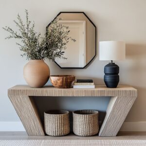
Layering by height is one of the most quietly used methods in composition, but it’s rarely accidental. Many console table arrangements follow a soft three-tier sequence—tall items like leafy branches or slim table lamps form the upper line, mid-sized pieces like vases or bowls sit at center level, and flatter items such as trays or stacked books shape the base.
Together, they create depth and variety, like landscape features on a narrow strip of wood.

What makes these layers more than stacking is how they pull the eye—not just up and down, but also diagonally. Some scenes guide the gaze along a slope that mirrors other elements nearby: a stair railing in the background, an archway just out of frame, or even a trailing branch that stretches across the vertical space.
These quiet alignments feel natural and often go unnoticed at first, but they build a deeper connection between the table and its surroundings. This kind of visual conversation isn’t loud.
It’s the reason why front door entryway table decorations can shape the whole feel of an entrance, without needing large objects or bright color. Even subtle layouts can carry a sense of structure, just by knowing where to pull a line and when to let the eye rest.

Light as Moving Ornament
Daylight isn’t passive in entry table compositions—it works like a silent tool that shapes the entire scene without adding a single object. Shadows often carry as much presence as the décor itself.
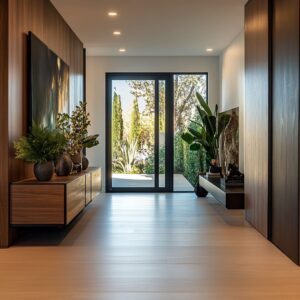
The sweep of olive branches casting their form onto plaster, or the ridged surface of raked gravel pulling soft stripes across a niche, creates a quiet rhythm that evolves as hours pass. Even architectural features like slatted screens or arched doorways contribute to this effect—letting natural light carve motion into still settings.

In some entry spaces, this movement is subtle but constant. Mirrors and transparent materials don’t simply reflect—they pull parts of the room into the frame.
A clear acrylic table, for instance, doesn’t stand alone—it carries with it the ghost of the nearby window, the floor pattern, the flicker of leaves outside. An oversized mirror doubles the view, folds in architectural lines, and makes a narrow hall feel layered without extra décor.
This shifting interplay between light, surface, and shape is what gives certain compositions their quiet energy. Decorating an entrance table becomes far more dimensional when the light is treated as an active element, not just a source of visibility.
The result is a surface that changes subtly throughout the day—never static, always quietly engaged with its surroundings.

Texture Over Tone
Muted palettes dominate many entryway setups, but that doesn’t mean the scenes lack depth. Most rely on tactile contrast rather than color for their presence.
The combination of unpolished travertine beside smooth glass, rough reclaimed wood next to fine brass edging, or boucle fabric under matte ceramic isn’t coincidental—it’s what creates visual grip without shouting. This approach turns tone into a quiet canvas where texture does the heavy lifting.
Instead of layering pigment, the materials clash and complement through surface alone. The scratch of stone next to a glazed pot, or the dusty surface of limewashed walls paired with a slick metal bowl, draws the eye not by brightness, but by difference.

Still, some scenes do introduce a small pop—but only once. A single coral-painted wall or a rust-toned tray might be the only burst of hue across an otherwise neutral layout.
These moments act like punctuation—meant to sharpen everything else, not compete with it. This use of contrast without clutter is why beautiful foyer tables often feel full without being crowded.
The volume comes from how materials behave next to one another, not from how many are present. Texture provides depth where color steps aside.

Natural Forms, Abstract Intent
Botanical elements often appear in entry console arrangements, but their role isn’t to fill space with greenery. Branches and dried stems act like freeform lines drawn into the air.
Eucalyptus fans wide to echo a curve found in nearby furniture. Pampas grass stretches upward, bending just slightly in the same direction as the drape of a throw below.
Olive stems lean softly, catching and echoing the light-and-shadow patterns on nearby walls. These aren’t floral accents—they’re spatial gestures.

Many items on the tabletop behave this way. They are not tools or decorative objects with a specific purpose, but forms that work like punctuation.
A magnifying glass is placed not for use, but to catch a glint of brass light. A jagged stone sits atop a closed book—not to weigh it down, but to pull contrast from the softness around it.
A sculptural horn-like piece doesn’t explain itself, yet it holds visual weight that makes everything else quieter. The pieces shape attention through form rather than function.
This type of thinking shifts how one sees the whole composition. Decorating an entryway console table becomes more about what the shapes imply than what they do.
Every line bends for a reason, even if the reason is simply balance within a space that doesn’t speak too loudly.

Negative Space as a Material
In many entries, the quietest feature is the gap. Wide spacing between items is often misunderstood as unfinished, but that space is working hard.
It gives each object a boundary—like a mat around a piece of art. A single bowl beside a lamp, or a low tray with nothing above it, gains more presence because the air around it is left open.
These empty spots aren’t leftovers; they’re intentional framing devices.

Below the console table, the composition often continues downward. Baskets, floor pillows, planters, or low stools aren’t just there for function.
Their placement beneath the table creates a second layer—like the lower half of a sculpture. The bottom row connects to the top, giving weight and depth so the console feels anchored to the room, rather than floating like a shelf.
The layout works in full scale, not just at tabletop height. A decorative entryway table often succeeds because it works from the floor up—not just left to right across the top.
Gaps are used as elements in their own right, and everything included is balanced not just by shape, but by space around it. The quiet between objects is doing just as much as the objects themselves.

Dialogue with Regional Character Without Obvious Tropes
Many entry spaces reflect the tone of their setting—but the most refined ones skip the expected symbols. Coastal themes appear through texture and structure rather than motifs.
A slatted wood screen casting striped shadows, or a console leg shaped like it’s been worn down by sand and tide, captures the atmosphere of a beachside town without using seashells or driftwood. These subtle choices allow the light, shapes, and finishes to speak for the setting without the need to name it.

In mountain homes, the mood is often built through contrast—a solid slab of alder or elm resting on dark steel legs, or a tall woven vessel beside rugged stone flooring. These pairings bring in a sense of altitude, mass, and grounded quiet, but without leaning on traditional patterns or rustic tokens.
The room feels connected to elevation, not through decoration, but through weight and restraint.

Some layouts carry clear Japandi influence, though distilled to its simplest notes. A console built directly into a niche, set above uneven gravel or beside thick linen cushions, doesn’t immediately explain itself.
The stillness comes from how the materials are treated—smooth plaster walls, uneven shadow play, and natural elements that are spaced rather than stacked. The effect is calm before it’s even understood.
Across all these approaches, the region shapes the styling—but never through literal storytelling. Decorative foyer tables can quietly echo their surroundings by material, finish, and space—without pointing at a map or following a script.

Quiet Subversion of Symmetry
Balance in console styling doesn’t always mean centering. In fact, many of the most visually stable compositions include a slight shift that breaks expected symmetry.
One framed piece might sit just a few inches lower than its neighbor. A pair of mirrors may hang with a subtle tilt in spacing.
These tweaks pull the viewer’s eye into motion, asking it to scan rather than stop.

The same principle applies to surfaces. Twin tables are often arranged side by side, but their contents rarely match.
A vase on one, a stack of books on the other, or differing art above each side—these differences keep the full width of the composition from feeling locked into a grid. It’s a type of rhythm, but one that builds tension instead of repetition.

This approach works especially well in layouts that might otherwise feel rigid—long entry halls, square niches, or perfectly mirrored walls. Decorating an entryway console table this way creates a tension that reads as human.
It avoids the formulaic and adds a kind of personality that can’t be found in symmetry alone. Every shift matters, even if it’s barely noticeable at first glance.

Micro-landscapes on a Fixed Horizon
A console table often acts like a narrow stretch of earth beneath a blank sky. Its surface becomes a horizontal strip where each item takes on the role of a landscape element.
Stone pieces stand in as boulders. Stacked trays flatten out like dry riverbeds.
A stack of books might read as a quiet ridge or plateau. The table itself stays still, but the scene above it builds dimension through scale and relationship.

These compositions aren’t built with literal scenery in mind—but they work because the human eye instinctively searches for land and sky, weight and openness. Even in neutral palettes and minimalist layouts, the surface can feel expansive.
It’s about how the items relate to one another, not just the shapes they take. A single tall stem breaks the line like a distant tree.
A low dish becomes a calm basin.

This kind of styling works especially well in transitional spaces like hallways or entry areas, where movement is part of the flow. The viewer doesn’t need to stop and analyze it.
The console reads more like a scene than a collection. Each item has a presence, but they also work together—quietly shaping a horizon in the middle of a room.

Key Ideas for Styling That Stands Out Quietly
There’s no formula to styling that feels natural, but a few low-volume techniques can shape a strong presence without drawing attention to themselves.

- Startting with sameness, then interrupt it. A row of matching frames or repeated shapes gives structure. Breaking that pattern once—a lower frame, a taller vase—makes everything feel more alive.
- Letting height variation tell its own story. A grouping of objects at different heights builds rhythm the way buildings do in a cityscape or trees across a hillside. This vertical play keeps the eye moving without needing color or texture to do the work.
- Thinking of sunlight as a material. Where it hits, how it casts, and what it reflects off of all shape the composition. Place items to make use of shadow—curves, ridges, branches—so even light becomes part of the styling.
- Using one accent hue, and only once. The rest can be left to material differences. Grain, fiber, patina, matte and gloss—these contrasts carry more weight than saturated color ever could.
- Giving every piece its own space. Leave air between objects. These empty zones are where balance comes from. They’re not gaps—they’re part of the layout.
- Pulling atmosphere from the local landscape, but avoid literal translation. Pale wood and weathered stone can say coastal. Blackened iron and thick timber might say high altitude. The material choice speaks more quietly than motifs ever could.
- Offseting key items. Perfect centering can sometimes feel pre-packaged. A shift—just a few inches—adds a human edge to even the most structured vignette.
These ideas don’t ask for attention. They don’t rely on showy gestures.
They build impact through detail and spacing, letting shape, placement, and surface do the talking. It’s a way of styling that feels quiet—but clear.