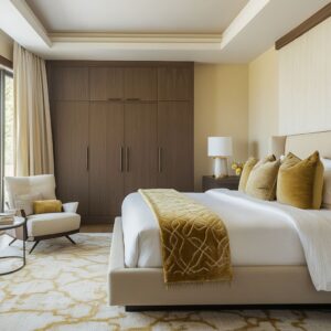
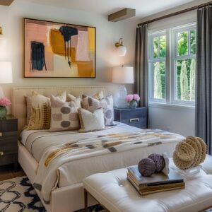
There’s a quiet shift happening in how bedrooms are styled, especially around that big blank wall above the headboard. What once was a safe spot for a framed print or centered mirror is now treated more like a design opportunity than an afterthought.
This article pulls together sharp, sometimes unexpected, over the bed decor ideas that have been showing up in thoughtful interiors. By grouping them into themes, you can spot how even the most unrelated styles end up drawing from the same visual cues—and maybe pick up a few smart tricks along the way.
Light as Surface, Not Fixture
In some of the most forward-thinking over the bed ideas, the main visual doesn’t hang on the wall—it is the wall. Designers are moving away from visible light fixtures and switching to light that’s built in, concealed, and subtle.
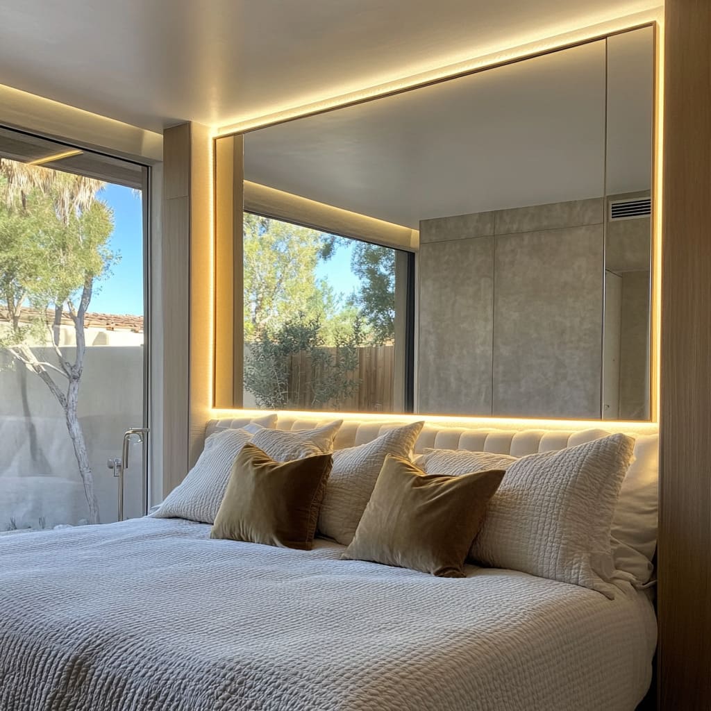
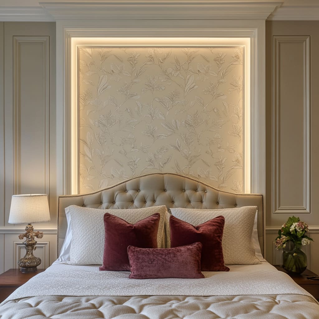
Instead of spotlighting an object, the light source turns the entire surface into a gentle glow. Take for example the use of LED tape hidden behind a narrow ledge or molding lip.
In certain interiors inspired by high-end styling seen in areas like Palm Springs or Westfield, this kind of lighting sits out of sight but sends out a warm edge glow that’s perfectly even. The result?
The wall doesn’t just hold art—it becomes the artwork. No visible bulbs, no lampshade glare.
And unlike ceiling lights, which flatten textures, this indirect light enhances detail. You’ll notice how floral wallpaper panels look soft in daylight but shimmer at night thanks to their mix of matte and glossy finishes.
What makes this move especially smart is how functional it is. Lighting that wraps behind the headboard’s edge can fully replace a bedside lamp, especially in rooms where side tables are narrow or shared with books, vases, or wall-mounted sconces.
It’s not about drama—it’s about creating that quiet sense of depth without relying on clutter. Backlit mirrors and insets are also gaining ground, particularly in rooms where traditional art would feel too heavy.
In those cases, the glow outlines architectural forms while bouncing light off fabrics and headboards. From a design perspective, this doubles your wall space: you’re lighting and decorating at once.
And there’s one more subtle trick worth mentioning. In the evening, with only the wall lighting turned on, the bed takes on a slightly floating effect—almost like it’s been lifted away from the floor.
This isn’t about illusion; it’s about shaping mood through low, horizontal lighting. It works beautifully with layered neutrals and soft textiles, making the bed feel wrapped in light instead of lit from above.
So if you’re collecting inspiration for over the bed decor ideas that feel both current and understated, pay attention to how light is being used—not as a spotlight, but as part of the architecture. The shift is quiet, but the impact is unmistakable.
Wall Treatment as Headboard Extension
The wall behind the bed has started playing a bigger role—less as a background, more as a built-in part of the bed itself. In some of the strongest above bed decor ideas, there’s no need for hanging anything at all because the surface is the main statement.
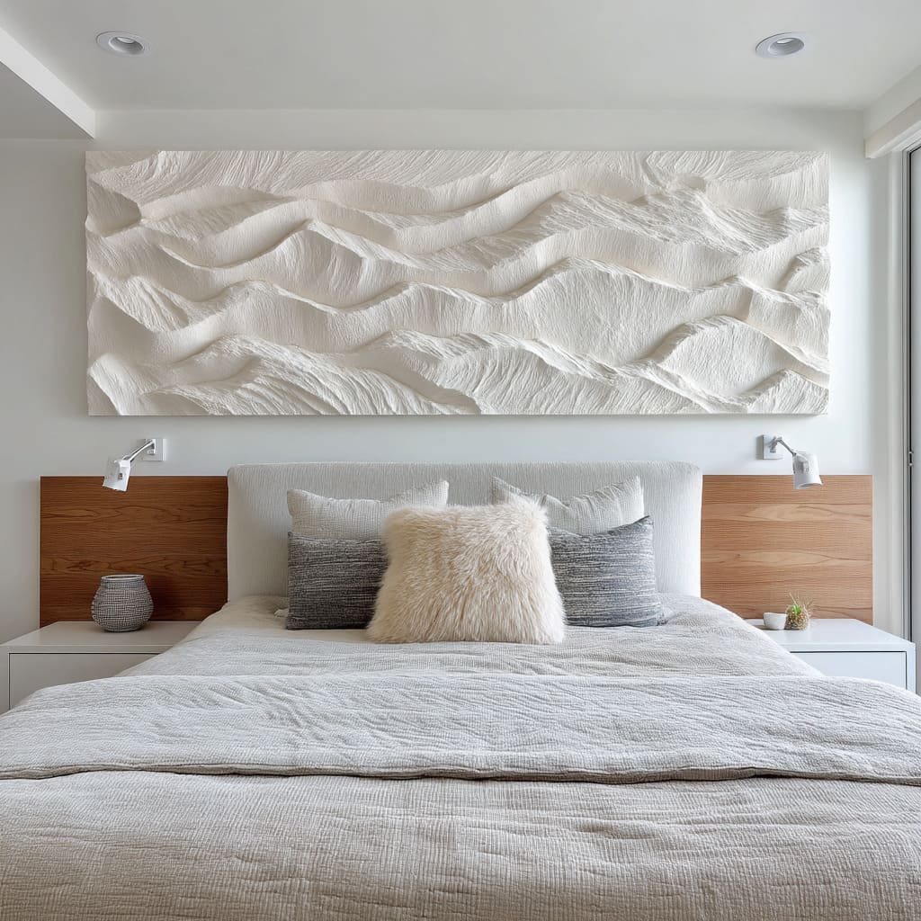
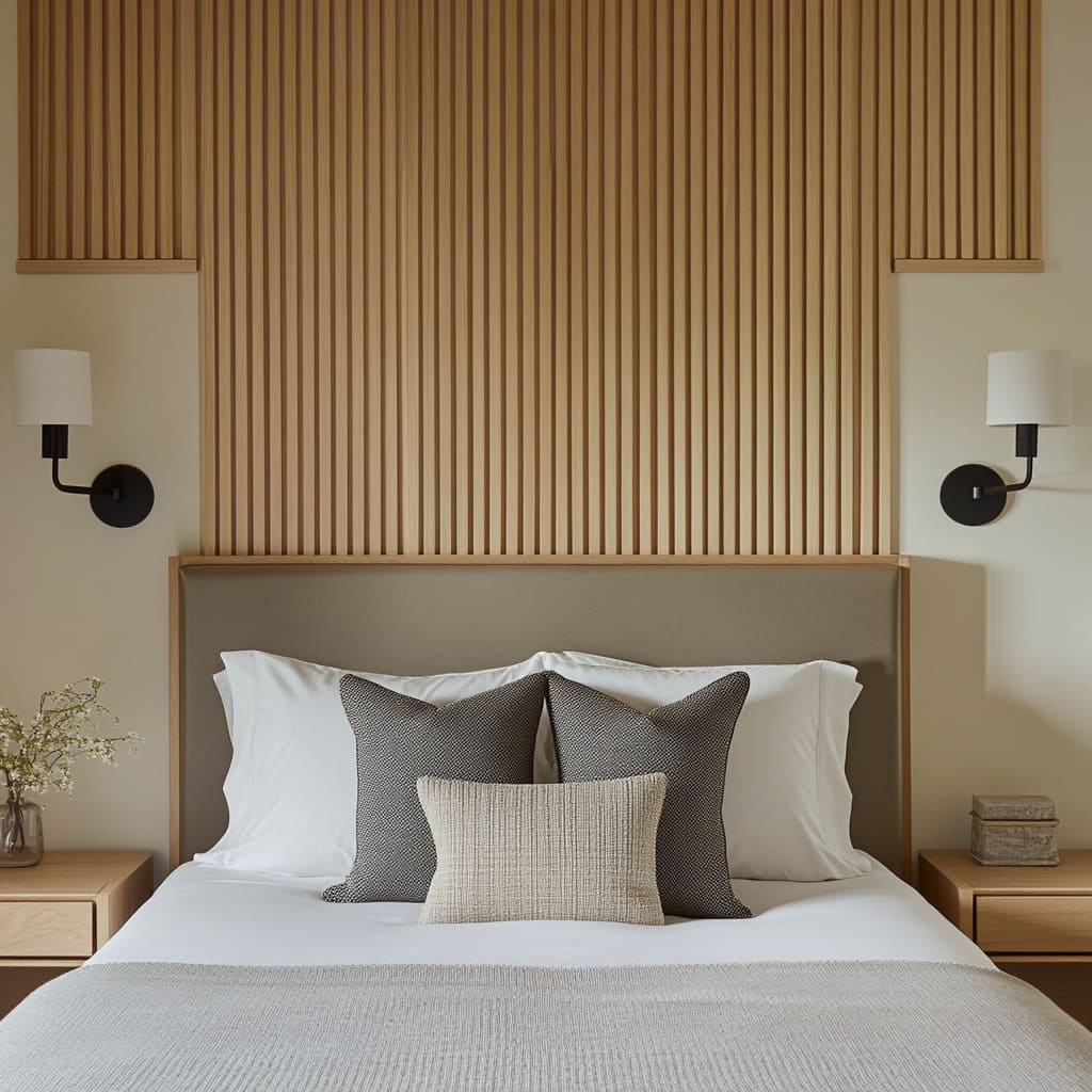
The approach centers on full-height installations that stretch from floor to ceiling, using material, texture, and volume to give the wall presence without needing loud contrast. In bedrooms inspired by clean-lined homes from areas like Northern California and parts of New England, vertical slat walls or carved plaster fields have taken the place of framed prints.
These elements rise all the way up, bypassing the usual 24 to 30 inches that are typically used for decor over the bed. It’s a visual extension that makes ceilings feel higher and rooms feel taller—without needing to physically change the structure.
What holds these designs together is how they keep the color palette quiet. Think pale oak wood slats on a slightly lighter background, or matte plaster sculpted into soft ridges, painted the same tone as the surrounding wall.
The effect depends heavily on side lighting—sunlight through a window or warm light from a wall sconce. That light hits the ridges or grooves and throws shadow, which creates contrast without needing color.
It’s tone-on-tone depth, not decoration. And it’s surprisingly effective.
One of the more subtle details that stands out in these examples is how the furniture doesn’t sit apart from the treatment—it flows with it. In some rooms, headboards are framed within the slat pattern, like a panel in a larger grid.
In others, the surface of the nightstand mimics the line direction of the plaster above it. That kind of repetition creates a visual system where the wall, the bed, and the bedside elements all speak the same language.
There’s also a practical benefit: by skipping framed art or shelf decor, the wall feels cleaner and calmer, which supports the overall goal of a bedroom being a space for rest. For anyone looking into above bed art ideas that feel modern but not harsh, this built-in approach is worth serious thought.
It doesn’t fight for attention—it shapes the space quietly but completely.
Soft Sculpture & Free‑Hanging Textiles
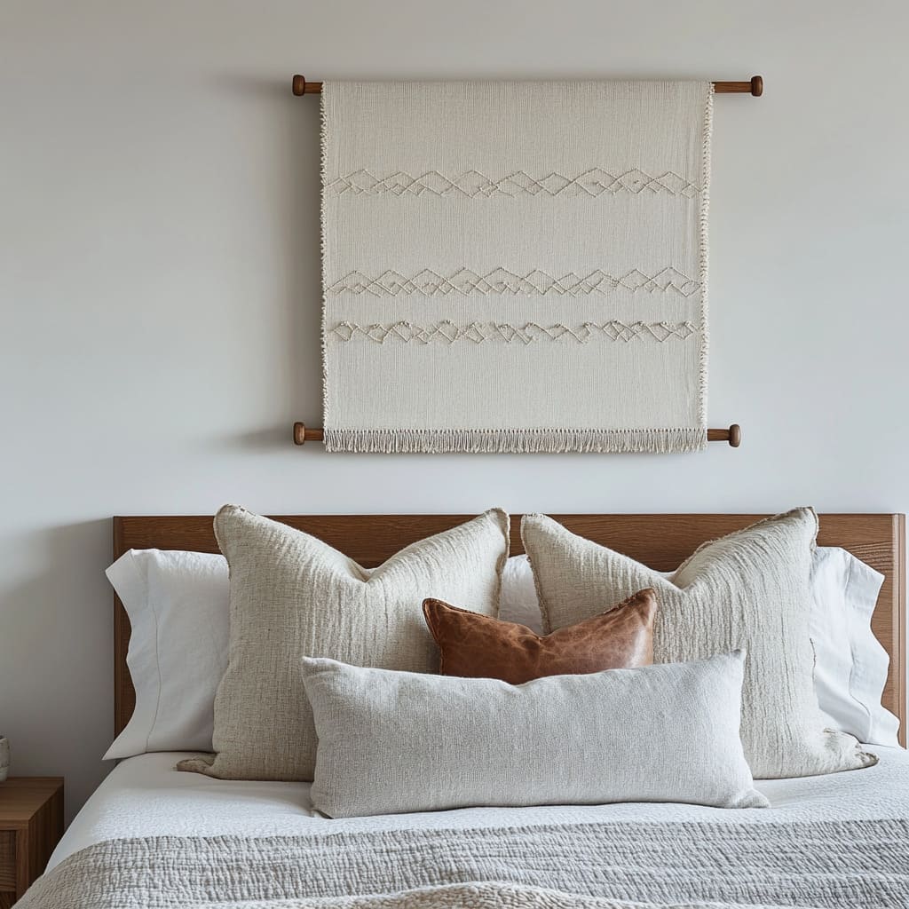
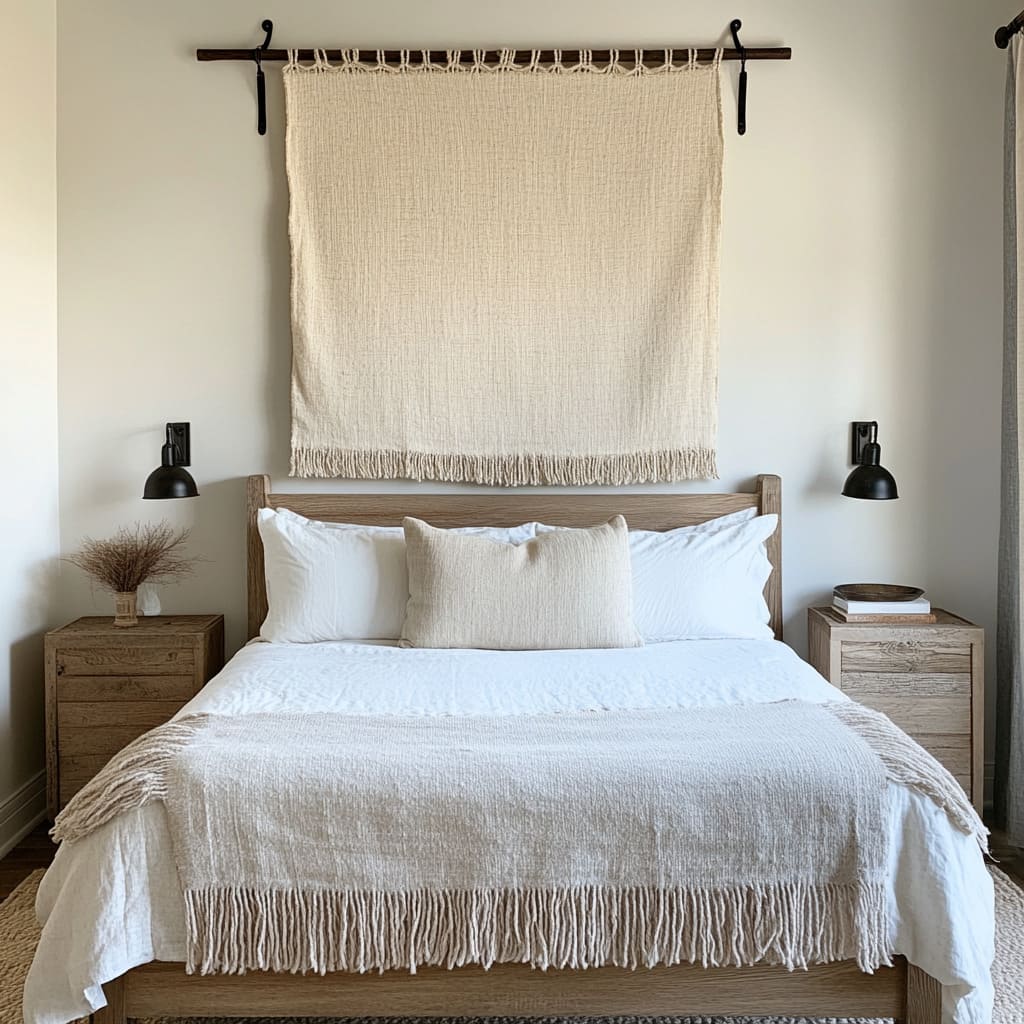
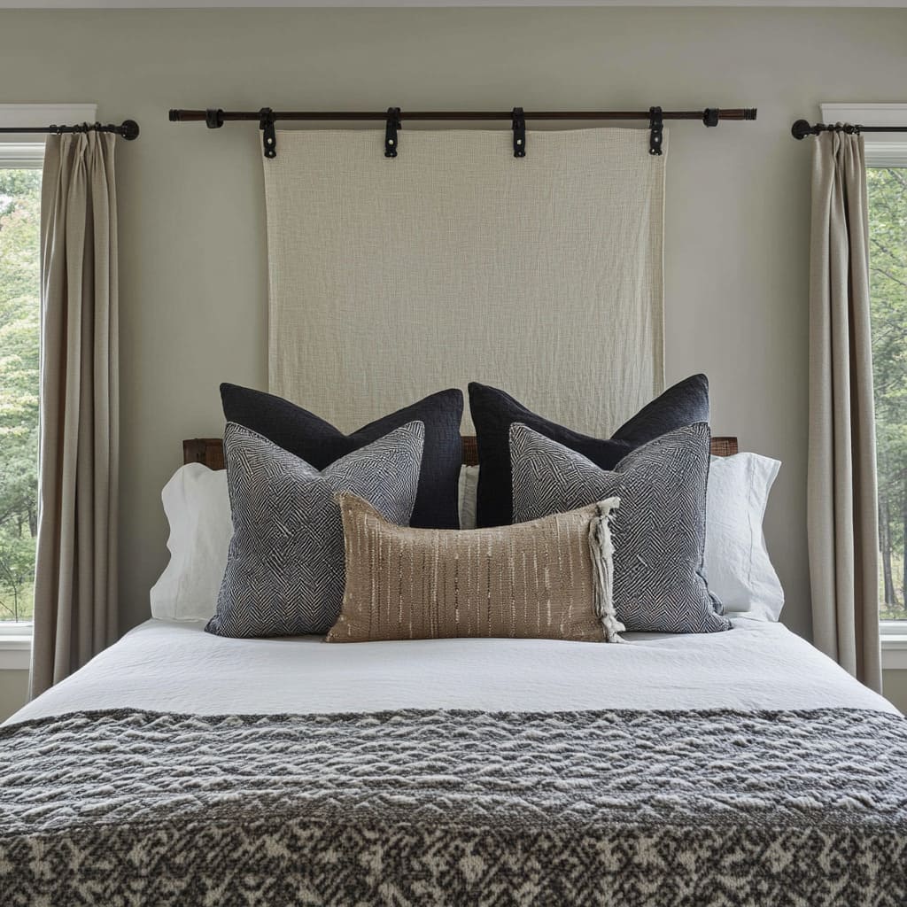
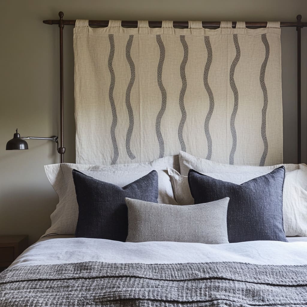
There’s a growing shift in bedrooms where textiles aren’t just on the bed—they’ve climbed the wall and taken over the role of traditional framed art. Whether it’s a loose panel of linen clipped to a rod, a scroll hung on a peg rail, or handmade fiber knots suspended like sculptural accents, the move here is clear: cloth is becoming visual.
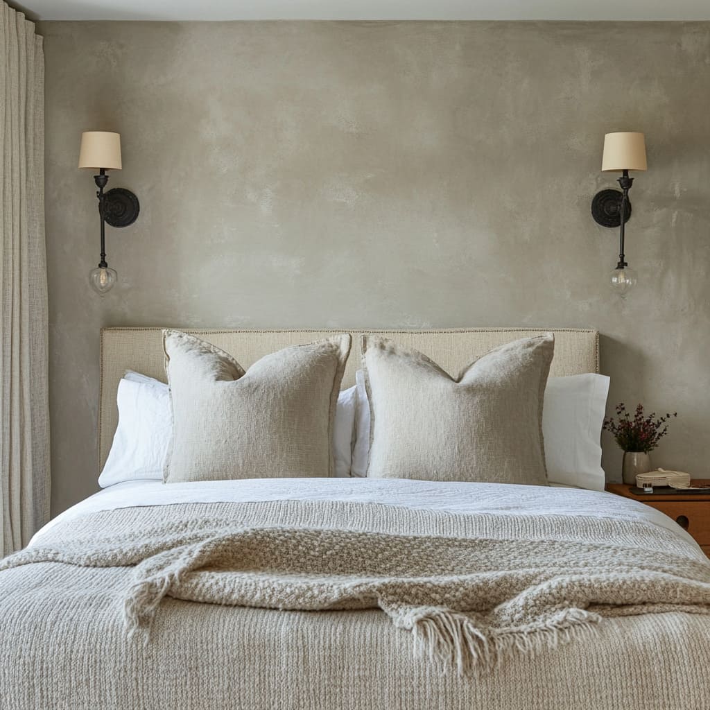
This works especially well in homes that already lean into natural materials or organic shapes. In some interiors seen in places like Short Hills and coastal towns, you’ll notice soft linen panels mounted with barn-style hardware or even simple black clips.
These aren’t tucked away—they’re visible and proud, giving the whole setup a tactile edge. The hardware becomes part of the design language, creating contrast with the soft fall of the fabric.
The best part of this approach is its flexibility. Because these fabric pieces are mounted like curtains, changing them out doesn’t require tools or major effort.
A summer-weight weave might be swapped for something heavier in winter, or a light pattern can rotate in when the rest of the bedding goes more neutral. It’s one of the few wall decor options that invites easy seasonal changes without needing to pull nails or move frames.
There’s also a technical perk that often gets overlooked: sound. Loose-weave linens, macramé knots, and other fiber-based elements do more than just look nice—they absorb sound.
In bedrooms with lots of hard surfaces like plaster walls, wood floors, or minimal window treatments, these soft hangings help reduce echo and soften sharp acoustics. It’s a visual and audio win.
Overall, the strength of this style lies in how casual it feels without losing impact. The textiles bring movement, softness, and character to the wall, while the hardware and hanging style add just enough structure.
For anyone looking to pull warmth into the space without cluttering it, this is a direction worth paying attention to.
Sculpture in Relief
One of the strongest shifts in modern above bed wall decor ideas is a move away from flat artwork and into three-dimensional forms that invite light to do some of the visual work. The trick is simple: instead of layering color or pattern, designers are relying on depth, shape, and placement—creating surfaces that shift with the time of day.
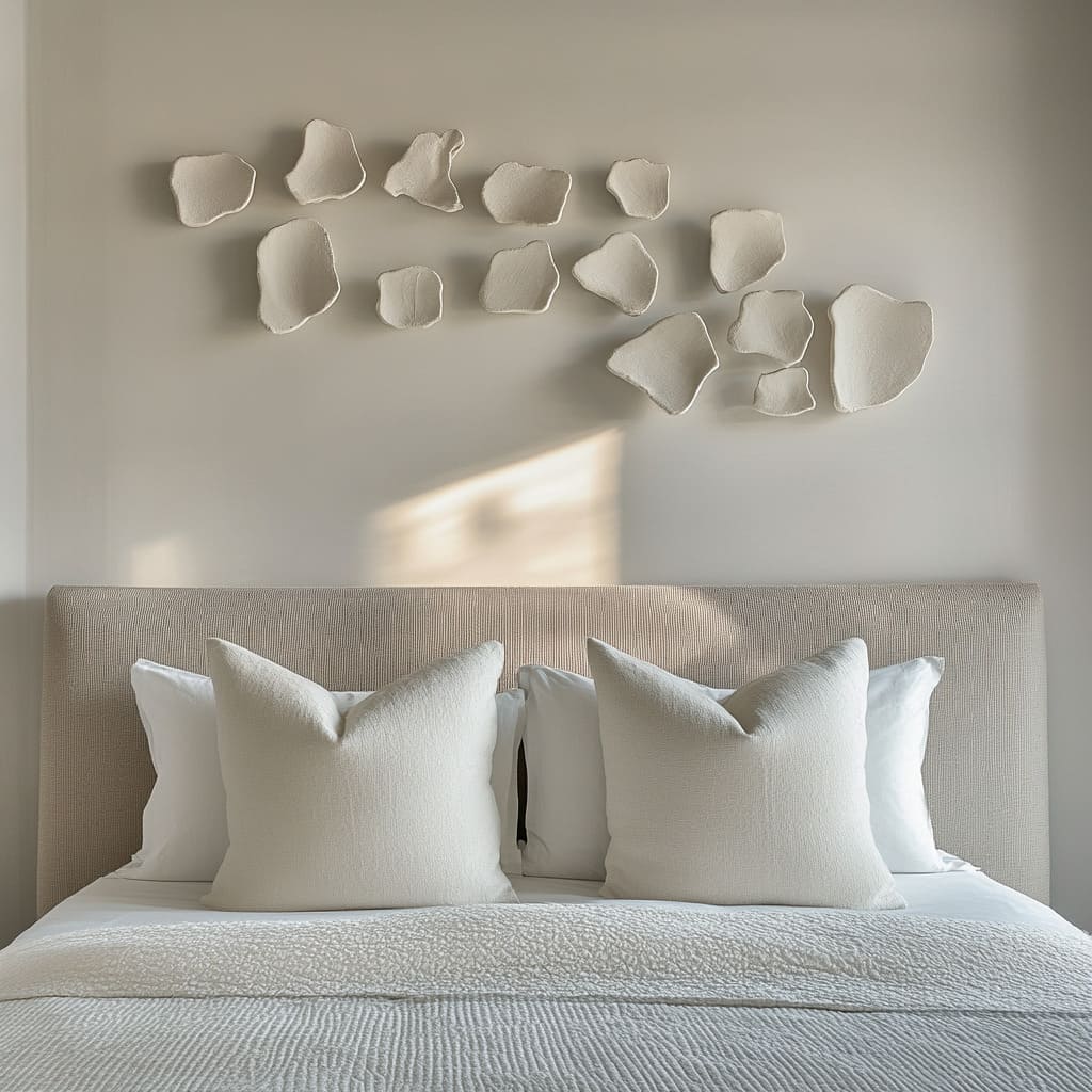
Pebble-shaped ceramics, sculpted plaster panels, and radial metal designs all bring depth without needing loud palettes.
What makes these pieces so effective is how they interact with light. In rooms that take cues from West Coast interiors, you’ll often find groupings of matte white ceramics, wave-textured plaster, or metallic sunburst forms arranged to catch natural light as it changes throughout the day.
The shadows move across the surface, deepening or softening certain spots, giving the impression of motion even though nothing is actually shifting.
The best part? These forms don’t need perfect symmetry or precise alignment.
One standout example uses ceramic orbs spread across the wall in a loose, asymmetrical layout. There’s no strict grid.
The negative space between each piece is just as important as the object itself. The entire wall feels curated without looking stiff—because each item has the same tone, finish, or size family, the layout holds together visually even with irregular placement.
In smaller bedrooms, this kind of setup has a bonus: it creates visual movement and dimension without adding weight or clutter. You’re not filling the space with frames or mirrors, yet you’re giving it shape, flow, and interest.
And because the look comes from texture and shadow rather than color, it works with a wide range of bedding palettes—from crisp white to muted earth tones.
Controlled Grids & Quiet Order
On the other end of the spectrum is a very different approach—but no less effective. Some of the most polished over the bed picture ideas borrow their sense of control from gallery walls.
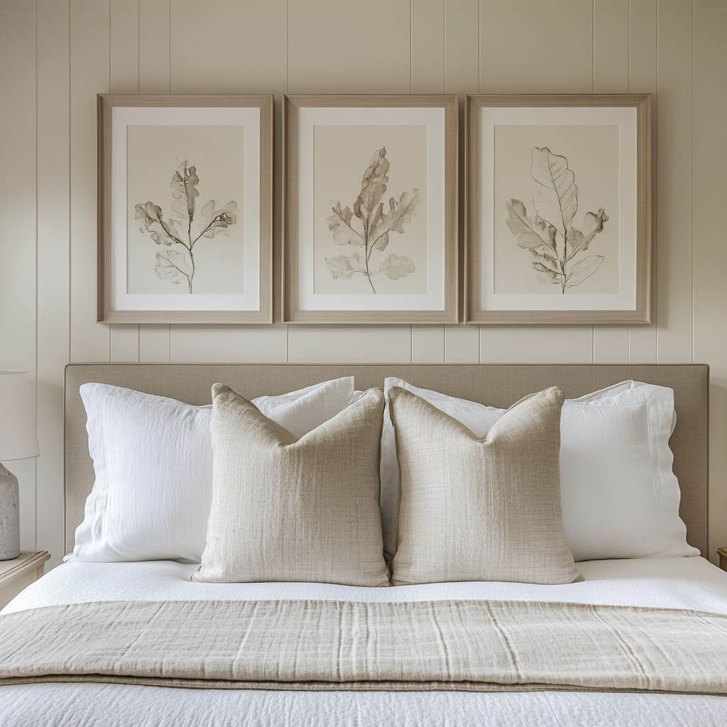
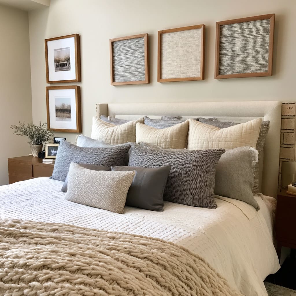
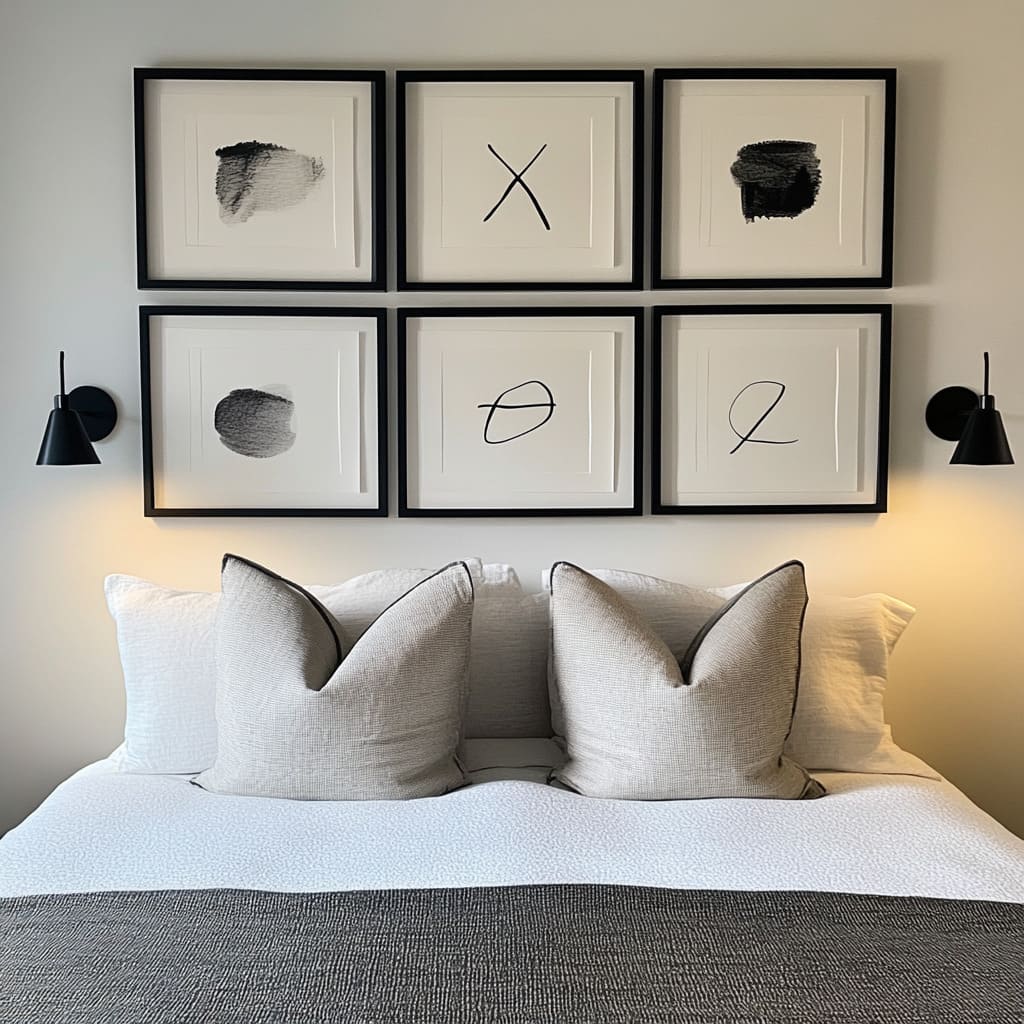
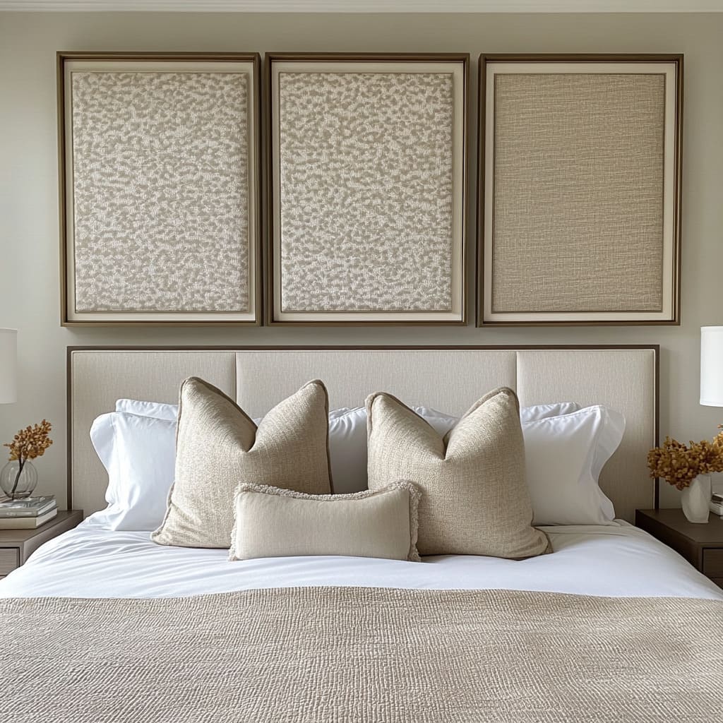
This means clean spacing, repeated shapes, and tight framing. Think of black-and-white ink drawings or textile panels in a rigid grid of two or three rows, spaced with precision.
The appeal here lies in balance. Whether it’s a six-piece art series or a fabric triptych, the equal margins between each frame create a rhythm that feels composed and calm.
This style works especially well in primary bedrooms with minimal furniture where the art has room to breathe.
But here’s the detail that makes these setups stand out: subtle irregularity. In one example, the artwork follows a strict layout, but each piece inside the frame has a different gesture—a mark, a brushstroke, a pattern shift.
Another room hangs three panels of textile art, but the third one on the end has a slightly different weave. These decisions are quiet enough not to break the order, but bold enough to keep the wall from looking flat or staged.
This mix of control with softness is key. It allows the viewer to first take in the overall structure, then notice the nuanced differences.
That tension between same and different adds depth without making the room feel busy. In both approaches—whether you’re going sculptural or structured—what matters most is how the pieces relate to light, spacing, and surrounding furniture.
The most successful layouts are those that don’t just fill the wall, but shift how the wall feels as part of the room.
Shelf & Ledge Storytelling
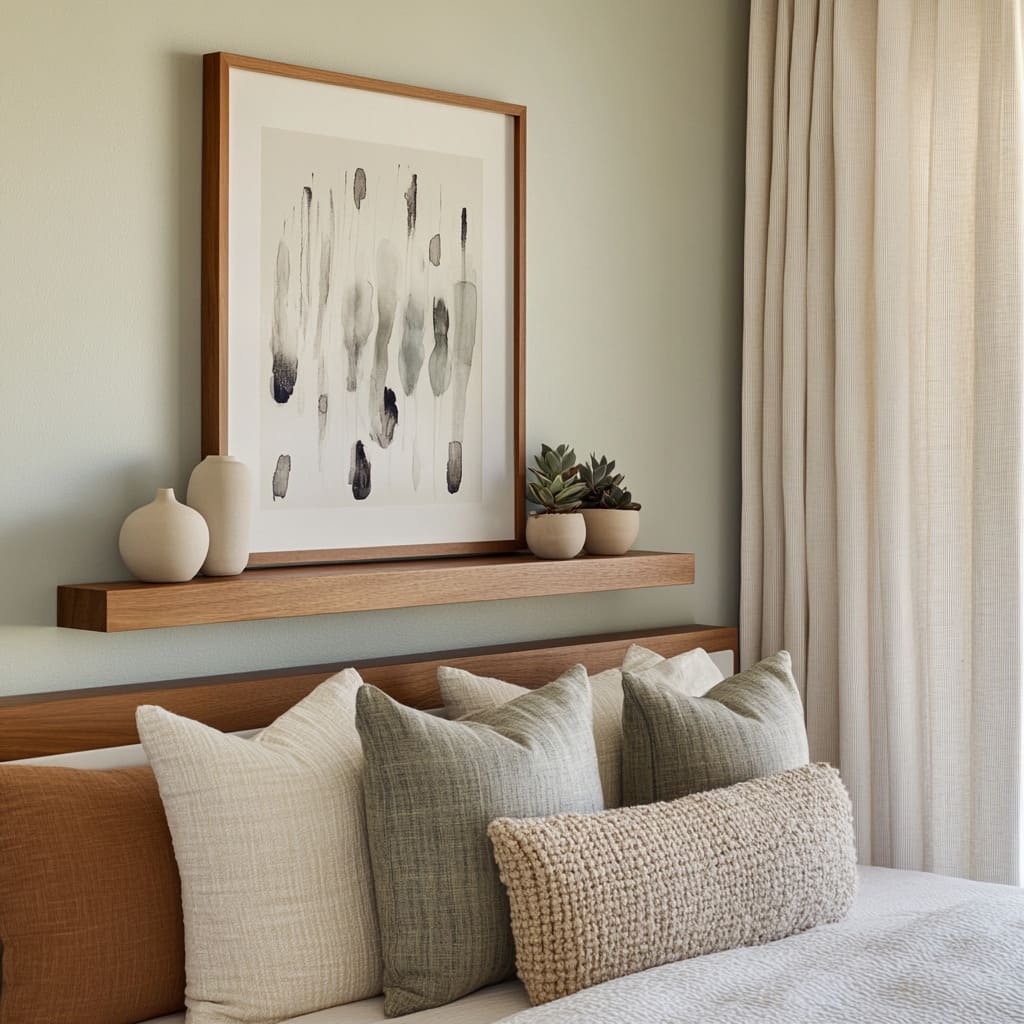
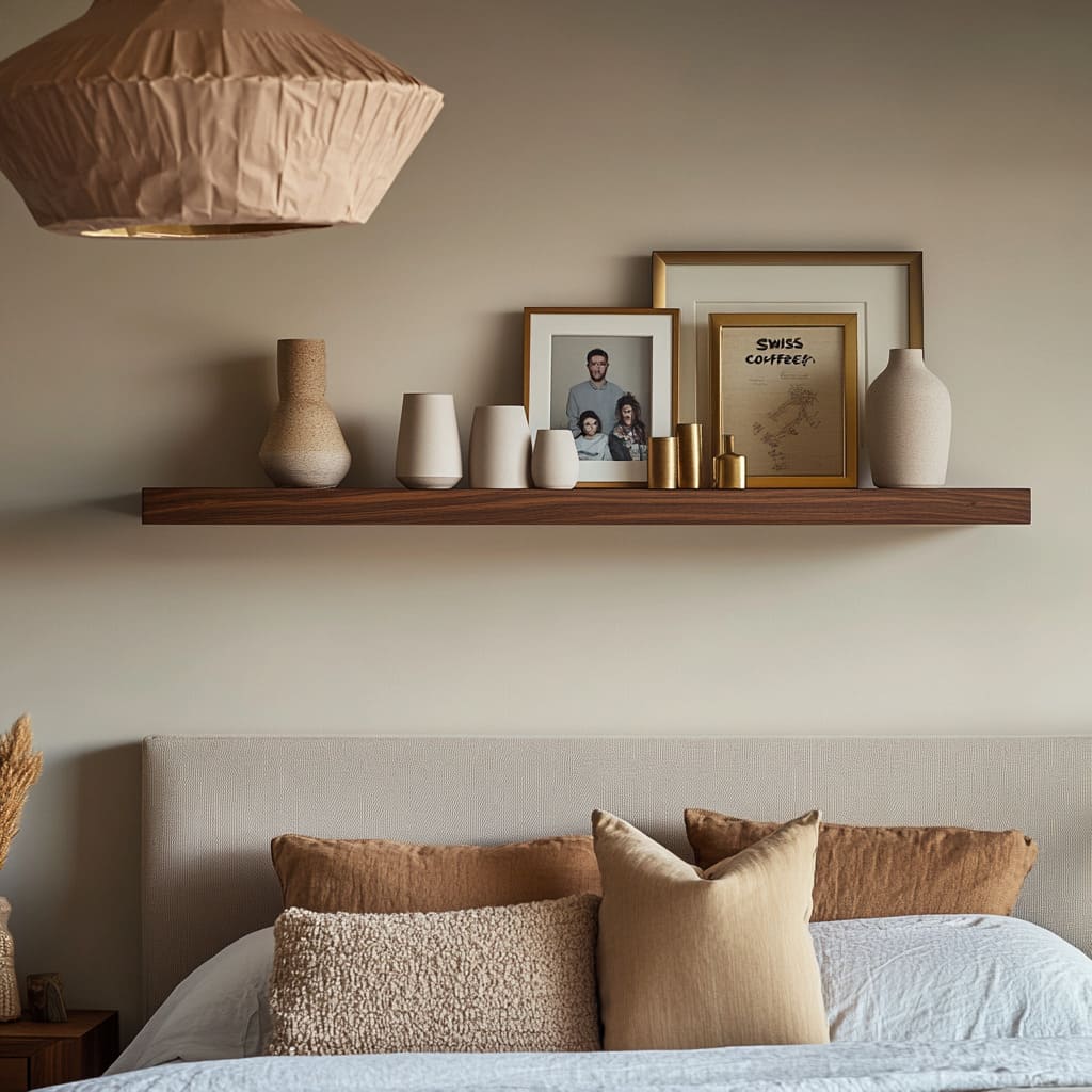
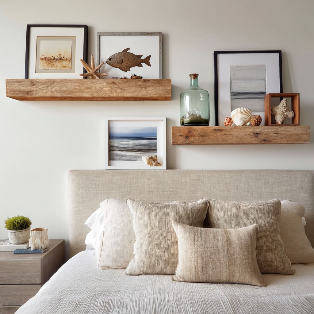
Shelves have moved far beyond their role as storage or display—they’ve become tools for shaping mood and memory in the bedroom. Some of the most thoughtful ideas for wall above bed setups now use floating shelves not to hold a single item, but to support a layered, sculptural arrangement.
The key isn’t what’s placed on the shelf—it’s how it’s placed. Instead of spacing things out in a line, pieces are grouped with intention.
Art leans instead of hangs, vessels overlap slightly, and the depth between objects varies. This creates small shadows, uneven layers, and a rhythm that’s closer to how people really live—more casual, more dimensional, more interesting from every angle.
These micro-variations give warmth that a grid of flat frames simply can’t.
In bedrooms drawing influence from coastal and Southwest interiors, shelves often carry a mix of rough ceramics, soft-toned portraits, raw metal accents, or even framed color swatches. The result isn’t styled to perfection.
Instead, it feels personal—like a slice of someone’s life presented in slow motion. Think of a green glass bottle next to a photo leaning slightly to the left, beside a natural coral chunk or a family portrait framed in warm wood.
It’s this balance of sculptural and sentimental that makes the setup so compelling.
Placement matters. One smart move that’s gaining popularity is lowering the shelf so it almost touches the top row of pillows.
By keeping it close, the whole wall—shelf, objects, bedding—reads as one connected layer, not separate parts fighting for attention. That visual tightness makes the whole setup feel more relaxed and intentional at the same time.
If you’re exploring shelves above bed ideas, the best approach is to treat the surface like a still life. Start with a tall anchor object, layer in varying heights, and let the items speak to one another.
Don’t worry about everything matching—just make sure every piece has a reason to be there, whether that’s form, color, texture, or memory.
Found & Natural Materials
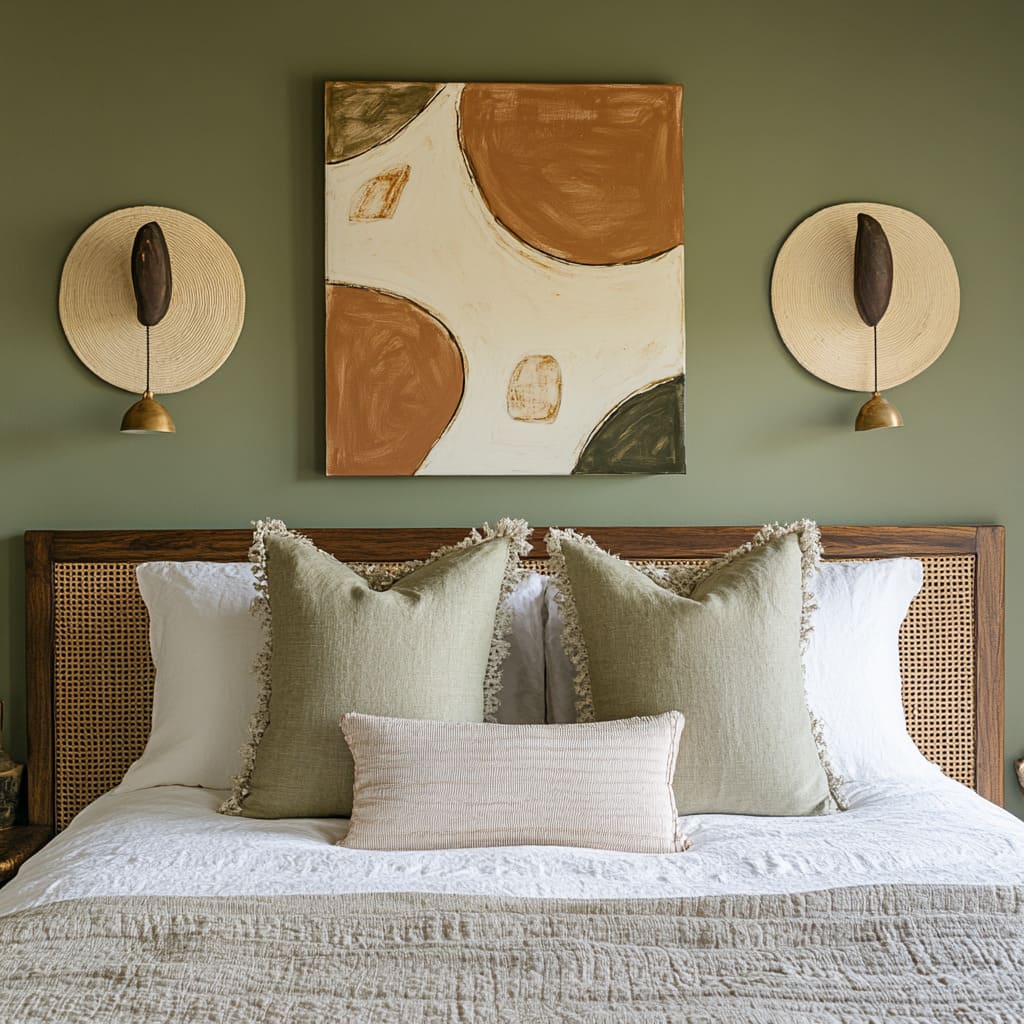
A big shift happening right now in over-bed styling is the return of raw, natural elements—but with a fresh, thoughtful spin. Designers are bringing in materials like twisted branches, straw wall plates, seagrass, cane, or jute, using them not as rustic throwbacks but as a way to soften sharp lines and bring real texture into modern rooms.
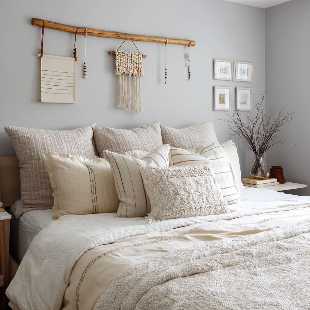
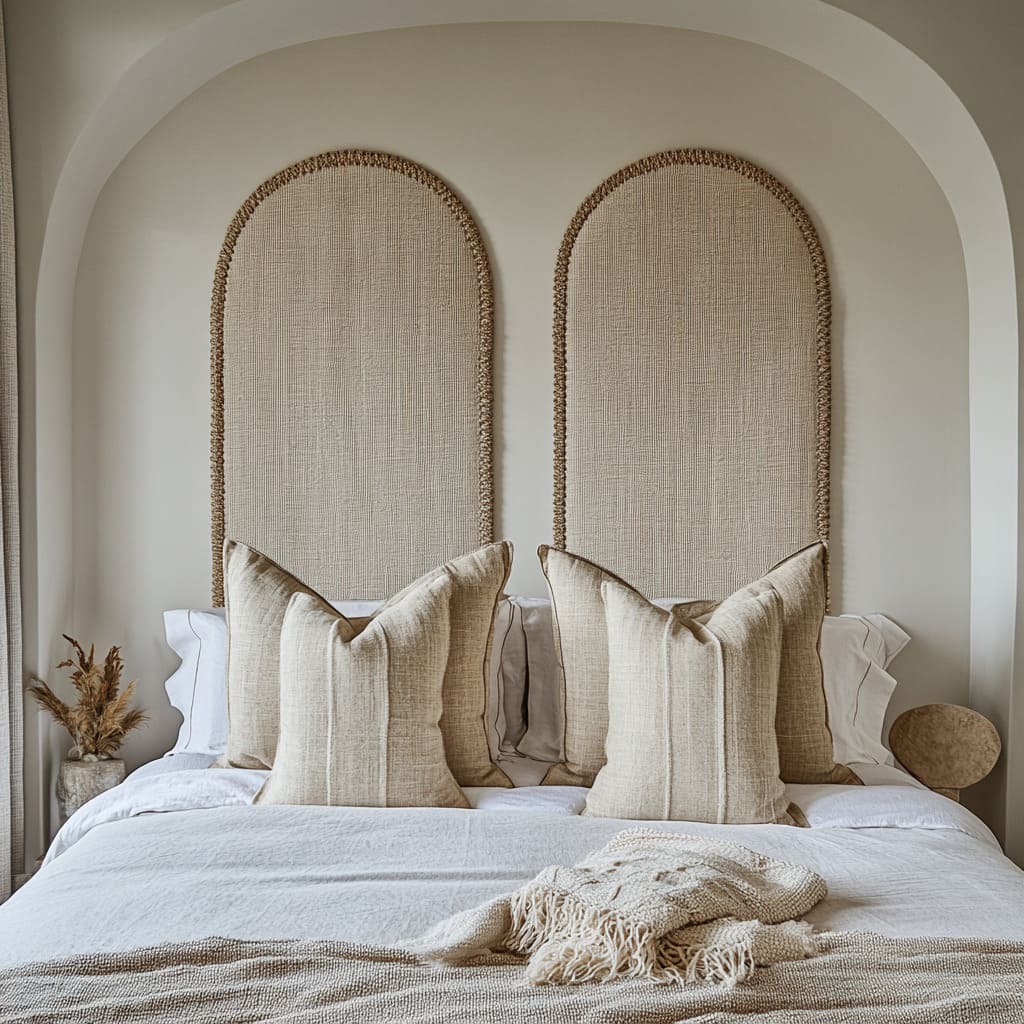
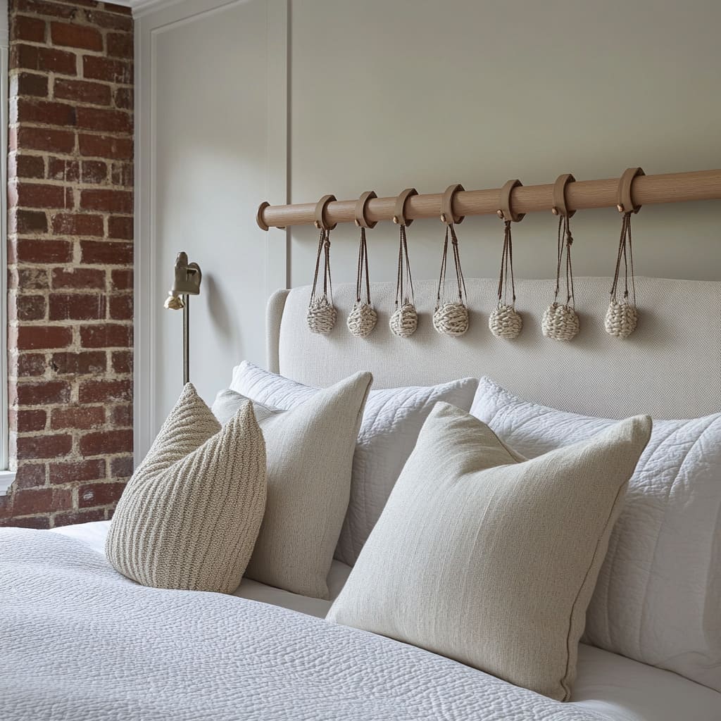
You’ll see it in details like a sanded wood branch suspended as a rail, or a round woven disk flanking a painting, or a simple cane headboard paired with thick linen. These choices matter less for their look alone and more for what they suggest: time, hand work, and quiet craftsmanship.
Knots, loops, uneven fringe, coiled rope—all of it speaks to slower processes and organic form.
What’s smart here is the restraint. Even though these materials are tactile, they’re used in measured ways.
One branch, seven knotted pendants, a single row of hanging bags—none of it overwhelms the space. And because these elements are often off-white, straw, or soft beige, they blend easily with natural palettes and washed-out bedding.
In homes with exposed brick, warm wall paneling, or plaster textures, this direction works especially well. The contrast between rough craft and clean lines creates tension in the best way—nothing feels staged, but nothing feels accidental either.
For anyone pulling together a space and wanting to move beyond framed art or polished prints, this category opens up a lot of options. From peg rails with woven baskets to hanging fabric knots over neutral bedding, these above bed moments bring both visual depth and a sense of material honesty.
Color Discipline: Neutrals Plus One
One of the quiet patterns that comes through across the most current ideas for over bed decor is a clear and careful approach to color. Walls, upholstered headboards, and the largest pillows often land in the soft zone between cream, stone, oatmeal, greige, or light taupe.
These tones lay the foundation for a restful space—but what keeps them from feeling washed out is the sharp, intentional placement of just one accent color.
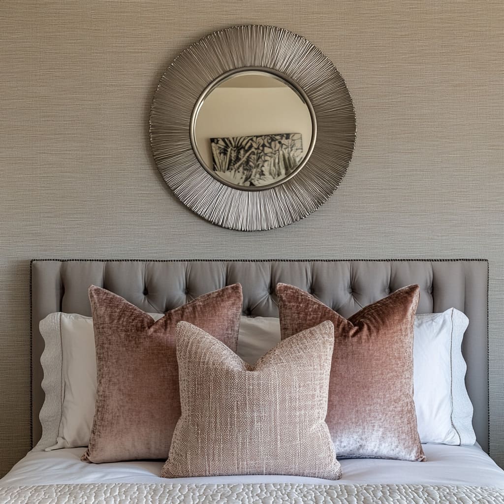
Rather than layering multiple hues, designers are choosing a single standout tone and using it in a very limited way. That might mean one rich lumbar pillow in burgundy velvet, a pair of ochre velvet cushions near the front, or a small art print with a burnt sienna brushstroke.
Because everything else is so calm and muted, this small injection of color carries much more visual weight. It creates a focal point without disrupting the rest of the palette.
This approach works especially well in homes pulling inspiration from high-end interiors seen in places like Southern California or coastal towns in the Northeast. It’s minimal but not stark.
The eye gets something to land on, but the mood stays grounded and soft. The key is that the accent doesn’t scatter—it appears once, maybe twice, and is echoed only gently, if at all.
That’s how you get richness without clutter.
Asymmetry Used Sparingly
Another move you’ll notice in above the headboard ideas is a willingness to break the rules—but only a little. While bedding is often kept symmetrical, with stacked pillows and centered headboards, what happens above can shift slightly off balance in a way that feels human, not random.
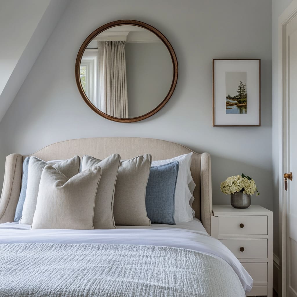
A great example: a thick floating shelf offset to the left, balanced by a low vase or framed photo on the right. Or a round mirror perfectly centered, paired with a slim vertical frame leaning off to one side.
This kind of visual weight shifting creates interest without chaos. The rule is simple—the heavier item gets paired with a lighter one, and their overall placement still centers around the bed.
This technique brings personality into bedrooms that are otherwise structured. It’s a way to add movement and contrast without giving up the calm.
Especially in rooms where the palette is already toned down, asymmetry keeps the space from going flat. And when done right, it can actually pull your attention toward the middle of the bed—helping to tie the wall into the bedding and furniture more naturally.
So if you’re exploring fresh layout tricks and want subtle ways to refine your ideas for over bed decor, consider how a small shift in balance or a single, bold color can reshape the room without overwhelming it.
Function Hidden in Plain Sight
What looks like decor is often pulling double duty in today’s smarter bedrooms. Storage, lighting, and even sound control are being folded into design moves so smoothly that the functional side almost disappears.
Instead of putting shelves or organizers elsewhere, designers are leaning into decorating ideas for above headboard setups that quietly do more than meet the eye. Peg rails are one example.
In recent interiors, they’re being mounted above the headboard with intention, holding everything from handwoven bags to soft hanging pouches. These aren’t random props—they serve as storage for lightweight extras like scarves, spare throws, or bedtime reads.
It’s storage that doesn’t read as utility.
Another quiet but powerful move: mirrored niches. In rooms with good daylight, a mirror installed above the bed and framed with soft indirect light will do more than reflect—it will bounce natural light deeper into the space.
This reduces the need for daytime lighting and subtly brightens the whole room, especially in homes with long side windows or darker corners.
And then there’s fabric. A loose linen drape suspended above the bed might look like a decorative swag, but it also softens harsh acoustics and reduces glare from early sunlight.
In rooms with hard surfaces like tile or plaster, this fabric layer becomes a light diffuser and a sound buffer in one move—without looking technical or staged. All of these examples share one thing: they don’t announce their purpose.
That’s what sets them apart. Instead of bolting on utility pieces, they let usefulness hide inside beauty.
The effect is subtle, but the comfort and practicality add up fast.
Where the Direction Is Headed
The most forward-looking ideas aren’t chasing trends—they’re reshaping the structure itself. More and more, decoration isn’t added later—it’s being built into the bones of the wall.
Designers are reaching for slatted fields, recessed alcoves, and integrated lighting to create surfaces that don’t need extra layers. In this shift, architecture becomes the visual anchor.
You’ll also start seeing more textiles in motion. Clip-on linen panels, pegged fabric scrolls, and swap-out displays make it easy to update the look with a change of season or mood.
The same way people rotate throws or pillow covers, these wall elements are becoming part of the wardrobe system.
Prints in frames are starting to take a back seat. In their place?
Hand-built ceramic clusters, carved plaster, or organic sticks used as rails or hooks. These three-dimensional pieces play with shadow and texture in a way flat art can’t match, especially under raking light from a sconce or late sun.
Color schemes are staying muted, but texture is getting more attention. A washed-out linen with a visible weave, a carved plaster arc, or a cane insert—all of these bring interest without loudness.
It’s not about contrast, it’s about surface depth. And one final detail to watch: a slight shift in balance.
Instead of rigid symmetry, expect small nudges—an off-center art piece, a shelf that leans to one side, a lamp that breaks the pattern. These moves keep the space feeling lived-in without falling into mess or chaos.
Together, these changes show where things are going: thoughtful, layered, and quietly practical—rooms that feel natural and look better over time.

