Front doors are often the most defined surface on a home’s facade—part entrance, part frame, part focal point. But in many of today’s most carefully built or remodeled homes, it’s not boldness that makes a door feel current.
It’s the quiet control behind the color choice and how it works with nearby textures, materials, and shadows. From coastal cottages with pale, powdered finishes to desert houses using deep neutrals softened by sand-toned stucco, the direction of entry door color ideas has shifted noticeably.
What’s emerging is less about traditional symmetry or vibrant contrast, and more about tuning. The tone of the door is often closely related to the climate, the angle of daylight, and even the grain of the stone or the patina of a planter nearby.
Instead of going high-gloss or pure color, designers and homeowners are opting for low-sheen, dusted versions of familiar hues—like greens with a hit of gray, or blues pressed toward slate. Hardware, casing, and landscape elements are no longer chosen independently but treated as part of one field of view.

Across styles—from modern farmhouses to mid-century ranches and Mediterranean revivals—the same themes appear again and again. The color isn’t louder.
It’s more refined, more specific, more in sync with what surrounds it. And the result is often an entry that feels stronger not through contrast, but through cohesion.
This article brings together a detailed look at current directions in front door color—how shape, texture, region, and lighting all shift the way a color performs.

Palette Directions
Color trends at the front door have moved far from basic primaries or default safe picks.
| Hue family | Shared traits across the set | Tactics that raise design quality |
|---|---|---|
| Dust-soft pastels(pistachio, oyster cream, bone, celery) | Always mixed with gray or brown to mute sweetness | |
| Dirty brights(dirty mustard, burnt almond, terracotta) | High chroma but earth-charged undertones keep them grown-up |
|
| Fog-toned blues & greens(soft concrete blue, dusty sky, beach-glass) | Land between two reference colors (e.g., slate ↔ robin’s-egg) | |
| Near-neutral chameleons(lead gray, forest-charcoal, deep earth-green) | Look neutral from the street; reveal color up close |
|
| Shadow blacks | Never true jet; always tipped with green, blue, or brown |
|

Hardware & Accessory Code
In most of today’s standout front door paint ideas, the hardware is no longer an afterthought—it plays a strong visual role without being theatrical. One specific type quietly dominates across a variety of homes: the vertical pull bar.
It’s not chosen purely for function. The form draws the eye upward, heightens the feel of the door, and emphasizes its presence without needing contrast or bright trim.
Especially on tall flush panels, it reads as part of the architecture rather than a separate feature.

The finish of the hardware tends to follow a less-obvious pairing method—more thoughtful than just picking something that “matches. ” First, the tone is often linked to the trim of nearby sidelights or glass cutouts.
When that alignment happens, the pull becomes part of a vertical rhythm, blending rather than cutting through the door zone. Second, the temperature of the hardware intentionally moves in the opposite direction of the paint tone.
For instance, a warm brass pull can bring low-key contrast to a graphite-blue door, and cool nickel adds a crisp edge to something like a terracotta or desert clay panel. That pairing of opposites adds a layer of depth, but without needing an extra paint color or border.

It’s a method seen in a lot of modern entries across warm and cool climate zones. The balance works best when the handle’s finish isn’t overly shiny—matte or brushed surfaces allow the eye to catch shape without reflecting distraction.
So while many might initially focus on front door color ideas, those quiet pulls end up shaping how the whole entry feels.

Sheen & Texture – The Ideas Beneath the Color
The finish of a front door matters just as much as the hue itself. Texture and sheen play a quiet role in how color is read—from how shadows fall across the surface to how daylight bounces (or doesn’t) back to the eye.

| Finish choice | Hidden benefit |
|---|---|
| Ultra-matte or satin-matte (24 of 26 cases) | Low reflectance lets subtle undertones read; also prevents glare on sunny sites from making a saturated hue appear cheaper |
| Visible wood grain under stain-like paint | Adds micro-texture that absorbs light, so deep colors (aubergine, charcoal) avoid looking plastic |
| Planked or grooved panels | Grooves catch shadow → hue appears to modulate across the day → a single paint looks like multiple tones without extra work |

Landscape as Paint Support
The visual weight of a front door often rests not only on the color itself, but how that color is echoed—or softened—by the surrounding elements. Designers have been shifting away from direct matching and instead, building subtle repetitions through the entry’s landscape.

Take planters, for example. Across dozens of homes, there’s a clear trend: the pot or container sitting nearby is rarely the same tone as the door.
Instead, it tends to repeat something quieter—the undertone. If the paint leans toward olive, the planter may show it in clay or sand rather than in green.
If the door has a soft blue tint, the pot may reflect the gray in that blue rather than the hue itself. This small move creates a sense of harmony, but sidesteps anything too literal.

Hardscape materials play a similar role. A good example is a terracotta door paired with steps tiled in the same warm clay tone, or a chalky beige door sitting above a washed-brick porch with similar dusty warmth.
These elements create a natural rhythm from sidewalk to threshold, letting the door feel like it belongs to a system rather than floating in a white wall or standing alone on concrete. The surface changes aren’t meant to compete—they bridge color and texture in ways that make the entry feel resolved.

In general, across everything from coastal towns to desert-edge suburbs, this idea of repeating tones rather than duplicating colors has become one of the more refined directions in modern front door paint ideas. It’s not loud, but it builds a layered entry that holds up in any light.

Context Blending vs. Controlled Contrast
A door doesn’t need to be loud to be clear. Some of the most grounded entries today use subtle contrast or low-key blending strategies to hold attention in a more refined way.
It’s less about standing apart from the house and more about working with what’s around it—materials, plantings, and architectural rhythm all play a role.

| Strategy | Examples | What makes it work |
|---|---|---|
| Tone-on-tone merge | Olive on cedar, bone on stucco | Casing removed or painted identical hue, sidelight gives the required visual break |
| Temperature echo | Burnt almond balancing warm wood & cool stone | Door carries a mid-point undertone, avoiding a jarring pivot between materials |
| Single-spot drama | Aubergine in muted stone field | Everything else stays within a 15 % lightness band so the vivid door feels curated, not random |

Geometry: How Form Intensifies Hue
The way a front door is shaped can dramatically shift how color is read—even before light or texture come into play. Certain forms seem to carry their own mood, allowing color to play a secondary, supportive role.
Arched doors, for example, already bring softness and visual interest through their shape alone. That curve draws the eye upward and rounds off the structure visually, which is why these doors are often painted in subtle, less saturated shades.
A soft coral with a bit of dust in it, or a cream that leans toward oyster, tends to feel more at home on an arch than something too loud or glossy. The form holds attention—color doesn’t need to fight for it.

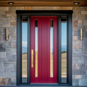
Meanwhile, slab-style doors that go full height with no window cutouts rely on other tools. They often take on bolder, darker hues—like deep aubergine or a dry matte black—not for showiness, but to create visual weight.
Vertical pull bars become the only detail, which adds proportion and tension to what could otherwise be an empty surface. These doors behave like flat sculptures: simple, tall, and color-driven.

Glass detailing plays a separate role altogether. Narrow glass strips—especially when installed flush with the door plane—act like light regulators.
In daylight, they let in brightness without clutter. At night, with the interior lit, these strips catch the glow and reflect the paint differently, warming even a cool charcoal or dusty blue.
It gives the door a kind of shift in tone between day and evening, something many might miss unless they observe the entry at different times. This idea of form shaping perception is one reason some front door paint colours feel more expressive than others, even without bright pigment.

Interesting Ideas for a Stylish Porch
Some of the most visually grounded entries today aren’t relying on dramatic contrast or flashy design—they’re built on quiet control. You’ll notice that many modern porches with style don’t treat the door as a separate piece, but rather as part of a single visual field.
By painting the casing the same shade as the door—especially with soft or dusty hues—the entire surface reads as a cutout from the house itself. It’s a subtle way to shift the emphasis from the frame to the shape.

Groove patterns in the door design have become a low-effort way to introduce movement without adding more color. Vertical or horizontal lines catch light at different angles, giving the impression of tone variation—even when the paint is a single mix.
The same paint looks like a range of shades throughout the day, and all without layering anything extra.

Hardware is another small feature doing a lot of work. The most current approach?
Contrast in temperature. A cool-toned handle like brushed steel on a warm clay-colored panel, or a bronze finish on a deep graphite blue, adds quiet depth without needing a second paint or extra texture.
It’s a color pairing trick that works by opposition.

Outdoors, the landscaping near the porch continues the same idea: instead of trying to match the door, plants and accessories often echo the undertone of the color. A clay-based pot under a pale olive door or gravel that reflects the brown in a warm beige helps link the color to the ground around it.
Even dried grasses and native shrubs can pull off that coordination without looking too perfect.

Another factor many overlook is sheen. Bright colors work better in ultra-matte, while deeper shades benefit from a soft satin.
Both finishes reduce glare, which in turn keeps the tone looking rich—not synthetic.

In homes with a mix of exterior materials—stone, wood, stucco—the most seamless entry door paint colors are usually the ones that sit right in the middle of those materials on the color temperature scale. These middle-ground shades act as visual glue.
They’re not exact matches to anything around them, but they allow everything to feel tied together.

There’s also a strong shift away from pure pigment. Few designers now are picking shades straight from a sample deck.
Most trending outside door paint colors include some degree of dusting—whether that’s a bit of gray to tone down a green or a smudge of brown inside a pink or yellow. These softened hues hold up better across seasons, light changes, and materials.

And perhaps the most practical idea running through many of today’s porches: light awareness. In harsh sun, faded finishes and chalky bases do more than protect—they control how the color ages.
In shaded, tree-lined lots, deeper, moodier tones with layered undertones tend to feel more dimensional.

Overall, these entries don’t push for attention—they’re balanced by thoughtful choices in color, texture, and form. The result is a front porch that doesn’t compete with the house, but fits right into the wider rhythm of its materials and setting.