Green on the wall carries a quiet strength—neither loud nor passive, it sits between natural calm and grounded structure. It can settle into a space like a shadow in soft light or sharpen the entire room’s outline, depending on how it’s handled.
Across finishes that range from flat matte to textured limewash, the same tone can read airy, dense, or calm with depth.
What’s especially compelling is how much variation lies within a single color family. From pale mints to deep pine, the spectrum of greens offers an entire set of visual tools.
These shades don’t operate alone—they shift in tone based on texture, furniture nearby, light from a pendant or window, and how space flows around them. That’s what makes so many green accent wall bedroom ideas feel layered and complete without being visually heavy.
This article looks closer at how different applications of green give shape, softness, and rhythm to bedroom spaces—through surface quality, contrast, shadow, and alignment. The focus is on what the wall does visually, and how its presence can hold the room together in ways that aren’t always obvious.
Nuances of Green Tones and Finishes
Matte vs. Satin vs. Textured Surfaces
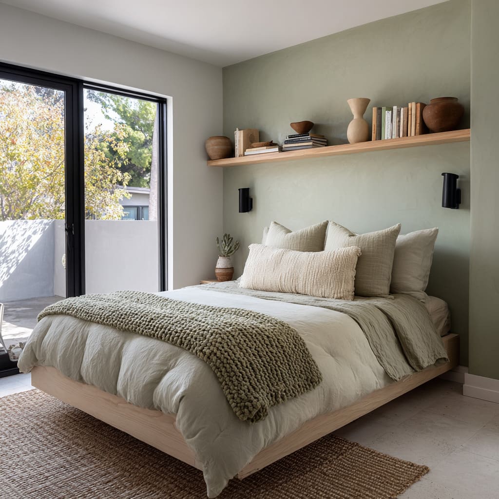
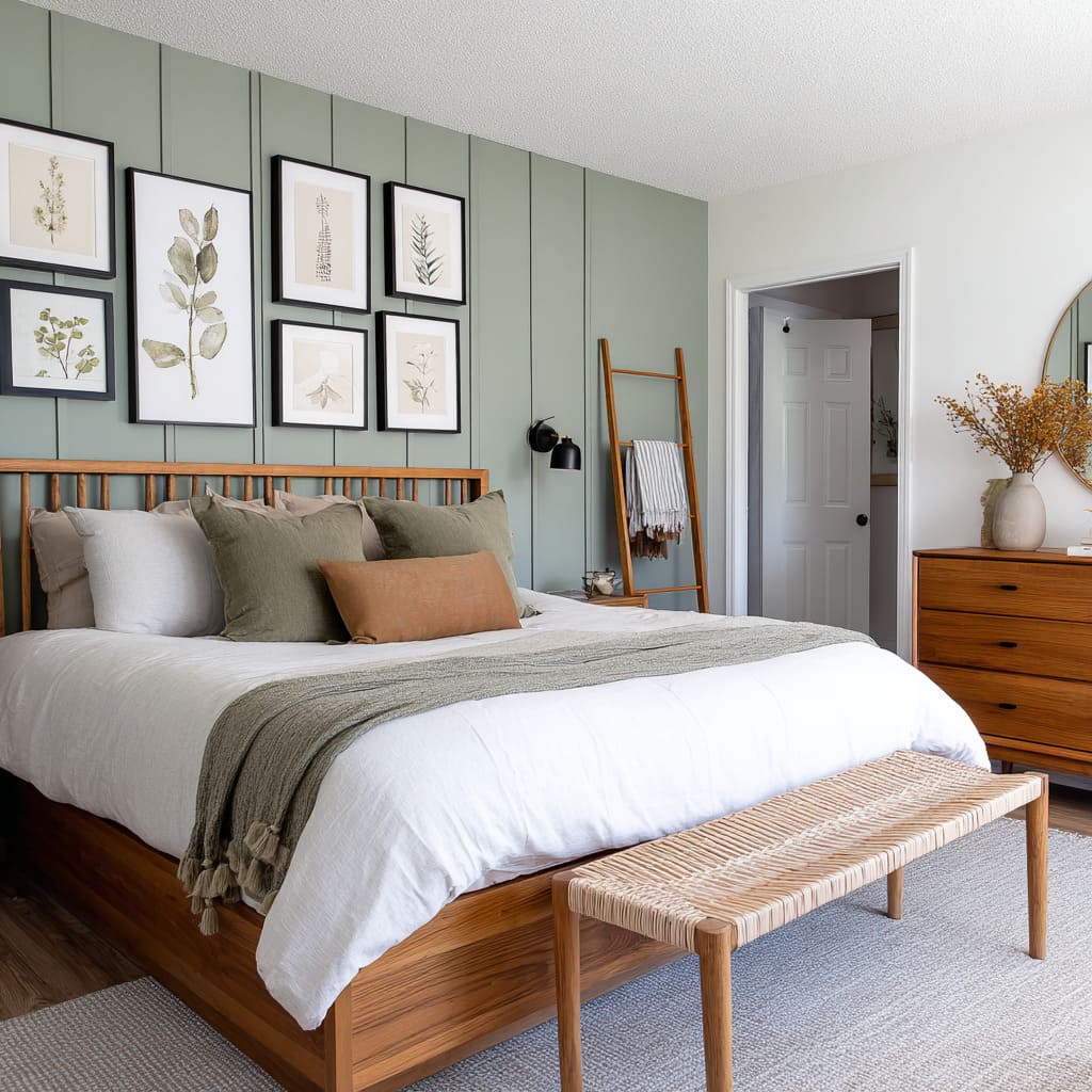
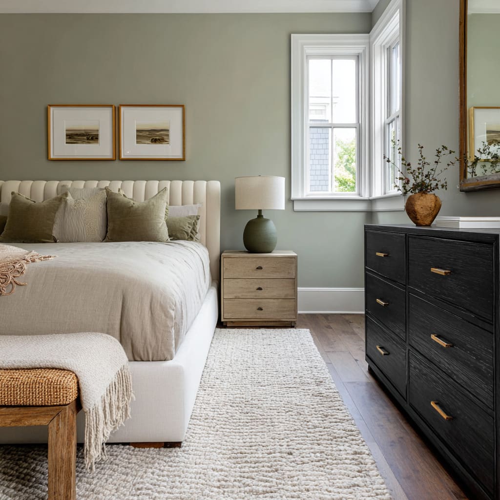
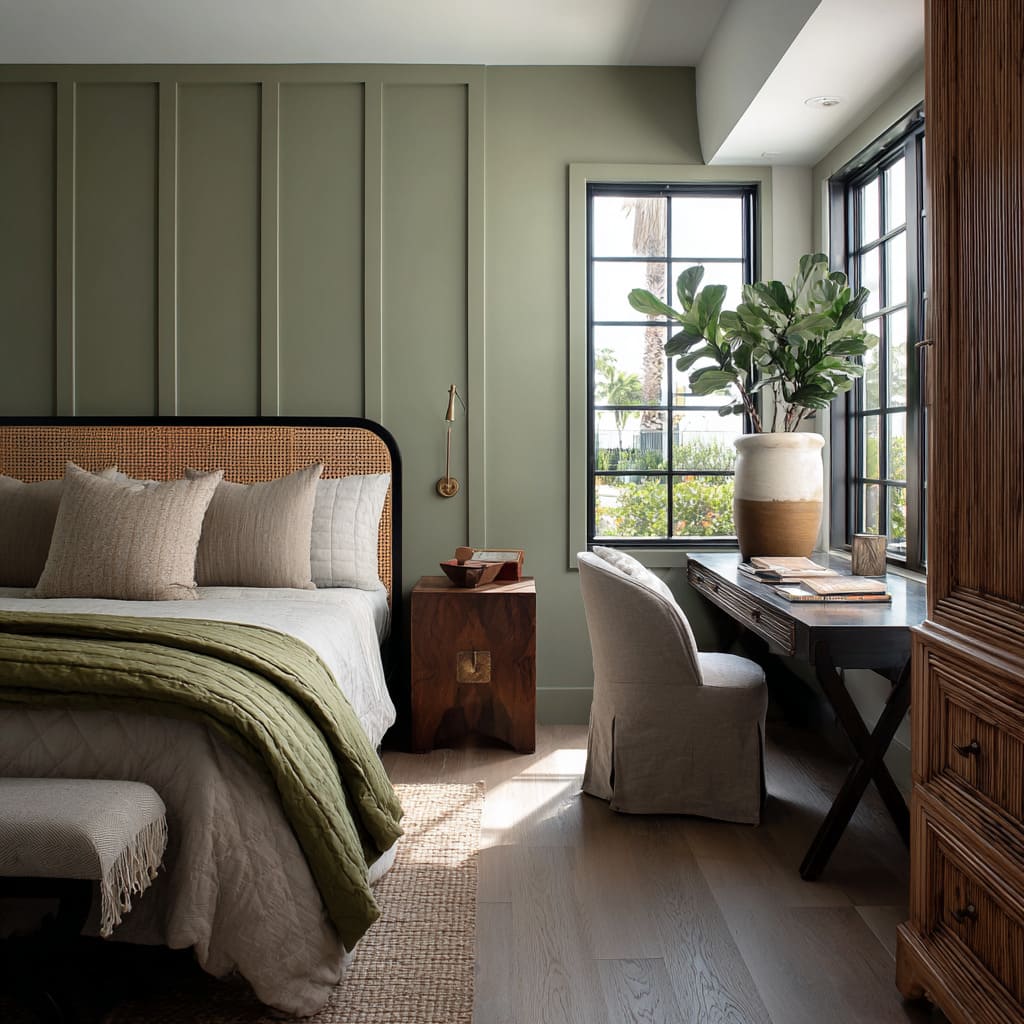
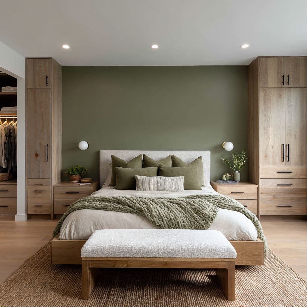
Matte, chalky greens (for instance, “soft fern” or “powdery mint”) diffuse daylight, making the space feel calm and cohesive rather than bold. These finishes soften edges and let textiles and wood appear richer by contrast.
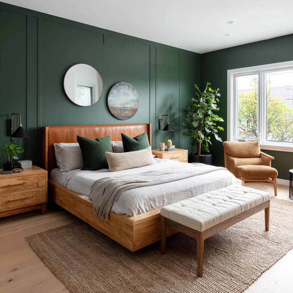
Satin or velvety finishes (as in the “deep pine green”) introduce a subtle sheen that catches low-angle light, lending the wall a living, almost liquid quality. That gentle glow deepens the hue without calling attention to brushstrokes.
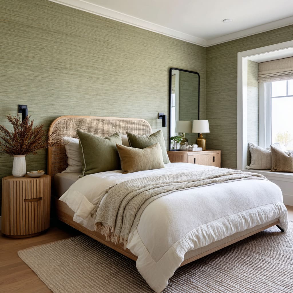
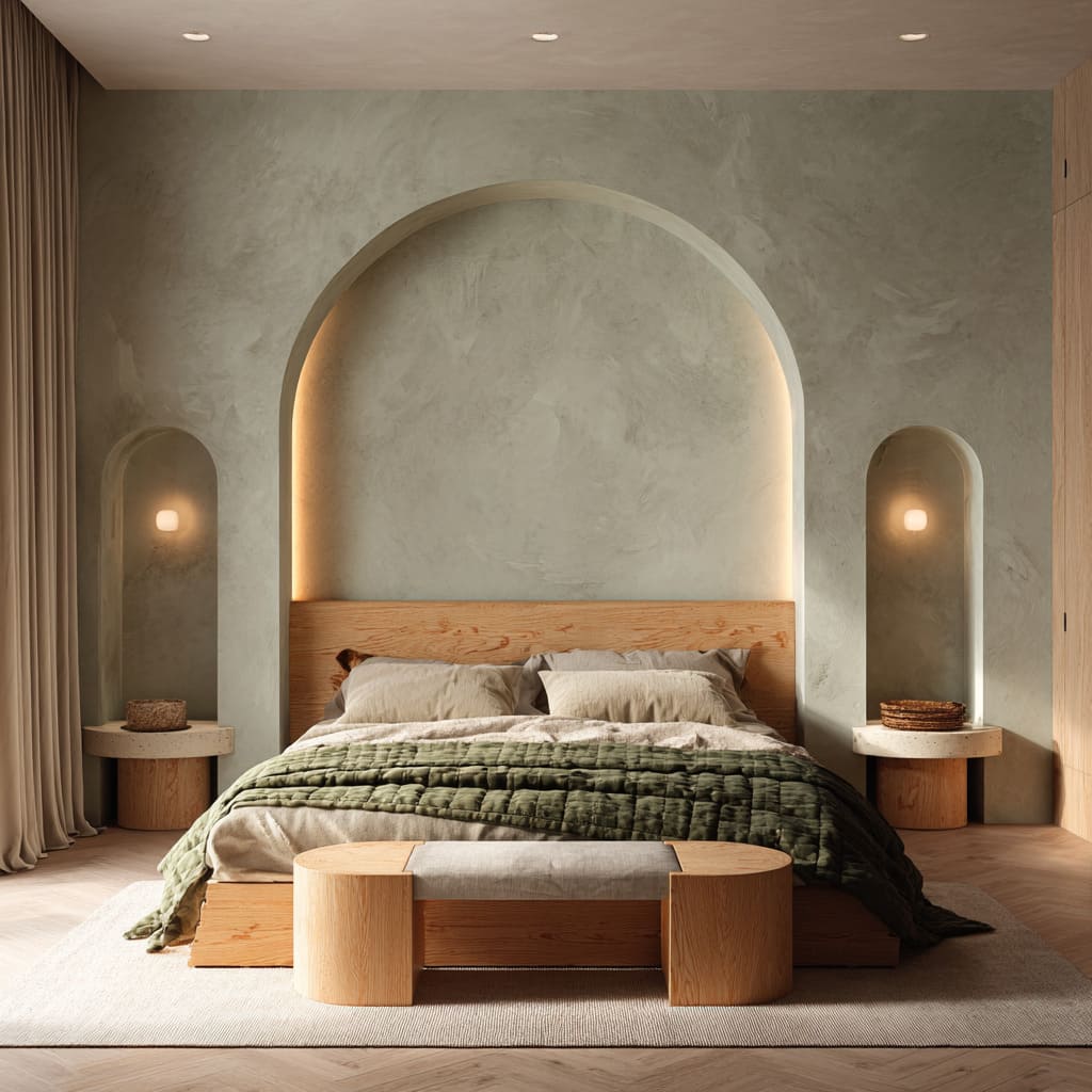
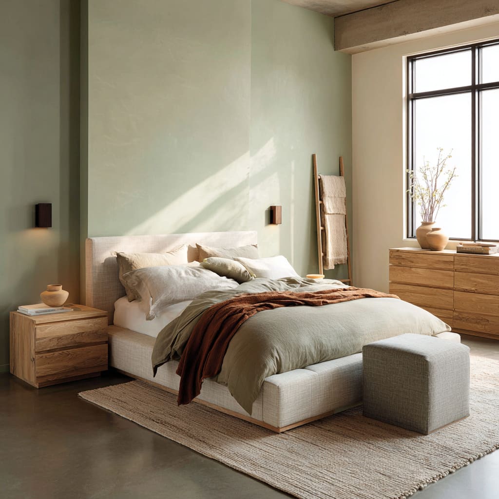
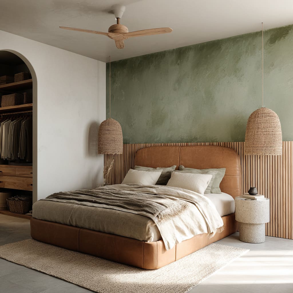
Grasscloth or limewash applications add organic irregularity. Grasscloth’s vertical threads animate the wall as you walk past; limewash’s mineral shifts read like a natural patina, evoking aged plaster or stone.
Gradient and Mural Techniques
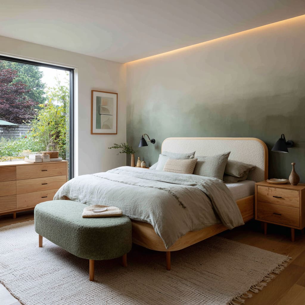
Ombré fades—from dusty sage at the base up to ivory—suggest a watercolor wash in three dimensions, visually lifting the ceiling and creating a soft focal plane rather than a harsh boundary.
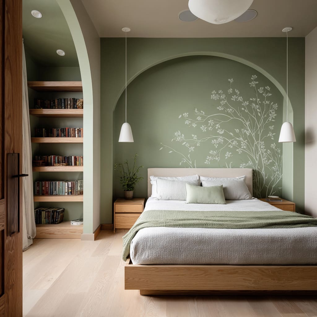
Hand-painted leaf murals or botanical niches layer pale and dark greens on one another; these both serve as wall art and a backdrop, so that furnishings feel as though they grow out of the wall itself.
Light, Shadow and Glow
Concealed Lighting to Shape Perception
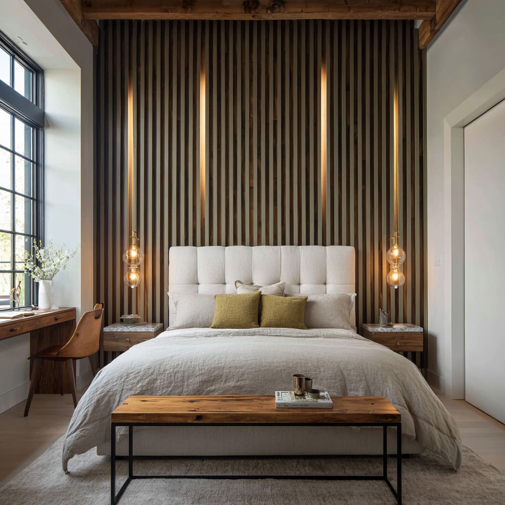
Integrated cove LEDs wash the top edge of a gradient wall with warm light, reinforcing the color shift and visually “raising” the ceiling line. Slim vertical light channels behind slatted wood unveil shifting glimpses of warm glow, turning the green into a stage for subtle drama rather than a simple backdrop.
Directional Fixtures as Color Enhancers
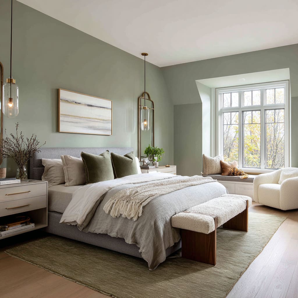
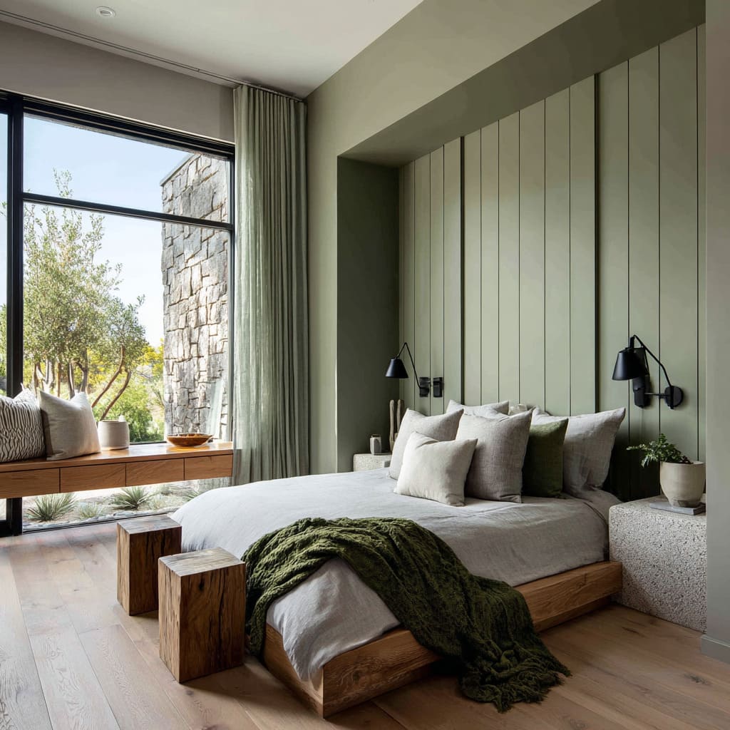
Down-light glass pendants placed close to a chalky fern wall reflect warm metal tones into the green, making it feel organic—akin to leaf veins lit from within. Black swing-arm sconces with gold interiors against dark green create tiny points of warmth that animate vertical panels, turning flat surfaces into rhythmic light plays.
Textural Conversations
Soft vs. Structural
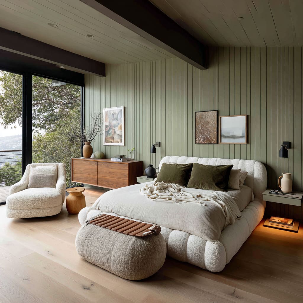
Plush boucle benches and flaxen linen bedding echo the muted forest greens in a matte finish, reinforcing softness and preventing the wall from ever feeling oppressive.
Contrastingly, smooth leather headboards or concrete-topped night tables introduce firmness against a satin or chalky wall, underscoring the depth of the green by juxtaposition.
Natural Fiber Pairings
Jute rugs, woven cane or rattan headboards, and grasscloth walls speak the same language of vertical lines and irregular textures. The green wall acts as the central thread tying these fibers together into a coherent textural tapestry.
Knitted throws and ribbed wood nightstands elevate secondary layers of softness, all within the same tonal family, so no element feels out of place.
Architectural Framing and Spatial Volume
Arch es and Niches as Headboard Substitutes
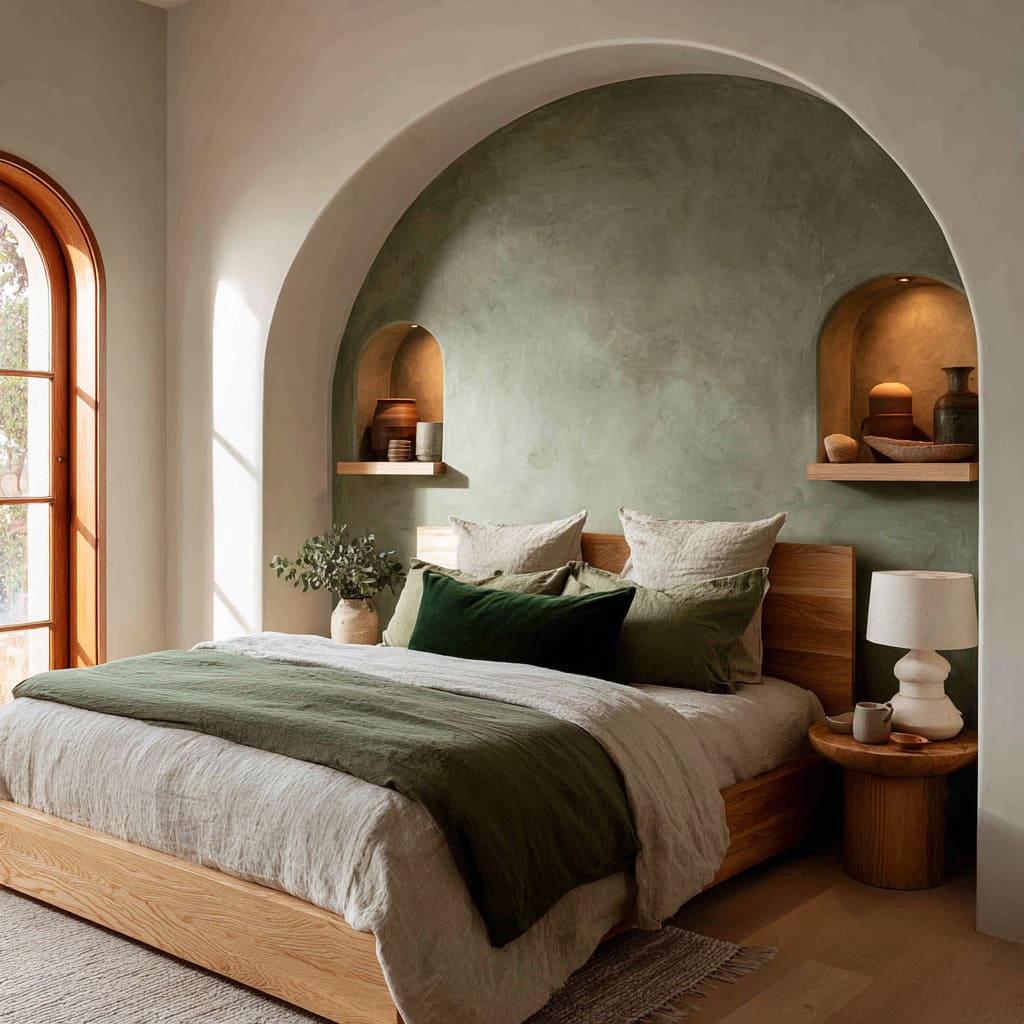
Sculptural arched recesses in charcoal-tinged green turn a wall into a three-dimensional frame, making the bed feel like an artwork without needing a physical headboard.
Repetition of curved openings (windows, niches) creates visual echoes that calm the eye and give the green a purpose beyond color—namely, as spatial storytelling.
Paneling to Expand or Contain
Vertical trim segments or full-wall slats break a broad green surface into manageable parts, adding height and giving light a place to fall. Even without moldings, slim vertical grooves can make the wall feel carved, not simply painted.
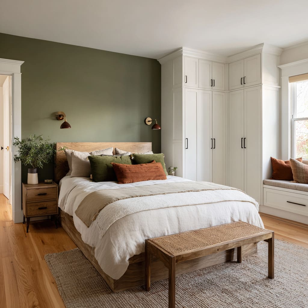
When green is bordered tightly (e. g.
between white cabinetry), it commands attention and becomes an organizing device, clearly marking the sleeping zone.
Furniture and Accessory Dialogue
Echoing Hues vs. Deliberate Contrast
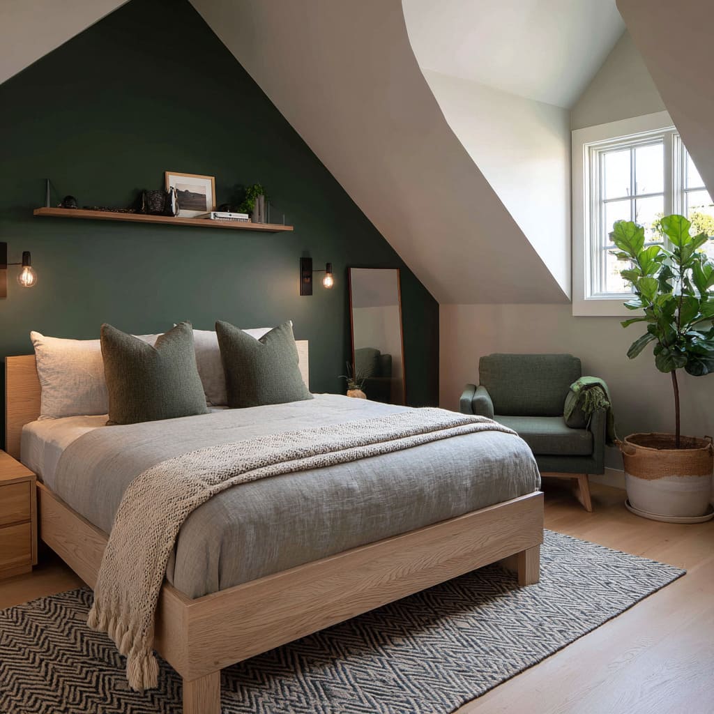
Some rooms layer pillows, benches, and chairs in matching green shades so that accessories seem to “grow” out of the wall. This ton-on-ton strategy reinforces calm and unity.
Others introduce a warm contrast—burnt ochre, caramel-brown leather, or brass highlights—to pull the green in new directions, suggesting both depth and visual focus points.
Organic Shapes Mirroring Leaf Forms
Rounded benches, barrel chairs, and softly curved lamps repeat the botanical inspiration behind leafy murals or grasscloth striations. These silhouettes soften the rectangular rigidity of windows, beds, and shelves.
Emotional Atmosphere and Flow
From Retreat to Gallery
Deep pine greens with leather and earthy linens evoke a woodland cabin feeling—grounding and enveloping without feeling cramped. Pale mints or pistachio washes paired with botanical prints create a living-sketchbook vibe: airy, fresh, and gently alive as if paused in the morning light.
Continuous Color Experiences
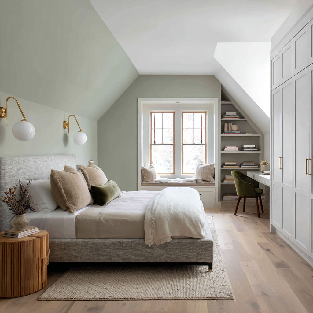
Extending green up into vaulted ceilings, sloped attics, or all the way around an angled transition ensures the color doesn’t read as a single accent but as the defining mood of the room.
When green wraps architectural quirks—be it dormers, gables, or built-in benches—it turns every nook into part of the overall design, making the eye travel and discover subtle shifts in tone and texture.
Conclusion
Green accent walls become far more than a backdrop when you treat color and finish as tools for layering, shaping volume, and guiding light. By choosing the right hue, applying it with purpose (through gradients, textures, or sculptural forms), and selecting furnishings that speak back to the wall’s character—whether by echo or by contrast—you can create bedrooms that feel both composed and alive.
In each of these designs, green is not a mere fashion choice but a careful mediator between architecture, light, surface, and the objects that inhabit the space.

