Green has become one of the most versatile tools in hallway design—not as a backdrop, but as an active visual element that shapes movement, mood, and rhythm. In modern interiors, this colour isn’t assigned to one surface or finish—it flows across walls, ceilings, textures, and even reflections, building continuity without monotony.
The approach avoids obvious contrast, instead relying on shifts in tone, texture, and light response to keep the space dynamic. From pale sage washed over plaster to deep olive tucked into upholstery seams, the green palette adapts itself to the surfaces it touches.
The strength of this concept lies in how subtle the decisions feel. One space might use tinted mirrors to echo the wall tone, while another lets lighting temperatures shift green from warm to cool along the path.
Rather than repeating the same material, many interiors layer green across fabric, stone, stained timber, or matte-finished cabinetry—each variation bringing a different weight or softness to the eye. These decisions build atmosphere that supports the layout rather than competing with it.
What results is not a dramatic effect, but a carefully tuned visual field where pace and perception are shaped by quiet colour control.

Colour Philosophy: Quiet Greens as Spatial Directors
In modern hall interiors, green tones act less as decoration and more as silent guides. Rather than introducing contrast, these colors adjust how distance, width, and height are perceived.
A hallway painted in dark moss along the sidewalls can visually push the ceiling upward, adding loft to narrow proportions. In contrast, pale sage on ceiling slats or panels subtly presses the space downward, producing a closeness that turns a corridor into a pause zone.

These effects don’t rely on wide tonal gaps; instead, the palette shifts just one or two values between elements—like a faded olive velvet wall adjacent to a chalky sage plaster surface. This restrained chromatic variation keeps the eye moving naturally down long layouts without sharp stops.
The entire passage feels composed, never visually cluttered or stagnant. In green hallway ideas that favor this tonal control, it’s the balance—not boldness—that maintains visual rhythm and harmony across every surface from floor to ceiling.

Layering Strategies: One Colour, Many Skins
Green finds its depth not through brightness, but through the surfaces it occupies. Instead of repeating one paint finish, the most thoughtful green hall ideas use material variety to avoid visual fatigue.
A limewashed wall may carry sage in a soft, chalky fade, while a nearby tinted mirror bounces back an olive hue with slight gold undertones. Fabric wall panels in eucalyptus green absorb light, calming glare and drawing the space inward, while grasscloth in muted thyme can catch light unevenly across its weave.
Even slatted wood stained in dusty mint delivers movement and softness. These subtle shifts in material reflect, absorb, or diffuse light at different rates, offering the eye something to trace along the corridor.
This is especially valuable in long hall layouts where repetition can quickly feel stale. Here, the green hall ideas aren’t about making a loud statement—they’re about how one hue can quietly take on dozens of characters, each texture contributing to a full, layered experience without shouting for attention.

Rhythm Making: Vertical vs. Horizontal Cadence
Visual tempo in a corridor is often shaped by directionality. Lines—whether through slats, grooves, or structured divisions—guide how space is perceived as the body moves through it.
Vertical elements, like walnut-framed mirror panels or fluted plaster dividers, create short visual intervals. They draw the eye upward, slowing the passage by creating a vertical resistance that breaks up the linear stretch.
In contrast, long shiplap boards or horizontal wood planks beneath the feet act like arrows, pulling the gaze forward and subtly increasing pace.

This variation is intentional: alternating direction between walls, floors, and ceilings prevents the hallway from reading as static. For example, a vertical paneling pattern on built-ins may be mirrored by a horizontal ceiling element—offering visual punctuation that lets the viewer pause, then move again.
This compositional pacing is especially effective in elongated layouts, where repetition can otherwise become monotonous. Such rhythmic choices bring structure and depth to even a light green hallway, guiding the way with shape rather than noise.

Focal Compression: Using Green to Anchor Pause Points
Hallways painted in close tonal range can risk visual sameness unless anchored by one deeper or texturally richer element. Within this subtle environment, a concentrated green feature draws attention quietly but decisively.
A narrow console in dark green marble or a recessed bench wrapped in deep sage velvet introduces density without shouting. These features slow the gaze, forming soft visual pauses.
Because the rest of the space shares that same family of tones—faded moss, pale eucalyptus, dry mint—this concentrated green doesn’t break the palette.

It acts as a gravitational point, gathering nearby elements and stabilizing the hallway’s visual flow. Whether through darker shade or intensified texture, these moments of compression give balance to otherwise continuous color fields.
In refined hallway design, especially with tone-on-tone strategies, these visual anchors keep the corridor from fading into one flat stripe. Instead, they let the eye rest, then continue—keeping interest alive without changing direction.

Light Choreography: Warm vs. Cool on the Same Palette
In green-themed hallways, tone is rarely fixed—it changes throughout the day, not because the paint shifts, but because the light does. Warm and cool lighting are used side by side, allowing one green surface to hold multiple roles.
Under soft amber sconces, a sage wall might lean into olive, matching nearby timber shelves. A few steps later, that same surface lit by a skylight may pick up a silvery cast, reading closer to eucalyptus.

This temperature contrast doesn’t compete—it builds a quiet storyline of visual change. Even low-glare LED strips tucked behind ceiling slats can fine-tune how much green reflects or recedes.
Cooler light near thresholds keeps transitions feeling crisp, while warmer lighting deep inside the hallway adds comfort and visual weight. This contrast keeps repetition from going flat.
Especially in sage hallway ideas, this shift in temperature—not brightness—lets green stretch its personality without switching shades entirely.

Material Echoes: Wood as the Counter-Colour
Wood makes green feel grounded. The pairing of organic timber and green surfaces is less about contrast, more about building structure through tone.
A smoked oak bench beneath moss-colored walls introduces shadow and heft, while pale oak trim framing sage plaster brings lightness and clarity. These wood tones are never forced—they echo back the green palette in a subtle response.
Grain becomes part of the texture vocabulary: knotty pine under a soft mint shiplap, or fine walnut lines outlining green velvet panels.

In these combinations, the wood isn’t an accessory—it’s a visual partner that keeps the green from sliding into chill. Especially in dark green hallway ideas, this material balance becomes even more critical.
Dark tones can quickly feel heavy in a corridor, but when framed with warm wood or surrounded by tactile elements like oak shelving or walnut slats, they gain a kind of visual support that feels strong rather than closed in. The hallway becomes less about color alone and more about how natural materials answer one another across every surface.

Reflective Tactics: Mirrors With a Tint, Not Just a Silver
Flat silver mirrors often bounce light but add little character. In contrast, tinted reflective surfaces—smoked, olive, or even soft eucalyptus tones—build depth into a hallway without overstatement.
These mirrors do more than double space; they fold subtle color back into the field of view. A passer-by doesn’t just see themselves—they momentarily appear within the green palette, their movement catching a faint hue that continues the atmosphere of the corridor.
This creates a fluid extension of the walls, not through added surfaces but through optical tone. These tinted mirrors rarely dominate.
Instead, they blend in as layered reflections, giving the space a low-contrast complexity that feels purposeful. Especially in a green colour hall, this use of muted reflectivity helps stretch the palette without introducing new elements.
It’s not about seeing more—it’s about seeing within the same palette from different angles.

Texture Hierarchy: Softness Where the Body Meets the Wall
Not all surfaces in a hall need to be touched—but those within reach are often where the experience becomes most refined. Velvet panels, boucle cushions, or woven linen accents are often placed at shoulder or hand level, turning functional movement into something subtly tactile.
The fabrics don’t compete with the architectural greens—they echo the tone in a new texture. A sage velvet bench cushion may sit just one shade deeper than the adjacent plaster, while a boucle pillow blends into the same value range but adds fiber and density.
These placements aren’t decorative fillers.

They are contact points, offering warmth where skin meets surface, softening an otherwise structured space. Meanwhile, harder finishes—like stone, polished concrete, or limewashed walls—stay out of reach, shaping the corridor visually but not interrupting the sense of physical comfort.
This layering builds a hierarchy of experience within the hall interior design, guiding how the space feels on approach, and how it subtly reacts to motion.

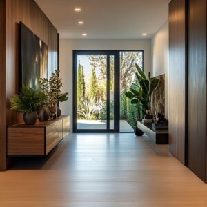
Long-Layout Playbook: Turning Corridor Into Gallery
A long hallway doesn’t need to feel like a stretch of leftover space—it can become a curated passage if each element is used with purpose. At the far end, a pistachio accent wall works like a quiet focal point, anchoring the perspective line and visually shortening the distance.
It adds clarity without shouting. Overhead, slatted ceilings with recessed lighting invite the gaze upward, especially when ceiling height is limited—the glow between slats softens the length and creates visual lift.
Along the corridor, oak-framed wall niches give the sense of progression.

These voids aren’t just storage—they’re pacing devices, each with a built-in glow that makes displayed items seem weightless. The repetition forms a rhythm of pause and movement.
Below, floating benches interrupt the floor without interrupting its continuity. By hovering slightly above stone or timber, they preserve the stretch of material and lighten the visual weight.
These details work together to give the layout intention and avoid visual fatigue, turning a transitional area into something closer to a quiet exhibit.

Subtle Contrast: Black, Bronze, and Brass as Quiet Outlines
In green-focused corridors, contrast isn’t abandoned—it’s just quieted. Thin lines of dark metal, whether in matte black or aged brass, serve as the punctuation marks of the palette.
Instead of competing with the green, these finishes define it. A slim drawer pull, a narrow hook, or the frame of a wall mirror—all become structure for the soft color field.
These accents function like ink around a watercolor edge: they bring order without dominance.

Bronze and brass introduce warmth that blends naturally with olive or sage, deepening the tone without oversaturating it. Matte black, on the other hand, gives grounding to lighter shades—it acts as a visual underline in spaces that might otherwise drift too pale.
These materials aren’t highlights. They’re boundaries, texture frames, and anchoring points—tools that help green live clearly in the space without needing to raise its voice.

Hidden Complexity: Why These Halls Feel Complete
At first glance, many green-toned hallways seem straightforward—calm, balanced, even minimal. But what gives them depth is not how much is added, but how consistently each element responds to the central hue.
The green isn’t isolated to a feature wall or a cushion—it threads itself through polished reflections, fabric surfaces, trim edges, even the base of a lamp or the shade of a stem in a vase. Rather than introducing loud contrast, the visual interest comes from subtle modulation.

A dusty olive wall, for example, may echo in the pale jade of nearby upholstery, which in turn reappears in a tinted glass frame or a tone-matched rug. This approach builds quiet sophistication by removing what isn’t needed.
No sharp accents, no dramatic inserts—just a restrained variation across texture, sheen, and light absorption. This orchestration is often missed on first glance, but it’s the reason the space feels unified without ever feeling dull.
The restraint creates richness by amplifying what’s already present—green becomes the throughline, not the highlight.

Final Thoughts
A carefully designed green hallway doesn’t rely on contrast or decoration—it builds clarity through repetition, balance, and material rhythm. Colour here isn’t secondary—it’s the structure.
Through soft changes in temperature, slight shifts in texture, and the quiet addition of natural materials, the space speaks in layers rather than noise. Instead of asking green to pop, these interiors let it carry the entire composition, influencing pace and perception along the way.
This is how a hallway holds interest without spectacle—through light, shadow, and surface, tuned to the same tone.