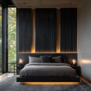
A dark headboard can behave like a quiet piece of architecture inside a bedroom: it changes how the wall reads, how daylight feels, and how the entire bed “sits” in the room. What looks like a simple color choice is often a composition choice.
In many strong black headboard bedroom ideas, the headboard acts as a value anchor that steadies everything else—especially when the room has big windows, tall ceilings, pale walls, or a lot of soft textiles that could otherwise drift into “nice but blurry. ”
Black as a controlled “base note,” not a mood
The most convincing interior designs treat black as a base note that supports the palette rather than a dramatic statement. The headboard becomes the darkest plane in the bed zone, but it’s rarely left alone.
It usually gets a few quiet partners: black window trim, dark sconces, a dark bench cushion, a thin dark frame, or a small charcoal textile. This is how black stops looking like a random heavy object and starts reading like a deliberate system.

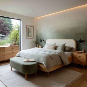
A useful mental model is a value ladder: bright wall → light bedding → mid-tone pillows → dark headboard.
Why this fixes the most common “black looks too harsh” complaint
Most inteiror designs that feel “too stark” are missing the middle step. Without mid-tone fabric between white bedding and a dark headboard, the bed reads like two cutouts: white block, black block.
The value ladder solves that by turning contrast into a sequence, so the eye experiences control instead of shock. The ladder keeps the eye moving in steps instead of jumping from white wall to black object.
When the ladder is missing, black can feel abrupt, almost like a cutout. When the ladder exists, the contrast feels calm and planned.

The “horizon line” effect that makes a room feel finished
One of black’s least obvious strengths is how it creates a horizon line inside the architecture. In tall rooms—vaulted ceilings, high walls, vertical paneling—there’s often too much blank space above the bed.
A dark headboard provides a stable horizontal boundary that tells the eye where the sleeping zone begins. That boundary can be reinforced by a second horizontal gesture: a bench at the foot of the bed, a low dresser line, or even the top edge of a large rug.

This is why bedroom ideas with a black headboard often look instantly “resolved,” even with minimal decor. The headboard is doing the job a full feature wall might do, but with less visual noise.
It contains the bed without requiring more artwork, more color, or more objects.

Wall tone and background behavior
Why does black look soft in some designs and crisp in others? Two interior designs can use the same black headboard and feel completely different because the wall behind it can behave like either a soft backdrop or a bright spotlight.
When the wall reads as “bright paper,” the headboard edge looks graphic and hard. When the wall reads as “soft plaster,” the headboard edge looks calm and intentional.

A useful way to understand wall tone here is not by paint names, but by temperature and softness:
- Warm-leaning light walls (creamy, sandy, gentle greige) make black feel less severe because the contrast carries warmth at the boundary. Black looks like structure sitting inside comfort.
- Cool-leaning light walls (blue-gray, crisp white) make black feel sharper because the contrast reads colder and more clinical. Black becomes more graphic, even if the room is minimal.
- Mid-tone walls (soft clay, muted taupe, smoky mushroom) can make black feel integrated rather than contrasted; the headboard becomes the darkest note, but not the only dark note.
This is one of the quiet reasons black headboards often look best in rooms that already have some warmth present—wood, textiles, or lighting—so the contrast reads designed, not accidental.

Containment: how black can make the bed feel intentional in open space
A bed can feel like it’s merely placed in a room, especially in bright, open bedrooms where the walls and ceiling stay light. A black headboard can create containment—like a soft frame around the pillows—so the bed reads as a designed zone rather than loose furniture.

This containment can show up in different ways:.
- Winged silhouettes: subtle side returns that “hold” the pillow stack and give the bed a protected outline.
- Inset wall fields: a darker rectangle behind the headboard or a panel detail that turns the bed wall into a composed backdrop.
- Built-in feel without literal built-ins: matching dark elements (sconces, trim, bench) that make the bed feel anchored to the room’s structure.
In other words, black bedhead interior design often succeeds when black is used to define a boundary, not to add intensity.

Texture is the real dial: matte, ribbed, woven, tufted, and how each changes the tone
Many people think black is one look. In practice, black changes character based on texture and how it handles light.
Matte upholstered black
Matte surfaces behave like soft shadow. They absorb daylight and lamplight rather than reflecting it, which keeps the room restful.
Matte black is especially effective in rooms with a lot of glazing because it prevents the bed wall from becoming visually “busy” with reflections.

Ribbed or channeled black
Vertical channels add controlled rhythm. The headboard becomes a textured field that can stand up to large walls without needing large art.
Channeling also makes black feel less flat; light catches the edges softly, so the dark surface gains depth without shine.
Woven or cane infill within a black frame
A black frame with a lighter woven center is a smart way to keep black present but breathable. The eye reads the black outline as structure, while the woven center prevents the bed from becoming a solid dark slab.
It’s a quiet way to make black feel lighter in bright rooms.

Tufted black
Tufting can easily feel busy in dark colors because every button creates a shadow. The best tufted examples keep the surrounding palette very calm, then let the tufting act like controlled micro-texture.
This is why black tufted headboard bedroom ideas often look most refined when the wall and bedding stay simplified and the lighting is warm and even. This texture logic is at the center of strong black headboard design: the color is consistent, but the surface behavior is tuned to the room’s daylight and mood.

Nine headboard looks, described by what they do
Instead of categorizing black headboards by “style labels,” the strongest way to explain them is by what problem they solve visually:
- The quiet slab: reads like a single calm plane; best when the room already has enough texture elsewhere.
- The channeled field: adds rhythm without pattern; holds up on tall walls because light creates depth along the channels.
- The framed center: black outline gives structure while the center stays breathable; the bed feels lighter in bright rooms.
- The winged boundary: makes the pillow stack look contained and finished; the bed feels protected, not floating.
- The panel-wall partner: the wall does the architecture job, the headboard does the depth job; the room looks designed with fewer objects.
- The leather-like sheen: makes black feel crisp and tailored; needs soft textiles nearby so it doesn’t go hard-edged.
- The tufted micro-shadow: turns black into a field of tiny shadows; works best when everything around it is simplified.
- The low headboard calm: reduces drama; black becomes grounding rather than statement.
- The tall headboard horizon: solves tall walls fast; the bed zone feels complete even with minimal decor.
Two common patterns:.
- Warm pools on light walls: black becomes a calm silhouette against gentle gradients.
- Warm grazing on wood slats: the wood becomes the luminous background, and the headboard reads as depth in front of it.
This solves a common problem: black can feel sharp when the room’s light is cool or when the wall behind it is a flat, bright white. Warm light makes the contrast feel intentional and comfortable instead of stark.

Black paired with wood: why it reads modern instead of heavy
Black and wood is a classic pairing, but the best designs aren’t simply dark + warm. They’re usually carefully proportioned so wood reads as warmth and black reads as structure.
A strong approach is to let wood carry the larger field (a slatted wall, wide nightstands, a dresser), then keep black concentrated in the bed zone. When black spreads too widely—headboard, dresser, nightstands, frames, lamps, plus dark bedding—the interior design can start feeling compressed.
When wood carries the warmth and volume, black can stay calm and clean. Warm wood nightstands next to dark headboards are doing temperature work: the wood softens the black edge where your eye naturally rests (right around the pillows and lamps).
It makes the bed wall feel welcoming without adding extra décor.

Bedding and Pillows as translation: how soft layers keep black from feeling severe
A dark headboard has a strong outline. The bedding is what decides whether that outline feels harsh or inviting.
The most successful compositions don’t rely on “busy” patterns; they rely on textures that scatter light and soften edges.

This is where black headboard bedding ideas become less about color matching and more about surface strategy:
- Tonal light neutrals (cream, off-white, pale greige) give black a clean, calm contrast.
- Mid-tone cushions (stone, taupe, warm gray) create an in-between step so black doesn’t jump straight into white.
- One warm accent (rust, cognac, tobacco, clay) adds temperature so the palette feels human rather than graphic.
The warm accent is often placed in a controlled way—commonly as a lumbar pillow. A lumbar shape acts like a “belt” across the bed: it compresses the pillow composition and makes the bed look styled even when the top pillows are relaxed.
That’s a subtle styling reason so many polished rooms use a long, warm pillow rather than multiple small colorful cushions.

Pillow stacks that repeatedly look finished with black
Certain pillow structures work unusually well with a black headboard because they create depth without looking busy.
- The soft triangle stack: two large light pillows create the outer shape, two mid-tone pillows create the inner step, then one warm lumbar “locks” the center. The warm lumbar is small but powerful: it turns the bed from “neat” to “styled” by adding one controlled temperature note.
- The monochrome-with-one-warm-note: white/cream base, charcoal or warm gray as the middle step, and a single warm accent that is longer than it is tall. The long shape reads calm because it behaves like a horizontal line, not a scattered color.
- The texture-first neutral: keep colors nearly the same but change surfaces—linen-like, knit-like, nubby, smooth—so the bed reads rich without extra pattern.
Throws also behave differently against black. A throw placed dead-center can make the bed look stiff; an off-center drape softens the composition and prevents the bed wall from feeling like a showroom display.

The bed frame and the second anchor: grounding the room at floor level
A black headboard can look top-heavy if there’s no dark element near the floor. Many strong rooms quietly solve this by echoing dark tones at the base: a dark bed frame, a bench with a dark cushion, or a slim dark leg line.
This is where black bed frame decorating ideas become a balance tool. A dark base makes the bed feel grounded, while a large pale rug keeps the interior design bright.
The rug often does double duty: it creates a clean “island” under the bed and introduces low-contrast pattern that visually hides everyday life without looking busy. That combination—dark base, pale rug, light bedding—lets black feel steady rather than heavy.

Symmetry, asymmetry, and the “distribution of weight” trick
Bedrooms often aim for symmetry: centered bed, matching lamps, matching nightstands. But some layouts can’t cooperate—windows, doors, off-center walls, narrow rooms.
The strongest interior design examples don’t force symmetry; they create balance by distributing visual weight.

A dark headboard can carry weight on one side of the room while daylight and negative space carry weight on the other. A tall black-trim window can counterbalance a darker bed wall.
A single piece of art and open wall can counterbalance a slatted feature panel. This is a quieter, more modern type of balance than “everything matches.
”.

This is one of the deeper reasons black headboard decorating ideas can look so convincing in real homes: the headboard gives enough structure that the room can tolerate asymmetry without looking unfinished.

The “frame wall” approach: making black look intentional without making the room dark
One popular idea is the frame wall: a composed wall field behind the bed that supports black without requiring a fully dark-painted room. It might be subtle paneling, a softly defined rectangle, or a vertical rhythm that the headboard interrupts.

Art above black: scale that feels calm instead of top-heavy
Art over a black headboard fails in two common ways: it’s too small (so the wall feels unfinished) or too loud (so the bed wall becomes a competition). The most convincing design compositions treat art as a bridge plane—a quiet object that connects the wall’s lightness to the headboard’s depth.

A consistent proportion pattern shows up in strong rooms: the artwork reads visually narrower than the headboard, but not tiny. That “slightly smaller” relationship makes the headboard feel like the foundation and the art feel like the finishing layer.
When art matches the headboard width exactly, the wall can start to feel like one big rigid billboard.

Tone matters as much as size. Art that works best above black often carries:.
- large light areas (so it relates to bedding and wall),
- a small amount of warm tone (so it relates to wood and textiles),
- and a restrained dark note (so it relates back to the headboard without repeating it loudly).
This is why calm landscapes, soft abstracts, and low-contrast drawings repeatedly show up in polished bed walls: they stabilize the composition rather than trying to “win. ”.

The headboard becomes the dark insert within a lighter architectural frame. That frame does two things:.
- It gives the bed wall a reason for being the focus.
- It prevents the room from feeling dark because the surrounding surfaces stay light.
The result is a bedroom design that reads designed with minimal objects: the wall has structure, the bed has anchor, the lighting adds glow, and the palette stays calm.

Micro-choices that change the whole mood
In more polished interior designs, the “big” choices (black headboard, light walls, warm wood) are supported by small decisions that quietly keep everything controlled:.
- Thin black lines repeated sparingly: window trim, sconce arms, art frames. Thin lines make black feel part of the architecture instead of a lone furniture color.
- Warm metals used as a soft counterpoint: brass-like finishes near black create warmth and keep the dark tones from reading cold.
- Plants used as shape softeners: a small organic silhouette near a strict headboard helps the room feel lived-in without adding clutter.
- One tactile throw placed off-center: a casual drape breaks the “hotel symmetry” and makes the bed feel welcoming while still styled.
- Artwork chosen for bridging, not drama: pale art with a hint of warm tone often sits best above black because it connects wall color, bedding, and headboard in one quiet move.
Why black can feel calm, even in bold rooms
Black also works in interior designs that lean into color—terracotta walls, clay textiles, warm accent pillows—because it acts like a stabilizer. Bold wall color can feel energetic; black gives it a calm edge.
The trick is keeping the rest of the composition disciplined so the headboard remains structure, not competition.

That’s why a dark headboard pairs so well with warm rust accents: the warm note adds comfort, black adds order, and light bedding keeps the room open. In many strong bedroom ideas with a black headboard, the emotional result is not dramatic.
It’s steady, quiet, and designed—black used as the calm line that holds the room together.

A quick map of black headboard looks
Different background of black headboard bed behavior and different kinds of warmth. Below is a compact map of distinct compositions:.
- The bright-frame anchor: pale walls + bright bedding + black headboard as a clean silhouette, with one thin dark line repeated somewhere else (window trim, art frame, sconce arm) so the black reads like part of the room’s outline.
- The warm-wood counterweight: wood carries the large surfaces (nightstands, dresser, a wood field), while black stays concentrated at the bed so the room feels warm-first, structured-second.
- The soft shadow bed wall: black headboard on a slightly warm wall tone, with matte textiles and gentle wall lighting that creates gradients; the whole bed zone feels like shadow control rather than contrast drama.
- The “thin black” system: the headboard is the main black mass, but everything else is thin—slim frames, narrow sconce arms, narrow window lines—so black reads precise, not heavy.
- The textured-black calm: the headboard surface carries the interest (channels, ribs, micro texture), while art and accessories stay quiet; the wall becomes a background and the headboard becomes the only “pattern.”
- The coastal black: black headboard plus airy light bedding and pale floor/rug, with small black repeats that keep the room from feeling washed out; warmth comes from sand tones and soft textures, not from more objects.
- The bold-wall stabilizer: a colored wall (clay, terracotta, muted rust) carries mood, and the black headboard acts like a stabilizing border that keeps the color from feeling noisy.
- The built-in illusion: the bed wall has containment cues (a shelf line, a panel field, a framed rectangle), so the headboard looks “assigned” to that wall instead of simply placed there.
- The hotel symmetry made human: matching lamps and nightstands set order, then one small asymmetry (a casual throw drape, one organic shape, one off-center object) keeps it lived-in, not staged.
- The tall-wall horizon fix: black headboard creates a horizontal boundary that makes high walls feel finished; the rest of the wall stays calm so the eye reads structure, not emptiness.
- The black base + light island: a dark bed base plus a large pale rug builds a grounded bed “island,” so the headboard doesn’t feel top-heavy.
- The art-bridge wall: one calm artwork above black acts as a connector between wall tone and bedding tone; art is selected for bridging value and warmth, not for loud contrast.

Common failure modes (and the design logic that prevents them)
Black headboards tend to go wrong in repeatable ways, and each one has a visual cause—not a “taste” problem.
- The floating rectangle: the headboard looks detached because black appears only once. The fix in strong rooms is never “more decor,” it’s one or two quiet black repeats that connect the bed to the room’s outline.
- The harsh cutout: black looks too sharp because the middle value step is missing. Adding a mid-tone fabric layer between white bedding and black turns the contrast into a controlled sequence.
- The heavy corner: the bed wall feels weighty because everything near it is dark. Strong rooms concentrate darkness at the bed and let the rug, bedding, and surrounding walls stay lighter so the headboard reads as structure, not compression.
- The busy black: tufting or strong texture looks fussy when the rest of the room is also detailed. The best examples let one surface carry the interest and keep the rest calm.
- The confused focal wall: when art and headboard both compete, the wall feels restless. Calm art that bridges tones (instead of shouting contrast) keeps the bed wall settled.

A unifying idea
Taken together, black works best when it is treated as structure, supported by soft textures, warm light, and a clear value ladder. It’s less about adding objects and more about making the existing surfaces—wall, bedding, wood, light—behave in a coordinated way.
That’s the quiet reason so many black headboard interior design concepts look finished with surprisingly little decor: the headboard isn’t decoration. It’s the organizing element that makes everything else look intentional.