A black backsplash paired with white cabinetry may sound like a simple design move, but in practice, it unfolds into something far more layered. This high-contrast pairing opens the door to nuanced surface decisions, tonal shaping, and refined material play.
Rather than relying on bold color or elaborate motifs, the strength of this combination lies in how it organizes the room visually—through structure, rhythm, and restraint. What makes a dark backsplash with white cabinets feel compelling isn’t the contrast alone.
It’s the way texture changes how the wall holds light, how sheen affects reflection, and how small elements—like hardware or shelving—quietly link surfaces across the space. The contrast becomes a backdrop for clarity, giving shape to each decision made across cabinetry, countertops, lighting, and layout.
Across many kitchen designs that lean into this palette, the focus shifts from visual noise to controlled layering—of finishes, temperatures, and angles. Even the quietest details, like the direction of wood grain or the angle of LED lighting, contribute to how balanced or sculptural the final composition feels.
Whether matte, brushed, or glossed, the dark surface isn’t simply applied—it’s shaped to respond to every surface around it. This article looks deeper into the design techniques and visual choices that make the black and white kitchen more than a high-contrast trend.
It explores how surface treatment, framing, undertones, and material relationships give this pairing its visual strength—and how those choices shift the kitchen from ordinary to refined without ever chasing attention.
The Wider Picture: Why Darkness Works Beside White
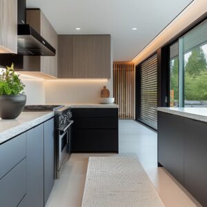
A dark backsplash with white cabinets doesn’t overwhelm the room—it sharpens it. The contrast between deep surfaces and bright cabinetry isn’t used for visual drama but for clarity and structure.
The darker background behaves almost like a backdrop in a lightbox, catching no glare, absorbing ambient noise from reflections, and allowing every line and finish in the foreground to stand out more distinctly. Edges look cleaner.
Hardware appears more defined. Even the grain in a pale wood shelf can feel more tactile when set against a low-luster black surface.
This effect isn’t achieved through color theory alone—it’s driven by the deliberate absence of brightness in key surfaces. Matte black tiles, honed dark stone, and textured ribbed panels absorb light selectively, which subtly reshapes how the entire wall is perceived.

Instead of creating a spotlight moment, the dark wall holds back just enough to let the brighter elements around it do the visual work. White cabinets don’t glow on their own—they glow because the black behind them steps out of the way.
This isn’t about darkness for contrast’s sake; it’s about using shadow and restraint to frame structure and shape with more control. In kitchens that aim for clarity without excess, the black backsplash with white cabinets setup becomes more than a combination of opposites—it becomes a method of revealing precision through calm, consistent contrast.

Movement Without Color: Pattern Direction & Rhythm
Even in a monochrome palette, motion is introduced through:
| Direction cue | Visual effect | Quiet trick |
|---|---|---|
| Chevron & herringbone | Diagonal drift softens rigid cabinetry and lengthens the wall | Gold veining or fine grout written on the bias doubles the sense of motion |
| Vertical ribs & shiplap | Height is exaggerated; cabinets feel taller; ventilation hoods seem sculptural | Minimal shelf bands slice across the verticals, creating a controlled pause |
| Horizontal planks & stacked stone | Kitchen feels wider; eye travels along the cook line | Under-cabinet light washes exaggerate shadow within grooves |
Hidden pattern logic: Designers choose grain direction to rebalance room proportions—tall rooms get horizontal planking, low ceilings get vertical ribbing.

Reflectivity Gradients: A Quiet Play of Shine
Not all dark backsplashes behave the same way. Some reflect every flicker of light, others soak it in completely.
What gives these kitchens visual dimension is the use of layered reflectivity—carefully choosing how much shine, shimmer, or softness a surface sends back into the room. Polished glass panels, porcelain slabs, and high-gloss marble behave almost like mirrors.
They bounce back everything: pendant lights, the movement of a hand, even the shape of the window across the room. These surfaces don’t add color—they echo the room itself, building a live image of what’s around them.

Then there are the mid-level finishes—brushed metals, honed marbles, soft-gloss glass. These cut the brightness down to a subtle glow, catching only the edges of pendant lights or the curve of a nearby faucet.
The effect is more muted, but it still builds layers, especially under warm LED lighting. Finally, there are finishes that don’t reflect at all.
Velvet-matte acrylic, ribbed black wall panels, painted wood shiplap—these surfaces pull light in and hold it there. By removing reflection entirely, they allow pale countertops and brass accents to shine without competition.
Their quiet presence gives the rest of the kitchen a cleaner, more organized feel.

What’s often overlooked is how these finishes are paired. In most cases, a single bright or reflective accent—a chrome tap, a glass pendant, a polished bar pull—is positioned against a soft, non-reflective wall so it floats in the space without visual clutter.
This subtle pairing creates depth without heaviness, using contrast in sheen instead of contrast in color. This layered use of gloss and matte, reflection and absorption, is what turns a black backsplash into something sculptural.
And when applied thoughtfully, it becomes a defining element in the atmosphere of a white-based kitchen without ever raising its voice.

Texture as Contrast, Not Just Tone
Black without surface texture can quickly fall flat beside crisp white cabinetry. That’s why so many kitchens using this contrast build depth through layered physical texture, not color.
The goal isn’t to make the wall busier—it’s to give it dimension that holds up under changing light and angles. Layered stone or stacked slate introduces miniature valleys and peaks where under-cabinet lighting plays across shadows.
The result is a surface that shifts subtly with the time of day, never static, never dull. Even under soft lighting, these materials appear more active, almost flickering in place.
Wood-look porcelain and bookmatched veneer go in a different direction. These bring a soft imprint of wood grain memory into the space, calling back to other features like islands, flooring, or open shelving.
The use of repetition in the grain—especially when mirrored horizontally or vertically—gives the wall a natural logic that anchors the palette without pulling attention.

Then there are materials with fine-line surface structures, like ribbed acrylic or tight shiplap paneling. These introduce rhythm through micro-grooves.
They elongate the wall visually, stretch the cook zone vertically, or break up a heavy plane of black with silent, tidy order. A key move repeated in many high-end kitchens is that this texture stays confined to the backsplash itself.
Counters, floors, and cabinetry rarely mirror it. That separation is intentional—it preserves the backsplash as its own design field.
The result: a wall that carries contrast not through color, but through tactile restraint. It turns black into structure, not shadow.

Temperature Pairings: Warm vs. Cool Dark Tones
There’s no such thing as just “black” in today’s kitchen design. What first appears as a single deep shade often hides warm or cool undertones that completely shift the feel of the space.
Whether the black leans toward bronze, smoke, or steel makes all the difference—and these subtle cues shape everything around them. Warm blacks bring in red, brown, or ochre shadows.
Think bronze-glazed tiles, charcoal porcelain with earthy clouding, or black glass backed by walnut-toned finishes. These are paired with brass hardware, saddle-tone bar stools, or soft oak flooring to reflect those sun-baked notes.
The entire space leans cozier, like filtered light at golden hour.

On the other side, cool blacks push into blue, graphite, or storm gray territory. Gunmetal glass tiles, brushed aluminum panels, or matte charcoal acrylics lean colder.
Here, the balance comes through stainless fixtures, blue-gray countertops, and cooler LED whites that keep the tone crisp without feeling cold. One detail often goes unnoticed but plays a big role: the countertop is usually the middle ground.
It doesn’t try to match the cabinets or backsplash exactly. Instead, it quietly mediates between the warmth of the floor or the chill of the backsplash.
This might be a marble with soft beige veining in a warmer palette or light quartz with icy speckles in a cooler one. This subtle shift in undertone—from warm to cool or somewhere in between—helps kitchens with white cabinets with a dark backsplash feel balanced, not divided.
The temperature pairing acts like an undercurrent, guiding how each material relates to the next without relying on contrast alone.

Bridging Elements: How Designers “Tie the Knot”
A dark backsplash without surrounding support can feel like an isolated block. That’s why thoughtful kitchens introduce linking elements that carry the darker tones into other parts of the room—not by matching them exactly, but by weaving them across surfaces in subtle, deliberate ways.
Open wood shelving is one of the most consistent bridges. A warm plank of oak or walnut stretched across a dark tile or acrylic wall serves as a connector—not only softening the surface, but also recalling the tones used elsewhere in the room.
Whether matched with the island finish or echoed in the flooring, this wooden band gives the dark area a purposeful tether to the rest of the kitchen.

Then there’s the use of hardware finishes. Pulls, taps, and lighting caps don’t simply echo the color of the backsplash—they mirror its sheen.
Glossy black slabs are matched with polished accents; matte stone is paired with brushed or powder-coated hardware. This quiet coordination creates consistency without repetition.
A third technique is the island echo. A charcoal-toned island base or waterfall edge counter can extend the presence of the backsplash into the foreground.
Instead of one dark wall standing apart, there’s a loop of tone that brings balance to the space. What often goes unnoticed is how these connectors are arranged on intersecting lines.
Vertical shelving may cut across horizontal plank tiles. Flat counters might contrast with ribbed walls.
This cross-pattern layout adds structure without symmetry, helping the room feel natural—not staged, but grounded. In kitchens that use a black kitchen backsplash with white cabinets, these bridging moves ensure the dark surface isn’t left to carry the contrast alone—it becomes part of a larger visual dialogue.

Framing & Containment
Sometimes contrast works best when it’s held inside a boundary. In several modern kitchens, dark backsplashes are framed the same way art is framed—set into recesses, bordered by trim, or lit with edge lighting that defines their limits.
These moves don’t shrink the dark field; they give it shape and purpose. A herringbone pattern set into a cooktop alcove doesn’t spread across the room.
It stays framed within white cabinets, making its texture feel concentrated, even sculptural. Likewise, a brushed metal sheet tucked between brick pilasters feels intentional rather than improvised.

One of the most subtle yet impactful methods is the use of under-cabinet LED lighting that outlines the upper edge of the backsplash. This wash of light adds a backlit effect, causing the black surface to visually float off the wall like a panel.
Even traditional details play a role. Crown molding on upper cabinetry, for example, sets a visual top boundary, giving the wall a sense of completion.
It also prevents tall black surfaces from climbing endlessly upward, which can make a room feel off balance. These framing methods work particularly well with bolder materials—like iridescent glass mosaics or sculptural bronze tiles—because they control the surface without muting its impact.
The result is clarity, not containment. The eye knows where the statement starts and stops, which makes the entire room feel calmer and more intentional.

Mixed Sheen Dialogue
A single black finish can feel too uniform—too flat—especially in a kitchen with little color contrast. But introduce two types of sheen side by side, and the same monochrome surface suddenly gains structure, weight, and motion.
One example: a brushed black aluminum backsplash placed behind an ultra-gloss black island waterfall edge. The wall holds a soft, clouded reflection, while the island bounces back overhead lights and window views in sharp lines.
These differences in reflection create visual tension without visual clutter.

Another: a honed black marble slab paired with a matte black vent hood. The marble picks up subtle daylight across its veining, while the hood above absorbs light and defines silhouette.
It’s not about contrast in color—it’s contrast in how light behaves on each surface. These mixed finishes serve as visual resting points.
A highly reflective field can become overwhelming on its own, just as a full matte environment can start to feel heavy. But the pairing of one against the other gives the eye micro-breaks.
Much like how a matte border frames a glossy photograph, the interaction between finishes builds structure into the composition. In kitchens that use a mostly black palette, this sheen layering adds depth in the quietest way.
No pattern. No grout lines.
Just carefully tuned surfaces playing off one another.

Light as Paint
Lighting doesn’t just reveal a backsplash—it alters how it looks entirely. In spaces that feature dark surfaces, the light source and color temperature become as critical as the tile or panel itself.
Warm LED strips tucked under upper cabinets often bring out the bronze cast in a porcelain fish-scale tile or soften the edge of a deep metallic gloss. In some kitchens, this glow leans amber, highlighting natural wood tones in open shelving or flooring as well.

In cooler climates or minimalist layouts, neutral white lighting is used instead. These strips preserve the true tone of charcoal-colored surfaces, especially those in satin or soft-matte finishes.
The lighting doesn’t shift the color—it reveals it with precision. Then there’s directional lighting—a small sconce placed to the side of a textured porcelain wall, for instance.
The light travels across the surface slowly, catching micro-grooves, rough patches, or clouded patterning. This angled wash gives the wall more texture than it shows in still daylight.

What’s rarely discussed but always impactful is how light is tested against the chosen backsplash material on site. Instead of picking the lighting first, the backsplash is viewed under multiple temperatures—allowing the final effect to be tuned in real time.
That’s how the subtle gold in gunmetal tile emerges, or how a matte acrylic surface avoids turning flat gray. The lighting isn’t just a utility—it becomes the final surface treatment, defining what textures pop, which reflections stay soft, and how the dark plane behaves once the kitchen is lived in.

Closing Thoughts
What may seem like a basic contrast between black and white often carries far more intention than it first reveals. Behind the calm surface of a black backsplash lies a series of layered decisions—directional texture, sheen balance, temperature tuning, and spatial framing—each contributing to how the space feels, not just how it looks.
Black isn’t treated as a color—it’s treated as structure. It defines the edge of a walnut shelf, sets a soft glow under brass lighting, and catches the line of marble veining like a frame.
Used this way, darkness doesn’t dominate—it supports. It’s shaped to hold light where it matters and disappear where it doesn’t.
The key is in the quiet coordination. Every element—gloss against matte, warm wood beside cold tile, narrow grooves intersecting wide panels—is placed to build clarity and control.
That’s how black becomes sculptural without being loud. And why white doesn’t just stand out—it becomes sharper, more grounded, more purposeful.
In these kitchens, contrast isn’t used to divide the space. It’s used to anchor it—to bring rhythm, shape, and restraint.
That’s what gives a black-and-white kitchen its edge without shouting for attention. It’s not about visual tricks.
It’s about how small material shifts, placed with intention, create a room that feels tuned rather than arranged.