Grey dining rooms are often misunderstood. To some, grey may seem flat or cold—but when handled with care, it becomes something entirely different: a background that brings everything else into sharper focus.
The current direction in design shows a clear preference for restraint, but not emptiness. Such spaces aren’t about adding more—they’re about using less in smarter ways.
This article explores the visual decisions that shape modern grey dining rooms—how color is pared back so texture, shape, and shadow can take the lead. From curved furniture forms that soften strict layouts, to shelving that punctuates walls like quiet breaks in a sentence, every move serves a reason.
Even the light itself becomes part of the material palette. What makes such rooms compelling isn’t contrast—it’s clarity.
A single well-placed object carries more weight than a mix of patterns. A shift in undertone changes the room’s mood without moving the palette.
And the spaces left blank are never afterthoughts. They’re planned with the same care as the filled ones.
Grey as a Silent Architect
Grey doesn’t shout, and that’s exactly why it can shape a space so effectively. In many current grey dining room ideas, this color plays a structural role—quietly outlining boundaries, tracing forms, and giving shape to transition points.
Rather than acting as decoration, grey works like a subtle sketch beneath everything else. You’ll often see this effect in rooms where the walls are divided by panel grids, fluted verticals, or horizontal plank cladding.
These features don’t compete with furniture—they support it. The way light glides across the raised surfaces creates shadow seams that hint at depth, even when the construction is relatively flat.
It’s a smart way to frame a dining area without crowding it visually.

In lighter compositions, trim work can be reduced to a whisper. Instead of bulky frames, a slim strip of black or charcoal might outline a window arch or skim the top edge of a niche.
These lines aren’t loud, but they carry weight. They read like inked borders—fine, confident, and deliberate.
Letting grey carry the framework like this means walls can stay pale and open while still commanding shape. It’s a layout move wrapped in color choice.
The result is a type of spatial rhythm that can anchor even the softest room without dominating it.

Micro-Textures Trump Hue Shifts
Color often gets too much credit when it comes to how a room feels. In the most restrained grey dining rooms, the standout element isn’t a dramatic shift in tone—it’s what happens within the same narrow range of values.
The key lies in texture, not tint. Soft grasscloth wallpaper is a frequent player in modern settings.
Its barely-there pattern gives flat surfaces a woven, fabric-like quality that glows softly in natural light. Without changing the color, the wall gains motion.
It picks up daylight differently depending on the time, creating subtle zones of brightness and shadow.

Upholstery does the same at a closer range. A grey boucle chair placed near a grasscloth wall doesn’t compete—it complements.
The textures nod to each other across the table, like quiet neighbors sharing a story. It’s this kind of repetition that creates atmosphere through surface rather than contrast.
Even plaster, especially when applied with a hand-finished technique, can act like a moving backdrop. A wall finished in soft Venetian grey might appear completely smooth at first glance.
But as the light angle shifts, so does its visual weight—what seemed flat a moment ago starts to show waves, layers, and brush marks. This kind of approach makes the color feel dynamic, even if it’s technically still.
It’s a way of adding richness without ever changing the core palette. The result is a setting where grey becomes more than a tone—it becomes a tactile layer that responds to the room’s movement, time of day, and softness of shadow.

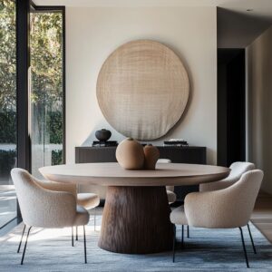
Curves Calm the Grid
There’s a quiet tension in many grey modern grey dining room ideas—and it comes from how soft lines are allowed to interrupt strong structure. In rooms where walls are divided into strict verticals or long horizontal planes—through panels, beams, or grid-style millwork—it’s often the rounded details that pull the space back into balance.
Circular rugs, especially those centered beneath round dining tables, bring that soft interruption. They act like visual pauses, giving the eye a place to land in the middle of an otherwise rectilinear setup.
These circular forms don’t compete with the grid—they answer it. Their presence in the center of the floor calms the pattern play without dulling it.

Arched doorways and shallow wall niches offer the same effect, but higher up. Where rectangular door frames and squared-off openings keep the eye moving in lines, a curve cuts through that rhythm and slows it down.
A well-placed arch doesn’t steal focus; it makes the room feel like it’s been exhaled slightly—less rigid, more open, easier on the eyes. Even minor gestures—a curved chair back, a softly rounded light fixture—can smooth out a space shaped by geometry.
These forms work not by contrast but by moderation. They gently settle into the sharpness and round the mood.
One decisive curve, properly placed, can soften the entire room without changing a single wall.

Warm Metal as Subtle Pivot
Among modern grey dining room ideas, you’ll often find that brass, gold, or bronze accents are not there to show off. They serve a purpose—but it’s quieter than people expect.
In a space defined by cool tones and layered greys, even the smallest bit of warm metal can shift the entire visual temperature. Slim wall sconces, especially those in a brushed brass or muted gold, can introduce a soft gleam right where grey starts to feel too flat.
Their effect is gentle—they don’t call for attention, but they shift the way nearby surfaces look. You see it as a glow rather than a glare.

A single dome pendant, with a burnished interior or low-luster finish, hovers with presence. It acts like a reflection pool for light, creating a golden moment in the middle of a cooler setup.
Unlike polished metals that bounce too much brightness, these matte tones create stillness. They let light hover rather than flash.
The point isn’t to overwhelm the space with shine—it’s to let the grey breathe against something warmer. In fact, one thoughtfully placed detail in warm metal can carry more weight than an entire fixture set.
The contrast is psychological as much as visual. It shifts the mood, not the palette.
Used sparingly, warm metal elements act as pivot points. They steer the eye, center the table, and keep the overall composition from feeling distant or static.
Against matte graphite or soft plaster greys, even a thin line of brass feels full of presence.

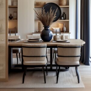
Shelving as Visual Punctuation
In dining rooms shaped by tone and texture, floating shelves serve as more than surface extensions—they act like line breaks in a long paragraph of grey. These aren’t functional leftovers or afterthoughts.
They’re part of the rhythm. Whether thick-cut slabs of natural wood or slender painted planks, these shelves slice through grey backdrops with intentional spacing and deliberate alignment.
When shelves are used as part of the wall composition, they divide planes horizontally, giving structure without heaviness. A row of ceramics, a single branch in a matte vase, a stacked book or two—these small inclusions gain weight because they sit in a field of restraint.
They read as punctuation. Nothing feels random.

Niches add another level. Recessed into grey walls, they offer framed zones of visual quiet.
And with soft lighting built inside—whether a hidden strip or a pinpoint glow—each object placed becomes an anchored moment. Even one sculptural piece gains quiet drama, not because it demands attention, but because the wall has cleared the stage around it.
This is a key design approach in small grey dining room ideas, where every surface matters. Instead of filling every shelf or overloading every ledge, the spaces in between are given equal weight.
The emptiness is part of the design. Here, shelving doesn’t carry the room—it punctuates it.

Layered Upholstery Keeps Seats from Looking “Set Around a Table”
Uniform seating might be practical, but it often flattens the shape of a dining room. That’s why mixing upholstery types—especially benches with chairs—is a recurring move in refined grey settings.
It adds depth, variation, and a bit of visual flexibility.
- Built-in banquettes, often upholstered in subtle grey textiles, create a strong horizontal base. These fixed seats wrap corners or run the length of a wall, letting the table appear to float in front. In contrast, the standalone chairs introduce height changes and edge definition. Together, they create a silhouette that feels composed, not repetitive.
- Slip-covered or skirted chairs do something else entirely. Their soft drape hides the understructure and lets the table legs remain visible, lightening the bottom half of the room. They move gently with air, shadow, and proximity to windows—never harsh, never stiff.

This layering of seating types avoids the stiff predictability of a circle of identical chairs. Instead, it builds a composition.
The dining zone becomes a volume, shaped not just by what’s on the floor, but by how the pieces relate to each other. High and low, tight and soft, open and enclosed—all of it plays into the atmosphere without needing anything loud.
It’s a subtle way to draw attention to shape instead of similarity. And in restrained rooms, shape is everything.

Rugs Mirror or Intentionally Contradict Geometry
In most thoughtfully composed dining rooms, the shape of the rug isn’t an afterthought. It’s part of the structure.
Designers don’t randomly place a rug beneath a table—they make a drawing choice. And that choice often plays with geometry either through harmony or through calculated tension.
- Circle-on-circle layouts, where round rugs sit beneath round tables, feel intuitive at first—but what’s happening is more deliberate. These pairings act like visual centers of gravity. They calm the room, draw attention inward, and help keep focus at table level. There’s a meditative rhythm in that kind of repetition.
- On the flip side, a rectangular rug under a round table throws that calm slightly off balance—in a productive way. It keeps the viewer’s eye alert. That shape contrast creates a kind of gentle visual push and pull: the linear boundary of the rug sets the scene, while the curved table breaks through the grid.
- Even more subtle are rugs with fine stripe patterns or basketweave textures. These don’t shout for attention, but they mirror the rhythm of nearby surfaces—panel molding, fluted walls, or even ceiling beams. The echo is quiet but noticeable. It’s a way of keeping the floor in conversation with the walls.
In rooms shaped by restraint, rug geometry becomes a language of its own—sometimes matching, sometimes interrupting, always intentional.

Grey as Daylight Canvas
In a color family where tone holds more importance than hue, grey makes the perfect background for light to show its range. Unlike warmer or bolder colors that shift light toward yellow or bounce back with energy, grey stays still—letting sunlight behave the way it wants to.
It doesn’t color the light. It just carries it.

High-set windows make this especially clear. When light slides across grasscloth wallpaper or matte plaster walls, it produces a slow, moving pattern across the room.
A grey wall becomes the surface where daylight traces its path—sometimes bright, sometimes soft, always changing. These shadows aren’t flaws—they’re the main feature.

In some spaces, that same effect happens through materials. Skylights can bring clarity to terrazzo—small reflective flecks catch the sun and sparkle briefly, like water rippling under cloud cover.
Quartz surfaces with subtle grey veining shift from flat to expressive as the sun moves, highlighting mineral traces that would otherwise stay hidden. The most compelling light patterns in grey rooms don’t come from decoration.
They come from what the sun does to surfaces. And because grey doesn’t interfere, the room stays open to it.
In this kind of space, light becomes the artwork—subtle, unforced, and always moving.

Objects Chosen for Silhouette, Not Color
In many grey dining spaces, shape holds more power than color ever could. Accessories are chosen not to contrast, but to stand out through their form, scale, and exact placement.
This subtle method builds impact from restraint. One recurring visual move is the use of black-and-white gallery grids.
These collections of framed pieces—line drawings, landscapes, or minimal compositions—gain their force from alignment and repetition. Strict spacing between the frames makes the wall read like a single composed surface.
The color range doesn’t change, but the graphic weight holds attention.

Dried branches in oversized vessels often add a deliberate shift in direction. While most of the room remains low and wide, a single tall branch set against a pale wall changes the pacing.
It pulls the eye upward. The tone stays soft, but the gesture is strong.
It’s a vertical break in an otherwise horizontal rhythm.

Then there’s the stillness of a single sculptural bowl or vase—placed dead center on the dining table. These aren’t centerpieces made for variety.
They’re anchors. Their mass and clarity do more for the mood of the room than any color pop ever could.
Think of them as punctuation marks at the end of a clean sentence.

In a setting built on greys and neutrals, one striking form reads louder than a handful of small decorations. That’s the power of silhouette—quiet, direct, and more than enough.

Tiny Shifts in Undertone Guide Mood
Not all greys are equal. In rooms where atmosphere depends on balance, small shifts in undertone can change the emotional feel of the space completely—without ever altering the palette.
- Cool-leaning smoke greys, often tinged with blue or steel, feel clearer and more open. These work well in northern exposure, where natural light tends to be cooler. They reflect that quality back into the room, keeping the space aligned with the environment outside.
- In contrast, warmer putty tones or soft greige appear softer and more grounded. They sit more comfortably in rooms that face sunlit areas or receive golden light during the afternoon. On moldings, trims, or wainscoting, these warmer greys offer quiet support and help connect soft fabrics or natural wood tones to the walls around them.
- Another method used in fine-tuned palettes is dual-tone upholstery. Chair shells, for instance, might feature one grey on the outer surface and a warmer or cooler tone on the interior—barely noticeable at first glance, but effective in creating subtle depth and shadow around the seating. It gives form more dimension without disrupting the visual calm.
In short, adjusting undertones—not brightness or saturation—can shift the atmosphere of a room throughout the day. Light moves, surfaces change slightly, and mood follows.
That’s the quiet logic behind grey that feels layered, not flat.

Negative Space Is Treated as an Ingredient
In many refined dining interiors, what’s left unfilled becomes just as meaningful as what’s installed. Such rooms don’t rely on decoration to build presence—they work with absence as a visual tool.
Negative space isn’t overlooked—it’s carved out on purpose, shaped to guide the eye and ease the rhythm of the layout.

One of the most effective examples is the console void—that long strip of empty wall space just above a sideboard or below a framed piece. Instead of filling it with clutter, the space is held open.
That opening creates breath. It sets the stage for the texture of the wall or the shadow line of the shelf to matter.
Above low-profile banquettes, the choice to leave upper walls blank can often be more impactful than installing more artwork. That smooth expanse becomes a plane for light to move freely, making the surrounding materials—whether boucle, plaster, or linen—feel intentional rather than withheld.

In more spatially complex setups like split-level rooms, the idea extends even further. Take a floating shelf, and line its bottom edge with the table height—it’s a move so subtle it almost disappears.
But that invisible line binds the furniture to the wall. The gap acts as a visual anchor, even though it holds nothing.
These rooms are composed in full awareness of what isn’t there. That’s what gives them their quiet strength—space treated not as a leftover, but as part of the plan.

Grey Lets Form Take the Lead
When everything is reduced to near-monochrome, shape starts to do the talking. Without distractions from color shifts or gloss variations, form gains clarity.
And in many of today’s most memorable grey dining compositions, that’s where the energy lives—in lines, in outlines, in pure structure.

Consider the use of fluted column bases—ribbed textures wrapping cylindrical shapes. Against a soft grey backdrop, these table legs don’t just support—they function like sculpture.
They break the flatness of the room without introducing a single extra material.

Cage-style pendants or open wire fixtures carry that idea above the table. With almost no visible mass, they define their shape through outline alone.
They seem to float—held in space by their frame rather than filled by their body. No added color, no shine—just form holding focus.

This approach doesn’t rely on size or quantity. Even one sculptural piece in a calm palette can hold a room.
And because everything around it stays quiet, its presence grows. The line of a chair leg, the edge of a banquette, the profile of a tabletop—all of it becomes more visible when color steps aside.

Grey makes that possible. It doesn’t compete.
It clears the way for proportion, contour, and spacing to build the atmosphere. In rooms where tone is stable and material is understated, shape becomes the story.

Conclusion
The strength of a grey dining room lies in how it’s drawn—with light, with line, with pause. These aren’t rooms that demand attention.
They earn it slowly. Every finish, every texture, every proportion speaks in the same quiet register.
But that quiet doesn’t mean plain. It means refined.

The approach stays consistent: fewer distractions, more intent. The palette narrows so other elements—form, rhythm, daylight—can do the talking.
Shapes carry more presence. Shadows become part of the composition.
What’s left out is just as critical as what’s included. Grey in these settings isn’t background.
It’s structure. And when treated with this kind of focus, it becomes a tool that shapes how space is seen, felt, and remembered.