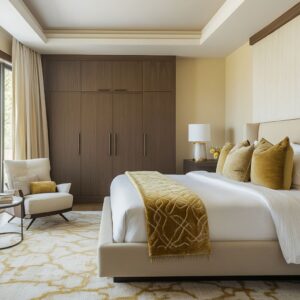
Attic spaces have always carried a certain potential, but they’ve rarely been treated as the centerpiece of a home—until now. Across many high-end homes, the attic master bedroom has become one of the most creative and personalized areas in the entire layout.
What used to be an awkward upper level is now the backdrop for some of the most refined and visually confident design choices seen in residential interiors.
The change doesn’t come from filling the room with extra furniture or complicated finishes. Instead, it’s about how form, light, materials, and layout work together to make the most of what the attic already offers—sharp slopes, natural divisions, and tucked-away charm.
Whether shaped into a minimalist retreat, a soft sculptural space, or a multi-zone suite, these bedrooms rely on quiet precision, smart detailing, and thoughtful restraint. This article breaks down the design patterns behind the most successful attic bedrooms—from hidden lighting tricks and material contrasts to built-in solutions and ways to manage difficult ceiling lines.
Each approach offers insight into how to work with the shape, not against it.

Architecture as the Primary Decor
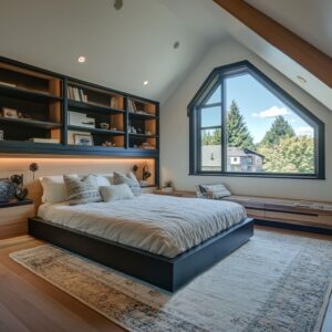
One of the most standout attic master bedroom ideas seen across high-end homes today is the shift in how structure is used—not hidden, but celebrated. Rafters, ceiling angles, wall slopes, and even window shapes now act as the visual backbone of the space.
Exposed Rafters as Visual Rhythm
Rather than covering ceiling beams, many designers let them stay visible and proud. Especially in homes with a rustic or mid-century influence, thick wood rafters are placed in a repeating diagonal rhythm.
That repetition becomes more than structural—it’s part of the visual identity, helping the room feel grounded without needing extra decoration.

Diagonal or Curved Wall and Ceiling Cladding
Some of the most refined attic master suite ideas include cladding that moves with the pitch of the roof. Matching wood panels are applied at an angle or curve gently across the ceiling and walls, echoing the room’s shape.
This approach doesn’t rely on pattern or ornament; the cut, tone, and alignment of the panels do all the work. The result is a room where the architecture carries the weight of the design—no extra artwork or busy styling needed.
Barrel Arches and Soft Curves
In attics where the structure allows, curved ceiling forms replace sharp gables. Flattened vaults or shallow arches made from plaster or pale timber soften the geometry and bring a relaxed, sculptural feel.
These curves break the usual attic triangle and add flow to what could otherwise feel sharp-edged.
Why It Matters
Letting the roof shape, beam lines, and natural slope lead the design makes the space feel thoughtful and high-end from the start. The attic no longer needs to be treated as an awkward leftover—it becomes the main event.

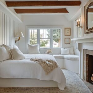
Unified Surfaces and Seamless Transitions
Another move seen in many top-tier attic bedrooms is a focus on continuity. Designers are using repeated tones and finishes across floors, walls, ceilings, and even built-in furniture to create a room that feels whole from end to end.
Matching Floor to Ceiling Finishes
Whether it’s pale oak or smooth plaster, running the same finish from top to bottom erases the typical cuts and breaks found in most rooms. That kind of surface continuity tricks the eye into reading the space as wider, taller, and more open—especially important in a room with sloped ceilings.
It also adds quiet sophistication without relying on extra layers or color.
Built-Ins That Disappear Into the Architecture
Benches under windows, desks tucked into side walls, even full headboard units are often finished in the same tone and texture as the wall behind them. This makes them feel like they were always part of the house rather than added later.
It’s especially useful in attics where every inch counts, and visual clutter quickly makes a room feel cramped.
Why It Works
Attic ceilings naturally come with awkward junctions and slanted corners. But when the surfaces wrap smoothly, without obvious transitions or material changes, those tricky areas almost fade away.
Everything feels more open—even if the square footage hasn’t changed.

Hidden and Embedded Lighting to Accentuate Angles
One thing that’s making a big difference in attic master bedroom design ideas today is how lighting is handled—not as a ceiling fixture, but as part of the structure itself. These angled spaces don’t always play nice with chandeliers or pendant lights, which can feel crowded under a steep pitch.
Instead, designers are now letting light slip into the design quietly, but with impact.
Linear Light Strips in Rafters or Ceiling Transitions
Recessed LED lines, tucked between planks or where ceilings meet walls, do more than just light a room. They highlight every slope and seam in a way that gives the space depth and softness.
That glow along a rafter or beam edge pulls attention to the form of the room without making it feel smaller.
Bed Base Lighting That Adds Presence
Several high-end attic bedrooms use under-platform lighting around the bed—not to spotlight it, but to create a soft base that makes it appear lighter, almost floating. It gives the bed structure without bulk and separates it from the floor in a subtle way that still adds drama.
Backlit Walls and Hidden Cove Channels
Another smart move is lining the lower third of the walls, or even ledges and shelving, with backlit details. This kind of low, indirect light can help guide the eye and shift focus away from tricky ceiling slopes.
It shapes the volume with shadow instead of spotlight.
Why This Feels Right
Attic rooms already come with visual motion thanks to all the angles. By layering in hidden light that works with those angles—rather than against them—you end up with a space that glows from within.
No bulky fixtures, no glare. Just a space that feels taller, quieter, and more in control.

Subtle Symmetry and Rhythmic Alignment
Even with all the irregularities that come with pitched ceilings, the most polished attic bedrooms still find a sense of balance. And it doesn’t always mean perfectly matching every side—sometimes the beauty is in a few key moves that bring a visual rhythm.
Centered Elements That Stabilize the Room
Placing a fireplace, headboard, or main window directly at the peak of the gable gives the room a center point. That central placement helps tone down the diagonal pressure and makes everything else feel more deliberate, even if the sides don’t match perfectly.
Mirrored Seating or Storage for Quiet Balance
Another way to create harmony is with built-in benches or shelving flanking a central element. They don’t need to be identical, but echoing size or placement can create enough balance to make the room feel structured.
Especially in attic bedroom inspiration taken from coastal or alpine areas, this method brings a relaxed order.
Repeating Smaller Elements
Designers also introduce balance in subtle ways—twin sconces on either side of a window, a pair of matching tables on each side of a bed, or mirrored panels tucked into angled walls. These repetitions do the work of symmetry without needing perfect architecture.
Why It Works in an Attic
Attic shapes can be unpredictable. But introducing rhythm through alignment, matching forms, or centered anchors brings the room back into focus.
It doesn’t have to be formal—but it does need to feel intentional. That sense of order is part of what makes an attic room feel finished and calming rather than chaotic.

Material Contrasts That Highlight Geometric Forms
Some attic bedrooms work with subtle shifts in tone—but others lean into contrast as a design tool. It’s not about adding drama for its own sake, but about guiding the eye across complex angles by giving it places to land.
Done right, contrast doesn’t compete with the architecture—it makes the structure clearer.
Dark vs. Light Contrast Framing
You’ll often find pale walls punctuated with sharply outlined black window frames, especially in coastal homes or hillside properties. That contrast isn’t random—it pulls attention to the window as a design feature, not just a functional one.
Triangular or narrow vertical windows feel more intentional when the darker edge gives them visual weight.
Fireplace Walls as Visual Anchors
In attic spaces that stretch across open square footage, a dark fireplace wall—matte stone, plaster, or metal—can break up zones without needing partitions. A charcoal finish behind a fireplace helps define where the bedroom ends and where a reading corner or lounge begins.
It’s an anchor in a room shaped by lines that don’t always follow symmetry.
Layered Wall Treatments
Some rooms split a wall visually into top and bottom halves. Maybe the lower section is upholstered, paneled in oak, or even wrapped in concrete plaster.
The upper half is kept soft and light. This helps highlight the slope of the ceiling while grounding the space—especially useful in loft master bedroom designs where scale and angle need balance.
Why It Works
Attic spaces have shapes that don’t always make sense at first glance. By layering contrast into walls, windows, and built-ins, designers can draw attention away from awkward corners and toward intentional features.
It’s a subtle way to shift perception—so the eye sees form instead of limitation.

Built-in Furniture as Architectural Extensions
In many high-end attic bedrooms, you’ll notice that the furniture doesn’t stand alone—it’s part of the walls, or it grows directly out of the structure. This isn’t just a space-saving move.
It’s about building a room that feels cohesive from every angle, especially when working with tight corners or sloped ceilings.
Beds That Merge with the Wall
Platform beds are often designed as extensions of the headboard wall. In some cases, they stretch into nightstands or even continue into shelving, all using the same material and finish.
There are no visible breaks, no awkward junctions. It feels like one continuous volume—clean, low, and made to match the slope behind it.
Window Benches and Wall-Length Desks
One clever move seen in many master suite ideas is using the low side walls for built-in seating or slim workspaces. Window benches are wrapped in the same wood or plaster as the surrounding wall, often with hidden drawers tucked below.
Desks stretch wall to wall, but feel like part of the baseboard. Nothing sticks out.
Nothing interrupts.

Integrated Lounge Zones
Some attic bedrooms—especially in mountain regions or larger properties—go a step further. They carve out seating zones from the structure itself.
Think of a deep niche under a vaulted ceiling filled with cushions, or a plaster arch with shelving and backlighting. In a few standout examples, the seating pit is actually sunken into the floor near a glass alcove.
Why It Matters
Standard furniture can make attic rooms feel boxed in. But when beds, benches, and desks are part of the structure, every inch of space is used efficiently—and everything feels deliberate.
Built-ins smooth out the tension between form and function. They make even the quirkiest corners feel like they belong.

Unexpected Functions (Bathtubs, Conversation Area)
Some attic bedrooms are rewriting the rulebook on what a top-floor space can be. These aren’t just sleeping zones—they’re starting to fold in other uses that take full advantage of a large footprint and creative floor planning.
That includes ideas you don’t typically expect in an attic layout.
Sunken Lounge or Conversation Pit
Designers have started shaping attic volumes into multi-use zones by cutting into the floor or building out glass alcoves under the eaves. These lowered seating areas create a sense of retreat, especially when paired with a central feature like a coffee table in a conversation pit or floor lamp.
The slope above becomes a dramatic backdrop, not a limitation.
Bathtub in the Attic
One of the boldest moves is placing a tub at the far end of the bedroom. It doesn’t shout for attention—it’s usually framed by warm wood, stone, or soft plaster, and tucked into a niche with a window or view.
This isn’t just about having a bath upstairs—it’s about rethinking the master bedroom as a personal retreat that blends function and calm.

Raised Zones for Defined Function
In some designs, part of the floor is lifted slightly—a move that signals a shift in how the space is used. A raised reading nook, elevated daybed, or platform seating at the end of the room helps break up the layout while giving the ceiling pitch a fresh sense of balance.
The change in level isn’t decorative—it marks intent.
Why These Moves Matter
These kinds of ideas require precision planning, but the reward is huge. They shift the attic from a pass-through or secondary space into something unique.
It’s how you get a layout that feels closer to a high-end suite than a top-floor leftover.

Rebalancing Angles with Curves or Straight Lines
Angled ceilings are a fact of attic design. But what sets a luxury bedroom apart is how those angles are handled—whether softened with rounded forms or made clearer through careful alignment.
Using Arches and Barrel Vaults
Instead of leaning into sharp gables, some bedrooms introduce curves—arched ceilings, rounded wall transitions, or plaster vaults. These shapes help distribute visual weight more evenly, so the ceiling feels like a calm overhead frame instead of a pointed wedge.
It works especially well in homes influenced by Mediterranean or transitional design.
Adding Repeating Vertical Lines
Another method is to go with the slope—but do it with rhythm. Slatted wood panels, battens, or narrow ribs along the ceiling can make steep angles feel purposeful.
It also adds texture and light-shadow play without needing extra color or décor.

Creating a Mid-Level Visual Break
Strong horizontal features like a ledge, shelf, or beam give the eye a place to rest in a room with a lot of vertical pull. Placing these elements right where the slope starts helps keep the room grounded and organized.
It breaks up visual tension, especially when the room’s shape is asymmetrical.
What This Does for the Room
Blending vertical lines with soft curves or anchoring beams doesn’t just clean up the visual layout—it gives the entire attic more structure and clarity. Every line has a reason, and the mix of shapes keeps the space from feeling boxed in or overcomplicated.

Textures and Tactile Contrast
Color can stay quiet, but texture does the talking. That’s one of the key approaches in today’s luxury attic bedrooms.
Rather than relying on bold prints or statement colors, these spaces let surfaces carry the character.
Using Wood Grain as Directional Flow
Matching the wood grain to the slope of the ceiling might seem like a subtle move, but it does a lot of work visually. It draws the eye upward along the line of the roof and emphasizes the architecture without clutter.
Mixing that wood finish with smooth plaster or rougher stone—like a softly honed limestone wall or a raw beam—brings out natural depth that doesn’t rely on contrast in tone.
Layering Textiles for Quiet Depth
In almost every luxury bedroom that leans minimalist, it’s the material mix that adds warmth. Neutral bedding—whites, sands, taupes—is layered with just enough variation: linen next to boucle, wool against velvet.
It’s the interplay of matte and nap, not color, that keeps the space from feeling flat.

Balancing Matte with Low Sheen
A smart touch seen in many rooms is pairing matte finishes with low-sheen accents. Think polished wood floors that reflect a bit of light underfoot, against a dry plaster ceiling.
Or satin upholstery on a bench beneath rough timber beams. This kind of pairing reflects light with control, helping to stretch or flatten the room as needed.
Why This Works So Well
In a space where ceilings slope and walls shrink inward, loud patterns or high-contrast colors can easily feel too heavy. Focusing instead on texture builds depth without overpowering.
It’s a key move in large attic bedroom ideas that aim for calm, scale, and visual layering—all without the noise.

Multi-Zoned Attic Suites
Today’s attic bedrooms are rarely just bedrooms. In homes where the footprint allows, these upper-floor spaces take on multiple roles—each part carved out by furniture placement, elevation, or lighting, all while staying under the same roofline.
Relaxation Zones Tucked into the Architecture
A common feature is the use of a wide dormer or corner window to create a dedicated reading area or lounge bench. These aren’t afterthoughts—they’re fully finished with cushions, lighting, and sometimes built-in storage.
By treating them as functional alcoves rather than filler space, the room gains both utility and balance.

Workspaces or Vanities in Low Zones
The shorter wall height under the pitch might not suit tall storage, but it’s perfect for a floating desk or vanity. Some rooms feature custom millwork that runs wall to wall, leaving just enough head clearance while giving purpose to the entire footprint.
Whether for work or daily routines, it keeps the space flexible.
Defined Lounge or Fire Feature Zones
A few more layered designs go further by introducing partial walls, two-sided fireplaces, or deep seating sections to break the room into clear zones. With the right layout, you can shift from bed to sofa to a fire-lit corner—without breaking flow.
It’s a quiet nod to boutique hotel layouts, except entirely private.
Why Zoning Makes a Difference
Multi-zone layouts make these rooms feel complete. Instead of feeling like leftover attic space with a bed squeezed in, they read like thoughtful suites—rooms that offer more than rest.
Each zone becomes a reason to linger, not just pass through.

Disguising or Highlighting Structural Beams
Beams can bring charm or distraction—depending on how they’re handled. In attic spaces, where the ceiling angles already play a major visual role, beams must be treated with clear intent.
The best designs either make them disappear or let them lead the look.
Painting Beams to Blend
In attic layouts with tight slopes, painting the beams the same shade as the ceiling helps smooth out visual lines. White beams in a white ceiling reduce clutter overhead and give the room a cleaner, taller feel.
This is especially common in more Scandinavian-inspired spaces where simplicity and light control are key.
Turning Wood Beams Into a Feature
Other attic master bedroom design ideas do the opposite. They use natural wood tones—walnut, oak, or even cedar—to contrast with lighter walls.
That visual break draws the eye upward, especially when the beam grain runs along the pitch. It brings warmth and structure without overcomplicating the palette.

Lighting Hidden Within the Beam Structure
Some designs go further and integrate lighting directly into the beams. A narrow LED strip tucked into the beam edge or underside adds soft ambient glow without introducing a fixture.
This gives beams a function beyond structure—they shape how light moves through the room.
Why It Makes a Difference
Whether concealed or highlighted, beams set the tone in an attic. If ignored, they can feel like clutter.
But with the right treatment, they add direction and purpose. The choice to make them subtle or striking depends on how much presence you want overhead—and what the rest of the design is doing.

Redefining Traditional Attic Styles with Modern Restraint
Some of the most interesting decorating ideas for attic master bedrooms borrow from older architectural styles—but simplify them. Instead of building a pastiche, these rooms reference classic forms and update them using clean finishes, tighter color palettes, and purposeful restraint.
Gothic Lines, Softened
Rooms that pull inspiration from gothic structures often carry arched ceilings or steep vaults. In updated versions, these forms are kept pale, free of extra molding or color changes.
The result is more about flow than drama. You still get the sweep of the shape, but it fits into a contemporary home without feeling dated.
Hints of Mediterranean Warmth
A few attics nod to Mediterranean influences—arched wall niches, curved built-in shelves, lightly textured plaster—but they skip the heavy tile or ornate detailing. Instead, tones are bleached, textures are dry and smooth, and the curves are integrated as part of the structure.

Mountain Chalet Made Sleek
In colder regions, traditional chalet cues show up through wood-paneled ceilings, fireplace walls, or exposed beams. But in newer interpretations, that same warmth is combined with sleek furniture lines and hidden lighting.
It’s no longer just a cabin feel—it becomes a calm, sculpted retreat.
The Value in Blending
Attic spaces carry strong lines by default. Referencing older forms—without repeating them exactly—lets the room feel grounded without going overboard.
It’s a balancing act that gives structure without weight and style without distraction.

Rethinking What Constitutes Luxury
In the context of attic bedrooms, luxury isn’t tied to how much is added—it’s often about how much is refined or removed. The most striking spaces rely on control, clarity, and an almost invisible level of care in how they’re put together.
- Less Decoration, More Intention. Instead of layering on ornate furniture or bold styling, many of these rooms use restraint. Clean shapes, soft palettes, and calm materials let the structure speak. It’s the precision in alignment, not the amount of décor, that signals quality.
- Function That Enhances Design. Built-in benches, storage walls, and tucked-away desks aren’t added for convenience alone. When matched to the same materials as the walls or ceilings, these features become part of the architecture. The result is a space that feels custom and cohesive—without shouting about it.
- Craft That Doesn’t Show Off. A high-end attic master bedroom might have seamless cabinet doors with no hardware, recessed lighting you never see directly, and paneling with exact joins. You don’t always notice these details right away, but they’re what shape the overall feeling. Nothing looks accidental, even in the most relaxed layouts.
- How It Comes Together. This approach to luxury doesn’t depend on square footage or cost per square foot—it depends on clarity. The room feels elevated because nothing is fighting for attention. It’s all working together in quiet coordination.
Summary of Key Strategies for a Luxury Modern Attic Master Bedroom
- Celebrate the Slopes – Let ceiling angles and rooflines shape the room’s personality instead of trying to disguise them.
- Consistent Finishes – Repeat materials across ceiling, walls, and built-ins to create flow and reduce visual breaks.
- Conceal or Integrate Lighting – Hide LEDs in beams, under beds, or behind trim to bring subtle light that supports the layout.
- Furniture & Architecture – Combine benches, beds, desks, and storage directly into the walls or angles to use space efficiently.
- Balanced Geometry – Soften the ceiling pitch with arches or draw attention with rhythmic lines.
- Introduce Creative Secondary Functions – Add a sunken sitting area, window nook, or bathtub to make the attic feel like a true master bedroom retreat.
- Careful Contrast – Let darker beams, frames, or walls break up a pale space and define visual zones.
- Plan for Views – Align windows with slopes or focal points to create strong inside-outside connections.
- Focus on Proportion – Match furniture size and rug placement to the shape of the ceiling and wall heights.
- Refined Detailing – Invisible joinery, smooth lighting reveals, and a restrained palette all work together to make the space feel polished.