Many of the most convincing kitchen glass door ideas begin with a simple interior-design premise: the door is judged by how it behaves as a plane of brightness inside the room’s larger composition. This means the door is handled like a controlled vertical “light surface” that can resolve a long sightline, stabilize a busy material mix, or soften a strong end wall without turning the opening into a literal window scene.
The core move is not transparency; it is luminance control—how bright the door reads relative to countertops, floors, cabinetry, and nearby daylight sources. A door that reads as the brightest vertical element can feel like an intentional end point, while a door that shares brightness with adjacent pale planes can feel absorbed into the room’s background language.
The subtle but high-impact choice is whether the door becomes a destination (a calm stop at the end of a galley), a mediator (a seam between two atmospheres), or a stabilizer (a soft plane that lets marble, tile, or wood grain carry more visual activity). When the door is designed as a light plane, the room often gains a quieter cadence: long horizontal runs (countertops, shelving, flooring direction) have a clear place to “land,” and the eye experiences a sense of completion rather than a restless pull toward whatever sits behind the glass.

Editing daylight with segmentation rather than relying on one big pane
A major strategy behind a modern kitchen door half glass design is segmentation that deliberately slows visual speed. Instead of allowing daylight to arrive as one uninterrupted sheet, the door breaks glow into measured zones—stacked rectangles, horizontal bands, or a top-and-bottom split that changes the door’s “tempo.
” This has an advanced compositional effect: the end wall stops behaving like a bright hole and starts behaving like architecture. The segmented glow also supports balance in a corridor kitchen, because the eye reads repeated units rather than one overpowering block of light, so the surrounding cabinetry and styling remain legible.
Three quiet advantages tend to appear when segmentation is used with discipline:.
- Paced brightness: the door reads as a sequence (header glow, main glow, base glow), so the room feels composed rather than washed out.
- Built-in visual gravity: denser or less luminous lower zones create stability, keeping the door from reading top-heavy even in very bright kitchens.
- Furniture-like presence: solid rails and panel portions give the door a grounded character, so it feels intentional even in modern palettes.

This approach often pairs naturally with other “band logic” in the design—shelves stacked in tiers, long counters that act like rails, and floor direction that guides attention forward—so the door’s internal divisions feel like part of the room’s overall structure instead of decoration.

Using frosted and reeded glass as texture, not as privacy
One of the most under-discussed moves in door glass design kitchen concepts is the way texture converts daylight into a material effect rather than a readable view. Frosted glass can act like a soft lamp surface, filling a door with even glow that supports calm interiors and reduces visual noise in open-plan layouts.
Reeded (ribbed) glass goes a step further: it turns light into fine vertical stripes that behave like a tactile veil, so the door reads as a panel of luminous texture. The important shift is psychological as well as visual—the door stops being a “scene” and becomes a surface.
That surface quality is especially useful in kitchen designs where the surrounding finishes already carry movement (veined stone, patterned backsplash, expressive wood grain), because textured glass offers brightness without adding more imagery.

Another high-level effect appears when textured glass creates subtle depth cues: faint gradients (brighter above, denser below) or stripe highlights that change with daylight make the panel feel layered, so it avoids the flatness that can make frosted doors look like blank white sheets. In well-edited rooms, this texture strategy often sits alongside matte cabinetry, calm stone, and restrained metals, allowing contrast and rhythm to come from sheen relationships and micro-patterning rather than bold color.

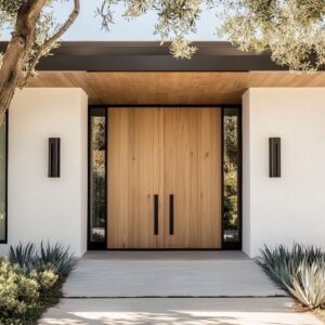
Controlling the edge system: frames, casing contrast, and “insert” logic
A strong kitchen glass door design is often decided less by the glass itself and more by the hierarchy of edges around it. Thin, dark frames behave like drawn outlines that raise the room’s visual resolution: when linear hardware, faucets, and small dark accents repeat that same stroke weight, the door feels integrated into a family of precise marks rather than a separate statement.
Conversely, thicker frames can supply authority and weight, especially when the glass is softly luminous and the room needs a crisp boundary to keep pale materials from feeling too airy.

A second edge move is casing contrast—bright trim around a darker leaf, or white casing around a dark grid—creating a “frame-within-frame” reading that feels intentional because it teaches the eye how to interpret depth. Finally, “insert logic” elevates the composition: when the outer border reads slightly stronger than the inner stiles, the leaf feels like a clean plane set neatly into a surrounding mat, which gives even muted color doors a finished, composed presence.
These edge strategies also help solve a common visual risk in kitchens: when many surfaces are smooth and bright, the door can drift into visual anonymity. A deliberate edge hierarchy prevents that, making the door’s rectangle feel placed, not accidental.

Pattern tempo: grids, diamonds, and scale discipline for modern clarity
In modern kitchen glass door design, pattern becomes convincing when it behaves like rhythm rather than ornament. A grid that contains frosted panes tends to read calmer than a grid with clear views, because each cell glows evenly and the pattern becomes the main event instead of competing outdoor “mini-scenes.
” This creates a measured beat that can hold its own in spaces that mix warm and cool finishes or combine several focal materials (wood grain, stone veining, statement lighting). The most sophisticated compositions often layer pattern at two scales so the room feels intentionally structured: a large grid on the door paired with finer woven textures in stools, baskets, or textiles creates order in both macro and micro readings.
Diamond lattice is a different rhythm entirely—diagonals create motion and sparkle even in a quiet palette, so the surrounding room typically stays more symmetrical and low-contrast to keep the lattice from tipping into busyness.

When patterning works at a high level, it usually follows three quiet rules:.
- One dominant pattern per plane: a patterned door can coexist with patterned flooring when contrast stays soft and the patterns live on different orientations (vertical vs horizontal).
- Glow is controlled, not noisy: frosted or lightly obscured glass makes geometry feel clean because the pattern reads first.
- Hardware supports the rhythm: discreet handles preserve pattern dominance; bolder handles can anchor the composition when there is a risk of the door reading too delicate.

Temperature mixing: cool fields, warm lines, and small metal “seasoning”
A refined kitchen half glass door design often uses color temperature as its true connector. Muted blues, soft greens, pale greys, and warm woods can sit together without visual confusion when the door quietly “coordinates” temperatures: a cool painted leaf can feel calm and architectural when warmed by wood shelving, warm-toned flooring, or brass-like linework in a grid; a dark-framed door can feel welcoming when the glass reads as an internal glow rather than a black block.
The most subtle technique is the controlled use of warm metal notes—small brass accents or warm-toned pulls that appear in multiple places at different scales.

When warm metal repeats in measured doses, the design gains a consistent gentle shimmer that balances cool paint and glass brightness without turning the door into a flashy moment. Equally important is the relationship between matte and sheen: matte cabinetry can support a luminous glass panel by absorbing competing reflections, while stone or glazed tile can add controlled sparkle that harmonizes with textured glass.
The door then becomes part of a temperature choreography: cool fields provide calm distance, warm notes add human warmth, and the glass supplies a stable brightness that helps mixed materials feel deliberate.

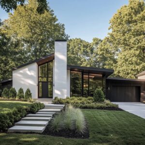
Placement psychology: the end-wall “full stop” and the corridor-as-gallery effect
Many kitchen glass-door compositions gain their power from placement rather than decoration: when the door sits on axis at the end of a galley or hallway, it acts like a visual period that completes a long sentence of cabinetry runs and countertop rails. The room’s directional elements—floorboard direction, long counter edges, repeated ceiling downlights—often behave like guides that naturally carry attention forward, and the door becomes the resolution point where motion stops.

A deeper strategy appears when the approach space is treated like a gallery: evenly spaced ceiling lights form a procession, wall art and trim create nested rectangles, and the surrounding planes stay quiet so the door reads as the final layer in a sequence. This is why bold grid doors can feel calm drama rather than harsh contrast: the corridor prepares the eye through repetition and centering, so the door’s geometry feels inevitable.
When used well, placement allows the door to remain visually disciplined—simple shapes, restrained hardware, controlled glow—because the drama is generated by alignment, proportion, and repeated cues leading to a single composed endpoint.

Visual gravity and “base weight”: making luminous doors feel grounded
A persistent challenge with glass doors is maintaining a sense of weight and stability while using brightness as a feature. High-level solutions create base weight so the door does not read like a floating light panel.
This can happen through solid lower sections, denser frosting near the bottom, or pane arrangements that naturally give the lower zone more visual mass. Even when the door is mostly glass, slight shifts in tone—upper zones reading lighter, lower zones reading deeper—build an architectural gravity that feels quietly satisfying.
Another grounding strategy is the use of small dark anchors: compact dark handles, a thin hinge line, or nearby repeated black strokes can “pin” the luminous plane so it feels placed rather than blank. In glossy kitchens with many reflective surfaces, the door often becomes the most neutral brightness source—neither the warm under-cabinet glow nor the cool window daylight, but a softly luminous middle—so the door acts as a stabilizer between competing light temperatures.
The result is a brightness that feels controlled and settled, not loud.

Echo systems: repeating door logic elsewhere so the effect feels intentional
The most persuasive glass-door concepts rarely let the door be alone; they build a network of echoes so the door’s key idea appears again in smaller, quieter ways. This repetition is what makes a door feel integrated even when it has strong geometry or texture.
Common echo strategies include:.
- Rhythm echo: reeded glass paired with fluted wood on an island face, or grid logic repeated in woven stool textures and basket weaves.
- Band echo: stacked glass divisions mirrored by stacked shelves, tiered styling, or long horizontal counter lines that support the door’s internal breaks.
- Stroke echo: dark frames matched by linear pulls, faucets, pendants, and small accents at different scales so the door’s outline feels part of a consistent graphic language.
- Shape relief: rounded bowls, circular boards, soft ceramics, and branch arrangements placed near strict grids to soften geometry and keep the room from feeling overly rigid.
These echoes often matter more than the door’s pattern itself, because they turn “a door feature” into “a room-wide visual system,” where the door simply becomes the most visible expression of a rhythm already present.

Styling as composition management: objects chosen for geometry, tone, and pacing
Decorating elements around kitchen glass doors often look casual, yet in refined compositions they function as geometry management rather than clutter. Rectangular objects—cutting boards, trays, books, framed art—quietly reinforce pane rhythms and casing logic, helping the eye accept repetition as intentional structure.
Organic elements—branches, leafy stems, fruit bowls—serve as controlled contrast: irregular edges and soft silhouettes relieve strict grids and straight lines, preventing the room from reading too severe or overly perfect. Dark accents—pots, vases, a compact appliance—act as anchor points that keep bright planes and glossy finishes from feeling weightless.
Even color accents tend to be chosen as linking devices: a warm fruit tone can echo warm metals; a muted green plant can connect interior greens to exterior brightness without making the glass act like a literal outdoor scene. In the most composed interiors, the door is not “decorated”; it is staged inside a calm field where every nearby object supports pacing—how fast the eye moves, where it pauses, and how the end wall feels resolved without relying on busy pattern or heavy ornament.