White cabinets often act as a blank starting point—but what happens around them sets the tone. In many kitchens, the backsplash isn’t simply a backdrop—it becomes a surface that carries rhythm, contrast, texture, and subtle color memory.
It can define proportion, absorb or reflect light, and quietly shape how the entire room behaves. What separates the ordinary from something layered and memorable comes down to the way materials interact.
A flat wall of tile can feel different based on finish, orientation, pattern flow, or how it relates to cabinetry lines. Even small shifts—like wrapping tile into a window well or placing a shelf to echo a grout line—can change how the space is read.
This article gathers design ideas and visual techniques where the backsplash becomes more than filler. It explores subtle pattern logic, surface pairings, and moves that tie floors, cabinetry, and vertical surfaces together—without adding bold color or drawing focus away from the simplicity of a white-based kitchen.
The goal isn’t to decorate more, but to build meaning into every part of the wall.
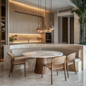
Mirrored Stone = Built-In Artwork
In some kitchens, the backsplash behaves more like a visual centerpiece than a surface—especially when a bookmatched slab is used. Here, the natural veining of marble or quartzite gets mirrored across a central line, forming a symmetrical pattern that quietly resembles inkblots or tree branches, depending on the slab.
This type of layout isn’t decorative in a conventional way—it reads more like a quiet composition that holds the space together. The symmetry isn’t just aesthetic—it’s psychological.
Our eyes instinctively rest at the midpoint, finding a sense of calm in the mirrored motion of the stone. In kitchens filled with straight cabinetry, metal hardware, and hard corners, that natural mirror effect has a softening influence.
It pulls the space inward without shouting for attention.

Things become even more layered when the same stone appears on the island’s waterfall edge. The matching structure gives weight and cohesion to the entire kitchen, like one continuous canvas folded into functional planes.
In some examples, LED lighting placed discreetly along cabinet bases causes the veins to softly glow. The result doesn’t feel high-tech—it feels like the material is emitting a quiet warmth, which draws people in.
Among the most memorable backsplash ideas for white cabinets, bookmatched stone offers a sense of permanence and artistry—something that doesn’t need to be labeled to be felt.

Texture Tension: Smooth Fronts vs. Rippled Planes
Some of the most subtle backsplash for white cabinets start with opposition, not matching. When perfectly smooth, reflective cabinet doors are paired with a matte, textured backsplash, the result feels active without needing extra color.
In certain layouts, softly rippled ceramic tiles stretch in gentle waves across the wall. Their surface remains matte, yet those curves catch just enough daylight or LED glow to change in tone across the day.
Set beside flat gloss cabinet doors, this difference becomes the feature—it’s an optical texture, not a loud gesture.
Then there are more sculptural moves, like fluted concrete panels. These are deeply grooved but softly finished.
When used in the same vertical rhythm as the woodgrain or groove pattern of the cabinets below, the wall and base begin to behave like a single unit. Many don’t notice this immediately, but the impression is seamless—not because everything matches, but because everything answers each other.
Travertine strips, sliced narrowly and stacked in horizontal rows, deliver a different kind of softness. They barely protrude from the wall, yet their sandy grain reads like linen from afar.
It’s not depth by dimension—it’s depth by texture memory. The tile lies flat, but it doesn’t sit still.
This approach doesn’t try to impress with shine or scale. Instead, it uses contrast in finish and rhythm to bring a subtle kind of structure—a look that holds the room together without shouting for notice.

The Mid-Tone Bridge
Some of the most balanced kitchens rely on tones that fall precisely between extremes—not quite white, not quite bold, and never fully neutral either. This middle ground often shows up in the backsplash zone, acting as a quiet mediator between bright upper cabinets and deeper flooring.
Whether it’s a blush tile, a gradient from mint to aqua, or something softer like a dusty rose or sea-glass tone, these vertical mid-tones behave like visual glue. The effect is almost horizontal even when the tile layout isn’t.
On the wall, these tones become the backdrop line that pulls warmth upward from wood tones or downward from cooler white surfaces. The kitchen feels like it has a low-key horizon—not a line you draw with a ruler, but one you feel with your eyes.
That’s the hidden strength of a middle shade on a vertical plane: it doesn’t demand attention but still holds the composition.

Subtle color drift inside a single hue—from coral to ivory, or sage to pale gray—creates flow without needing a pattern. This soft tonal shift mimics the way light moves through a plastered wall or brushed textile.
The wall doesn’t need to change form to feel alive—it simply needs variation that isn’t uniform. Among the most effective kitchen backsplash ideas with white cabinets, this kind of tonal mid-layer acts as a quiet structure.
It supports everything around it, even if few notice why the space feels so resolved.

Orientation Tricks: Stretch, Lift, Ground
Tile layout has just as much influence as color—and sometimes more. Vertical or horizontal orientation can completely reshape how the wall behaves in a room, even if the material stays the same.
Vertically stacked tiles, especially narrow profiles like kit-kats or pencil slats, can stretch the eye upward. This is especially helpful in layouts where upper cabinets are reduced or eliminated, leaving space for light but also for rhythm.
That upward pull, tile by tile, lifts the wall without adding bulk.

An even more refined move is wrapping the tile around a window return—a visual continuation that makes the wall read as integrated, not applied. It turns what might be an interruption into part of the overall form.
The kitchen wall then feels like it was planned from the start as one surface rather than separate planes. Horizontal moves work in a different way.
Long subway tiles, chevron stripes, or wave-textured ceramics pull the gaze sideways, giving the wall more width than it physically has. This is particularly strong in galley kitchens, where the width is limited but the visual line can stretch endlessly.

In some cases, even a chevron floor pattern can echo a chevron backsplash—not as a match but as a rhythm. These shared diagonals quietly link vertical and horizontal planes, helping the space feel anchored.
These layout strategies form the backbone of many backsplashes for white kitchens. The shapes don’t speak loudly—but they structure the whole room without needing extra color or clutter.

Shelves as “Commas,” Not Full Stops
Open shelving doesn’t need to dominate a kitchen wall to have impact. In many of the most visually balanced kitchens, floating oak or walnut shelves act more like subtle pauses—they’re not endings, they’re soft breaks between bold surfaces.
These shelves do more than hold ceramics or glassware. They adjust rhythm.
What makes these boards so visually effective is their proportion and placement. The best ones aren’t thick, bulky, or overly decorated—they’re refined, clean-lined, and in tune with the surfaces they’re paired with.
When their grain matches the warmth of the backsplash, or their edges align with grout joints or veining, the shelves stop feeling added—they start to feel embedded.
A single asymmetrical shelf on a stone slab, for example, can shift the entire mood. Without symmetry, the space becomes more relaxed—less like a showroom and more like a home.
It lets the stone stand as the feature, while the shelf interrupts just enough to bring movement into the composition. In many modern interpretations of backsplash ideas for white kitchen, these kinds of shelves offer a way to ease between vertical and horizontal, without making the wall feel too busy or too plain.
They become part of the structure—not just storage.

Quieting the Room with Soft-Reflective Surfaces
Not every backsplash needs shine to stand out. In fact, some of the most visually rich walls achieve their look by diffusing light rather than bouncing it back.
Materials like hand-applied plaster, satin-finish porcelain, or softly glazed tile create a surface that interacts with light in hushed, broken reflections. It’s the opposite of mirror polish—more like glow than glint.
In these spaces, the light doesn’t bounce—it lingers. Low-sheen finishes take incoming daylight or LED warmth and scatter it in small pieces, softening the feel of the kitchen.
A wall of cream herringbone tiles, for instance, catches sun in micro-angles across the day, creating gentle variations that almost mimic textile surfaces.

This quality makes the wall feel tactile even when untouched. It’s read as texture before color, which is why it never overwhelms, even in a fully monochrome setting.
Sound and light both take a softer tone in these setups. For a kitchen backsplash with white cabinets, this approach provides depth without contrast and detail without noise.
It holds attention in a quiet way, relying on material softness and rhythm, not gloss or pattern.

Light Choreography
Some surfaces don’t sit quietly—they shift as light shifts. In kitchens using reflective finishes like glossy glass tiles, metallic mosaics, or slabs with a lit underside, light isn’t just present—it’s active.
Each step across the room alters the surface subtly, as highlights move in response to the viewer’s motion. What stands out in these setups is not the brightness itself but how it’s handled.
A backsplash made of gold-leaf glass in a chevron pattern, for example, can remain visually calm during the day—then come alive under pendants or under-cabinet LEDs after dark. The shimmer isn’t loud, but it’s constant.
It responds to every change in light, giving the wall dimension without needing added pattern or form.

Backlit slabs push this further. When a slab glows from behind, especially one with natural veining, it creates the illusion of depth that moves without motion.
Unlike spotlighted walls, the glow feels internal—like the material is breathing, not reflecting. It’s not theatrical, but it never sits still either.
These choices are increasingly part of back splashes for white kitchens that want presence without adding bold color. The light does the work quietly—but it does a lot.

Full-Wrap Moves = Backsplash as Architecture
There’s a specific kind of clarity that comes from treating a backsplash as a full wall treatment, not a partial stripe. Whether it’s tile, stone, or polished plaster, continuing the material to the ceiling and across side returns shifts how the kitchen is perceived.
The room no longer reads in segmented zones—it behaves like one object. These wraparound moves often go unnoticed on first glance, but they change the visual rhythm immediately.
Without break points, without sudden changes in height or surface, the wall gains a sculptural presence. It’s not just a background—it defines the volume of the room.

One especially strong example is where the backsplash folds around a window, with the same material continuing onto the return surface. The detail work may be precise down to the millimeter, but what the viewer takes in is calm, not precision.
It’s an atmosphere made from continuity. In a sea of options, this is one of the most distinctive back splash ideas for a white kitchen—not because of material, but because of how the surface is treated as part of the space itself, not just something installed above a counter.

Site Echo: Pulling Outdoors In
Sometimes the strongest visual connections aren’t direct—they’re remembered. A backsplash that picks up on the tones of the surrounding environment doesn’t have to be literal to feel grounded.
Instead, it can echo the elements just enough for the eye to draw the link. Pebble-toned travertine has the softness of sand without mimicking it.
Driftwood-look shelving carries the mood of bleached timber, not as a replica but as a gesture. In kitchens where the window frames trees, coastlines, or low desert brush, color decisions often lean into this mood memory.

Sea-glass green tiles aren’t copies of the ocean, but they reflect it in tone and shine. Their glazes respond to daylight in the same way water does—slipping between cool and warm depending on sun position.
Similarly, a vertical wall of terracotta-toned tile can quietly mirror the tint of nearby palms or canyon stone, tying the inside to the landscape without ever being thematic. This kind of visual referencing adds depth to ideas for a backsplash with white cabinets, where materials do more than decorate—they carry some of the outdoor atmosphere in with them, but through tone rather than imitation.

Pattern Echo Across Surfaces
There’s an order the brain reads before the eyes catch it fully. Pattern repetition across materials—especially when done with restraint—can settle a room and give it rhythm.
One of the clearest examples is the use of chevron or herringbone in both floors and backsplashes. A chevron wood floor can set a foundational direction for the space.
When that same angle shows up behind the range in marble mosaic, it’s not repetition for its own sake—it’s an alignment that feels right without needing explanation. The floor leads upward; the wall responds.

In another layout, a narrow teal herringbone backsplash may center perfectly under a vent hood, with the tiles rising in a subtle fan. This centering isn’t loud, but it shapes behavior—people tend to place pots and pans at that midpoint, not by rule, but because the symmetry nudges the action.
These kinds of visual cues don’t announce themselves, but they guide the eye. For those collecting kitchen backsplash ideas for a white kitchen, this technique adds refinement without changing the color story or layout.
The rhythm is already built into the geometry—it only needs to be echoed.

Hand-Made vs. Machine-Perfect
Some surfaces draw attention by being a little off—on purpose. In kitchens that combine smooth, engineered finishes like quartz slabs or integrated cabinet pulls, introducing hand-formed tile can shift the atmosphere immediately.
It’s not about contrast—it’s about tension that feels human. Zellige tiles, with their uneven glaze and slight warping, never repeat the same reflection twice.
Each tile plays with shadow and light differently, and that visual randomness offsets the precision of flat counters and high-gloss fronts. The same is true of pitted navy hex tiles—each one might hold a slightly different tone or surface depth, which means the wall never falls flat.

The result isn’t chaotic—it’s grounded. That mix of hand-finished and machine-smoothed surfaces can warm up even the most minimalist layout.
It takes white cabinetry out of showroom territory and makes it feel tactile. The difference is subtle, but the room starts to behave differently.
Lines feel softened. Texture steps forward.
In many of the most thoughtful combinations of white kitchen cabinets with backsplash ideas, this play between rough and refined brings in a kind of ease—not visual noise, but gentle imperfection that balances control.

Metallic Echoes Without Shine Overload
There’s a way to use metal in a kitchen without it feeling too flashy. The trick is in pairing it with surfaces that already carry their own shimmer—iridescent tiles, mother-of-pearl mosaics, or gold-flecked glass.
In those settings, even a small brass pot-filler or warm-toned pendant can feel intentional without becoming decorative clutter. The metals don’t compete—they reflect.
A single brushed pull or curved fixture will quietly echo the highlights already present in the backsplash surface. Because those tiles shimmer naturally under changing light, the metallic accent begins to look like part of the wall itself, not something added afterward.

What makes this tactic work is restraint. One or two touches are enough, especially when the backsplash is already playing with gloss or color movement.
The metal doesn’t need to shine—it just needs to echo the same tones. This technique works especially well in designs where light, finish, and shape are carrying the mood more than color.
It’s less about contrast, more about harmony—without adding layers or fuss.

Key Ideas for a Visually Strong White-Cabinet Kitchen
Some kitchens rely on color. Others rely on structure.
In the case of a white-cabinet layout, the most memorable results tend to come from quieter decisions—those that don’t shout but shape the room in ways that hold attention over time.
- Symmetry and framing can turn stone into a compositional centerpiece. When veining is mirrored or intentionally centered, the result feels planned rather than simply applied.
- Texture contrast between gloss and matte gives the space visual rhythm. A polished surface beside a rippled or matte tile wall adds dimension without needing a new color.
- A single mid-tone introduced through tile or natural material can create connection across cabinetry, countertop, and floor, allowing all parts to relate without obvious transition lines.
- Tile direction plays a quiet role in shaping proportion. Vertical layouts can lift ceilings; horizontal layouts stretch walls. Neither changes the space—but both change how it reads.
- Open shelving behaves best as a pause, not a full stop. When boards are placed to echo stone lines or blend into the tile rhythm, they feel built-in, not inserted.
- Surface finish alters how light moves. Whether light scatters, reflects, or sinks into a texture depends on glaze, polish, and placement—choices that shape mood more than color ever could.
- Full-wrap backsplashes that include window wells or return walls create continuity that calms the space. The wall becomes part of the room’s structure instead of something set against it.
- Tones taken from the surrounding landscape—water, sand, plant, sky—can make a room feel tied to its place. This works without direct copying. Soft references in material or color are enough.
- Pattern repetition between floor and wall introduces alignment that feels unspoken. Chevron underfoot and on the wall doesn’t feel matched—it feels balanced.
- Hand-finished materials beside machine-perfect lines bring warmth. Wavy tile beside a clean-edge countertop offsets coldness with touchable depth.
- Metals already suggested in the tile or surface—brass, silver, or champagne—can be echoed with restraint. One matching accent speaks louder than a dozen unmatched ones.
All of these moves can exist in quiet layers. In kitchens that lean white, the details don’t compete—they hold together.
Each choice supports the others, forming a space that feels steady, composed, and visually full—without relying on color for definition.