Dark cabinetry sets a deep visual tone, but it also raises a quiet challenge: how to build character around a surface that already dominates. That’s where kitchen backsplash ideas with black cabinets become central—not as filler, but as subtle tools for contrast, rhythm, and texture.
In many interiors, the backsplash doesn’t shout for attention. Instead, it shifts the balance, carries the atmosphere, and makes the entire room feel more composed or expressive depending on its tone, material, or shape.
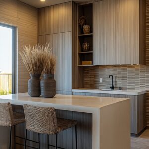
Some surfaces add softness, others reflect light or stretch shadow. In many kitchens, vertical lines in tiles help counter the horizontal mass of dark drawers.
Meanwhile, matte textures balance sleek cabinetry, and warm neutral shades bridge black surfaces and natural wood. These choices, individually small, determine how a kitchen feels—not only during the day but also in the quiet hours when lighting draws out patterns that may go unnoticed at first glance.

This article brings together a wide variety of backsplash ideas for black cabinets—each one chosen not for bold contrast but for the way it shapes the room’s overall tone and pacing. Whether the goal is subtle shadow play or strong graphic structure, each combination points to a larger design move.

Texture That Softens Mass
Black fronts bring gravity. Designers often answer this weight not with bright contrast but with quiet, touch-driven surfaces that filter light:
- Cream tadelakt, handmade cream squares, and off-white rippled ceramics scatter glare the way parchment scatters ink. They cut the hardness of dark joinery without adding another hue, letting kitchens feel calm rather than stark.
- When grout nearly matches tile the wall reads as a single skin; every tiny pit or ripple becomes the visual action, keeping attention on tone shifts instead of grid lines.
- Vertical fluting in concrete or porcelain echoes wood grain in the cabinets. The repeated groove marries two materials through touch rather than color, giving a sense of craft even in very pared-back rooms.
Hidden idea: The “pause wall. ” The backsplash can be less an accent than a moment of stillness—an intentional lull between dark base units and open air above.
This pause lets warm shelves, brass, or greenery register more clearly.

Light as a Moving Material
How a surface handles light can shift the entire mood of a kitchen. With black cabinets absorbing so much visual weight, backsplashes that reflect, scatter, or glow become powerful tools to restore balance.
The goal isn’t shine for its own sake—but the quiet movement light brings across subtle finishes.

Smooth, light-bending planes take black from dense to floating:.
- Frosted or back-painted glass doubles as a diffuser: LEDs tucked behind the panels turn the wall into a softbox. The cabinets stop reading as blocks and start reading as silhouettes.
- Gloss diamond and picket tilescatch raking sun, setting diagonal or vertical shimmer that changes hour by hour—motion without color.
- Micro-textured matte porcelain proves that even low sheen can play with daylight: skim light across a brushed face and shadows do the decorative work for you.

Design idea: Reflection is tuned, not maximized. Most shiny backsplashes here are honed, brushed, or frosted rather than mirror bright.
Polished steel would overpower; softened gleam simply lets the room breathe.

Direction of Lines = Direction of Space
Line direction in a backsplash isn’t decoration—it’s spatial strategy. Vertical and horizontal moves guide the eye, reshape the perceived height or width of the room, and counter the density of dark cabinetry.
These shifts in rhythm often do more for layout perception than any added color ever could. Some of the same materials that balance black cabinetry can create a different effect beside white cabinets, bringing added depth, contrast, or a more grounded finish to a bright kitchen.

Cabinetry sets a horizontal datum. Backsplashes either amplify or counter it:.
- Vertical moves: Stacked blush rectangles, beadboard, picket, fluted concrete pull gaze upward, giving extra perceived ceiling height and balancing long islands.
- Horizontal or banded moves: Painted shiplap, wood-look porcelain, wide-format slabs stretch the room sideways—useful when black lowers the visual center of gravity. The eye runs along those lines and the kitchen feels broader.

Insight: Outlets can be hidden or seamless so the chosen line rhythm stays unbroken. Visual rhythm is fragile; one errant socket would break the spell.

Pattern as Personality (Not Noise)
Where color is added, it tends to be disciplined yet expressive:
| Approach | Example Ideas | Role beside black fronts |
|---|---|---|
| Graphic repeat | Fan-pattern concrete, teal stacked | Replaces absent cabinet detail; the wall becomes the “door profile” |
| Stone drama | Panda marble | Veins echo cabinet color, so even wild streaks feel tied to the base |
| Terrazzo field | Terrazzo everywhere | Speckles act as miniature cabinet echoes, knitting every plane together |
| Soft color wash | Mint glass, sage squares, blush tiles | A middle tone that bridges black and wood, adding mood but keeping contrast low |

Notice: Pattern often wraps corners or rises into hood surrounds. By refusing to stop at the usual backsplash line, designers blur where wall ends and appliance begins, turning utility into architecture.

Material Continuity for Visual Order
Using a single material across multiple surfaces creates more than consistency—it builds visual calm. When backsplashes stretch without interruption onto walls, hoods, or islands, the kitchen reads as one unified composition rather than a set of parts.
This quiet repetition lets black cabinetry hold its shape without fighting for attention.

That is why some kitchen designs push one finish across multiple planes to compress visual information:.
- Full-height brushed aluminum stretches industrial logic from counter to ceiling, so shelving almost disappears.
- Concrete panels that wrap island and hood let the cook zone read as a single sculpted block.
- Bookmatched quartzite slabs extend veining uninterrupted; shelves intersect stone like trim in a Japanese screen, making the wall feel designed, not clad.

Insights: When one dominant material rules, black cabinetry becomes negative space—an intentional void that frames rather than competes.

Shelf & Hood Choreography
Shelves and vent hoods often shape the wall as much as the backsplash itself. Their placement, material, and alignment can either interrupt or enhance the surrounding surfaces.
In kitchens with black cabinets, these elements become anchors for color, line, and texture to stay visually connected. Open shelves are more than storage:.
- Their wood species often matches a tint in the backsplash—oak warmth beside sage, walnut echoing gray tiles—creating a bridge that keeps color dialogue tight.
- Shelf height is set to sync with tile repeat or stone vein breaks, so every horizontal element feels plotted, not accidental.
- Hoods clad in the same surface erase appliance bulk, allowing the eye to read one continuous plane.

By echoing tones and syncing placements with the backsplash, shelves and hoods stop acting like add-ons. They become integrated parts of the composition, helping the kitchen feel deliberate from edge to edge.

Lighting as Final Layer
Lighting isn’t just functional here—it’s part of the composition. The backsplash becomes a responsive surface, changing with the time of day and the direction of the glow.
What seems static during daylight turns dynamic under LEDs, making texture and tone feel alive.

From under-shelf glow in beadboard grooves to champagne LEDs behind glass, light treatment stakes out the backsplash as an active surface:.
- Warm strips under shelves graze fluted or beadboard ridges, turning texture into evening pattern.
- Recessed washers above stone pick out veining depth, giving slabs the look of abstract art.
- Integrated channel lights with glass create a “color field” that shifts from mint to gray as ambient light changes.

Hidden idea: Light color temp is chosen to balance cabinet sheen. Warm LEDs soften cool black; neutral white keeps gloss black from looking plastic.
These lighting choices aren’t just about brightness—they shape how the surfaces are perceived. By adjusting warmth, placement, and angle, light becomes the final element that ties material, color, and cabinetry into a complete visual rhythm.

Synthesis: Principles Surfaced
Pull back from the tile shapes and surface gloss, and certain patterns begin to emerge. Across many designs, it’s not contrast or color that carries the weight—it’s how each finish interacts, where it stops, and what it supports.
These underlying ideas shape whether the kitchen feels tense, open, or quietly structured.

- Contrast is rarely about hue; it’s about surface character. Matte black begs for relief through touch, gloss, or void—not necessarily through color.
- Eyes need a resting point. Many backsplashes serve as that rest; others make cabinets the rest and push energy onto stone or pattern. The designer decides which story matters.
- Proportion outranks decoration. Where backsplash stops—at shelf, hood, or ceiling—alters a room more than any tile choice. Height lines orchestrate perception.
- Mood comes from middle notes. Mint glass, mustard squares, blush rectangles: each inserts a gentle intermediary tone between deep black and pale counters, preventing harsh two-tone divides.
- Texture echoes forge unity. Fluting mirrors wood grain; terrazzo flecks pick up cabinet color; beadboard grooves repeat shaker rails. The mind connects these cues even before noticing them.

What reads as a simple backsplash is often doing far more—balancing the cabinetry, softening the light, and threading together textures across the room. These aren’t just surface choices; they’re spatial decisions with lasting visual impact.

How to Read a Black-Cabinet Kitchen at a Glance
Even before identifying materials or styles, certain visual cues can explain the room’s tone. The backsplash acts like a map—through texture, sheen, and alignment, it reveals how the kitchen was composed.
Following these clues helps explain why some spaces feel calm while others carry more tension.

- Find the texture that calms the dark. Is it powdery plaster, striped concrete, or brushed porcelain?
- Trace the light path. Does shine, glow, or shadow reveal the wall?
- Follow the lines. Vertical lift or horizontal stretch tells you what the designer wanted to correct in the room’s shape.
- Spot the bridge color or pattern. That “third element” mediates between black mass and lighter surfaces.
- Look for material carry-over. When a finish wraps edges or spans devices, it signals intentional restraint amid bold cabinetry.

These under-the-radar strategies turn black cabinets from a heavy statement into a balanced composition—one where walls breathe, light shifts, and every surface plays a specific visual role without shouting for attention. By tuning into these subtleties, the room becomes clearer: where relief is placed, how movement is created, and which surfaces carry the story.
It’s not about trends, but about balance—and the backsplash often holds the key.

Conclusion
A backsplash paired with black cabinets doesn’t need to be bright or bold to make a lasting impression. Often, the most impactful results come from subtle gestures—thin fluted lines that catch light, soft handmade tiles that echo the feel of natural clay, or surfaces that carry a gentle gloss to mirror the day’s shifting brightness.
These details do more than decorate. They stabilize the space.

Across styles—whether rustic, modern, or somewhere between—certain ideas return: texture over color, line over pattern, and a balance between heavy and light. The result is not a dramatic contrast but a steady rhythm that lets black cabinetry feel grounded without weighing down the room.
In many of kitchen designs, the backsplash becomes the one surface where mood is shaped most clearly—without saying a word.