Many light grey couch living room ideas fail for a surprising reason: the sofa is treated like background paint instead of a three-dimensional object. Light grey behaves like a screen for everything around it.
In strong daylight it can look airy but thin; after sunset it can tip bluish; on pale walls it can blur into one pale mass. The proper interior design approach can solve that by giving the sofa a supporting system that controls edge, temperature, and visual weight—so the sofa reads intentional even when the palette stays quiet.
A useful way to read such interior designs is to look for three invisible “jobs” happening at once:.
- A stop point (a darker anchor that tells the eye where the composition lands)
- A warmth source at eye level (so grey doesn’t turn icy when daylight disappears)
- A line system (thin repeated outlines that keep forms crisp without making the interior design heavy)

The intentional look is a contrast ladder
An interior design starts looking planned when light grey has a contrast ladder nearby: soft seating → medium surfaces → one dark anchor → tiny warm highlights.

The ladder matters because it stops grey from reading like the default choice that happened to be there.
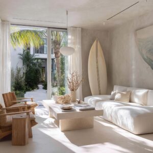
- If there is a stone fireplace, the ladder is unusually clear: pale sofas sit next to a big black center table (heavy but low), behind that sits a large stone surface with mixed values, and then small warm metal notes appear sparingly. That sequence makes the sofas feel like calm architecture framing a feature, not like “two couches.”
- If there is a curved sofa, the ladder is quieter but still present: light upholstery and pale rug meet a warm oak drum table, then a thin black tray and dark ceramics create a crisp border. The contrast is not loud; it’s measured. That measurement is what makes living room ideas with light grey sofa feel finished without needing “more stuff.”
A non-obvious idea: the dark anchor works best when it is simple in shape. The black block table succeeds partly because it reads as one confident volume, not a collection of legs, shelves, and mixed materials.
Grey interior designs often fall apart when the “dark contrast” is fragmented into many small items; the eye reads it as clutter rather than structure.

Night-time coldness is rarely about paint; it’s about where warmth sits
People often describe the problem as “my sofa turns blue at night,” but what’s really happening is this: after sunset, the interior design loses the warm daylight reference and the sofa starts reflecting cooler surfaces (windows, dim walls, shadows). The fix is not “add beige everywhere.
” It’s placing warmth where the sofa visually needs it.

How warmth can be positioned:.
- Warmth at ceiling height: brass chandeliers, woven pendants, or warm-toned fixtures create a gentle golden bias that affects the whole seating zone.
- Warmth at eye level: metal sconces, warm-toned art notes, or a warm lamp shade near the sofa puts “heat” where the sofa’s back cushions and upper planes catch it.
- Warmth at center height: wood tables and trays warm the middle of the composition so the seating doesn’t feel like a cool island.
That three-height approach is why a living room with a light gray couch can feel cozy while still looking modern and restrained. The warmth isn’t a color theme; it’s an atmospheric placement strategy.

A subtle, easy-to-miss trick: warm metal reads warm even when it isn’t shining. Brass and bronze carry a baked-in temperature, so they behave like quiet warmth markers during the day and gentle glow sources at night—without changing the palette.

Readable edges come from line weight
When light grey meets pale walls, the issue isn’t only “not enough dark. ” It’s usually not enough consistent line weight—meaning the interior design lacks a repeated, deliberate outline that tells the eye where one object ends and another begins.

The strongest interior designs often use black like a drafting pen:.
- black window grids
- thin black table frames
- black trays that create borders
- a dark fireplace opening (a clean rectangle)
- occasional black in art or accessories
This is why light grey couches living room ideas can look sharp even with very few colors. The black isn’t used as decoration; it’s used as edge control.
The best versions repeat black in different scales—one large dark shape, a couple of medium lines, and tiny dark points—so it reads like a system.

Another non-trivial move: the plaid/grid pillow should not be “pattern for fun. ” It’s an edge strategy disguised as softness.
It translates the window muntins into fabric language, tying architecture to upholstery, so the sofa looks integrated with the room’s skeleton.

Expensive color pairings
Light grey pairs well with almost any accent color, yet many designs still look immature because accents are treated like confetti. The accents can look grown-up because they follow two rules:
- Accents arrive with a supporting material (wood, metal, natural fiber), not alone
- Accents are repeated as a family (the same warm note shows up in more than one height or form)

That’s why warm notes such as clay, rust, mustard, or olive can feel refined: they appear as one concentrated moment (a pillow, a shade, a small art field) and are then reinforced by warm woods or warm metals nearby. The color doesn’t have to be everywhere; it has to be believable in the design’s material story.

A very subtle cue that reads high-end: using art as a “permission slip. ” For example, in the grey-green wall interior design concepts, the art can include creamy off-white, a warm ochre block, and a small black mark.
That tiny trio authorizes the room’s whole palette—warmth, calm light, and crisp edge—so nothing feels accidental.

Textiles look natural when they carry shadow design
The pillow and throw arrangements can avoid the showroom look by focusing on shadow design—how textiles create depth and softness—rather than novelty prints or many colors.

Key decorating ideas:.
- End punctuation: darker or denser pillows often sit closer to the ends to sharpen the sofa silhouette, like visual bookends.
- A calm center panel: a single hero pattern (often a lumbar) can create a designed center, while supporting pillows stay quieter.
- Texture as color substitute: nubby weaves, boucle chairs, ribbed ceramics, chunky knits—all create micro-shadows that make grey feel layered without introducing extra hues.
This matters even more for light grey leather couch living room ideas, because leather reflects light differently: it can show cold highlights at night and glossy glare in daylight. Texture around a leather sofa (wool rug, woven shades, matte ceramics, knit throws) can become the softening layer that fabric sofas already provide naturally.
A non-obvious point: pattern scale is doing social work. One large, clear pattern reads calmer than many small patterns.
That’s why a bold woven lumbar can feel quieter than several tiny prints.

Rugs “fix all”
Rugs are powerful here not because of rules about inches, but because they act as a platform that tells the eye: “this is the living zone. ” Ther eare two distinct rug strategies:
- Warm neutral platform: natural fiber or warm greige rugs make the sofa feel grounded and cozy while keeping the interior design bright. This is the relaxed, sunny approach—grey looks softer because the ground plane warms it.
- Graphic boundary rug: high-contrast rugs (cream + black) give instant zoning and edge definition. The sofa stops blending because the base beneath it has structure and rhythm.
What’s less obvious is how rugs also control the tone of grey. A slightly warmer rug makes grey read softer and more livable; a cooler rug can make grey read sharper but risks chill unless the design adds warmth elsewhere.

Depth without darkness: material rhythm
Interior designs that stay bright yet rich often rely on a material rhythm: matte next to soft, smooth next to nubby, heavy next to airy. Depth appears because the eye can travel through different surface behaviors.
Example ideas:.
- matte black vases on a warm wood table (weight + warmth)
- stone fireplace texture beside tailored sofa upholstery (busy surface + quiet surface)
- boucle chairs near woven grey sofas (soft fuzz + clean weave)
- greenery as thin linework against pale walls (organic rhythm without color noise)
Interior designs often put their heaviest object low and centered (a blocky table, a drum table), then keep the upper half lighter (glass, branches, airy lighting). That creates stability without making the space feel full.

Coffee tables and side tables
Table choices are not just style—they’re gravity management.
- A low black block table anchors pale sofas by creating a center of gravity. The sofas can stay light because the table carries the room’s weight.
- A warm wood drum table warms the center while also softening geometry (round against rectangular seating).
- A wood top + black frame table mixes warmth and edge definition in one object, which is why it fits so many neutral rooms.
- Trays appear repeatedly because they create containment—a visual boundary that makes everyday objects look intentional instead of scattered.
This is also where interior design approaches quietly solve concerns without turning utilitarian: containment makes the space feel calm even when life happens.

Open-plan layouts feel “zoned”
Even without walls, interior designs can imply a living zone by giving it a signature:.
- a distinct rug language under seating
- a center table with clear mass and shape
- lighting that marks the seating area as its own ceiling moment
- a chair or console that defines an edge of the zone
What’s interesting is how the strongest open-plan setups keep the dining area calmer, so the living area can hold the graphic moment (or the reverse). The room stays coherent because only one zone carries the boldest visual rhythm at a time.

Lived-in polish: “forgiving contrast”
Interiors designed for kids/pets don’t have to look busy; they often look more composed because they rely on forgiving contrasts:
- mid-tone greys that hide minor marks better than pure pale neutrals
- textured weaves that break up the surface visually
- throws that add softness and also act as a reset layer
- dark anchors (tray, table, fireplace opening) that make the room look intentional even if small items move around

A wrong grey? is often a room-filter problem
Such regret tends to come from undertone mismatch: a cool grey placed in an interior design where the whites are cool and the shadows are cool will look colder; a warm greige placed beside very crisp whites can look dingy. Grey should be treated as something that changes with its neighbors—especially whites, woods, and black outlines.
A useful way to think about it: surrounding elements behave like filters.
- Warm woods and warm metals push grey toward cozy.
- Thin black outlines push grey toward crisp and tailored.
- Natural fiber textures push grey toward relaxed and sunlit.
- Strong dark anchors prevent grey from feeling vague.
The sofa becomes successful when the room’s interior design supplies clarity, warmth placement, and a calm hierarchy of contrast—so the grey stops being “safe” and starts reading like a deliberate design choice.