No part of the home holds color the way the living room does. It’s the place where walls, seating, textiles, wood, and light all meet—and where choices around tone, texture, and finish set the atmosphere in motion.
But the strongest rooms don’t rely on a long list of bold shades. Instead, they shape impact through careful use of repetition, material shifts, and the way colors are anchored by contrast or softened by daylight.
This isn’t about following color wheels or seasonal palettes. The most interesting living spaces take a quiet, structured approach—where undertones are matched across surfaces, where a single dark frame can hold the palette steady, and where variation comes not from hue, but from sheen or weave.
It’s in the balance of cool against warm, matte against velvet, or solid color against open grain that a living room takes form.

Some tones might only appear once, while others show up again and again in smaller doses—a pillow, a vase, a shelf backing—pulling the whole space into rhythm. There’s a noticeable difference between rooms that simply include color and those that organize around it.
This article looks closely at that difference, focusing on how thoughtful sitting room colour schemes are shaped through placement, value balance, and quiet contrasts that don’t immediately call attention to themselves but leave a strong impression.

Color Patterns and Why They Work
Even within the most refined and restrained interiors, some of the strongest visual impressions come from decisions that don’t rely on contrast or quantity of color—but instead on how surfaces, finishes, and placement relate. These approaches are rarely pointed out by casual observers, yet they consistently show up in projects by leading designers working on thoughtful living room colour ideas.
Here’s a breakdown of these subtle design methods that quietly control how a room feels.

Tri-Material Same-Hue Layering
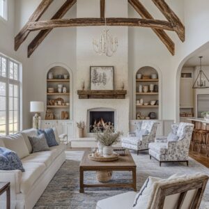
In many spaces, designers use three or more wood finishes that—while technically different—sit so close in tone that the eye reads them as a shared family. One wood might lean slightly yellow, another drift toward gray, and the third hold a dusty red base.
What makes this work is not the sameness, but the controlled variation. When floors, beams, and coffee tables share hue but differ in lightness or gloss level, the result is soft depth rather than visual clutter.
In practice, this layering brings out warmth, makes space feel tactile, and reinforces continuity in rooms that span open layouts or mixed-use zones. This approach often defines a refined color combo for living room schemes where color isn’t added on top—but built directly into the structure through material shifts.
Rather than add another tone, the room breathes through the differences in reflectivity, wood grain, or oil-finish intensity.

Color Looping Through Hardware and Small Metals
In rooms where the color scheme is rooted in tone-on-tone neutrals, small metallic finishes often serve as a pivot point. For instance, a bronze trim on a pendant might echo the same tone in chair legs or art frames—tying the rust-colored upholstery to cooler-toned slate walls.
This technique is quiet, often going unnoticed unless pointed out, yet it closes the loop visually between otherwise unconnected zones. What’s notable is the role of metal color as a mediator: it neither shouts nor disappears.
Repeating one metallic tone, spaced across architectural and furnishing elements, adds cohesion without over-decorating. In polished living room color combinations, where contrast is low and materials do most of the visual work, this kind of repeat-through-metal becomes a subtle foundation.

“Ghost” Complements
Some of the most balanced interiors don’t use complementary colors in direct pairings—they suggest them, faintly. Think of a soft taupe room that includes a branch of green leaves in a vase, or a sandy beige living space grounded by a single pale peach pot.
These “ghost” complements trick the eye into perceiving harmony across the color wheel, even if the main scheme seems monotone. Designers often keep these elements under 3% of the room’s visual field, so they never pull focus.
Yet without them, the room would feel oddly flat. These are not accent colors in the traditional sense—they’re balancing weights, tucked into corners or sitting quietly on shelves, keeping the overall palette from leaning too warm, too cool, too bright.

Material-Driven Value Shift
Rather than shifting color to create depth, many contemporary designs use value changes in the same hue group to guide the eye vertically through space. For example, ceiling planks might be a few shades darker than the walls, but lighter than the stone flooring.
In this setup, furniture in the middle zone—like an aqua or oatmeal sofa—appears suspended between the two, neither blending into the floor nor disappearing into the architecture. This balance is even more striking in rooms with tall ceilings or large open layouts.
A coffee table chosen to sit visually halfway between the wall and floor color can anchor a floating furniture grouping. These value shifts can make a room feel settled without needing stronger saturation or added color.

Peripheral Color Placement
Color, especially saturated tones, can either anchor a room or break it into parts—depending on where it’s placed. Designers working with stronger hues (mustard, teal, coral) often put them right in the center—like in a sofa or central rug—while keeping the outer parts of the room pale and quiet.
Others do the reverse: using a neutral base for the sofa and floors, and introducing bolder colors at the periphery—coffee tables, planters, benches. Avoiding the mid-zone for strong color keeps the room’s vertical rhythm calm.
It also helps define the palette hierarchy without crowding the eye. This approach is particularly successful in spaces with large window walls or built-ins where central items draw natural focus.

Shadow-Line Amplification with Slatted or Fluted Surfaces
In rooms where bold color is restricted (due to code, taste, or natural light), surface texture does the job of visual variation. Vertical slats, grooved panels, or fluted media cabinets deepen shadow without darkening the room.
These elements cast their own light breaks, especially when hit by angled daylight or warm directional sconces. This technique can act like a drawn line around architectural features—pulling walls into view or outlining a central fireplace wall without any added pigment.
It’s also one of the most consistent ways designers make neutrals feel designed, not blank. For anyone studying living room color combinations closely, this is where the palette shifts away from swatches and toward depth sculpted by structure itself.
These techniques don’t demand a palette of ten hues or a room full of contrast. They instead ask for control—of undertone, of placement, of repetition.
Whether in a room of creams and browns or in a scheme that pushes coral against chalk white, the quiet choices often do the loudest work.

Main Color Trends
| Theme | Design Approach |
| Single-Hue Shells | Painting architecture and major furnishings the same tint erases hard edges and makes the room read as one sculpted form |
| Texture-First Contrast | Instead of adding more colors, change sheen, weave, or pattern to avoid flatness while staying calm |
| Mattes Paired with Low-Gloss Accents | A controlled touch of sheen catches daylight and keeps earthy tones from looking dusty |
| “Shadow Anchors” in Black or Charcoal | A narrow dose of deep neutral stops pastel or mid-tone schemes from floating and gives the eye a resting point |
| Strict Saturation Ratios | Decide the percentage of bold, mid, and quiet tones first, then assign finishes to meet that formula |
| Regional Color Echo | Matching palette temperature to local daylight and outdoor hues yields schemes that feel inevitable rather than applie |

Practical Color Ideas
Looking closely at the 24 color-rich living room images presented, there’s a clear pattern: the most cohesive and quietly impactful designs aren’t improvised—they follow a certain structure. Not rigid rules, but tested proportions, visual anchors, and spatial relationships.
These aren’t always mentioned in the usual design talk, but they’re deeply embedded in how color is used in high-end homes across the country. Here’s how those visual choices come together.

Three-Level Value Ladder
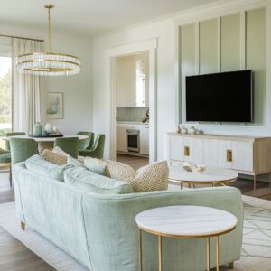
A recurring structure emerges across living rooms: a vertical value plan that defines how lightness and darkness are stacked. Ceilings and walls—often in soft whites, pale grays, or muted sage—carry about two-thirds of the visual weight.
The next tier, roughly a third, is handled by the larger furniture pieces like sofas or media consoles. These come in mid-values—soft taupe, warm greige, faded blue.
Then, grounding everything, is the final slice: black window trim, dark picture frames, fireplace boxes, or iron legs on a bench—small but concentrated areas of depth, usually no more than 10–15% of the visual field.

This three-part ladder doesn’t always shout, but it holds a space together. Especially in open layouts where there are few walls to stop the eye, the quiet shift from light to mid to dark makes everything feel arranged without lines being drawn.
You’ll find this balance holding up both subdued spaces and rooms with bold moves in color or layout, offering a good foundation even in brighter sitting room colour ideas.

Rule of Echoes
Rooms that look accidental rarely are. One consistent move that separates pulled-together spaces from chaotic ones is how saturated accents are distributed.
When a rich tone—emerald green, ochre, coral—is used, it never appears just once. Instead, it repeats quietly across smaller items: a pillow, a vase, a mat in the art.
These echoes pull that bold tone into the room’s rhythm and make it feel chosen, not inserted. The accent doesn’t shout from all corners; it appears just enough times to feel deliberate, often three.
This doesn’t require matching everything—it’s about direction and placement. So the red in a rug might whisper again through a candle base, or the soft blue of an armchair may land again in a glass bottle across the room.

Material Mix Count
Color alone doesn’t shape atmosphere. Texture does just as much—sometimes more.
One of the subtler yet highly consistent features in well-balanced living rooms is the number of textures within a single color range. In rooms with a dominant hue like sage or beige, there are usually four to six different materials: linen, velvet, boucle, matte-painted millwork, raw wood, woven jute.
This doesn’t create visual noise—it actually makes restraint more interesting. Instead of changing color to avoid flatness, designers shift the way light hits surfaces.
It makes tone-on-tone rooms look complex without looking busy. You’ll see this method in both minimalist spaces and warm layered ones—it works across the board.

Directional Warm-Cool Split
In rooms with both warm and cool tones, placement determines whether the palette holds together. There’s a clear pattern in how these temperatures are stacked: warm shades—beige, terracotta, wood—tend to stay near the floor.
Cool tones—sage, light blue, graphite—tend to rise up the walls, curtains, or built-in cabinetry. The result is an internal gravity that feels steady.
Warm tones help ground the room, while the cooler notes lift the sightline without floating away. Even where rooms are mostly neutral, this directional temperature layout helps the space feel balanced.
It’s especially common in areas where daylight shifts dramatically, allowing the cooler vertical tones to play with light and the warmer floors to anchor the view.

Micro-Contrast Zones
Large, quiet rooms can start to feel empty if the eye has nowhere to land. That’s where micro-patterns come in—not loud prints, but subtle motifs that live in the background.
In Lake Forest’s taupe-gray room, for instance, a faint rug pattern sits between similar tones, barely visible at first glance, but key in breaking up the floor plane. This idea shows up in textured stone, lightly striated wood, or matte finishes that carry a slight sheen.
In spaces with long sightlines, these micro-contrasts give structure without needing a new color. They’re like a whisper that helps the eye move without stopping it cold.

Emerging Color Pairings and Their Technical Roles
| Combo | Structural Role | Best Supporting Neutrals |
| Slate Blue + Rust | Rust catches light; slate retreats, deepening shadows | Pale ash, limestone, worn oak |
| Olive + Sand + Concrete Gray | Olive carries temperature; sand lifts; gray cools firebox mass | Black steel, light cane |
| Plum + Caramel Wood | Plum provides saturation; caramel spreads warmth horizontally | Cream walls, taupe chairs |
| Mustard Gold + Cloud White + Walnut | Gold owns mid-value range; walnut supplies low value; white tops brightness curve | Charcoal hearth, pale marble |
| Powder Rose + Slate Blue | Blue calms the sweetness of pink; pink bounces soft light back onto blue velvet | Driftwood, off-white travertine |

Future-Facing Ideas
As more designers push beyond conventional front room colour ideas, some fresh methods are beginning to surface. Not trends in the disposable sense, but quieter moves that feel like new tools in the palette.
Sheer-Tint Curtains Matching Wall Paint
A soft move with high payoff. Sheer curtains are dyed just a hint darker or lighter than the wall behind them.
This makes the color shift with the light—morning makes it brighter, dusk deepens it. The result is one hue read multiple ways, turning even pale pastels into active color fields without adding contrast.

Neutral Fireplaces, Colored Seating
In many newer projects, the fireplace is stripped of color entirely—stucco, limestone, matte concrete—while sofas or chairs carry the main tone. This leaves the eye free to focus on the seating without distraction, while the fireplace holds structure without competing.
The approach gives a quiet clarity that works especially well in rooms with mixed materials.
Low-Gloss Leather as “Temperature Regulator”
There’s a growing preference for matte, dusty leathers in tan, camel, and ochre. These finishes help visually warm up cool palettes—grays, blues, sage—without bouncing light like polished finishes do.
The result is a soft correction that makes cooler tones feel less sharp, especially in open-plan rooms.

Shadow-Colored Ceilings in Coffered Grids
Painting the recessed part of coffered ceilings just one tone cooler than the beams has an unusual effect—it deepens the space overhead without lowering it. This isn’t about contrast but about giving depth to daylight.
It’s a subtle move, but it turns the ceiling into a form rather than a blank.
One-Tone Walls with Contrasting Built-In Interiors
Another emerging idea is painting the interiors of shelving units in a stronger shade than the room’s walls. It turns the built-ins into framed elements.
Think of navy inside slate, or black inside warm greige. It doesn’t add new colors into the room—it just sharpens the lines of what’s already there.
All of these methods aren’t about decorating—they’re about organizing how a room breathes through its color. Whether that’s done with texture, tint, or placement, the results don’t shout.
They hold the space quietly, and let the furniture, light, and materials do the speaking.

Key Ratios for Specifying Paint & Fabric
| Element | Quiet Palette (coastal, cottage) | Bold Palette (mid-century, color-block) |
|---|---|---|
| Walls & Ceilin | 75% off-white / paste | 60% mid-tone colo |
| Large Seatin | 15% soft mid-ton | 25 % saturated hu |
| Accent Seating & Pouf | 5 % gentle contras | 10 % strong complemen |
| Dark Anchors (metal, frames | 3%% | 3% |
| Metallic / Stone Highlight | 2% | 2% |

Closing Insights
One thing becomes consistently clear: the success of a space isn’t driven by how many colors are present, but by how carefully they’re placed and how deliberately they’re carried through. The most cohesive colors schemes for living room interiors often contain only a small number of hues—but they don’t feel sparse.
That’s because every tone is repeated with intention, whether through fabrics, finishes, or even shadows. Black and charcoal come up again and again—not as bold accents, but as subtle anchors.
Their job isn’t to demand attention, but to map out structure. Whether found in window frames, fireboxes, lamp stems, or art outlines, these dark touches keep the room oriented.
They provide contrast without noise, supporting the flow of quieter tones.

More notably, in the most refined spaces, color is treated like architecture. It wraps from wall to built-in, from beam to shelf.
It shapes space rather than decorating over it. That approach gives depth, especially when combined with materials that hold texture.
It’s common to see velvet beside matte-painted surfaces, or soft linen next to raw wood—pairings that stretch one hue across different finishes. This is where layers are formed without needing more pigment.
Texture is the silent partner in these rooms. It’s the reason a space with five tones can feel full and considered.
In fact, the best examples avoid piling on color altogether. Instead, they trade sheen for shadow, and fabric weight for visual balance.
What ties everything together is restraint paired with repetition. By letting certain colors show up more than once, and by adjusting them slightly in tone or finish, the rooms feel connected from floor to ceiling.
These aren’t spaces that try to impress with saturation. They impress because nothing feels accidental.
This is the quiet edge of design—spaces that hold attention without asking for it. The kind of rooms that feel resolved, even before you’ve noticed why.