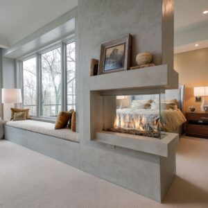
Today, the fire zone is not a loud focal object but a long, steady element that sits low and stretches across the wall like a calm horizon. This approach to living room decorating ideas with a fireplace turns flame into a soft underline rather than a shouting centerpiece.
Often, a continuous bench or ledge in warm wood, soft stone, or a plaster finish glides underneath the fire and acts like a quiet spine holding the entire wall in place. That band behaves less like architecture and more like furniture, and because it stays low, it keeps the eye grounded.

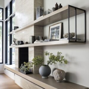
Shelves above or beside this line are rarely stuffed; instead, a few matte ceramics, a branch in a clay pot, or a stack of pale books rest with quiet certainty, leaving generous air around them. The empty space matters as much as the objects, giving the room a feeling of control and care.

Natural light can slip over these surfaces, moving across grooves in oak, shining softly along travertine, or creating gentle shadows that animate the wall. This sense of slow movement and soft glow becomes the real essence of living room ideas with a fireplace, where calm tones and long lines set the mood.

The long line: why the bench/hearth is the real conductor
A single low band—drawer bench, stone ledge, or concrete plinth—does most of the visual work. That line:
- ties TV, flame, and shelving into one readable sentence;
- sets a comfortable “eye rest” that keeps taller moves (slats, beams, clerestories) from feeling busy;
- behaves like furniture, so display objects read grounded instead of floating.

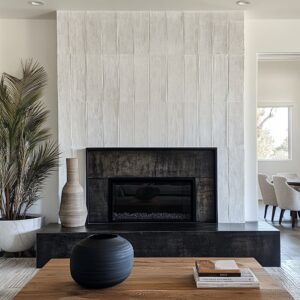
When that band picks up a shadow reveal instead of a visible baseboard, the feature wall turns lighter and more sculptural. Elsewhere, a slim warm-white baseboard outlines the perimeter without stealing attention.
This contrast between hidden base at the feature and quiet base at the room edge helps the fireplace wall feel like a crafted piece rather than a regular partition.

Vertical vs. horizontal: a composed tug-of-war
Modern interior concepts often set vertical rhythm (slats, fins, ribbed panels, beams, drapery folds) and then lay a horizontal counter-stroke (ribbon flame, ledge, mantle). That opposition is what calms the TV.

The black rectangle stops reading as a random object because it’s nested inside an intentional grid. If verticals are strong, the flame must stay thin and exact; if horizontals dominate (travertine courses, mantle + hearth), the flame can widen or sit a touch higher to keep the reading line clear.

Shelves are styled by mass and finish instead of color—three or five items per run, gaps left on purpose so joints and ribs stay legible. The best compositions put heavier/darker pieces high outer corners and keep smaller pale items mid-shelf, holding the visual center open.
Coffee tables carry one stone bowl or one stacked book pair; empty space reads as confidence, not lack.

Two subtle tactics often in use in grain and course direction:
- Grain flips (vertical veining on chimney, horizontal on ledge) separate mass from support without trims.
- Cross-grain dialogues (cedar beams running perpendicular to stone courses) energize the wall without additional items.

Tone-on-tone warmth: color quiet, texture loud
These ideas rarely win with color variety; they win with one temperature of neutrals stretched across many materials—oat, honey, stone, plaster, sand—plus one or two accent notes that echo the fire:
- Ember echoes: rust chair, caramel leather sling, tobacco cushion—used once or twice, mirrored in a stool or piping for continuity.
- Cool relief: a single gray or limestone piece (coffee block, hearth slab) to keep all the creams from blending into mush.

Because colors sit close, texture carries the melody: boucle vs. jute, ribbed wood vs.
smooth plaster, matte pottery vs. glass reflections.

Modern interiors often use one decisive warm accent (rust, caramel, sienna) to bring the flame’s temperature into the seating group. Repetition is deliberate and sparse: once in a chair, once again in stools or a small pouf.
This avoids scattered spots that feel noisy and keeps the fire as the brightest color in the palette.

Light: grazing, glow lines, and reflections
A modern move: let light do the styling.
- Grazing above slats/fins makes shallow textures feel deep without adding pattern.
- Hidden coves lift wood tone at night and make slats appear thicker.
- Glass and windows turn trees, louvers, and sky into active décor; keeping surfaces uncluttered lets those reflections be legible.
- Pin lights in niches create tiny halos so objects appear to hover; useful when the wall behind is dark ribbed charcoal and needs relief.

Rugs as field control
Rugs can be chosen for edge behavior and shadow absorption:
- Flat-weave or chunky loop keeps furniture stable and swallows busy leg shadows.
- Washed parchment or chalk expands the floor plane without a “frame” effect; faint stripes or diamonds stretch rooms along the same axis as the bench or floorboards.
- In glass-heavy interiors, a low, soft rug cuts acoustic glare and visually “lands” the seating island.

Seating geometry: rounded counterweights for stone and grids
When walls go structural—blocks, ribs, slats—the furniture softens:
- Rounded lounge chairs, pebble ottomans, oval stone tables prevent a right-angle pileup.
- Low, deep sectionals keep the feature wall visible and make the bench read continuous rather than interrupted by backs and arms.
- Swivels with thin legs add lift next to heavy vertical fields.

Asymmetry that still feels balanced
Even when TV and flame align off-center, balance is restored with counterweights: three floating shelves on the light side, a round table where the composition is angular, or a plant placed where the eye lands after the screen. The point isn’t symmetry; it’s giving every strong line a partner elsewhere so nothing reads accidental.

The wall avoids stiffness but never feels accidental. This is where scale and mass matter more than quantity—one heavier object placed high, two small pale ones low, a clear gap where the slat rhythm needs to breathe.

Window partnership: when the garden carries the color
Black or bronze-black window grids can act like eyeliner for pale rooms. Sheer or tone-matched drapery either:
- disappears (same color as wall) so landscape leads, or
- softens (long folds, slight puddle) to add vertical gravity and keep the fireplace primary when curtains are drawn.

Benches that jog under windows or turn corners pull the fire into the view, so the seat line and the horizon outside rhyme.

Skirting strategies that make a wall feel crafted
- Feature wall: often no visible base; a recessed shadow gap or the bench overhang becomes the base.
- Perimeter: warm-white or pale greige baseboard, slim to medium height, crisp top edge.This contrast is a small detail with big effect—it makes the fireplace assembly read like custom furniture against a quiet room shell.

Decor: bowls, branches, and scale shifts
The best styling behaves like punctuation:
- One branch placed at a shoulder or seam softens a hard edge and adds upward motion.
- One heavy bowl on the hearth or coffee table anchors the center; rough clay or hammered wood links to the fire’s earthy note.
- Scale jumps—tiny cups beside a larger vessel—create rhythm without color changes.

Walls that divide into three calm bands (slats, painted plank field, bench) win even when shelves are empty. The eye reads order first: upright field, quiet center, grounding base.
After that, a couple of matte vessels is enough. Resist the urge to add art above the flame unless it sits casually on a mantle and shares the wall’s hush.

Micro-alignments that tidy the whole picture
A few almost invisible moves can keep the interior composed:
- sconces lining up with window mullions;
- shelf spacing tuned to TV height;
- pendant cords falling in parallel with slats;
- art hung low to converse with the hearth instead of floating alone

Open-plan coherence
Layouts that share sightlines with kitchens stay calm by repeating:
- one leather tone (cognac chair ↔ stools),
- one wood species/hue (bench ↔ shelves ↔ table legs),
- one sand-colored story (rugs, counters, cane or woven seats)
The result is a level that feels like a single thought, not two rooms stitched together.

For tighter layouts:
- Dark center panel (ribbed charcoal) compresses TV and fire into one quiet field, letting the rest remain pale and airy
- Rounded compact pieces (short chaise, circular table) keep corners clear
- Generous ledge depth doubles as perch and display, freeing floorspace

Quick ideas
Palette pairs
- Sand + oat + one rust (chair or pillow): reads warm, sunlit, and steady
- Pale plaster + cool gray stone (one piece) + walnut: adds relief without color noise
- Charcoal ribbed field + creams: moody yet calm; flames look extra bright

Shelf recipe
1 large matte vessel, 1 medium stack of books (horizontal), 1 small pale cup/bowl. Leave visible gaps so the wall texture reads.

Coffee table recipe
One heavy bowl or one stone stack + a thin book. Keep the rest of the surface open so light can pool.

Rug choices
- Chunky loop when you want shadows to animate the floor.
- Washed parchment flat-weave when you want furniture to appear weightless.

Accent note
Pick one: rust/caramel/sienna/tobacco. Use it in a chair and repeat once (stool, piping, small pouf).
Stop there.

Skirting plan
Perimeter walls usually carry a slim warm-white or light greige baseboard with a crisp top line; the fireplace wall often drops the base entirely and relies on a recessed shadow gap or the bench overhang.

This simple shift separates the feature from the shell. The effect is subtle but strong: the hearth assembly reads crafted and lifted, while the rest of the room feels outlined and tidy.
- Perimeter: warm white or light greige, slim to medium height, crisp line.
- Feature wall: shadow gap or bench overhang as the “base” so the assembly reads as crafted joinery.

A closing read
These living room decorating ideas with a fireplace show a move away from clutter and toward thoughtful stillness.

Nothing feels accidental, yet nothing feels staged. Instead, the rooms seem shaped by restraint, where every surface has a reason to exist, every object feels chosen, and the fire burns quietly like a pulse under the broader composition.

Whether the home sits in a calm countryside, a leafy suburb, or a city apartment with clean lines, the same language shows up: one clear datum, edited shelves, tone-matched curtains, tactile seating, natural light grazing across grain, and a warm ember note repeated sparingly.

The feeling is tranquil and cultivated, not loud or flashy, and the mood rises from the blend of warmth, texture, shadow, and breathing space.