
A large living space reads as high-end when it behaves like a clear visual system: a few dominant gestures, repeated at different scales, with enough quiet space for the eye to understand the composition. In big living room interior design, the most persuasive “luxury” signal is often restraint that still looks rich—built through hierarchy, repetition, and controlled contrast instead of a high object count.
This article is a set of decorating ideas framed as visual strategies: how layouts, shapes, color weight, and light behavior create distinct moods and effects—without construction talk.
Quick outcomes these strategies are built to produce
- A big space that feels calm, not empty
- Clear hierarchy (the eye knows where to rest first, second, third)
- Depth that comes from contrast placement, not clutter
- Seating that feels socially “pulled together,” even at a large scale
- Day-to-night mood shifts created by glow and surfaces, not repainting

Layout recipes that read luxury (without filling the space)
These patterns show up again and again because they solve the same big-room problem: the space must feel complete while staying visually clean.
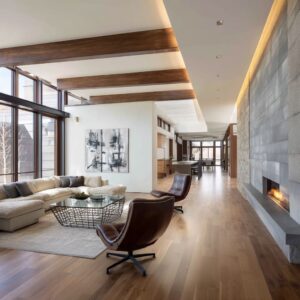
Layout A — The floating island
Core move: Seating floats off the walls, anchored by a large rug; a slim console or low shelf sits behind the sofa line.
Why it reads expensive: The perimeter becomes a calm “gallery walk,” while the center becomes a deliberate scene.
Detail that often seals it: Leaving a deliberate “breathing gap” between the main seating and the glass line makes the view feel curated, not pressed-on. That gap also makes each piece look chosen, because it has room around it.

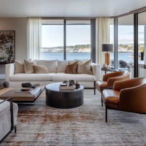
Layout B — The double-focus axis
Core move: Seating acknowledges two focal conditions (for example: view + fireplace, or view + art wall).
Why it reads balanced: The room feels like a complete environment instead of a single-direction viewing setup.
Detail that often seals it: A wide, low U-shaped seating outline can face both focal points at once. It keeps the plan social (conversation-first) while still letting the view act as the strongest background “pattern.
”.
Layout C — The two-zone rectangle
Core move: One main conversation zone plus a secondary pocket near glazing (two chairs + small table, or a chaise + side table).
Why it feels lived-in: It creates “chapters” in the same room without adding visual noise.
Detail that often seals it: Make the secondary pocket visually lighter (fewer objects, thinner silhouettes) so it reads like a pause, not a second living room competing for attention.
Layout D — The gathered U-shape
Core move: Long sofa/sectional plus two chairs forming a U; a round/oval table softens the center.
Why it fixes distance: Rounded geometry pulls attention inward so people feel closer even in a large footprint.
Detail that often seals it: Keeping the chairs slightly forward (not flush with the sofa line) creates a tighter conversation pocket inside a larger room.

Layout E — The perimeter statement + calm center
Core move: One strong wall carries intensity (dark built-in, fireplace mass, major art), while the center stays open and legible.
Why it reads refined: The room avoids equal intensity everywhere; the eye gets a clear map.
Detail that often seals it: Concentrate the darkest tones into fewer, larger shapes (a wall plane + table plane). This makes contrast feel architectural rather than decorative.

The formal-but-modern formula
Big drawing room interior design: the formal-but-modern formula
The “drawing room” idea often leans more composed than casual family living, even when the style is modern. The cues tend to be consistent:.
- Paired seating rhythm: chairs in twos, lamps in twos, styling moments in balanced placements
- One central rug field: the rug acts like a stage so furniture reads as a single arrangement
- Symmetry with one planned break: a balanced base with one offset element (sculptural chair, tall plant, bold art) prevents stiffness
- Large, calm surfaces: fewer objects, bigger forms; tables read as planes rather than display shelves
- Controlled shine: glass, warm metal, or lacquer shows up in small doses so the room feels dressed without looking busy
A subtle modern upgrade that keeps this from feeling too formal: use one strong “spine” (fire + art, or fireplace + tall piece) to claim the wall, then keep tabletop styling low so the view and negative space stay dominant.

The 13 visual strategies that control scale, mood, and hierarchy
The low-horizon strategy: making volume feel calm by lowering where the eye rests
A recurring approach in large spaces is to keep the main visual “horizon” low:.
- seating that sits close to the floor
- tables that read as thin slabs or discs
- accessories kept short and grounded
- tall architecture left visually clean so it stays background
Visual effect
- The view becomes the tallest “art piece,” so glazing and landscape carry drama without extra objects.
- Ceiling height feels greater, while the seating zone feels more intimate because the eye has a stable resting band near the floor.
A useful refinement: keep the darkest tones mainly in that low band (tables, fireplace void, small grounded objects). It anchors the room without making the upper volume feel heavy.

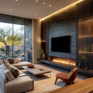
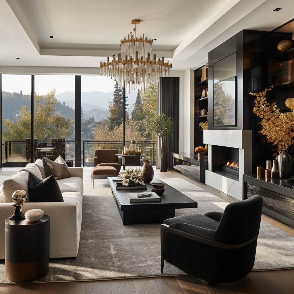
Black as outline, not theme: dark accents used like ink on a pale wash
Many large-room palettes use black as a drawing tool:.
- dark window grids echoed by a dark table plane or fireplace void
- black limited to silhouettes meant to read crisp (chair frames, pedestal tables, thin objects)
- black repeated in different “weights” (chunkier close, flatter mid-room, tiny far accents)

Visual effect
- Pale upholstery stops feeling washed out because the room gains clear edges and landing points.
- Depth appears naturally through foreground/middle/background contrast.
A useful refinement: let black show up as both mass (a table, a fireplace plane) and line (thin frames, slim chair arms). That mix prevents a black-and-cream room from looking like two flat blocks.

The three-layer neutral logic: structure, comfort, and glow
Large neutral rooms stay interesting when the palette has roles:.
- Structure layer: charcoal/black planes and outlines that define boundaries
- Comfort layer: warm whites, creams, greiges in upholstery and rugs that reflect light softly
- Glow layer: small warm-metal or warm-glass notes that add life without adding many colors

Visual effect
- The room reads composed because every layer has a job.
- Day and night both work: warm glass and warm metal become more active after sunset without changing the story.
A useful refinement: keep warm metallic notes scarce but strategic—one round side table, one pendant stem, one small reflective object on the coffee table. One warm “spark” can make cool blacks feel intentional rather than severe.

4) Quiet space as a design ingredient: intentional emptiness that reads like confidence
Large rooms often look more refined when they allow visible quiet zones:.
- seating islands that float with a deliberate gap near glazing
- open perimeter space around the rug field
- shelves styled with noticeable voids around objects
- table surfaces left partly empty instead of fully filled

Visual effect
- The view feels curated, because interior comfort does not press right up against the glass.
- Each object looks selected, since it has room to be seen.
A useful refinement: emptiness works best when it has a job—framing the view, keeping circulation readable, or giving one statement wall room to breathe.

Rugs as atmosphere and camouflage: the floor plane that merges pieces into one “island”
In large room designs, rugs do more than soften floors. They often function as controlled atmosphere:.
- smoky mottling that blurs furniture edges into a single scene
- gradients that contain the seating group like a soft shadow frame
- low-contrast texture that changes with sunlight and shadow
- pale fields that keep the footprint expansive

Visual effect
- Separate pieces start to read as one intentional seating “island.”
- Tonal texture absorbs changing shadows so daily light shifts look stylish, not messy.
A useful refinement: a “visual fog” rug (smoky, clouded, lightly marked) can hide real-life traffic shadows while still reading designed from far away.

Chandeliers as scale translators: presence overhead without heaviness
Ceiling elements in tall rooms often succeed when they are large but visually light:.
- clusters of clear globes
- warm-tinted glass that stays airy
- mesh or woven pendants that read like textured shadow rather than solid mass

Visual effect
- The tall void becomes readable in layers: floor layer, eye layer, air layer.
- The ceiling feels connected to the composition instead of distant.
A useful refinement: large lighting can be “big” in diameter but low in visual density (transparent rods, glass bubbles). That gives scale without creating a ceiling cap.

Curves as social gravity: soft geometry that pulls the seating zone together
Big room designs can feel emotionally distant when everything is rectangular. A common fix is controlled curvature:.
- oval and round coffee tables in front of long seating lines
- curved sofas facing each other to reduce perceived distance
- rounded ottomans that read like soft stones rather than extra furniture

Visual effect
- Curves make the seating zone feel gathered, not lined up.
- Circulation reads calmer because the eye doesn’t hit hard corners everywhere.
A useful refinement: even one rounded element (oval table, rounded ottomans) can soften an entire plan dominated by window grids.

Indoor–outdoor continuity: a layered “two-scene” composition instead of more furniture
A strong view often lets the terrace act as a second layer of the living room design:.
- outdoor silhouettes echo indoor low profiles
- plants placed near glass corners soften the boundary line
- interior tones quietly match landscape tones

Visual effect
- The room gains depth: interior lounge as foreground, terrace as mid-ground, landscape as background.
- The space feels “full” through layers of scenes, not through added objects.
A useful refinement: corner plants are powerful because they blur the “stop line” where interior meets exterior, making the room feel like it expands outward.

Silhouette-first styling: objects chosen to read from distance
Large spaces require decor that makes sense from far away:.
- rings, spheres, cylinders, shallow bowls
- tall thin branches that add height without bulk
- low clusters that stay beneath the window line
- trays and book stacks used like small platforms for one strong shape
Visual effect
- Tables look intentional instead of under-styled, even with few items.
- The coffee table becomes a designed plane, not a storage surface.
A useful refinement: in big rooms, “tiny cute objects” often disappear. A few heavier-looking silhouettes (stone-like bowl, substantial vessel) read better, even if the object count stays low.

Concentrated drama at the perimeter: keeping the center calm while the edges carry weight
Many successful large rooms keep the middle readable and reserve intensity for one side:.
- a dark fireplace wall or built-in as a single concentrated “weight”
- monumental art paired with that weight so the wall feels anchored
- small warm glints nearby so the dark zone feels layered
Visual effect
- Clear hierarchy appears: the eye understands what matters first and where to rest next.
- Contrast stays deliberate and localized, so it reads refined rather than themed.
A useful refinement: a dark “anchor tower” (a tall, matte wall mass) can keep a glazed room from feeling like it floats away into the landscape.

Art as a color hinge: one field that ties cool structure to warm comfort
A frequent move is to let one large artwork act as the temperature setter:.
- warm sections inside the artwork give permission for warm pillows and metals
- darker blocks inside the artwork connect to charcoal walls, table planes, and window grids
Visual effect
- Warm accents feel grounded in a source rather than random.
- The room gains personality while staying controlled.
A useful refinement: a rug can “translate” art into the seating zone—subtle rust, ink, or deep blue notes in the floor plane can echo artwork without spreading color around the whole room.

Time-of-day palette: evening mood created by light behavior, not paint
Some large rooms are tuned so that dusk becomes part of the design:.
- linear flame lines acting like a warm underline
- candle points creating a glow gradient from one side toward the center
- warm glass pendants that become more present at night
- matte dark surfaces that keep reflections calm when the outside turns higher-contrast
Visual effect
- Daytime stays clean and airy; evening becomes mood-driven without changing decor.
- Warmth comes from glow and reflection, so the palette remains disciplined.
A useful refinement: keeping bright light off the walls can make walls feel farther away at night, so the room stays large but still intimate around the seating.

The anti-lobby toolkit: sequencing and depth layers instead of filling volume
Large rooms often avoid “lobby energy” by behaving like a sequence of moments:.
- more than one focal condition (view plus fireplace, or view plus art)
- secondary pockets near glazing that read as pauses
- foreground punctuation (an ottoman, a sculptural side table) that creates depth
- a defined rug island that claims the center while the perimeter stays open
Visual effect
- The room gains chapters rather than one giant open rectangle.
- Empty space feels intentional because it has a visual job.
A useful refinement: adding one “near object” in the foreground (a rounded pouf, a sculptural stool) creates perspective layering: near → middle → far. That alone can make a large space feel designed.

Small details that make the whole room look intentional
These are subtle moves that repeatedly show up in strong big living room designs, because they solve scale and clarity without adding clutter.
A) The “height zoning” trick: dark low, warm mid, quiet high
Keep the darkest tones low (tables, fireplace voids, grounded objects), warm neutrals at cushion height (pillows, throws), and let the upper volume stay calmer.
Result: the room feels inviting where the body touches, and the tall architecture stays elegant instead of busy.

B) Table styling as composition, not decoration
Treat the coffee table like a low stage:.
- group objects by height (low tray + medium vessel + one taller airy element)
- keep the footprint calm (a few clusters, not scattered pieces)
- prefer silhouettes that read from distance (stone-like bowl, clean cylinder vase)
Result: the table looks “designed,” even when it isn’t crowded.
C) One reflective surface can add depth without adding objects
A glossy or glass table top can behave like a reflecting pool, doubling light points and turning small objects into crisp silhouettes.
Result: a neutral room feels deeper and more dimensional, without new colors.

D) Accent color works best as “heat points,” not sprinkles
One saturated moment (a floral centerpiece, a mustard pillow cluster, a rust note in art) reads stronger than many small pops.
Result: the room gets life while staying controlled—especially useful in a pale big modern living room.

E) Built-in styling that looks expensive is often about empty space
A curated shelf wall reads high-end when objects are spaced with visible voids. An effective pattern is a “material ladder”:.
- organic (greenery)
- matte solid (ceramics/stone)
- graphic edges (books)
Result: variety without clutter, and each object looks chosen.
F) Drapery can soften geometry even in a modern room
Full-height drapery, especially in softer tones, can round harsh corners and make tall glazing feel “framed” rather than exposed.
Result: the space feels calmer and more finished, without making the palette heavier.

G) Plants as placement tools, not decor
Placing greenery near glass corners or near a strong dark wall helps in two ways:.
- it blurs the boundary line at glazing
- it softens strict geometry with irregular silhouettes
Result: the room feels more relaxed and less rigid, even when the palette is strict.

Common mistakes that quietly ruin the look
Too many small decor items
In a large room, small pieces often read like visual dust from a distance.
Rug too small
A small rug breaks the “island” effect and makes furniture feel scattered.
Furniture pushed to walls
It creates an empty middle that looks accidental instead of planned.
Equal intensity everywhere
If every surface tries to be a statement, hierarchy disappears and the room feels louder than it needs to.

The main visual “types” these strategies produce
View-first gallery lounge
Low horizon, pale field, dark punctuation, sparse silhouettes; the skyline becomes the dominant artwork.

- Black-frame refinement
One major dark plane sharpens warm neutrals; small warm glints keep the contrast from feeling severe. - Cathedral calm
A monumental window dominates; furniture stays low and gently rounded so the architecture reads taller and softer. - Shadow-box library lounge
Deep, dark shelving contains visual density; the rest stays light and open, creating intimacy inside height. - Resort warmth minimalism
Caramel leather and woven texture warm the scene; the palette stays controlled while the mood feels relaxed. - Art-hinge composition
One oversized artwork sets temperature; smaller repeats in pillows, metals, and tabletop moments create cohesion. - Evening cinema room
Fireline and low glow points act as the color story; matte dark layers keep reflections quiet after sunset.

The quiet master rule behind the look
Most successful large-scale interiors do not attempt to decorate the entire volume. They compose it through hierarchy:.

- a calm center claimed by a strong floor “island”
- one or two perimeter statements carrying visual weight
- repeated curves that soften the architecture’s straight rhythm
- dark accents used as outlines and anchors, mostly low to mid-height
- light behavior treated as part of the palette

This is the underlying logic that makes large, open rooms feel intentional, controlled, and socially inviting—even when the object count stays minimal and the view remains the strongest element in the room.