
Modern luxury bathrooms read calm at first glance, then unfold layers of intent the longer the eye lingers. Surfaces sit in a measured dialogue: long timber lines steady the view, stone fields stay velvety, and light behaves like an instrument that sketches edges and holds everything in place.
Rather than showpieces shouting for attention, quiet hierarchies do the work—mirror halos that set the mood, shadow gaps that turn weight into air, thin dark glyphs that annotate the scene without noise. The result is a design that feels composed before a single object is noticed, a space where the choreography of light, mass, rhythm, and silence does the storytelling.
Line Discipline as the Quiet Code of Luxury
Modern luxury bathroom composition often begins with a calm conversation between long horizontals and precise verticals, establishing a visual order that replaces overt decoration with measured structure. A continuous vanity slab reads like a gentle horizon that steadies, while mirror spines, ribbed wall fields, and light blades rise like carefully placed markers that stretch height without fuss.
The success lies in how these elements repeat exact dimensions—shelf thickness echoing bench thickness, light-channel width mirroring a window mullion, mirror height matching an adjacent wardrobe opening—so the eye reads a single language. Within this framework, a library of luxury master bathroom ideas emerges: stone fields aligned as if carved, timber intervals that signal places of touch, and generous negative space that keeps the air clear around objects.
Nothing looks accidental; alignment, spacing, and proportion create the feeling that every piece belongs to a wider logic rather than to a single wall.

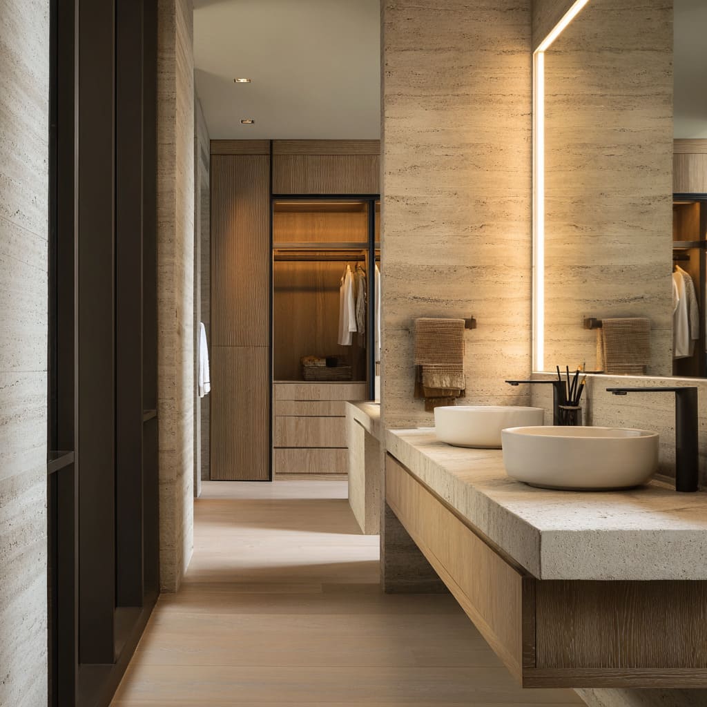
Stone as a Continuous Shell
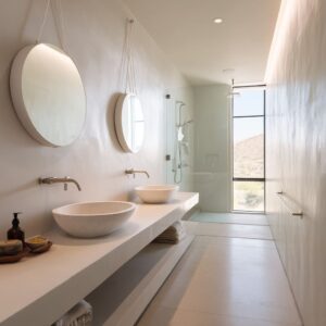
Stone acts as the calm skin—honed, dry, and laid with quiet joints—so surfaces feel like one uninterrupted field rather than a collage. Large-format panels glide around corners, letting veining flow as a gentle motion instead of a loud pattern, and niches are cut into thickness so bottles live inside the mass rather than perched on top.
This “carved” reading gives depth to the simplest gestures: a raked, illuminated niche that makes objects hover; a plinth whose shadow line lifts weight from the floor; a bench slab whose thickness repeats elsewhere to stabilize the composition. Because the finish is low sheen, light is absorbed into soft gradients that polish form without glare, allowing the design to glow at its edges while keeping the main planes velvety and calm.

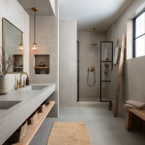
Timber as Warm Counterpart and Spatial Guide
Timber appears exactly where the body wants comfort—at touch points, under a canopy, framing a mirror, or as shelves that slide through stone—so warmth is distributed by use rather than by accent. Grain direction reinforces spatial reading: horizontal oak lengths widen a wall, while vertical grain in doors and ribs quiets height into a steady climb.
Ceilings trimmed in warm wood lower selected areas, turning a vanity bay or dressing alcove into a welcoming pocket within a taller stone envelope. Even small shelves carry the discipline of the larger layouts; thickness, spacing, and alignment echo nearby counters and lights, so joinery behaves like architecture, not accessory.

Light as Structure Rather Than Decoration
Light organizes such designs the way datum lines organize a drawing, locating edges, anchoring volumes, and guiding movement with soft precision. Glows are set back into coves and reveals so the source is hidden and the effect is calm: ceilings seem to float; corner seams turn into luminous fins; benches and shelves appear lighter than their material mass.
Because luminous lines align with mirrors, steps, and niches, the design reads as a sequence of gentle cues rather than a set of spotlit objects.
Key lighting roles used in these spaces:
- Perimeter ceiling coves that lift the lid into a soft plane.
- Vertical blades beside mirrors or at corners that subtly stretch height.
- Under-bench and under-shelf lines that cut weight and articulate horizontals.
- Backlit mirror boxes that turn reflection into an even, flattering field.

The Language of Edges: Thickness, Thinness, and Shadow
Edge control is where restraint becomes visible. Thick stone counters and bench slabs express calm permanence, while wafer-thin mirror edges, micro-bevels, and precise shadow gaps add finesse.
A finger-width step in a vanity lip creates a crisp underline; a recessed plinth folds darkness under mass, making solids appear composed rather than heavy. Basins often sit slightly lower or broader, which increases the rim’s shadow and gives a grounded, relaxed stance.
These edge decisions replace decorative trim with small, exact moves that sharpen silhouette and signal care.

Near-Symmetry, Not Mirror Symmetry
Order is established with paired basins, twin mirror spines, or centered light blades, then softened with minor shifts that bring ease—an offset tray, drawers grouped heavier on one side, a plant that interrupts perfect balance with a single natural note. The result is stability without stiffness.
In plan, the same thought shows up in axial shower galleries whose end walls glow like quiet destinations, while staggered shelf placements or alternating bench heights keep the procession from feeling rigid. A design built on near-symmetry holds attention longer because the eye finds balance and small surprises at once.

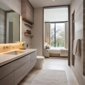
Suites, Not Rooms: One Language Through Wardrobe and WC
The most convincing luxury reads as a suite where bathroom, shower, WC, and wardrobe share proportions, grain directions, and light temperatures. A wardrobe front illuminated like a boutique display continues the glow from the vanity; a WC niche aligns its midline with cistern plates and shelf reveals; dressing cabinets keep oak grain and rail lighting in the same family as the bath.
This continuity dissolves thresholds so movement feels like a quiet sequence rather than a hop between functions. The viewer senses one intent that shapes the entire private zone.

Sheen, Color Temperature, and the Tone of Calm
Surface gloss is kept to a minimum so light grazes rather than bounces: honed stone, oiled or satin timber, powder-coated metal, matte porcelain. The palette lives in warm neutrals—travertine oatmeal, soft beige marble, gentle oak—with small, cool counter-notes supplied by distant daylight or a view to water.
Because reflectivity is reduced, color is felt as depth and warmth, not as shine, which naturally supports elegant master bathroom ideas where subtlety carries the atmosphere instead of bright finishes.

Fixtures as Graphic Marks
Hardware appears as thin silhouettes—slim spouts, quiet mixers, round or square heads—and sits on clear alignments with joints, edges, or light lines. Matte black and brushed brass read like punctuation on the stone field, giving the wall a calm syntax instead of a collection of gadgets.
Heights are tuned so profiles cut through the soft light cleanly; even hoses and wands follow a shared centerline logic. Because the shapes are simple, the wall stays legible as one composition.

Objects as Micro-Architecture
Objects are placed with architectural intent. A single stem sits where a vertical light blade needs a soft echo; a dark tray anchors the center of an extra-wide counter; towels in fawn or graphite merge with stone rather than shout against it.
Common object roles within the composition:
- Small, dark vessels used as visual commas on long horizontals.
- Plants with fine leaves repeating ribbed textures in miniature.
- Bottles grouped in tight rows inside backlit niches to read as a curated band rather than clutter.
- Towels scaled to shelf thickness or basin span so textiles feel integral to the layout.

Material Rhythms, Ribs, and Combed Bands
Textural systems carry identity while keeping the palette calm. Vertical ribs in timber or stone tighten the cadence of a wall; horizontally combed bands add a subtle drift that guides the eye toward a window; plaster with fine grooves diffuses light into a sandy glow.
These textures are tuned to read under grazing light, which is why edge lighting and corner blades are so effective here. Within this family of moves sit luxury modern master bathroom designs that favor disciplined patterns over bold graphics, letting rhythm replace color as the source of interest.

Mirror Logic: Voids, Spines, and Soft Boxes
Mirrors act as instruments rather than decoration. One approach treats a full-width mirror as a quiet horizon that binds openings and vanity into one plane; another splits the field into two tall spines that lift the composition and make paired basins feel like a ritual.
A third sets the glass inside a four-sided luminous reveal, turning faces into evenly lit portraits and the wall into a floating panel. These moves create amazing master bathroom ideas without adding any extra objects, because reflection, height, and glow become the experience.

Axial Movement, Framed Views, and Step Theatrics
Corridor-like showers and narrow windows to distant water show how movement can be staged with restraint. Steps gather the floor plane into quiet platforms, and light under each tread writes parallel lines that march toward the focal wall.
Floating benches and repeating shelf thicknesses accompany the walk, reinforcing the axis. A high, slim window ends the sequence with a calm slice of horizon—a cool tone that counterbalances the warm stones and woods—so the plan delivers drama through alignment rather than through color.

The Power of Negative Space
Open floor under long cabinets, clear spans of countertop, and quiet zones around basins grant objects room to breathe and make shadows do real design work. The distance between basins equals a bowl’s diameter; the mirror’s lower third aligns with the cabinet height; the shadow gap under a bench is tuned so the slab looks light but certain.
This attention to nothingness is what gives mass its grace and detail its clarity.
Suites That Read as Daily Rituals
When all of these systems—line discipline, edge language, stone shells, timber warmth, structural light, micro-architecture—work in concert, the environment begins to feel like a daily ritual set within calm geometry. The wardrobe gleams softly as an extension of the vanity glow, the WC bay holds its poised midline, and the shower reads like a small sanctuary of stone and steam.
This unity is the quiet heart of luxury master bathroom design, where composition and restraint turn simple materials into a coherent, soothing world.