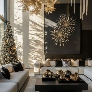
Seasonal decorating has moved into a more refined space, where tone, form, and texture often speak louder than color or excess. The focus now leans on how things feel through structure—how an arrangement holds stillness or rhythm, how lines pull the eye, and how materials react to light without relying on shine.
This shift creates a different kind of festive presence—quieter, but more layered.
Rather than centering everything on symmetry or tradition, design ideas have grown into a broader visual language. A soft curve, a vertical stack, or even the break in balance becomes the anchor.
These moves don’t compete for attention; they hold it. What carries weight is how the pieces relate—branches echoing door panels, shapes repeating across levels, or textures lining up across the space without shouting for notice.

Contrast also takes a new shape. It appears in the pairing of dried leaves with stone, matte wreaths on dark backdrops, or warm tones against cooler surfaces.
These choices don’t rely on the obvious—they play with atmosphere. Color becomes subdued, shadows become part of the styling, and movement shows up through a slight shift in direction or a breeze-caught mobile.
This approach doesn’t erase festive energy. It reshapes it.
The atmosphere still signals the season—but through details that ask the viewer to pause, observe, and absorb the mood rather than be overwhelmed by it. It’s a visual rhythm built with fewer notes, but more depth.

Color as Emotional Anchor
Color choices at the front door set the entire mood, not through intensity or contrast, but through subtle shifts in tone and how each surface responds to surrounding light and texture. A slate blue door, for example, holds its quietness with precision.
It doesn’t call attention to itself—it steadies the whole scene. The wood ceiling above, left plain, adds an earthy cap to the cool blue below.
This combination lets pale details like bleached pods or soft white florals float forward without creating visual tension. That slight lift—visually and emotionally—sits perfectly over a grounded base of muted concrete planters.

With a muted olive green door, the atmosphere changes again. This tone slips between light and dark, avoiding obvious seasonal colors.
Brass handles catch light softly rather than gleaming outright. The metal’s finish works like an accent thread, warming the green without brightening it.
The door carries a settled look, as if it’s part of the surrounding earth, and even before any actual light sources are introduced, the scene feels dimly aglow.

A cranberry-brown door brings a low, glowing richness to homes with brick façades. The warm red tones echo the sun’s late-day light, bouncing color back onto wreaths and branches.
Dried floral elements—especially in pale hues—begin to reflect like soft glints, creating tiny points of warmth. It’s a palette built on muted intensity, where deep base colors pull pale accents into visibility.
This mix aligns perfectly with door decorating ideas for Christmas that rely on balance rather than shine.

Textural Dialogues and Layered Depth
In modern Christmas decorating ideas for a door, texture often carries more visual weight than color. Materials speak in surface rhythm, pattern, and how they reflect or absorb light.
Consider a spiral wreath made from dense wool or felt-like material—it’s not symmetrical, but it commands attention. The spiral shape naturally draws the eye in, and when flanked by vertical painted branches, a quiet sequence emerges: center to edge, soft to sharp, horizontal to vertical.
This conversation between elements builds a kind of visual architecture—no clutter, just movement.

At entries where driftwood is stacked beside a compact evergreen, the tension lies in form. The stone siding behind reflects clean lines and hardness, while the driftwood introduces rough edges and a looser gesture.
The eye doesn’t rest in one place—it shifts, assessing grain, curvature, scale. Even the contrast between stone smoothness and weathered wood tells its own story about surface and tone.

Across several looks, bleached pods and white-washed pinecones quietly handle the role that color would typically play. They bring contrast through detail, offering highlights and fine shadows rather than brightness.
These textures don’t shout—they ask for close viewing. From a distance, they appear as soft silhouettes; up close, they show tightly packed detail that reveals the care behind the styling.
This kind of texture-driven layering is what gives these modern setups their depth without overwhelming the door itself.

Composition Beyond Symmetry
What catches the eye in many modern front-door styles isn’t precision—it’s the tension of things placed just off the centerline. An offset wreath, for example, creates a subtle shift in balance.
Its weight leans to one side, often with a soft tail of dried ferns or sculpted cones trailing downward or outward. That off-balance look introduces motion—like a gust of air has touched it—and that sensation is what holds attention.
Viewers don’t just see it; they sense the quiet imbalance and pause longer to understand it.

Some setups push further into asymmetry with diagonal arrangements. A piece like a moss arc or a stretched driftwood structure anchored from one corner cuts across the expected vertical grain of panel siding.
That cross-angle doesn’t calm the eye—it activates it. The lines challenge the architecture of the door and push beyond tradition.
Instead of outlining the door, they move against it, giving the whole surface a sense of movement.

In contrast, a rare but striking move is the use of a center-line garland, especially against dark doors. A garland pinned vertically in the very middle—especially with a repeated shape, like a stack of matte spheres—turns the door into a kind of sculpture.
The geometry becomes the message. The rhythm between spheres, their gradual change in size, and the alignment against the door’s panel seams all read as precise but not cold.
The vertical pull makes the space feel taller, almost ceremonial. In certain cases, these arrangements go beyond standard ideas for decorating Christmas doors, offering an architectural gesture rather than a seasonal frame.

Accent Notes That Punch Through
Sometimes, what creates impact is a single flash of unexpected texture or hue. One of the clearest examples is the use of bright citrus elements.
A pine garland that carries clusters of kumquat-colored accents or small preserved oranges immediately catches the eye—not because it’s loud, but because of where it’s placed. Against sage green or muted wood, the color reads almost electric, bringing energy that feels both vivid and grounded.
It’s a visual jolt that still feels rooted in nature.

Other compositions lean on one strong object rather than many small pieces. A heavy bronze bell or a geometric hanging piece, such as an inverted triangle with metallic charms, becomes the main focal point.
These aren’t filler elements—they are the structure. The rest of the decor simply supports the form.
That one element creates a stop point for the gaze and says something definite. It signals a break from the expected wreath and introduces the idea of a door as a surface for sculptural display.

What links many of these bold choices together is restraint. A single accent doesn’t crowd the scene.
It creates clarity. And in a time where door styling can feel crowded with glitter and repetition, these quieter but sharper ideas stand out.
They offer new direction in door decorations for Christmas ideas that rely less on quantity and more on the strength of one decisive choice.

Regional / In-Climate Responses
Seasonal decoration rarely works the same across different climates, and some of the most interesting Christmas front porch decorations reflect that. In warmer or dry-weather areas, there’s a clear move away from classic pine greens and snow motifs.
Instead, porches often turn to sun-scaled materials like bleached palms, terracotta pots, and dried tropical leaves. These materials echo the dry texture and color of the surrounding environment.
Rather than fight the climate, the styling builds on it. Palms arranged in radial shapes or soft draped grasses catch natural light, while terracotta tones hold warmth even in cooler seasons.
The effect is subtle but grounded—a visual tie to climate that also works seasonally, without relying on artificial snow or cold-weather symbols.

By contrast, entries in colder regions tend to lean toward snow-friendly restraint. Here, the decorations scale back in color and volume.
Whites, grays, frosted browns, and unfinished metals allow the actual weather—snow on the railing, frost on the steps—to become part of the visual rhythm. Sparse leafless branches placed in matte buckets, or loosely arranged wreaths of pale pinecones, let the architecture breathe.
These looks don’t compete with the season; they allow winter to finish the composition. What’s most compelling is how nature isn’t an extra—it’s already built into the layout.
This shift between climate zones reshapes what front door Xmas decoration ideas can be. It makes room for textures that feel weathered in the right way, whether through heat or frost, and brings seasonal energy in through tone and finish rather than bright color or glitter.

Light, Shadow, and Implied Movement
Lighting and movement often do more to define a holiday entry than color or shape. A soft amber sidelight, for example, can turn a dried floral garland into something almost weightless.
On a porch where roses, pinecones, or cotton clusters are arranged with care, the added glow from a low wall sconce doesn’t just light the space—it creates depth. That golden light lands gently across pale materials, giving them a warm surface that shifts with time of day.
It’s quiet, but it adds presence.

Shadow, too, becomes a kind of decoration. On dark facades—like black-painted brick—any ornament with angular metal rods or suspended shapes can cast narrow, precise shadows.
These shadows stretch across the brick’s surface and become part of the pattern, reinforcing the geometry of the door area. The effect is subtle but controlled—especially when mirrored by nearby verticals like window frames or planters.

Some entries take it further by using hanging mobiles or vertical displays in place of traditional wreaths. On porches where sun and air movement are part of daily life, these lightweight woven pieces—starbursts, moons, discs—sway gently with each breeze.
Their shadows dance across stucco or wood, changing by the hour. There’s no static center to these setups.
Instead, the eye follows the shifting light and the angles of shadow as part of the styling. That movement keeps the display from feeling flat—it creates a quiet animation that changes without needing any cords, bulbs, or color.
The porch becomes part of a slow, natural performance.

Subtle Repeat Cues
In many modern Christmas door design ideas, the smallest repeated elements often hold the strongest visual pull. These repetitions don’t always register on first glance—but they’re doing quiet work, guiding the eye and giving the entire scene rhythm.
Take white pods, for example. These might appear once in a wreath and then again, subtly, in the nearby planters.
Their repetition isn’t obvious—they’re spaced out, varied slightly in scale, maybe paired with a different texture or backdrop. But the shape repeats, and that keeps the viewer’s attention moving in loops.
These little details form visual bridges between components that might otherwise feel disconnected. The result is an entryway that feels thoughtfully joined without being over-matched.

Ribbons play a similar linking role. Whether it’s a length of dark jute, slate-gray fabric, or a narrow taupe strip, the ribbon often serves more than a functional role.
It becomes a quiet line that ties multiple levels of the display together—sometimes literally. A ribbon from the wreath drapes close to a planter’s edge, repeating the same color and finish as another piece across the porch.
These lines run like quiet connectors, linking form and height across the entire composition. They’re not loud, but once you notice them, they hold the whole arrangement in place.
Key Takeaways
- Color shifts rely on subtlety—tones like slate blue, olive, black, and taupe create emotional weight without relying on holiday clichés.
- Shape and direction carry visual motion. Spirals, arcs, vertical garlands, and off-center placements keep the door from looking flat, offering depth through structure.
- Texture matters. Soft dried flowers, smooth concrete, rough driftwood, and matte metal speak through contrast, building a surface story that reacts to light and touch.
- Climate-sensitive design matters more than matching traditions. Some porches lean into frost and pale branches; others swap in dried palms and sun-warmed tones that fit their surroundings.
- Less can do more. A single citrus accent, a woven mobile, or one striking bell can shift the entire focus of a doorway and suggest a mood far beyond the materials used.
These examples show how modern entries can go far beyond surface decorating. The strongest looks are built through quiet links, tone-on-tone control, and an understanding of how form and texture carry atmosphere.
Together, these details create compositions that aren’t trying to impress—they’re simply well-composed and full of clarity. They make space for seasonal tone without relying on loud cues or crowding, and that’s what makes them feel different the moment you see them.