A strong TV background wall design often reads as a complete composition first, and a screen second. The wall behaves like a controlled visual system: one deep rectangle held inside texture, rhythm, weight, and empty space, so the “tech” presence feels contained rather than dominant.
In many TV wall background ideas, the key shift is simple: the wall carries the atmosphere, while the screen stays clear and legible inside it.
A recurring theme in TV background ideas is restraint that still feels rich. Instead of adding lots of objects, the look is built through value control (light fields vs.
dark notes), pacing (clusters and pauses), and a few deliberate materials that keep the wall from feeling flat.

The screen as punctuation, not the headline
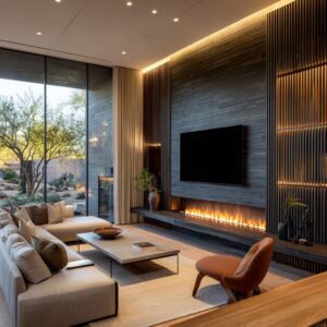
The most consistent visual strategy is treating the TV as a punctuation mark inside a larger sentence. In wall mounted TV background design, the black rectangle is usually the deepest value in the design, so the wall has to “hold” it with supporting shapes and nearby shadows.

Common stabilizers include:.
- A second dark note nearby (a dark slab, a shadow pocket, or a narrow dark strip) so the screen isn’t the only heavy value on the wall.
- A calm buffer zone of negative space around the screen so graphics read intentional rather than “cut off.”
- A deliberate placement within the quietest portion of any linework field, so the wall stays readable as a whole.
The result is a screen that feels inserted into a composition, not pasted onto it.

Baseline control: the long low line that calms the wall
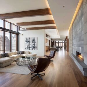
Most successful media wall designs rely on a single horizontal rule that behaves like a horizon. This is the quiet logic behind wall design for TV background: a long, low console line steadies everything above it and prevents the upper field from feeling floaty or nervous.

Three baseline personalities show up repeatedly:.
A dark underline baselineA charcoal or black band beneath the screen compresses visual contrast into one controlled strip. It “pins” the TV to the composition and makes the rectangle feel deliberate rather than harsh.
A warm wood baseline
A warm, matte wood run changes the emotional temperature at the bottom of the wall. It turns the composition into something livable, while still keeping the upper field calm and airy.
A floating baseline
A shadow gap beneath the cabinet makes the entire wall feel lighter. The horizon still exists, but it has air underneath, which keeps the composition from feeling heavy at floor level.

Vertical tempo: why linework walls look premium
In many versions of background TV wall design, tall plant or forest linework reads “expensive” when it behaves like tempo rather than pattern. The wall doesn’t rely on the subject matter (bamboo, birch, reeds); it relies on pacing.

The premium signals are subtle:.
- Spacing that varies slightly (clusters, then pauses) so the rhythm feels composed, not mechanically repeated.
- Density that shifts from lower to upper areas (denser below, airier above) so the ceiling line stays clean and quiet.
- Two-volume distribution (sparse on one side, denser on the other) so the wall feels directional without needing loud color.
This tempo strategy also solves a common problem: thin vertical marks give the eye an upright framework, so the TV rectangle stops feeling like the only “hard geometry” in the scene.

Balanced asymmetry: stability without mirroring
A calm wall rarely depends on perfect symmetry. A refined living room TV background design often uses unequal elements that still balance through visual weight.

The most frequent balancing methods are:.
- Tall-light vs. short-dense: one side carries airy height (branches, slender forms), the other side carries compact mass (low sculptures, darker clustered objects).
- Density vs. mass: a denser graphic field can be counterweighted by a heavier base, a darker neighboring surface, or a single strong vertical mass elsewhere.
- Shifted “gravity”: the TV may be centered in position, while the composition’s emotional weight leans slightly left or right through object scale and line density.
This creates a relaxed, lived-in feeling while still reading composed.

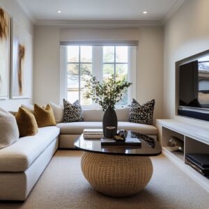
Texture as luxury: absorbing the rectangle
A defining move in TV background interior design is using quiet texture to soften the screen’s flatness. Pale woven finishes, cloudy plaster looks, mineral washes, and micro-ribbed fields do not function as decoration; they function as a visual buffer.

Texture contributes in three ways:.
- It adds micro-variation so large neutral walls don’t look empty.
- It reduces the “techy” harshness by surrounding the TV with softness rather than flat paint.
- It allows minimal styling to look intentional, because the surface itself already carries depth.
The most effective pairings keep the palette restrained while multiplying the number of surface reads: matte against matte, grain against linework, haze against sharp edges.

Geometry dialogue: line, rectangle, and one soft counter-shape
A calm wall stays interesting when it stages a small geometry conversation: vertical linework, a rectangular screen, and one curved form that releases tension. This is why simple TV background design can still feel layered.
The most reliable geometry roles:.
- Linework gives lift and rhythm.
- The rectangle provides the visual anchor and functional center.
- A rounded object (urn, bowl, mirror, round table) softens corners and stops the wall from reading overly strict.
A particularly subtle effect appears when rounded forms sit near TV corners: the eye reads “softness” beside the hard edge, so the screen feels less like a cutout and more like part of the still life.

Sheen choreography: richness without noise
Many walls in this style stay calm because shine is treated as a low-volume note. Instead of spreading gloss everywhere, the composition often keeps matte dominant and places reflective moments where they read like quiet depth.

Typical sheen structure:.
- Matte ceramics and dry textures set the baseline calm.
- Warm wood introduces a gentle, low-gloss richness.
- One reflective element sits deeper, lower, or partially shadowed so it reads as a whisper, not a headline.
This is one reason a single saturated, glossy ceramic can work: it becomes a controlled highlight rather than a palette shift.

Depth as a “finishing layer”: niches and quiet shelving
A recurring strategy in TV background design for living room is adding depth without clutter. Built-in shelves and niches function as shadow instruments: they create pockets where darkness and warmth can live without turning the wall busy.

Two common depth personalities appear:.
- The calm vitrine: warm recesses with plenty of air around a few objects, so the spacing itself reads intentional.
- The shadow museum: darker silhouettes inside warm wood cavities, where contrast comes from depth rather than color.
Because these recesses already carry shadow, the wall can remain lightly styled and still feel complete.

Light as composition: grazes, halos, and controlled gradients
The most atmospheric walls treat light as part of the surface. A thin ceiling graze line can soften the top edge, making the wall feel taller and calmer at the same time.
Recessed zones that wash a mural gently can shift attention away from the TV and toward atmosphere: glow, shadow edges, and negative space.

This approach defines many examples of modern TV background wall design: the wall becomes a background scene rather than a decorated panel, and the screen reads quieter because the eye is also reading light.

Temperature control: warm-cool tension that reads intentional
A black screen is visually cool and firm. Calm walls often resolve that firmness through controlled temperature relationships:.
- Warm wood and warm ceramics create a grounded base note that keeps the composition welcoming.
- Neutral mid-tones bridge the cool screen and the warm elements, so the wall doesn’t feel split.
- Stronger color moments work best when they are localized and anchored low, so they feel stable rather than scattered.
The wall ends up feeling composed because temperature shifts behave like structure, not like decoration.

Scale control in tall rooms: vertical marks as a translator
In taller spaces, thin vertical marks often act like a scale translator between human-height furniture and soaring ceilings. Instead of adding big blocks of art, the wall uses height that stays quiet: slender lines, light clusters, and generous empty space.
The TV then reads as a pause inside the rhythm, not as the only focal point competing with the architecture.

Look families that keep appearing
These strategies tend to cluster into recognizable visual families:.
- Gallery-calm neutrals: textured pale field, disciplined negative space, one deep ceramic accent.
- Tempo linework minimal luxe: pacing through cluster/pause spacing, long baseline horizon, counterweights rather than mirrors.
- Tactile warm minimal: texture contrast carries the interest; objects stay oversized and earthy, color stays muted.
- Moody cinematic hush: mineral haze, dark horizon band, minimal accessories, and light grazes that turn graphics into atmosphere.
- Coastal layered quiet: linework paired with soft plaster masses and woven notes, where texture does the heavy lifting.
Micro-moves that quietly make the wall feel “resolved”
Certain small composition choices show up again and again because they complete the visual logic:.
- A dark “partner note” beneath the TV that reduces harshness.
- A real branch arrangement that echoes mural linework, so graphics feel integrated.
- One rounded form near the screen to soften corners visually.
- A density shift in linework to create direction without loud color.
- Objects kept low and clustered so the upper wall stays restful.
Together, these moves form a consistent visual grammar: the wall holds the atmosphere, the baseline holds the weight, vertical rhythm holds the height, and the TV reads as a calm, contained mark inside the system.