This article takes a close look at contemporary minimalist bedroom design—examining the quieter details and the smart decisions behind them. Minimalism today goes far beyond removing clutter.
It’s often built into the structure of the room itself, with clever material pairings and subtle depth that gives each space its own identity. These minimalist bedroom ideas reveal how simplicity can still feel complete, using layout, texture, and architectural features in ways that are rarely discussed.
Composition Through Architectural Integration
Framed Alcoves and Wall Niches
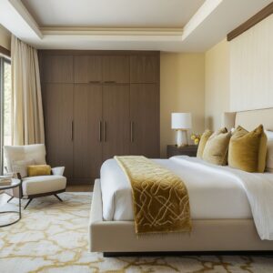
A recurring approach in today’s minimalist bedrooms is shaping the bed area with a built-in niche or a recessed architectural frame. This idea has been adapted in homes from the West Coast to the Northeast, where it not only gives the bed a focal zone, but also creates a natural boundary within the room.
Some alcoves are built from softly finished wood slats, others are fully upholstered with wide textile panels or structured plaster. Regardless of material, the result is the same: a surface that feels purposeful, insulating both sound and visual clutter.
Many designers have started skipping traditional headboards entirely—these architectural insets already do the work, while keeping the room streamlined.

Millwork That Conceals Storage
Custom millwork is no longer just about storage—it’s often the defining feature of the bedroom. In minimalist bedroom design, closets and cabinets are built directly into the wall plane, often with push-latch doors or hidden seams.
This choice helps the walls feel quiet and uninterrupted. It’s also a useful trick in narrower layouts: storage that flanks the bed visually opens the space outward and keeps the layout feeling balanced.
In smaller homes, this approach doubles the function of the room without adding anything extra. By integrating storage into the background, the overall mood stays calm without sacrificing practicality.

The Power of Negative Space
Floating Furniture
In many minimalist bedrooms, one of the most effective ways to keep a room feeling open is by removing bulk from the floor. Wall-mounted nightstands and floating storage units shift the visual weight upward and free up the lower part of the room.
It’s a technique often seen in compact city homes and coastal builds, where square footage matters and visual clarity helps the room breathe. These elements don’t fight for attention—they quietly support the overall structure, giving space for the eye to rest.
Restraint in Decor
What makes many of these rooms work is how little they try to show off. Styling tends to be understated, limited to one or two items that act as visual punctuation.
It could be a clay vessel placed deliberately off-center, or a trio of books on a ledge—each chosen more for its form than any narrative. This quiet approach makes texture and material the real focus, and the absence of extra objects allows those surfaces to speak clearly.
Negative space isn’t empty—it’s doing the job of setting the mood.

Texture Contrasts and Fabric Strategy
Layered Textiles in Monochrome
Minimalist bedroom decorating ideas often lean on a restricted color palette—but what makes them engaging is the range of surfaces within that palette. A room can feel deeply inviting using only shades of beige, gray, or cream if the materials are mixed thoughtfully.
Think about soft-washed linen sheets layered with a thicker, slub-woven blanket, or pillows that shift from crisp cotton to loosely spun boucle. Texture replaces color as the key to visual and physical comfort, especially in softer climates or homes that get cooler light.

Large-Scale Upholstery
Instead of standard headboards, many designs now stretch fabric panels across an entire wall, creating a single material field that absorbs sound and adds softness without needing extra decor. This idea is used widely in both custom builds and high-end renovations, especially where acoustic quality matters.
It’s not always flashy, but the impact is clear: padded walls can turn a plain layout into something that feels wrapped and quiet. These fabric installations also provide a textural backdrop that highlights smaller furniture pieces placed in front.
For minimalist bedrooms, it’s a move that works both visually and functionally.

Thoughtful Lighting Techniques
Hidden or Recessed Illumination
Lighting has taken on a quieter role in modern minimalist spaces. Rather than visible fixtures hanging mid-air, the current move is to integrate light into the room’s shape.
Hidden LED strips tucked into architectural edges—under headboards, inside wall niches, or behind ceiling lips—offer a soft wash that adds depth without demanding attention. This kind of lighting doesn’t just brighten the room; it redefines how surfaces are perceived.
You’ll find it used in minimalist ideas for bedroom layouts where the structure carries the atmosphere. It’s less about spotlighting, more about glow and shape.

Oversized Pendants as Sculptural Anchors
Not all lighting has to disappear, though. In contrast to the quiet use of hidden LEDs, oversized pendant lights are showing up as bold visual anchors.
These are often large paper or fabric spheres, heavy ceramic cones, or raw stone shades hanging low beside the bed. They tend to be placed slightly off-center, sometimes even replacing the standard nightstand lamp.
The point is to break symmetry with intention. In spaces where everything else feels measured and calm, one strong object—especially one that casts interesting shadows—can add exactly the kind of contrast that keeps a minimalist layout feeling alive.

Unconventional Material Pairings
Raw Woods and Polished Surfaces
Mixing rough textures with smoother finishes is one of the most interesting shifts in simplistic bedroom ideas. Rooms now often pair unvarnished timber with soft plaster walls or even microcement.
This works especially well in spaces that favor beige and gray palettes, where texture steps in to add depth. A wall of washed wood planks beside a cool-toned concrete floor creates a layered visual story without adding objects.
These pairings aren’t random—they follow a pattern of quiet contrast, where natural imperfections meet clean lines.
Subtle Metallic Hints
Minimalism doesn’t avoid metal—it just keeps it in check. Small brass accents on sconces, a narrow black frame on a mirror, or a slim pull on cabinetry are usually enough to create contrast without pulling focus.
The trick is to use metal in thin lines or as a faint edge—not as the main feature. In several projects, these details also help balance warm woods and cool stone.
The metal isn’t trying to shine—it’s there to add edge and weight in just the right places.

Geometry as a Design Language
Repeated Lines and Grids
Clean geometry continues to be one of the most recognizable traits in a modern minimalist bedroom. Many of the strongest designs rely on repetition—vertical wood slats that cover entire walls, horizontal panels that line up with window mullions, or a sequence of squares padded into a headboard wall.
These repeating lines help organize the space visually. You might not notice it at first, but they quietly pull everything together: furniture edges match the rhythm of ceiling beams, lighting shapes echo bed frames, and even rugs are often cut to match the room’s grid.
This level of alignment builds a calm sense of order without needing much else in the room.

Strategic Asymmetry
While balance is usually part of the plan, perfect symmetry isn’t always the goal. Many designers break the grid with a purpose.
One oversized pendant might hang lower on one side of the bed, or an art piece might be slightly off-center to shift the mood. It’s this subtle move away from exact repetition that can bring a minimalist space to life.
Used well, a single object placed off-axis draws attention in a good way—it creates tension without adding clutter, and gives the room a focal point that feels spontaneous.

Integrated Window Seating and Desks
Using Window Ledges as Multi-Functional Zones
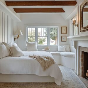
Some of the most effective ideas for minimalist bedroom layouts come from turning architectural features into useful furniture. Deep-set windows are a perfect example.
Instead of wasting the ledge, designers often turn it into a seat, a compact desk, or a low display surface. In tighter rooms, this type of setup can replace bulkier furniture altogether.
One long cushion, a few hidden drawers, and suddenly the window becomes one of the most practical spots in the room. These features also pull natural light into the function of the space—whether you’re reading, working, or simply resting.

Matching Materials With Surrounding Millwork
What makes these built-in seats or desks feel natural is how they blend with the room. Often, the materials match everything else—same wood tone, same trim style, even same hardware (or no hardware at all).
The desk or bench becomes an extension of the wall or storage rather than a new piece of furniture. You’ll see this often in homes where millwork takes the lead in shaping the entire room layout.
It’s a quiet but smart way to keep things looking clear and cohesive—without giving up comfort or function.

Low-Profile or Platform Beds
Visual Grounding
A consistent design move across many minimalist rooms is the use of beds that sit low—either close to the floor or fully built into a platform. These shapes keep the eye level steady and allow taller walls or sloped ceilings to feel balanced.
In larger spaces, the lower height reduces vertical tension and brings the room down to a calmer proportion. You’ll often find this approach in modern coastal homes or open-layout homes in the suburbs, where quiet grounding plays a bigger role than filling space.
Tactile Upholstery on Bed Frames
Even with minimal bed ideas, comfort doesn’t need to be sacrificed. Bed frames are often upholstered in thick, textured fabrics like linen or boucle, with soft edges and visible folds that add a relaxed quality.
Some feature intentionally wrinkled or slouchy corners, which contrast nicely with sharper architectural elements like clean wall panels or hard flooring. This balance between structure and softness is key—it stops the room from feeling too strict and gives it that lived-in comfort that still stays clean.

Subtle Color Gradations and Tonal Blocking
Consistent Palettes With Near-Identical Tones
Color choices in a minimalist room tend to stay close to each other—off-white walls paired with beige bedding, light gray headboards, and pale oak floors. Rather than pulling in a bold accent, the focus is on texture, weave, and material finish.
A single soft olive pillow or muted rust-colored throw might be the only tone that breaks the continuity. These quiet palettes are especially effective in homes that receive a lot of natural light, where subtle changes in shade shift naturally throughout the day.

Micro-Shifts in Wood Finish
In wall paneling or cabinetry, you’ll often notice that the wood doesn’t match perfectly—and that’s intentional. Slight variations in grain direction, tone, or reflectivity are used to keep things visually interesting without disrupting the mood.
This technique works well in rooms with vertical slats or full-wall storage. The differences are small enough to read as cohesive, but just noticeable enough to add warmth.
It’s one of those small design tools that separates average from carefully done.

Precision in Furniture and Decor Placement
Controlled Scales and Alignments
In a minimal bedroom interior, scale does a lot of the heavy lifting. Rugs are cut to exact measurements, often matching the bed width or landing just past the frame.
That sizing helps ground the layout without bleeding into unused areas. Wall lights are placed with similar care—lined up with pillow seams, mattress edges, or the vertical grain of nearby panels.
These alignments may seem invisible at first glance, but they’re what gives the room that clean and settled feel. Each detail serves a visual cue, reinforcing balance without needing anything extra.

Minimal Accent Objects
Decor is reduced, but never careless. The strongest examples feature a single branch in a handmade vase, or one low ceramic bowl on a floating shelf.
These items are positioned intentionally—centered under a sconce or nestled into the negative space between panels. Their job isn’t to decorate in the traditional sense; they act as soft contrasts to the clean lines.
In many rooms, this kind of restraint keeps the focus on the shapes and materials already present. It’s minimalism made personal, not blank.

Acoustic and Light Control Advantages
Fabric-Wrapped or Upholstered Wall Treatments
In many quiet spaces, acoustics play an underrated role. Large padded walls or textile panels—often installed behind the bed—help soften sound, especially in homes with polished concrete, tile, or wide wood floors.
Besides reducing echo, they also add tactile warmth. They turn the bed wall into a soft zone without introducing extra furniture or accessories.
These kinds of installations have become common in homes where the minimalist bedroom aesthetic is guided by both calm and comfort.

Thick Curtains and Window Treatments
Another overlooked layer is the curtain wall. Floor-length drapes that match the wall color visually flatten the space and prevent harsh breaks in the room’s vertical rhythm.
In higher-end setups, curtain tracks are often recessed into ceiling slots so that fabric seems to flow straight from the wall. The benefit isn’t only aesthetic—these curtains help with light control and buffer outdoor sounds.
In minimalist layouts where fewer materials are used overall, these soft planes bring in both coverage and warmth without changing the visual temperature of the room.

Key Takeaways for Modern Minimalist Bedrooms
Built-Ins as Both Architecture and Furniture
One of the biggest shifts in modern bedrooms is how often the furniture disappears into the architecture. Full walls become storage units, padded niches double as both headboards and visual frames, and seating is carved directly into millwork.
These built-ins help remove clutter and keep everything flush, a key move in many minimalist style bedroom designs.
Use of Vertical and Horizontal Lines
Rooms feel more composed when their structure repeats. Vertical wood slats, square paneling, linear shelves—these elements form a quiet rhythm.
Designers often echo these lines in rugs, curtain pleats, window divisions, or even lighting cords. It’s not about pattern—it’s about pace.
Texture and Material Variation Over Color
Rather than changing up color palettes, most rooms stick to creams, grays, and pale woods. The visual interest comes from how those neutrals feel: rough plaster, soft velvet, smooth stone, or brushed oak.
These subtle switches in texture keep the room full of depth without looking busy.

Clutter-Free Zones
Minimalism thrives when there’s room to breathe. That’s why floating nightstands, built-in benches, and hidden drawers show up so often.
Surfaces stay clean, and even the decor—like a single ceramic piece or an open book—feels intentional, not staged.
Subtle Lighting
Instead of overhead fixtures grabbing attention, lighting is built into the room’s structure. Recessed LED strips, oversized pendant globes, and slim vertical sconces give off a soft glow and double as visual structure.
They’re part of the room, not separate from it.

Small Architectural Interventions
A window ledge turned into a reading bench or a corner with a built-in writing desk can make a big difference. These add-ons don’t overwhelm—they slot into the room and serve a clear function, especially helpful in compact layouts inspired by minimal room ideas.
Careful Scale and Positioning
What makes many of these rooms work isn’t just what’s used—it’s how it’s placed. Rugs are sized exactly, lighting lines up with headboard seams, furniture doesn’t overextend.
It’s precise without being stiff.

Concluding Observations
Today’s minimalist bedrooms rely less on furniture pieces and more on architectural framing, built-in function, and layered materials. This new direction has little to do with emptiness—it’s about giving each surface, line, and object a reason to be there.
Designers aren’t trying to remove personality—they’re editing it down to the most refined version. Texture matters.
Proportions matter. Lighting isn’t decoration, it’s part of the space.
Through all of this, warmth and comfort aren’t lost. They’re built in—quietly, precisely, and with a kind of calm that doesn’t need to prove anything.