Minimalist contemporary entryways have shifted far beyond functional thresholds. They’ve become carefully tuned interiors—spaces where volume, texture, tone, and light collaborate to create atmosphere before a single step deeper into the home.
Rather than relying on heavy ornament or dominant statements, these entryways speak through the quiet weight of their materials and the subtle decisions hidden in their composition. What defines these modern entrances is precision softened by restraint.
Surfaces don’t compete; they complement. Color fades into tone, and objects become part of a visual system that feels slow and intentional.
Lines align not by chance but through a focus on continuity, balance, and framing. Within this structure, entry spaces are shaped to feel calm but never blank—every object, every light source, and every plant has a spatial role to play.
Across a range of emerging interior design ideas, this entryway style continues to evolve, folding in new layering techniques, unexpected contrasts, and natural elements placed with care. What results is a hybrid of control and fluidity, where design feels composed but never stiff.
These spaces set the tone not just visually but emotionally—with rhythm, texture, and proportion building the first conversation between the home and its viewer.

Tonal nuance as atmosphere builder
Subtle tonal layering shapes first impressions. A cream base might slide toward warm beige on one wall, yet pull cooler on the floor where polished stone catches daylight at a different angle.
That half-tone drift keeps surfaces from collapsing into a single plane, giving the eye quiet steps of depth without overt decoration.

Minute shifts feel like moving planes rather than color changes. In many modern entryway ideas, a waxed plaster wall can read a whisper brighter than the adjoining slim-vein limestone, while pale timber trims pick up trace hints of pink or grey depending on time of day.
Because these finishes sit so close on the spectrum, the transition feels more like light folding around a corner than a new hue taking over.

Texture seals the illusion. A matte ceiling softens specular bounce, letting walls appear to glow gently outward, whereas a slightly honed floor offers a muted reflection that doubles the ceiling tone beneath every step.
Grain direction in timber or the faint directionality of trowel marks nudges brightness along one axis, convincing the viewer that volume, not pigment, is shifting. The result is layered calm that reads richer with every glance.

Horizontal vs. vertical dialogue
- Calm base lines anchor the space. Low benches, slim console ledges, and long runners create a quiet horizontal band that whispers pause the moment one enters. This band often aligns with door thresholds or the lower edge of a mirror, setting a visual datum that steadies the corridor.
- Upright elements answer with measured lift. In many modern entrance hallway ideas, narrow timber slats, tree trunks in tall planters, and full-height mirrors rise from that base like musical notes on a staff. Because the verticals stay slender and evenly spaced, they read as rhythm rather than clutter, letting the eye travel upward without strain.
- Intersections become intentional highlights. Where a bench meets a vertical slat or a mirror aligns with a door jamb, the crossing feels staged—neither axis dominates. Soft indirect lighting grazes these junctions, sharpening the outline of each line so that floor, wall, and ceiling work together like parts of a single graphic composition, guiding a calm progression down the hall.

Illusions of floating mass
What looks weightless often carries the most visual presence. In many modern foyer ideas, thick stone benches and solid wood consoles appear to levitate—yet it’s a precise trick of construction and light.
Supports are pulled back into wall recesses or tucked into shadowed zones, leaving only the visible surface exposed. Once lighting is added beneath or around the base, the heavy mass lifts visually, creating a line of negative space that feels deliberate.
This reversal makes the background do the structural work. A bench that seems to hover no longer reads as anchored to the floor, but instead as part of the architecture itself.
The wall behind becomes more than backdrop—it behaves like a plinth, framing the object and absorbing the load in silence.

This method plays with hierarchy. Rather than placing heavy items ‘on’ a space, the design threads them through it, encouraging the eye to flow along the negative edges.
What’s removed from view—brackets, bases, supports—is as critical as what’s seen. These voids aren’t accidental; they’re sculpted pauses in the visual field, quieting the entry sequence while still adding presence.

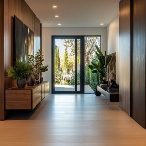
Plant life as sculpture, not decoration
The greenery in such entries isn’t filler—it’s form. Each specimen is selected for structure over volume: long bare trunks, sparse branching, sharp outlines.
The visual clarity that results feels more architectural than decorative. Whether it’s a thin olive tree reaching gently to the ceiling or a broad bird of paradise leaf leaning toward the light, the plant reads like a piece of visual punctuation, not background noise.
Spacing and framing matter more than lushness. Rather than clustering, the best modern front entrance ideas use foliage sparingly—one large pot per axis, cleanly aligned to guide the eye.
This restraint avoids crowding and amplifies silhouette. Leaves are not massed but shaped, giving the green its own posture within the space.
The planters, too, act like architectural bases. Neutral-toned vessels—matte white, soft stone, or black ceramic—fade into the corridor’s material language, so the plant feels integrated.
Even the soil surface is often dressed: with moss, gravel, or ornamental grass rings that frame the trunk like a pedestal. Every detail leads the plant to feel like a sculpted figure—anchored, balanced, and complete.

Mirrors as depth regulators
In narrow corridors, mirrors do more than reflect—they redirect the room’s structure. A carefully placed mirror, whether circular or vertical, becomes a silent extension of the space.
The effect is especially powerful when the mirror edges align precisely with architectural lines—grout joints, panel seams, or timber slats. In this way, the glass doesn’t float aimlessly on the wall.
It slots into the design’s order, and the reflection carries that rhythm forward.

The illusion is subtle, but persistent. A narrow hallway suddenly feels doubled, not through optical gimmickry, but through the repetition of aligned geometry.
These are not mirrors used for personal check-ins—they behave more like transparent walls that deepen the composition. In modern entryway mirror ideas, this technique helps define symmetry without using bold outlines, allowing proportion and perspective to quietly do the work.
Even the frame matters—or its absence. Thin bronze or black edging can ground the glass visually, while frameless versions simply vanish into the wall texture.
Either way, the mirror isn’t there to decorate; it’s placed to participate in the spatial system, catching light, reflecting foliage, and softly expanding the view without pulling focus.

Rhythm through micro-repetition
Order in modern entryway design rarely follows a perfect grid. The repetition seen in timber slats, tile layouts, or planter arrangements often appears even at first—but then shifts just enough to keep the eye alert.
Gaps may widen slightly, grain direction might change mid-panel, or foliage spacing may alter across the same bench. These are not flaws; they are inserted variations that make the surface breathe.
Repetition becomes rhythm, not monotony. This pattern language builds movement that feels natural rather than mechanical.
It’s a language that avoids strict uniformity, giving a pulse to the corridor. In modern entryway wall decor ideas, a row of similar vessels or panels might begin evenly, then introduce a soft break—a taller vase, a different texture, or a space left empty.
That disruption isn’t disruptive; it creates pause. Small irregularities serve a larger harmony.
These visual shifts don’t demand attention—they reward those who linger. The corridor unfolds like a slow composition, where surface changes guide the pace of seeing.
The rhythm isn’t loud, but once noticed, it anchors the entire space.

Light treated as a second skin
In modern foyers, light isn’t added on—it’s woven in. Instead of spotlighting objects directly, light runs along surfaces like a thin veil.
Concealed LED strips tucked under benches, shelves, or ceiling edges glow without exposing the source, creating a soft lift around solid forms. This low, ambient wash detaches volumes from their background, letting them hover in quiet contrast.
The effect is atmospheric, not theatrical. Rather than pouring brightness onto materials, light skims them—bringing out fine texture, catching a ripple in plaster, or tracing a line in wood grain.
These glows feel like shadows in reverse: they mark edges without hardening them. By avoiding glare, the lighting lets materials hold their natural tone and finish without distortion.
What’s left is visual depth without intrusion. Corners feel open, not confined.
Lines stay legible but gentle. The hallway gains presence, not from a fixture on display, but from the way surfaces seem to breathe light back into the space.
This kind of lighting becomes part of the architecture’s fabric—more like skin than spotlight.

Transparency vs. opacity staging
Modern entrance ideas often rely on contrast—not of color, but of material clarity. A common approach is to place full-height glass directly across from solid mass.
The transparency isn’t used for openness alone; it sharpens the wall it faces. As sunlight passes through the glass, it washes over stone, wood, or textured plaster, exaggerating edge, depth, and grain.
This interplay makes both surfaces more legible. The dense wall, normally static, begins to shift in tone and shadow as daylight moves.
Meanwhile, the glass panel—by contrast—feels sharper and more weightless, especially when framed in black or bronze trim. This pairing lets the corridor toggle between openness and weight without needing bold contrast.
It’s a controlled exchange of presence. Where the glass invites the eye through, the wall holds it.
Together they form a kind of spatial dialogue—one that’s especially effective in narrow halls or side-lit entries. In some cases, transparency allows a view into an internal garden or light well, adding a third layer of depth.
This quiet tension between clear and closed is a recurring feature in high-end modern foyers, where volume and visibility are shaped as carefully as furniture.

Curated objects as punctuation marks
In wide, quiet spaces, objects don’t fill gaps—they guide movement. A single ceramic vase, a shallow bowl, or a neatly stacked book doesn’t attempt to dominate a shelf or bench.
Instead, it’s placed with just enough shift from center to slow the eye. This off-balance arrangement gives rhythm to stillness, much like a comma in an otherwise even sentence.
It’s about timing, not abundance. On a long floating ledge, one small clay vessel might sit near the far third—intentionally distanced from the midpoint to signal direction.
These objects act as visual nudges, not expressions. And because they often echo the corridor’s palette—matte stone, muted glaze, soft fiber—they don’t add contrast, but dimension.
In many modern entryway design ideas, these details create pause without breaking flow. They let the wall remain expansive while gently suggesting scale.
Each object becomes a cue for where to look next—not by demanding attention, but by punctuating the silence in a way that feels paced rather than placed.

Controlled asymmetry to soften order
Strict order can sometimes feel overbuilt—but a single break brings ease. In corridors dominated by straight lines and parallel planes, one unexpected move—a curved ceiling edge, a planter shifted just off-grid, or an artwork tilted slightly—adds looseness without losing discipline.
These decisions don’t interrupt the design’s logic; they make it feel lived-in.

Imbalance is used with precision. For example, a row of three matching sconces might be joined by one off-center framed textile below, or a bench might stretch longer to one side of a mirror without echoing its alignment.
These are not decorative quirks—they are softeners that temper symmetry without denying it. This approach makes minimalism feel less rigid.
It gives the eye a moment to rest in variation and offers a sense of rhythm that doesn’t follow a metronome. Within highly composed layouts, this kind of quiet deviation adds humanity—letting even the cleanest space breathe just enough to feel open rather than over-edited.

Conclusion
What ties these entryways together isn’t any single feature—it’s the sum of visual restraint, rhythmic composition, and intentional silence. Minimalism here does not rely on subtraction alone; it thrives on subtle variation, shadow play, and contrast used with focus.
The corridor becomes a framing device for movement and light rather than a blank path from door to interior. Soft lighting wraps around edges instead of aiming directly.
Materials shift in texture just when the surface risks monotony. A mirror might double a narrow hall’s length without ever drawing attention to itself.
These ideas don’t aim to impress—they aim to balance.
In current decorating approaches, the modern entryway is no longer an afterthought. It sets structure, clarity, and rhythm from the start—pulling together natural tones, sculptural silhouettes, and carefully tuned asymmetry into a composition that feels finished without being closed.
The space remains open to interpretation, yet grounded in design choices that quietly hold everything in place.