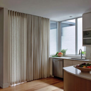
A birch mural works best in minimalist designs when it behaves like a visual organizer rather than “art added on top. ” The motif becomes a way to regulate pace, edit contrast, and create soft depth inside a narrow volume.
In many minimalist foyer ideas, the forest theme succeeds because it is treated as a system: rhythm, negative space, one anchor, and one tactile note—kept intentionally sparse.
The mural as a pacing tool
Hallways and entry passages are experienced in motion, so the most valuable role of a birch tree wall mural is often tempo.
Trunk spacing that “breathes”
A repeating trunk motif looks premium when spacing is not perfectly uniform:.
- A slightly denser cluster reads like quicker beats.
- A slightly wider gap reads like a pause.
- This alternating density prevents the pattern from reading as a print repeat, even when the motif is consistent.
Directional geometry without obvious arrows
A subtle curve in the wall surface, a gentle wrap at a corner, or even a composition that “leans” down the length of the passage can make the trunks feel like they escort movement forward. This is one reason a birch forest mural often feels calmer than bold graphic wallpapers: it can guide without shouting.

Depth without contrast drama
Many successful birch compositions are light-on-light, which can risk flatness. The deeper strategy is to build “depth cues” without using strong color.
Grazing light as a surface amplifier
Side daylight and soft wall washing make pale trunks separate from the base tone through glow and micro-shadow, turning the background wash into something atmospheric rather than blank.
The bright-lower-zone illusion
A lighter base near the floor can make edges feel airy and wide, while also pulling the gaze upward through the trunks. This is a quiet shortcut toward height and calm in minimalist entryway ideas, because the “busy” information stays above the human zone.

Nature lines edited by an order system
A birch wall mural feels architectural when it is paired with a strict, readable structure elsewhere in the same view. This creates a refined dialogue: organic linework held in place by order.

Common order systems:.
- Floor grids (tile joints or plank seams) that stabilize the free branch network.
- Background seam fields that suggest large wall panels, giving the forest an architectural skeleton.
- Slats, mullions, or thin vertical repeats that echo trunks in a more engineered language.
This balancing act is one of the core moves behind minimalist hallway ideas, where the space stays spare but still looks intentional.

The anchor counter-move: one “full stop” element
Light forests gain power when the composition includes a controlled counterpoint that ends the sentence. Anchor types that frequently create a high-end read:.
- A dark niche or deep-toned wall section that compresses visual space and frames pale trunks by contrast.
- A heavy, monolithic surround that turns the mural into a curated insert.
- A strict grid element (often a door or panel field) that behaves as an ordered endpoint.
In minimalist entryway design ideas, this anchor prevents the long wall from feeling endless and gives the corridor design a clear visual purpose.

Branch weight control: keeping the wall airy
A major difference between “themed” and “edited” birch walls is where detail is allowed to live.
High canopy, quiet human zone
When branches gather higher and thin out around eye level, the passage stays comfortable and uncluttered, even if the mural spans a long run.
Negative space as a luxury signal
A broad, lighter open field inside the composition (fewer branches, fewer marks) acts like breathing room in art. It makes the detailed zones feel chosen, not accidental.
This is a key ingredient in minimalist entryway design that still feels dramatic.

Warmth without clutter: one tactile truth
Birch motifs can skew sterile if everything around them is smooth and pale. The usual fix is not more décor, but one believable tactile note.
Common “tactile truth” elements:.
- A raw-edged wood slab or a single prominent wood grain surface.
- One woven fiber piece (runner, cushion, basket) that introduces softness without pattern noise.
- Low, shadowed shelving with books or magazines that adds life while staying visually contained.
This is where minimalist foyer design ideas often succeed: the space remains sparse, but the materials still feel human.

Two big compositional visions
The birch theme tends to land in two clear design directions, and each produces a different emotional effect.
Vision A: perimeter skin
Here the birch forest wall mural behaves like atmosphere. Wraps, long fields, and continuity through corners reduce the “accent wall” feeling and create immersion that still reads minimalist.
Vision B: framed art zone
Here the birch tree mural sits inside a defined pocket—by contrast, by mass, or by an architectural surround—so the wall reads curated and deliberate, like a quiet gallery insert.

Stair volumes: why birch works especially well there
Stairs introduce diagonals, and diagonals are a powerful compositional tool against vertical trunks.
- Vertical trunks supply stability.
- Stair angles supply movement.
- Thin rail repeats can echo trunks as a crisp “graphic frame,” making the forest read dynamic rather than static.
This is a common reason design minimal foyer schemes pair birch scenes with clean stair geometry: the design feels alive without adding objects.

Mood families created by base tone and mark density
A birch wall mural can read very differently depending on background temperature and mark density:
- Warm greige bases: calm with a subtle urban edge.
- Blue-grey bases: airy and coastal-leaning, especially with warm wood lines as relief.
- Mist-gradient bases: depth illusion that makes small entries feel expanded.
- Relief-like or canopy-heavy markmaking: enveloping, best when counterbalanced by a strict order element.

Micro-composition moves that signal “edited”
Small placement decisions often carry the high-end feel:.
- Slightly off-center styling keeps the scene relaxed and modern.
- Real branches in a vessel act as a controlled echo of the wall motif, adding dimensionality without clutter.
- One tiny warm “color event” (a wood tone, a warm halo of light, a small reddish-brown branch) can become the emotional center while the palette stays quiet.

Closing synthesis: the repeating logic
The strongest birch concepts share the same internal structure:.
- one calm field (the forest),
- one order system (grid, slats, seams, mullions),
- one anchor (dark mass, frame, or strict endpoint),
- one tactile proof (fiber, wood grain, books low in shadow).
That is the core reason a birch scene can feel both minimal and memorable, even in tight transitional spaces, while still aligning with minimalist entryway ideas and maintaining a clean visual hierarchy.