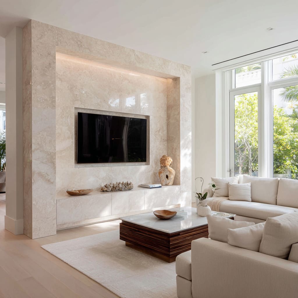
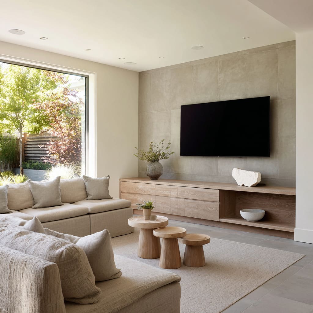
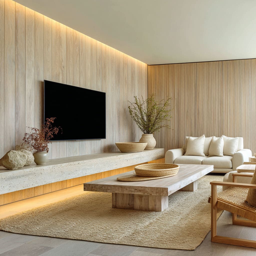
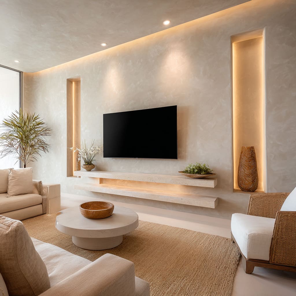
Modern TV wall design ideas in minimalist-luxury interiors avoid anything that feels loud or overly shaped. Instead, the strongest examples work through precision and quiet contrast—balancing heavy textures with subtle movement, and solid materials with controlled light.
These compositions often appear simple at first glance, but a closer look reveals how much intention is packed into every surface, proportion, and void. Rather than relying on decoration or display, these designs build their atmosphere through controlled materiality and subtle weight shifts, where a blank wall becomes the central visual focus of a living space without pulling attention from everything around it.
In homes where the modern living room TV wall must feel like part of the architecture rather than something applied, these quiet strategies prove especially effective.
Illusion of Weight Versus Float
There’s a specific tension that shows up again and again in modern minimalist TV walls: the use of mass that doesn’t feel anchored. This isn’t about floating shelves in the obvious sense.
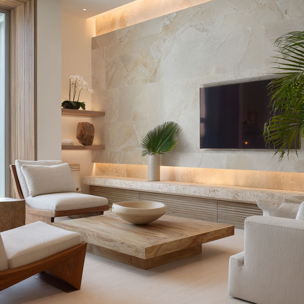
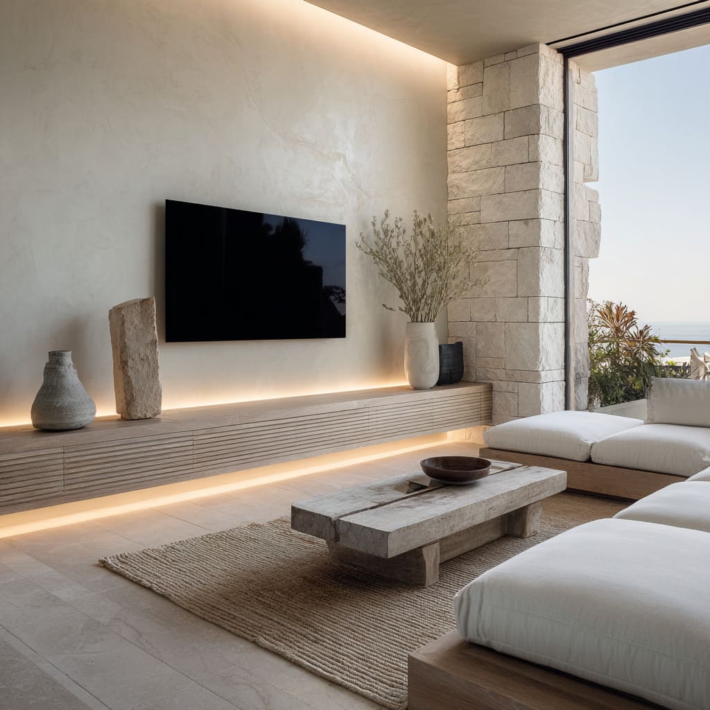
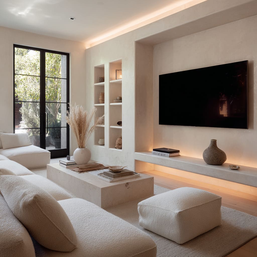
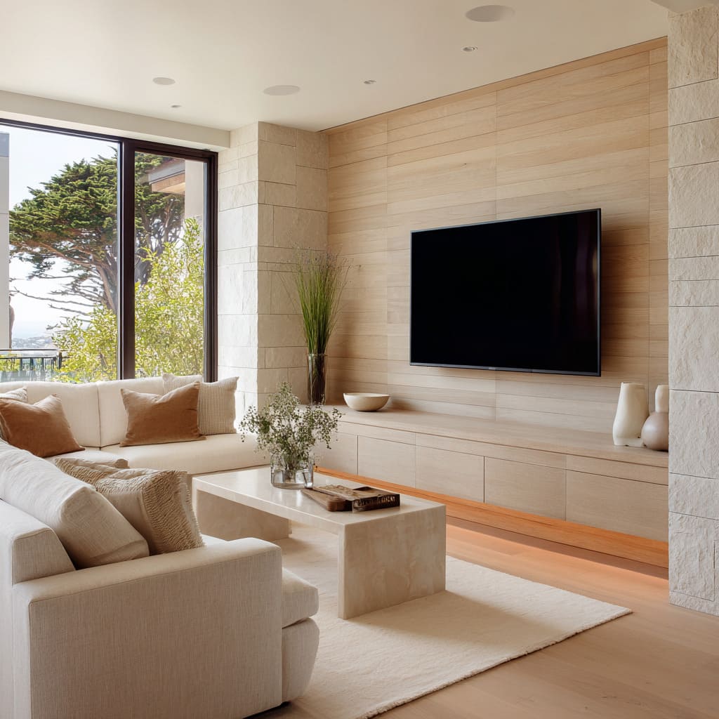
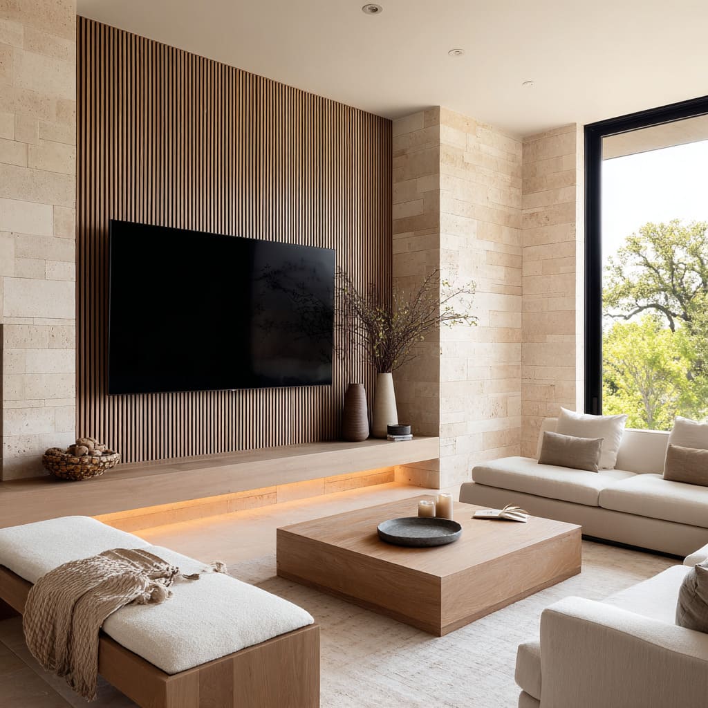
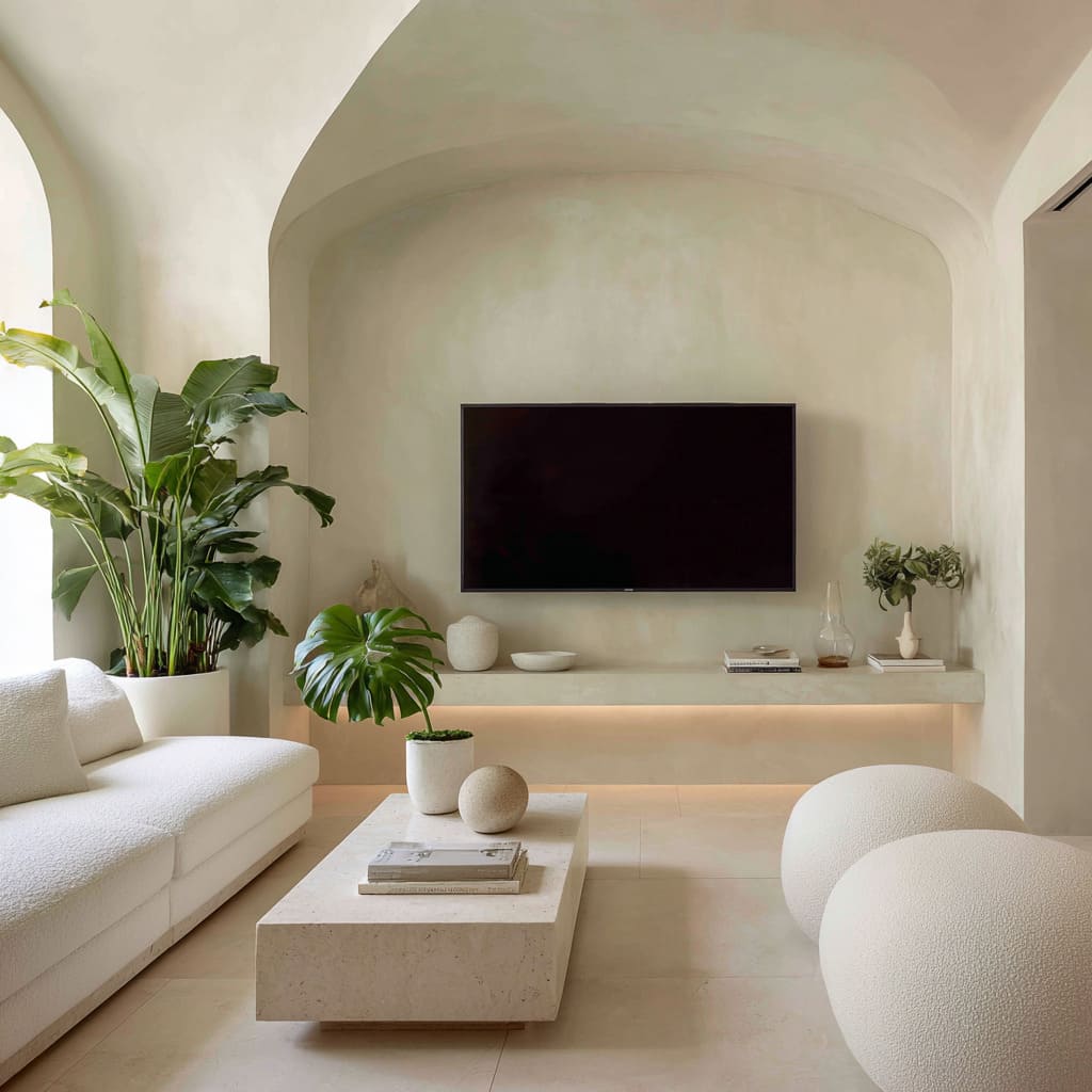
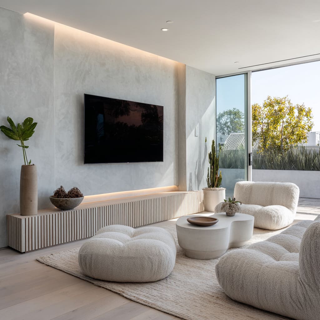
It’s about creating the visual impression that solid, heavy-looking volumes—like a thick stone bench or a full slab wall—have been gently lifted from the floor. The trick lies in small shadow reveals or very faint underlighting that tucks underneath a cabinet or console.
These narrow gaps act as visual separators, slicing the base just enough to break the expected gravity of the object.
This subtle effect matters more than it might seem. It changes how the whole wall is read—what would otherwise feel grounded and immovable becomes lighter, almost quiet in presence.
In many cases, the console appears carved from the same material as the wall behind it, or extends uninterrupted across the width, adding to the sense of continuity. Yet it’s the barely visible recess beneath that shifts the perception: from architectural bulk to composed presence.
This approach also helps the rest of the room maintain balance, especially in open spaces where visual movement flows across multiple zones. Whether stone, wood, or plaster, the floating impression adds control without needing embellishment.
And within the broader world of modern tv wall design ideas, it’s these quiet manipulations of weight that often hold the whole room together.
Light as Quiet Ornament
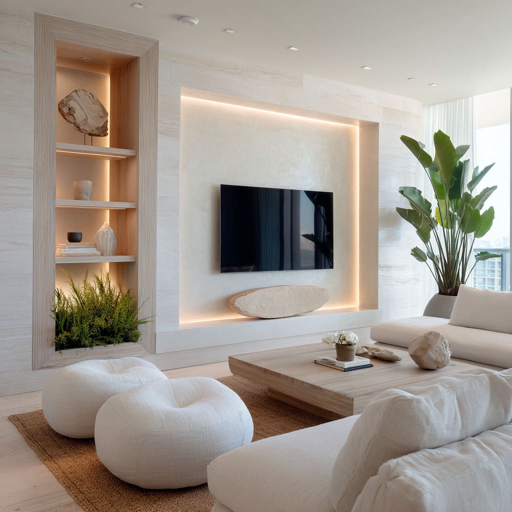
There’s a certain kind of lighting that doesn’t announce itself—it simply changes the way materials behave. In many modern living room tv wall ideas, light isn’t a fixture or fitting, but a thin line, a glow, a suggestion.
These hidden sources of illumination slip into the architecture almost unnoticed: under a console, tucked into a niche, or trailing along one side of a vertical panel. The result isn’t spotlight or glare—it’s a soft haze that dissolves the hard edge, making stone feel less rigid, wood feel warmer, and plaster seem to blur at its edges.
What makes these lights different is their placement and their tone. They’re usually warm, sitting just above the visible temperature of the wall surface, casting subtle shadows that shift slightly over the course of the day.
This time-based shift matters—the space becomes responsive to natural light, quietly evolving as the day moves. And because these lines don’t frame in the traditional sense, they let the viewer’s attention glide along the architecture rather than land on a decorative boundary.
In these kinds of settings, light becomes the only ornament needed, replacing the role of contrast or color completely. Whether placed symmetrically or offset with intention, these lights do something remarkable: they outline volume without bulk.
Especially in spaces that prioritize simplicity, this method allows each form—be it console, recess, or TV field—to stand on its own with clarity, but without harshness. In the wider world of modern tv wall ideas, this restraint with light is one of the defining tools used to shape space without decoration.
Rhythm Through Texture, Not Color
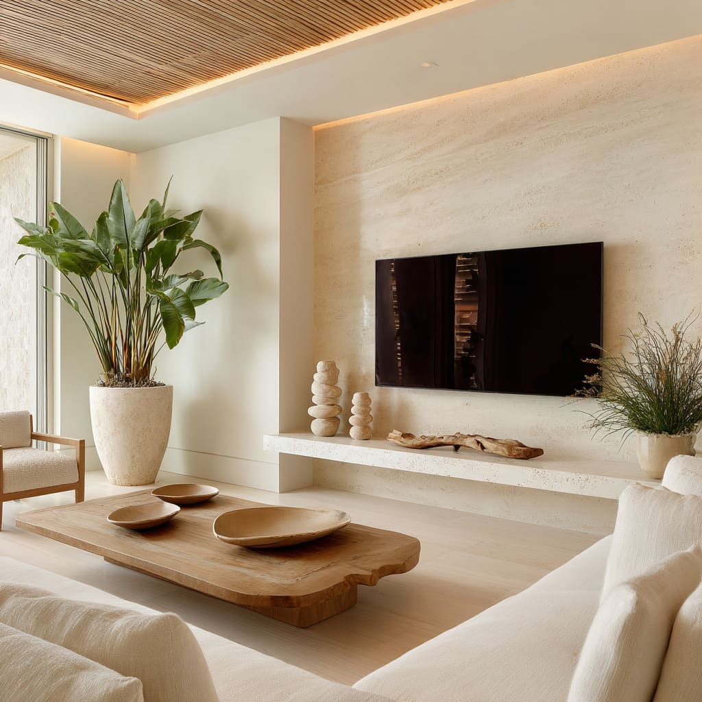
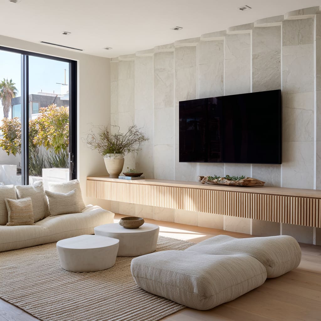
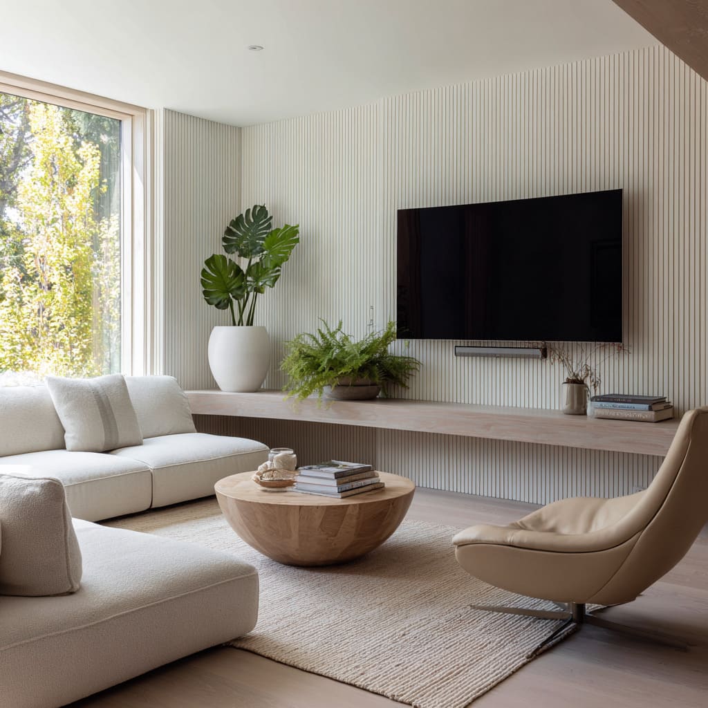
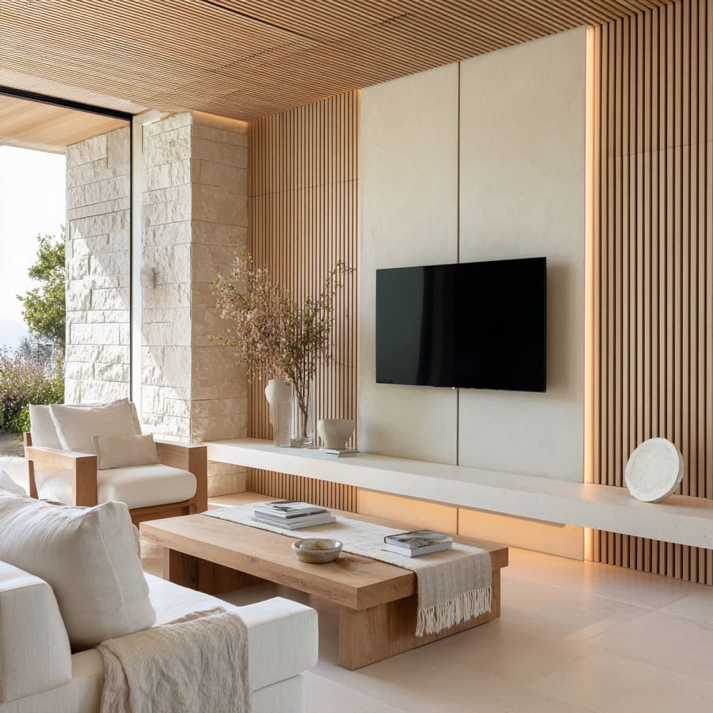
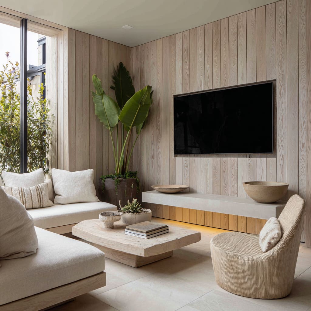
In rooms built on restraint, texture often speaks louder than tone. Instead of working through bold contrast, these TV wall compositions rely on repeated patterns—narrow vertical slats, shallow fluting, or softly ribbed finishes—to create rhythm that flows across the wall like a slow pulse.
The grain runs upward or sideways, uninterrupted, guiding the eye across the full surface without interruption. This kind of visual tempo brings a calm energy without shifting the palette.
Even when the wall, console, and flooring are all near the same hue, these surfaces remain distinct—not because of what color they are, but because of how they catch and shape light. Thin grooves draw shadows.
Projecting edges break the smoothness just enough to introduce movement. Some panels wrap into the ceiling or spill down into built-ins, giving the wall the sense of being part of the room’s structure rather than a backdrop.
What makes this tactic stand out is its restraint. Nothing needs to be added for impact; instead, the wall gains strength through subtle shifts in depth and line.
These repetitions also harmonize with the furniture around them—seating with soft curves, low tables with rounded forms, even sheer drapery that mimics the vertical flow. Within modern tv wall ideas, this use of texture keeps the surface alive while preserving visual calm.
It’s a way to hold the viewer’s eye without pulling their focus.
Curated Void and Negative Space
There’s a deliberate restraint in the best contemporary TV wall design examples—a choice to value space as much as the objects placed within it. Instead of filling every niche, shelf, or surface, many interiors leave room to pause.
The gap between two sculptural items isn’t treated as absence—it’s treated as material. These voids aren’t byproducts of minimalism, but essential parts of the visual balance.
Oversized stone benches that stretch farther than needed, long floating consoles that offer more length than storage requires, or built-in shelving with wide gaps between pieces—all of these are used to control visual rhythm through spacing rather than volume. Each item placed is surrounded by intentional quiet.
That quiet amplifies the material, giving a matte ceramic or rough-cut stone the sense of being featured, almost like an artifact in a gallery.
The void becomes framing. It lets plaster walls catch light cleanly.
It draws attention to the way one surface ends and another begins. And it gives every texture—stone, timber, metal—a place to hold still.
Within the variety of modern media wall ideas, this measured spacing is one of the least flashy yet most essential moves—it keeps the entire composition from feeling overly constructed or artificial. Instead, it offers breathing room, where simplicity feels anchored and meaningful.
Softening Geometry With Gentle Curves
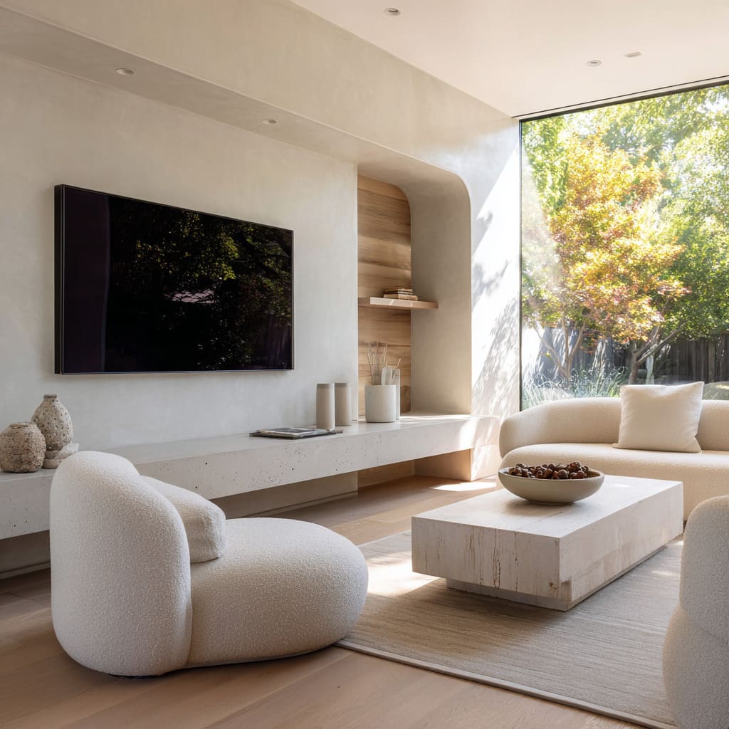
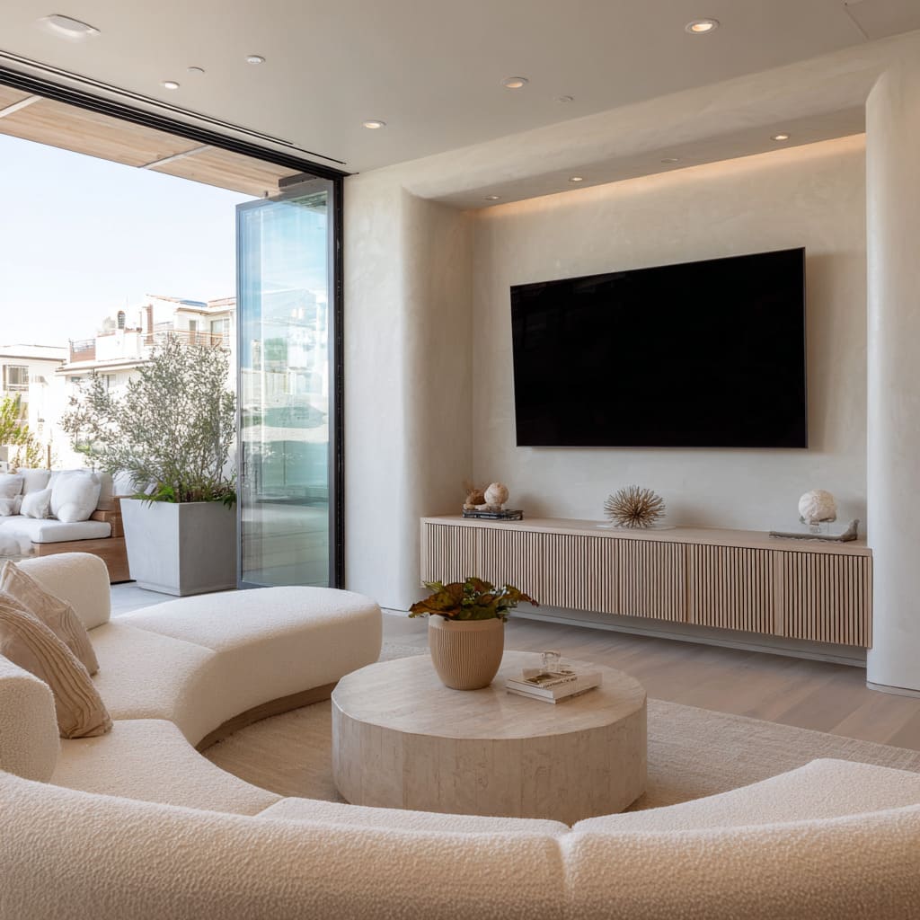
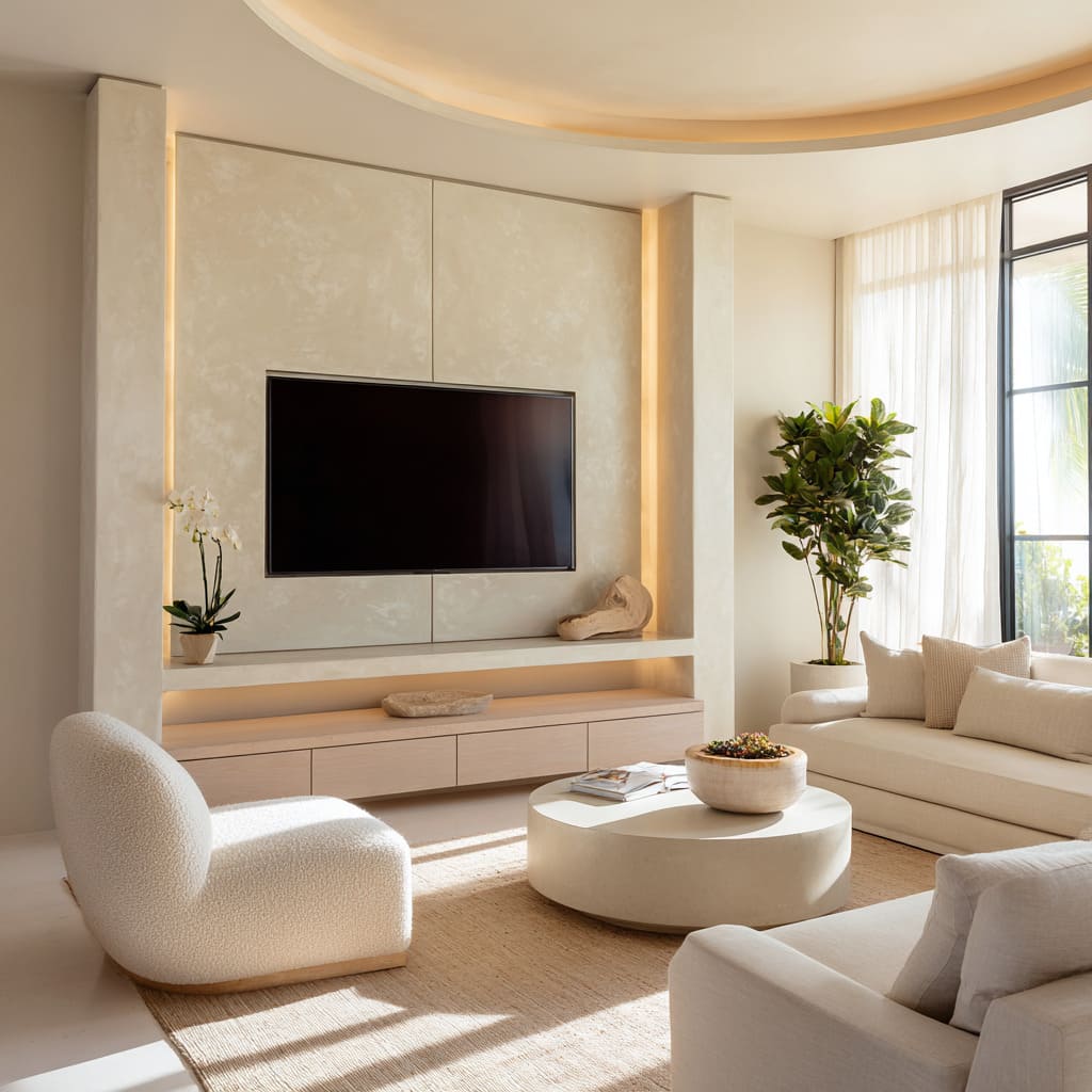
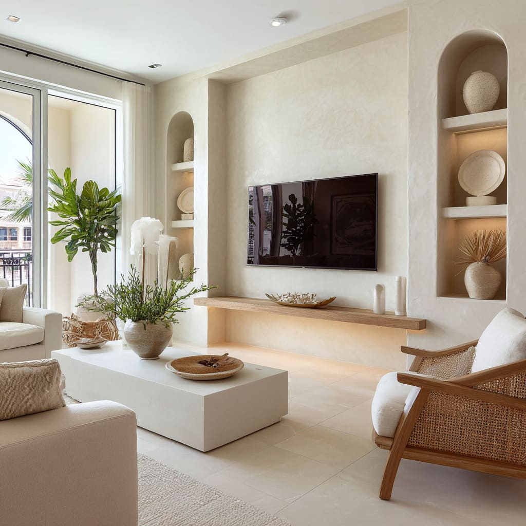
In rooms built on lines and planes, curves step in quietly to change the tone. Arched openings, rounded alcoves, and gently convex wall sweeps are subtle adjustments that reshape the sharp logic of a rectangular TV.
These aren’t theatrical flourishes—they’re softened corners, quiet arches, and shallow bends that blur the grid just enough to ease the space into comfort. The goal isn’t to erase the structure, but to give it softness without weakening it.
A softly curved plaster recess, for instance, won’t compete with the television’s geometry—but it shifts the feeling of the wall from rigid to approachable. It breaks the predictable pattern of vertical and horizontal lines that often dominate media walls, replacing sharp transitions with a visual flow that relaxes the composition.
These touches also echo in the furnishings. Rounded coffee tables, curved sectional seating, and even cylindrical vases reinforce the idea that nothing needs to feel strict to feel refined.
And because these curves often appear without symmetry or fanfare, their effect works in the background—settling the space rather than styling it overtly. This kind of shaping, especially in high-end minimalist living rooms, is part of what separates standard feature walls from more refined contemporary tv wall design choices: it’s in how the space feels before the viewer even registers why.
Tonal Whisper: Palette Strategies
In modern wall TV design, color rarely shouts. Instead, it moves in quiet gradients—variations so slight they almost disappear until you look closer.
These designs lean into what might seem like a narrow range: oat, sand, ivory, limestone, muted taupe. But the effect isn’t bland—it’s layered.
Tiny changes in warmth and finish do the work that bold contrast might otherwise do. A matte plaster surface next to polished stone creates a soft dialogue between textures, even if they’re nearly the same hue.
Sand-washed timber may align with cool-toned travertine in color but diverge subtly in how they absorb or reflect light. These shifts are where the layering lives.
It’s not about opposites; it’s about proximity and nuance.
This approach makes the black TV screen stand out not by framing it—but by letting it break the silence. Against this sea of soft tones, the screen becomes the visual anchor.
The wall, in turn, doesn’t compete but sets the scene—like a muted stage that holds the viewer’s attention in the right place. These palette strategies also serve to unify the space, allowing furniture, art objects, flooring, and textiles to speak in the same volume without becoming repetitive.
The result is an atmosphere that feels resolved rather than styled.
Sculptural Objects as Calibration Points
In many modern media wall designs, objects aren’t just decoration—they’re control points. One sculpted ceramic, one chunk of driftwood, or a rough mineral form can shape how the wall reads.
These items are chosen not only for texture or tone, but for how they interact with the scale of the composition around them. Where wall surfaces are large and smooth, even a single matte-finished vessel or jagged coral fragment can break the visual stillness and shift the temperature of the entire wall.
It’s not about quantity. In fact, the power lies in scarcity.
One piece, carefully placed, draws attention not just to itself but to the space around it.
The contrast is also tactile. Where the wall is smooth and controlled, these items are irregular and grounded.
Their surfaces catch light unevenly, casting shadows that cut across the flatness. It’s this contrast—not in color, but in form and touch—that creates balance.
These objects also help reinforce human scale. A console that floats across three meters can feel too architectural without something to punctuate it.
But a low bowl or asymmetrical sculpture shifts the reading from structure to livable. In the context of modern media wall designs, these pieces work less like decor and more like punctuation—quiet marks that help the wall speak clearly without needing to say much.
Framing vs. Dissolving Boundaries
In many interiors, how the television is integrated—or not—is a clue to the room’s intention. One path treats the TV like a piece of framed artwork: recessed into a defined box, sometimes backlit, often symmetrical, and always centered.
This approach creates a sense of control. The screen is bordered by geometry and light, and the result is quiet formality.
It asks the viewer to recognize the object without letting it interrupt the room. The frame doesn’t exaggerate the presence—it contains it.
On the other hand, some compositions go in the opposite direction. The screen is simply mounted, left unbordered, and absorbed into the wall’s rhythm.
No trim, no outline—just the screen sitting inside the surface story. This method places more weight on the materials surrounding it: slatted wood, textured plaster, or stone fields extend across the wall, and the screen becomes just another flat shape within the composition.
The advantage here is seamlessness. The wall reads as continuous, with no single point trying to own the spotlight.
Both techniques are found in living room modern tv wall design—but they serve different moods. One clarifies the hierarchy by creating a soft stage; the other lets the TV sit inside the architectural language without being formally introduced.
It’s a contrast between framing and dissolving—each effective, each subtle, and both capable of steering the entire room.
Dialogue With Nature
In rooms where visual flow matters, the modern tv wall design often acts as a bridge between indoors and the landscape beyond. That relationship isn’t always loud, but it’s present in small, consistent echoes.
Tall planters with architectural foliage mimic the rhythm of vertical wood slats. A driftwood sculpture on a console mirrors the raw texture of a branch just outside the window.
Light strips that extend horizontally repeat the same axis as the horizon line glimpsed through a glass wall. These choices aren’t coincidental—they’re part of how the space speaks to its context.
In many modern interiors, outdoor influence isn’t limited to a view—it’s brought in through material tone and visual rhythm. Pale stone finishes inside often pick up the color of gravel paths or dry soil outdoors.
Earthy ceramics nod to clay, sand, or bark. Plants, chosen for their leaf shape or scale, repeat the geometry already present in the architecture.
The result is that the wall doesn’t feel like an end point—it feels like a passage that connects interior calm with the world outside. And in modern layouts with open floor plans and large glazing, this balance becomes more noticeable.
The TV wall becomes a soft mediator, holding its role as a screen backdrop while echoing the colors and lines found just a few feet beyond the glass.
Quiet Asymmetry for Visual Tension
In designs that seem calm at first glance, there’s often a quiet imbalance that keeps the space from going flat. A console that doesn’t run the full width of the wall.
A light line that rises up only one side. Shelves arranged in a grid that weights slightly to the left.
These small deviations inject energy into a composition without introducing chaos. It’s a technique that plays with expectation.
Instead of perfect symmetry, there’s a measured offset—enough to feel intentional, but never disruptive. This kind of asymmetry adds character without calling attention to itself.
The viewer may not notice why the space feels more dynamic, but they register it all the same. It’s not imbalance for the sake of being different—it’s a way to avoid predictability, keeping the eye engaged without forcing movement.
This strategy works especially well in minimalist-luxury settings, where the materials are refined, the tones are low, and the form is reduced. Without color contrast or decorative excess, small shifts in placement become the tools for rhythm.
A short console beneath a large screen pulls gravity toward one side. A shelving system that climbs vertically on just one edge shifts the center of gravity.
These moves don’t disrupt the calm—they shape it.
Conclusion
Modern TV walls with a minimalist-luxury tone are built not from complexity, but from sharp attention to proportion, light, and surface behavior. Every move is quiet.
Color is hushed. Shapes are deliberate.
The power of these designs doesn’t lie in what’s added, but in what’s chosen to stay absent. A wall finished in soft plaster, a bench that floats on a faint glow, a piece of driftwood placed beside a pale ceramic—these moments speak more than layers of ornament ever could.
The television doesn’t dominate; it participates. It’s one part of a space where light becomes volume, and where texture plays louder than color.
What defines this design language is control without force. Each choice supports the next: light softens material, space amplifies form, and quiet asymmetry keeps the scene alive.
The result is a wall that holds attention without demanding it—composed, refined, and built for rooms where calm and clarity matter more than statement.

