Some spaces speak in subtle tones instead of loud contrasts. Color on a bedroom wall can do more than add decoration—it shapes how the space feels, how materials relate to each other, and how the entire room settles into itself.
The choices might seem quiet at first glance, but there’s a lot happening beneath the surface. It’s often not the main hue that defines the atmosphere, but how that color shifts with daylight, how it interacts with nearby textures, and how softly or boldly it holds its place.
From delicate pigment transitions to finishes that respond gently to light, every element contributes to the calm—or complexity—of the room. This article explores how specific tones, surface treatments, and placement techniques work together to create balance without overwhelming.
Not every wall needs to demand attention. Sometimes, the best results come from restraint, rhythm, and how each choice supports the next.
Subtle Temperature Blends: Why the Best Accent Walls Resist Certainty
In recent interiors, the most refined bedroom accent wall colors avoid being clearly warm or distinctly cool. They shift quietly across the spectrum, pulling the atmosphere into a steady visual rhythm.
Instead of high-contrast bolds or themed pairings, many walls hover in tones that respond to light and context rather than declaring a fixed hue. A blue-grey can feel like soft fog in morning light and lean toward slate by evening.
Silvery taupe holds a brushed-metal tone at dusk but softens into sand when daylight fades. Even frosted almond, which seems off-white at first glance, gains a gentle peach warmth near sheer curtains in late sunlight.
These are colors designed to stay in motion—alive without looking busy, calm without being static. This sense of flux is what keeps bedroom accent wall paint ideas from feeling boxed in.
There’s no single reading of the color—what’s seen depends on time, angle, and what surrounds it. That flexibility allows the wall to act less like a backdrop and more like a participant in the room’s atmosphere, adapting without overwhelming.

Gradual Pairings: How Accent Wall Colors Echo into Textiles
Across many thoughtfully composed bedroom designs, the palette moves in careful steps rather than direct repeats. That quiet repetition creates depth—not through repetition of the exact same tone, but by echoing part of it elsewhere in a softer or deeper way.
A clay-orange wall doesn’t need a matching throw to feel connected; instead, it might link to a rust velvet cushion or a sienna-toned blanket in a slightly darker range. In another space, a stormy teal wall becomes a starting point, mirrored gently in a set of velvet cushions that don’t mimic but suggest the same family of tones.

This restrained color rhythm avoids visual fatigue. It prevents the room from slipping into high-contrast theatrics or overly staged matchiness.
The result feels collected—woven together by the quiet movement of shade and material. Among the most effective examples of bedroom accent wall paint ideas are those where the textiles serve as a soft echo chamber, not a chorus of repetition.
Instead of matching the wall, they trace around its feeling and carry that tone across the space in subtle inflections. Even within soft interiors, this approach adds a clear visual memory.
A space feels layered without having to lean on pattern or clutter. It’s a way of building richness through refined gradation, something often missed in louder or more literal pairings.
For anyone observing closely, this level of nuance is where the difference lies in what makes some bedroom accent wall colors feel mature and composed—not due to complexity, but because of control and restraint.

Movement Over Motif: Why Texture Replaces Pattern in Modern Bedroom Walls
Many of today’s most distinctive ideas for accent wall in bedroom design avoid relying on bold patterns or graphic shapes. Instead, they lean into surface texture that carries quiet motion.
This shift in focus allows the wall to feel animated without being loud. Plaster finishes, marbled brushwork, and layered mineral tones work not by drawing sharp lines but by allowing the light itself to perform across the wall.
A lavender-tinted plaster doesn’t call attention by color alone—it gains presence by how it softens under ambient glow. Misty blue surfaces hold a fog-like transparency that gives the room an airy lift, while a pale peach marbling introduces an almost translucent warmth that mimics the depth of stone without any shine.

Because these textures scatter light instead of bouncing it, the color appears lighter, softer, and sometimes even more dimensional. There’s no gloss here—no reflections that flatten or compete with the surrounding space.
Instead, what stands out is how the wall seems to respond as the day moves: tone becomes a slow shift, and the finish acts like fabric draped across architecture. These treatments aren’t backdrop—they are the quiet surface that holds the room’s rhythm.
This textural approach brings clarity to paint ideas for bedroom accent wall layouts where subtlety counts more than symmetry.

Low and Grounded: How Scale Balances Saturated Color
In rooms where the wall color carries deeper weight—whether it’s wine plum, ocean teal, or adobe clay—the rest of the design often leans horizontal and grounded. There’s a clear preference for beds that sit closer to the floor, furniture with simple stretched silhouettes, and wide visual framing that avoids height where it’s not needed.
This intentional flatness keeps darker colors from crowding the space. Rather than letting a strong pigment take over vertically, the effect is to compress its presence and spread it calmly across a longer field of view.

It’s a move that shifts power from color intensity to composition. A stormy teal wall behind a platform bed reads as firm but not loud when the bed stays low and the materials around it remain matte and soft.
A plum plaster wall feels rich, not moody, when it’s paired with symmetrical furnishings and pale wood elements that carry warmth. The effect isn’t about contrast—it’s about restraint.
Color holds its place because form gives it space to do so. These layouts suggest that saturation works best when it’s met with simplicity of line and a sense of structure that stays close to the floor.
This grounding technique becomes one of the most subtle yet effective tools in refining how strong wall color interacts with architecture. It allows boldness without exaggeration and shows how the right shape—not just the right tone—can define the feel of the room.

Wood as a Temperature Equalizer in Color Palettes
Across many refined bedroom interiors, natural wood is used less as decoration and more as a quiet moderator between temperature shifts. Rather than standing out, oak, walnut, and reclaimed timber play a behind-the-scenes role in holding the palette together.
Light cerused oak placed near a misty blue wall doesn’t just introduce texture—it softens the coolness into something bleached and easy, as though the wall had been touched by sun and time. Honey oak, when used as framing around blue-grey cane panels, holds the palette low and warm, keeping the overall tone grounded without tipping it into either cold or overly rustic territory.

This approach is particularly noticeable in designs where color leans ambiguous—neither fully warm nor fully cool. Smoky lavenders and washed-out mauves, for example, take on a more balanced tone when set beneath a weathered wood ceiling.
That ceiling becomes a horizon line that gently collapses vertical weight, bringing structure without adding visual pressure. In these spaces, the wood doesn’t contrast—it blends in by muting excess and introducing calm through grain and tone.
It’s a choice that works across a variety of accent wall colors in bedrooms. Whether the wall leans soft or dark, neutral or colored, wood’s presence helps the space feel stable and resolved.
It doesn’t compete—it connects.

Light as Tone Shifter: How Illumination Refines Wall Color
In current interiors, lighting isn’t used to spotlight—it’s used to reshape how color behaves in the room. Soft, indirect sources are placed not to highlight a feature, but to reveal what might otherwise stay hidden within the paint finish.
Cove lighting, tucked into a recess above a clay-toned wall, draws out its pink undercurrents, warming the entire surface without needing a direct beam. A concealed strip behind a headboard on a blue-grey wall turns the tone silver at night, adding a cool glow that redefines the wall’s role after dark.

Even small fixtures serve this function. A pair of slim brass sconces set high against a silvery taupe wall won’t read flashy, but the way their glow touches the surface changes the wall entirely.
What was a flat neutral becomes slightly pearly; the light doesn’t bounce—it hums softly along the finish. These light sources are not sculptural, and they’re not theatrical—they are there to influence mood through color change.
This approach has a particular impact on how accent wall colors for master bedroom design are perceived. Because these rooms rely on quietness rather than flash, the ability of a surface to shift subtly in tone throughout the day adds more value than high contrast ever could.
It turns the wall into an ambient part of the room, one that plays softly with time and shadow, and carries depth without needing to speak loudly.

Soft Edges Through Shape and Finish
In modern bedroom layouts, visual flow is shaped as much by form as by color. Rounded furniture edges, matte textures, and sculptural lighting are often used to reduce the impact of visual breaks.
A curve-framed bed placed in front of a saturated wall—whether it’s deep teal, rich plum, or moody wine—feels integrated, not separate, because the geometry echoes the softness of the finish itself. Orb-style lamps and boucle-covered headboards don’t just add texture; they blur the transition point where vertical meets horizontal.
Even with strong contrast between a dark wall and light bedding, these gentle contours remove the sense of divide.

The matte finish plays a key role here. Without shine, colors stay grounded, letting form lead the rhythm of the room.
There’s no competition between glare and shadow. Instead, the surface stays calm, even if the hue is bold.
This design move is central to how accent wall paint bedroom concepts remain refined—by allowing color to carry weight without cutting into the room’s flow. The absence of hard corners and glossy edges keeps the energy of the space steady, quiet, and structured without stiffness.

Micro-Contrast as Visual Pacing
Rather than filling the room with bold touches, many compositions favor precise, quiet moments of contrast—a single charcoal lumbar pillow on a pale bed, a rust-hued throw folded loosely, or one dark ceramic lamp beside a soft white wall. These gestures aren’t meant to grab attention but to guide it.
They give punctuation to the overall palette, introducing rhythm without adding clutter. Because these rooms use such restraint, the dominant wall color doesn’t get interrupted.
It stays clear as the main visual plane, while the small accents become the details that anchor the larger shapes and tones. This is especially useful in bedroom accent wall color ideas that lean toward nuance—misty blues, clay washes, silvery taupes.
These colors do more when the surrounding elements don’t compete, and a single contrasting detail—handled with care—can shift the entire reading of the room. This idea of controlled punctuation is what keeps the space from feeling overly blended or too monochrome.
It gives shape to softness, without relying on harsh contrast. That balance is what makes these rooms feel both expressive and precise—not because they are packed with color, but because each choice is placed to do just enough.

Color Memory: Pigments That Feel Rooted in the Natural World
Even without literal references to stone, soil, or mineral, certain wall colors carry a quiet familiarity tied to the earth. These pigments don’t spell out their source, but they feel like they came from somewhere real.
Terracotta washes suggest heat and dust without showing a single tile. Blush mineral pink brings to mind the chalky surface of limestone, aged and softened by time.
Silvery taupe sits somewhere between weathered driftwood and worn stone, giving off a sense of quiet permanence. These tones don’t illustrate—they recall.

That emotional tie to natural material is subtle but effective. It shapes how the room feels without spelling it out.
Viewers connect more through sensation than concept. A wall in muted clay feels warm because it reminds us of warmth.
A dusty violet, close to dried lavender or shadowed granite, becomes calming without needing to explain itself. These subdued pigments are especially effective in bedrooms, where atmosphere is often built through tone, not through literal theme.
The impact of a bedroom paint with accent wall like this lies in suggestion, not statement—and that’s why it works so quietly well.

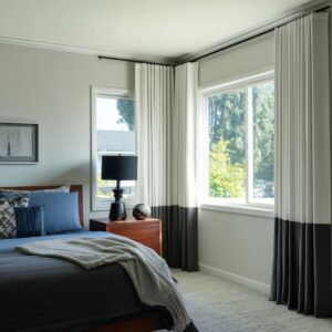
Line Control: How Horizontal Elements Stabilize Wall Height
In rooms where the feature wall carries a mid-to-deep tone, it’s often the horizontal elements that regulate how that color holds space. Beds with slatted headboards, floating benches, extended ledges, and framed window seating all serve a purpose: they divide the height visually, introducing restful pauses.
This helps the color feel expansive rather than enclosing, even when the wall is fully painted in a dense tone. Without these horizontal moves, deeper hues can start to climb—visually stretching the wall and making the room feel taller but not always better balanced.

But with horizontal banding, the eye moves sideways instead of up. A ledge in light concrete or pale oak at waist height can calm a moody plum or dark teal wall by breaking its dominance.
Similarly, low headboards that span the wall without reaching too far up allow more wall color to show—while keeping it grounded. These layers create a rhythm across the surface, letting the color breathe without overwhelming.
The technique works especially well with layered colours for bedroom feature wall designs, where texture and tone vary across a single plane. The result feels considered and open, even in smaller or more compact rooms.
It’s not about adding more elements—it’s about how each element slows the eye, giving weight to the wall without making it feel too vertical or compressed.

Light as Texture: How Finishes React Quietly to Illumination
In thoughtfully layered bedroom spaces, light doesn’t compete with color—it completes it. Walls with brushed or matte surfaces are selected not for gloss, but for how they hold and release light at specific moments.
A silvery taupe surface might look softly matte during the day, but at a certain angle—where the light glances across the texture—it glows faintly without shine. The same wall, in artificial light, stays calm and even, never slick or flashy.

This dynamic is even more pronounced in mid-toned finishes. A muted blue-grey wall, for instance, appears steady and cool—until a single lamp casts amber light across it, pulling a gentle green warmth from beneath the top layer.
These interactions happen quietly and without visual strain, allowing the room to shift with time rather than stay fixed in tone. This approach is especially common in master bedroom feature wall paint ideas that aim for atmosphere over contrast.
Here, the finish isn’t a surface treatment—it’s part of the visual rhythm, responding slowly and subtly throughout the day.

Neutral with a Nudge: How Undertones Keep the Palette Coherent
In cohesive bedroom designs, it’s not the main wall color that holds the scheme together—it’s the way every supporting shade leans in the same tonal direction. Even when colors seem varied at first glance, there’s usually a second layer beneath them that connects one to another.
Linen white might seem neutral, but in the presence of a terracotta wall, it bends ever so slightly warm. Pale grey bedding can echo a wall’s coolness, or soften against it with just a hint of lavender in its weave.

This subtle method keeps the room from breaking into isolated pieces. A boucle headboard in off-white picks up a trace of mauve when set against plum plaster, making the texture feel linked rather than floating.
Warm-toned woods shift cooler next to smoky blue. These small tonal pivots create a shared visual language without calling attention to themselves.
It’s this kind of alignment—not obvious matches—that prevents hard stops in the room’s flow. The result feels smoother, easier on the eyes, and more thoughtfully arranged, especially in color-focused layouts.

Conclusion: Controlled Shifts Over Bold Statements
What defines the current use of color in bedroom design isn’t intensity—it’s control. A wall doesn’t need to shout to have presence.
It needs to move gently with the light, reflect the tone of nearby textures, and hold space without taking over it. These walls carry color like fabric: pliable, layered, and responsive.

Rather than choosing a single standout tone and building contrast around it, the better approach is to let the color feel like part of a system—one shaped by texture, light, temperature, and tone. Whether it’s a whisper of peach in a cream, a green note hiding in blue, or a shimmer hidden in plaster, the effect is built by restraint.
This is where the strongest bedroom compositions find their depth. Not through saturation, but through movement.
Not in isolation, but in how one tone plays off the next. The result isn’t busy or showy—it’s clear, measured, and rooted in balance.
A modern bedroom today isn’t defined by the wall color alone, but by how that wall behaves alongside everything else.