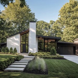
Some of the most effective al fresco ideas come disguised in quiet choices—shapes, finishes, and arrangements that don’t immediately call attention to themselves but carry a shared design language. Across different climates and architectural styles, modern backyard dining areas speak in a consistent visual rhythm.
This rhythm isn’t loud; it’s found in material softness, in repeated forms, and in how open-air rooms are shaped without visual clutter. Though every space reflects its local conditions—sun, shade, planting style—the overall visual clarity and layout follows patterns that feel almost instinctive.
It’s this undercurrent that links so many standout alfresco dining ideas together, even when the surroundings vary.
Curves that Quietly Expand the Space
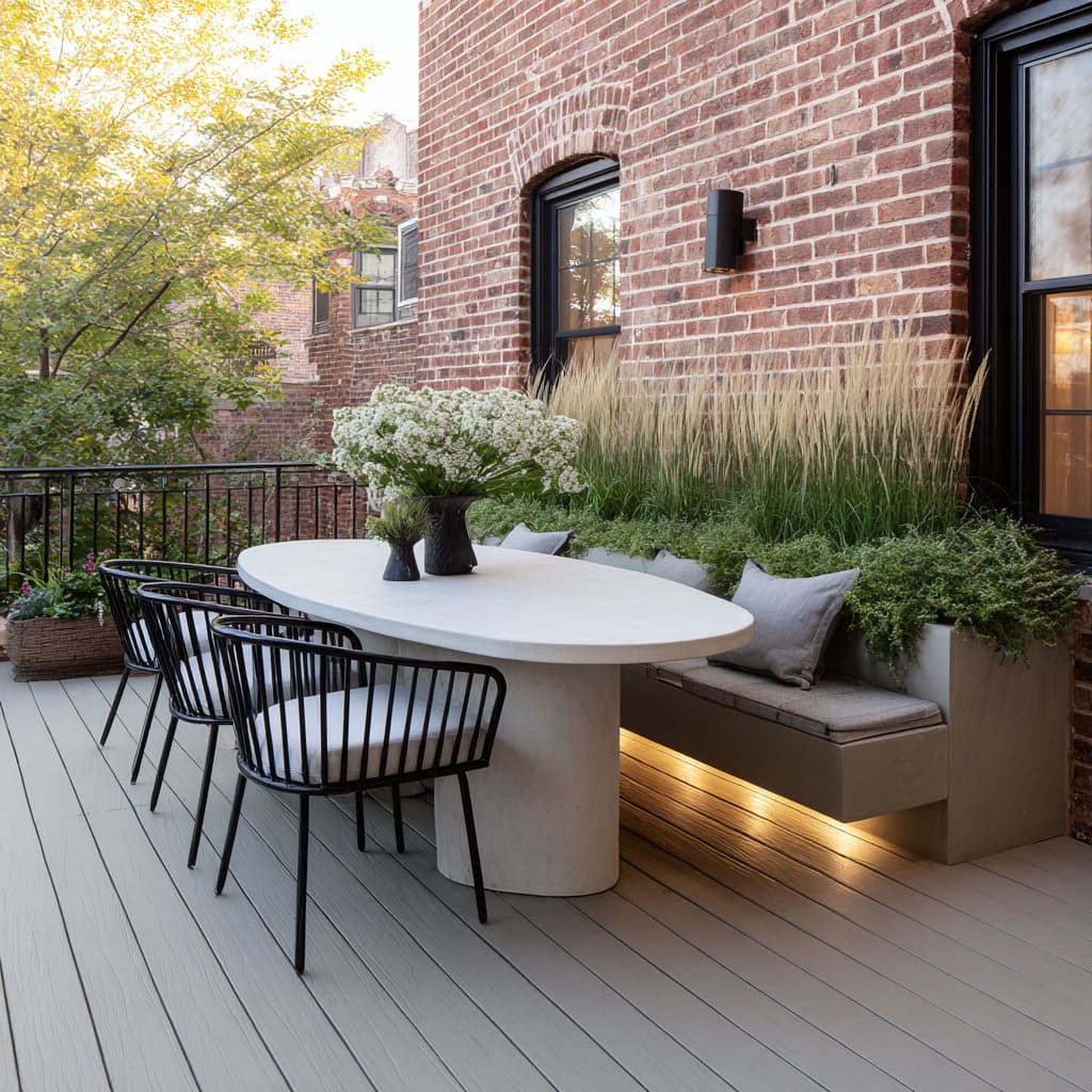
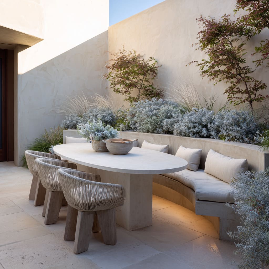
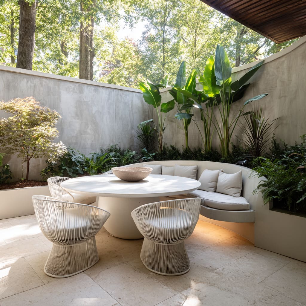
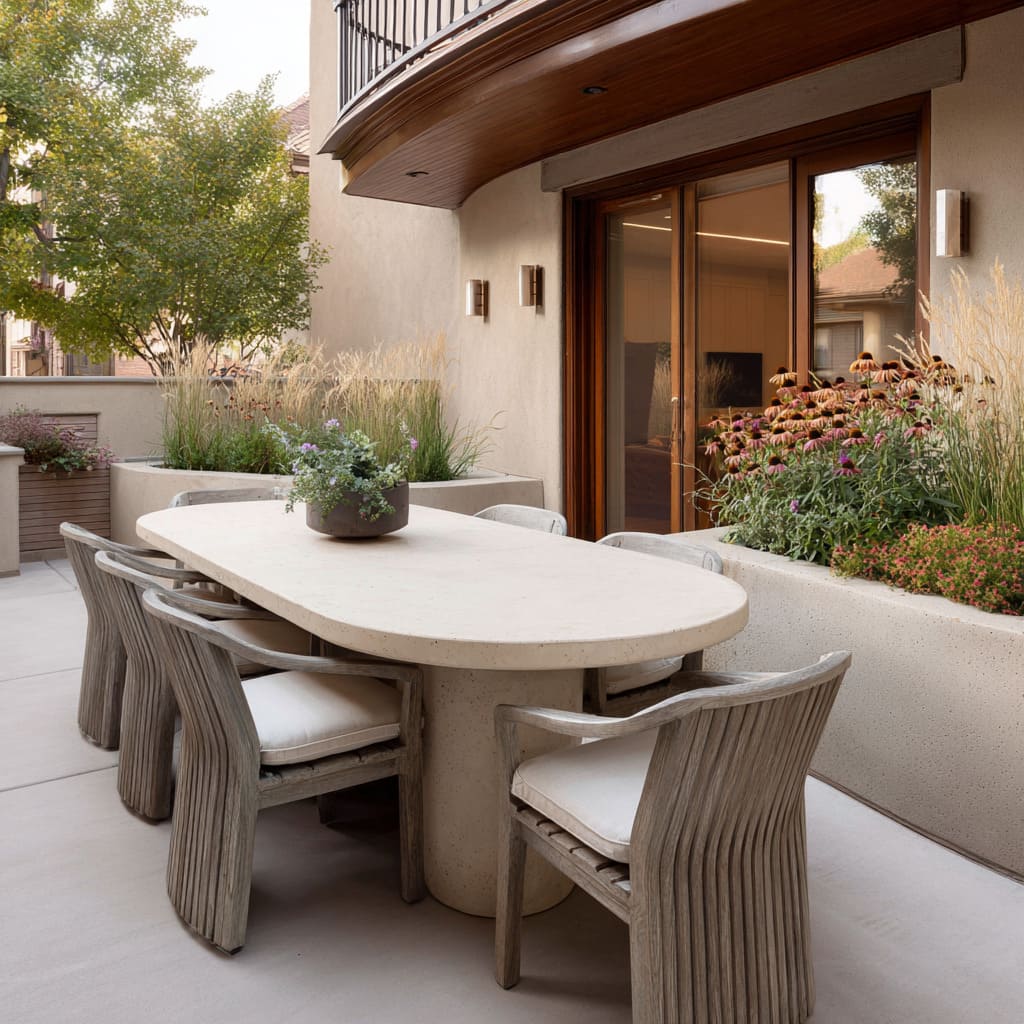
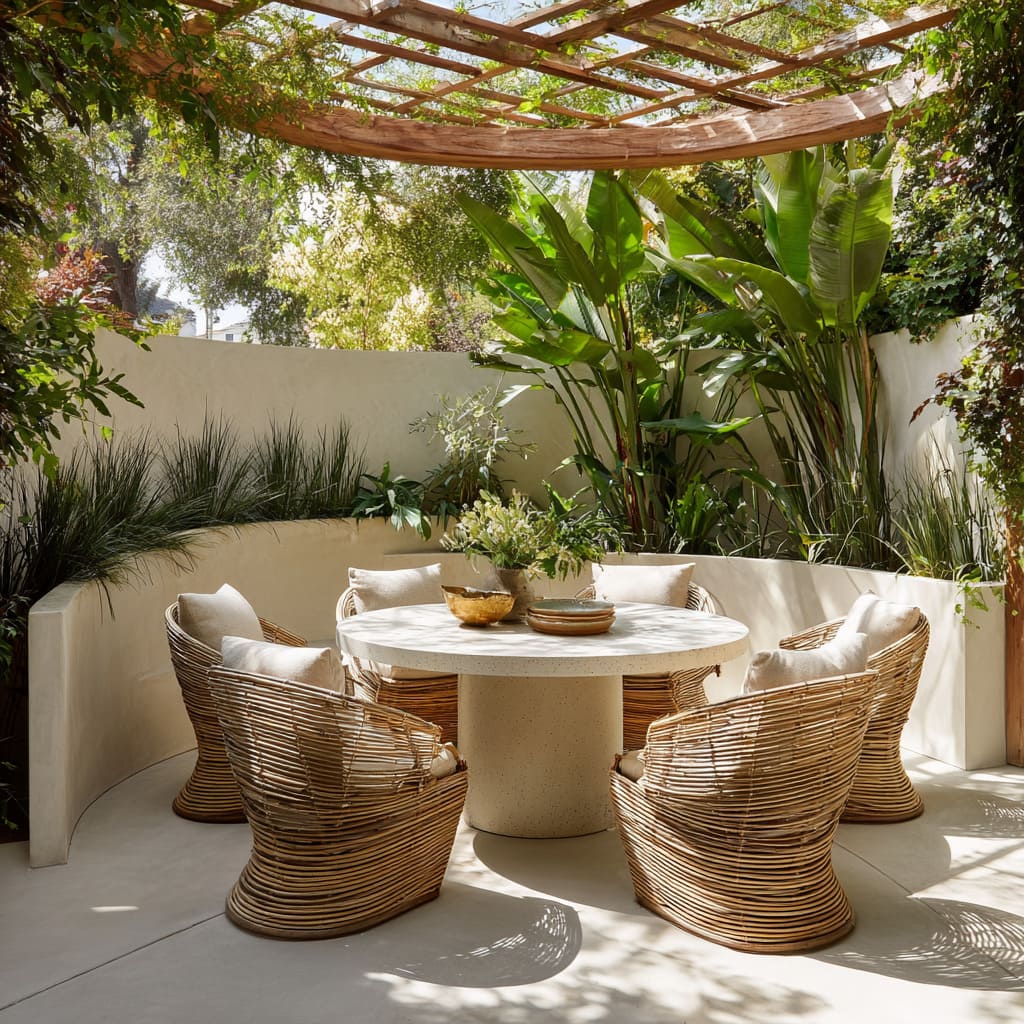
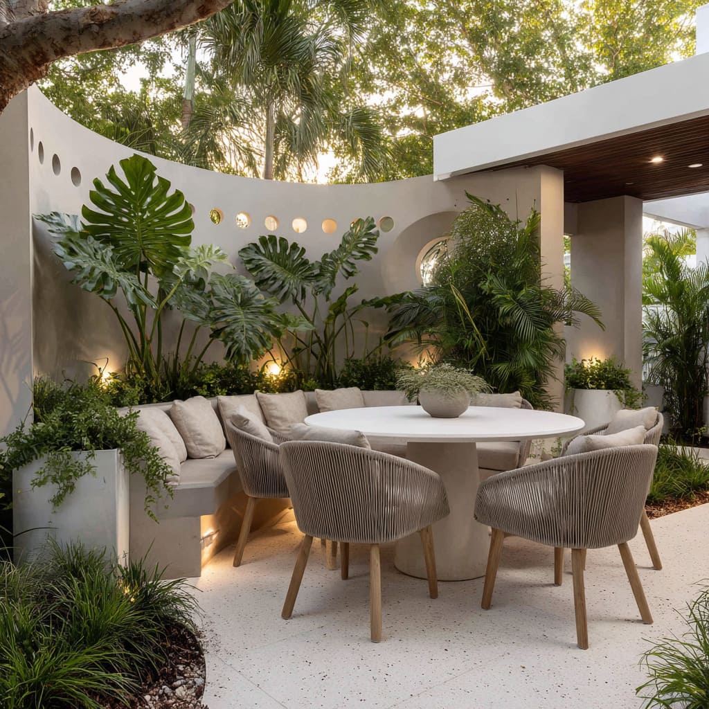
One of the most effective tools in modern layouts is the curve. Rounded tables, soft bench arcs, and even sweeping planter edges play a critical role in reducing visual tension.
Curved furniture softens corners that would otherwise cut up small yards, helping narrow patios and tight side gardens feel more generous.
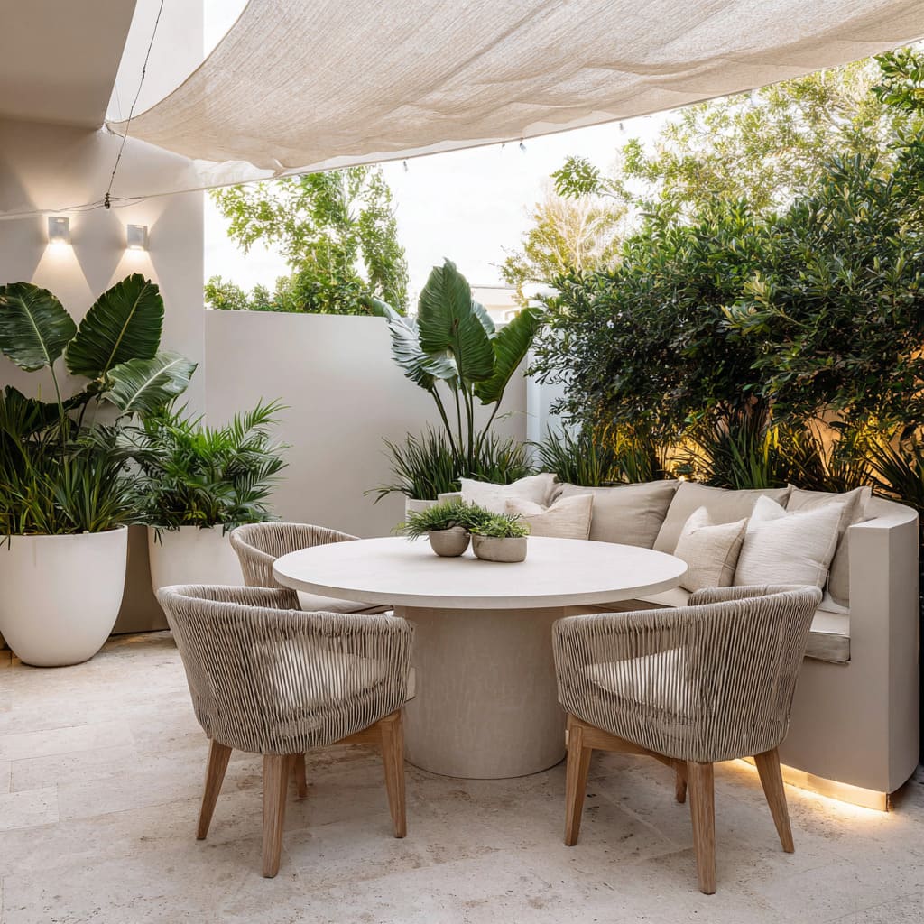
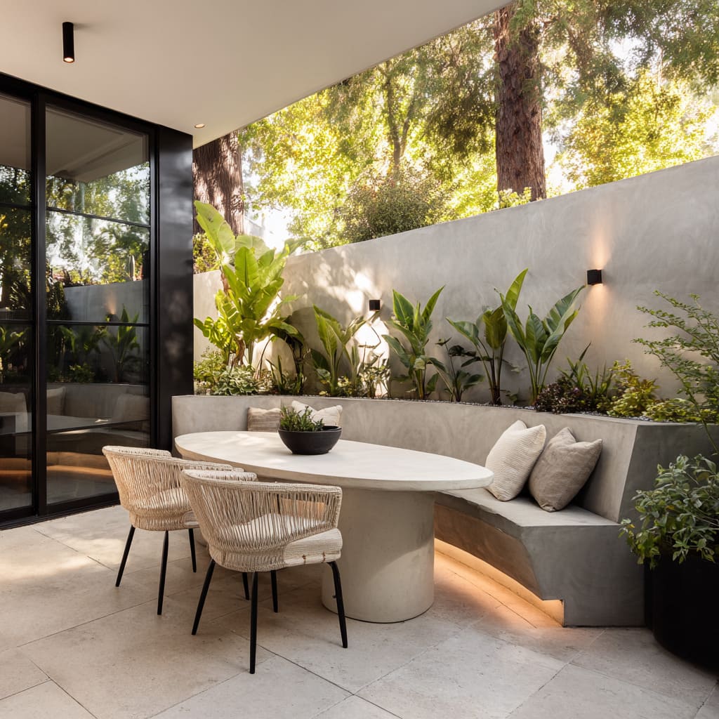
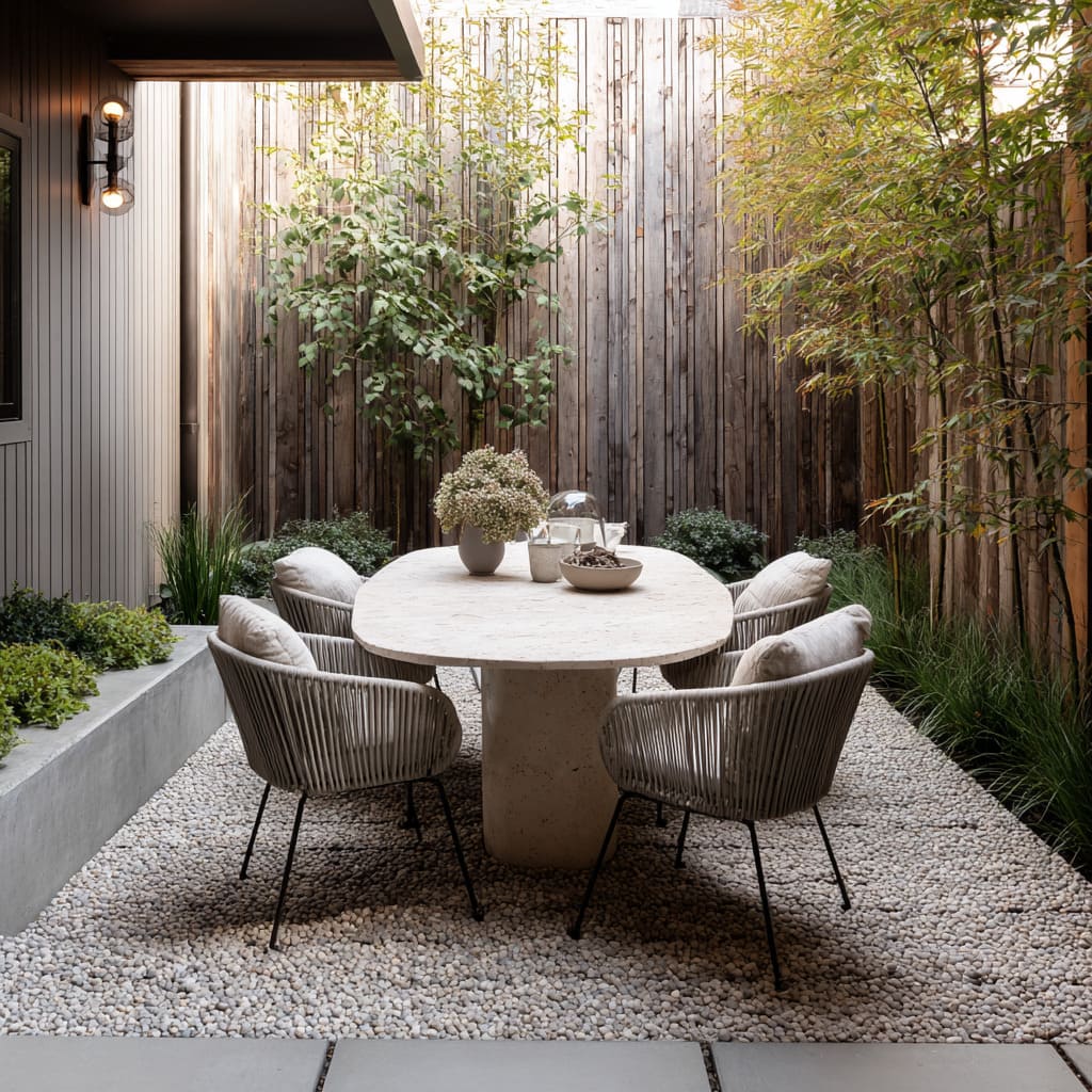
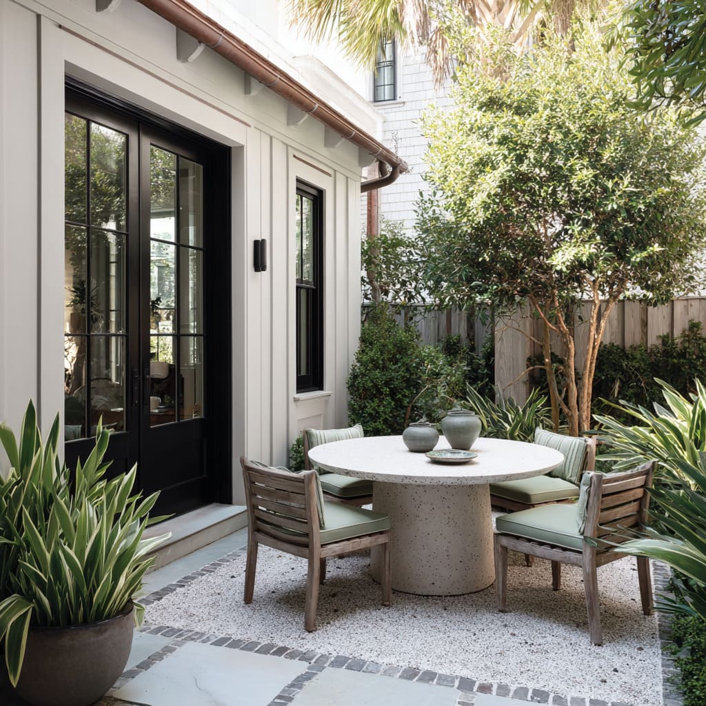
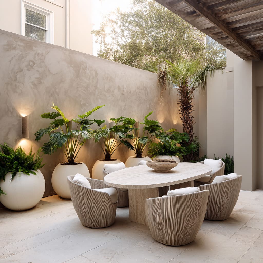
The change is subtle, but powerful—by removing hard angles, the eye is allowed to continue without pause, which creates a gentle spatial rhythm. This trick appears often in circular pedestal tables paired with arc benches or in oval slabs surrounded by soft foliage.
The result is a sense of openness that feels intentional without needing to announce itself. These shapes don’t compete with their setting—they blend, echo, and guide.
In spaces where every inch counts, this design move becomes a quiet asset.
Built-in Benches That Merge with Planting Zones
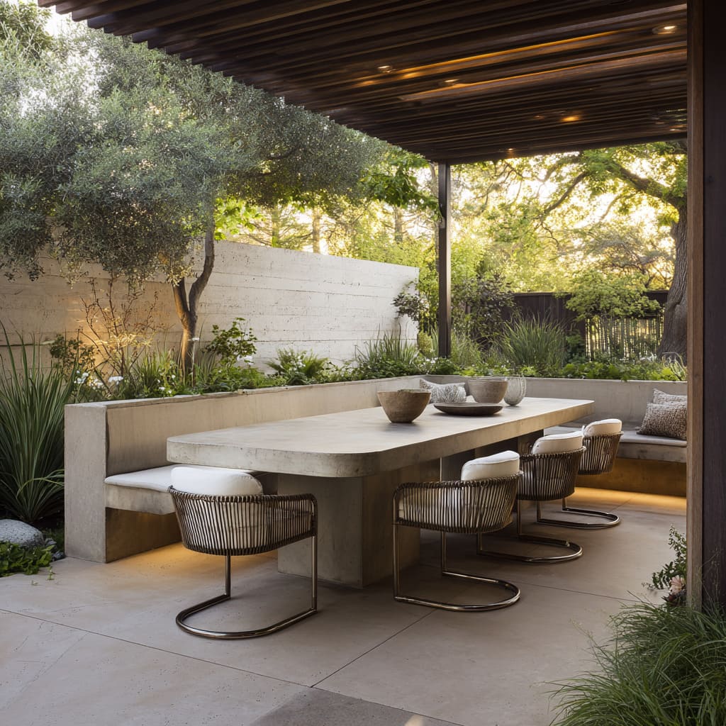
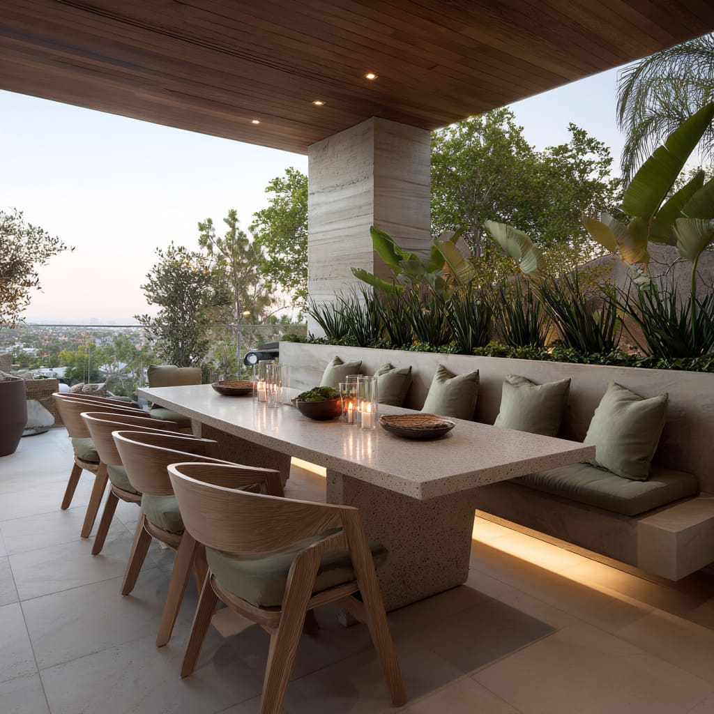
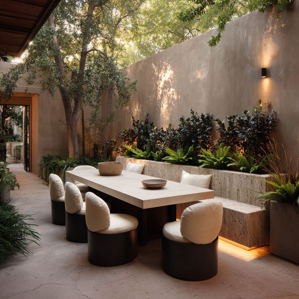
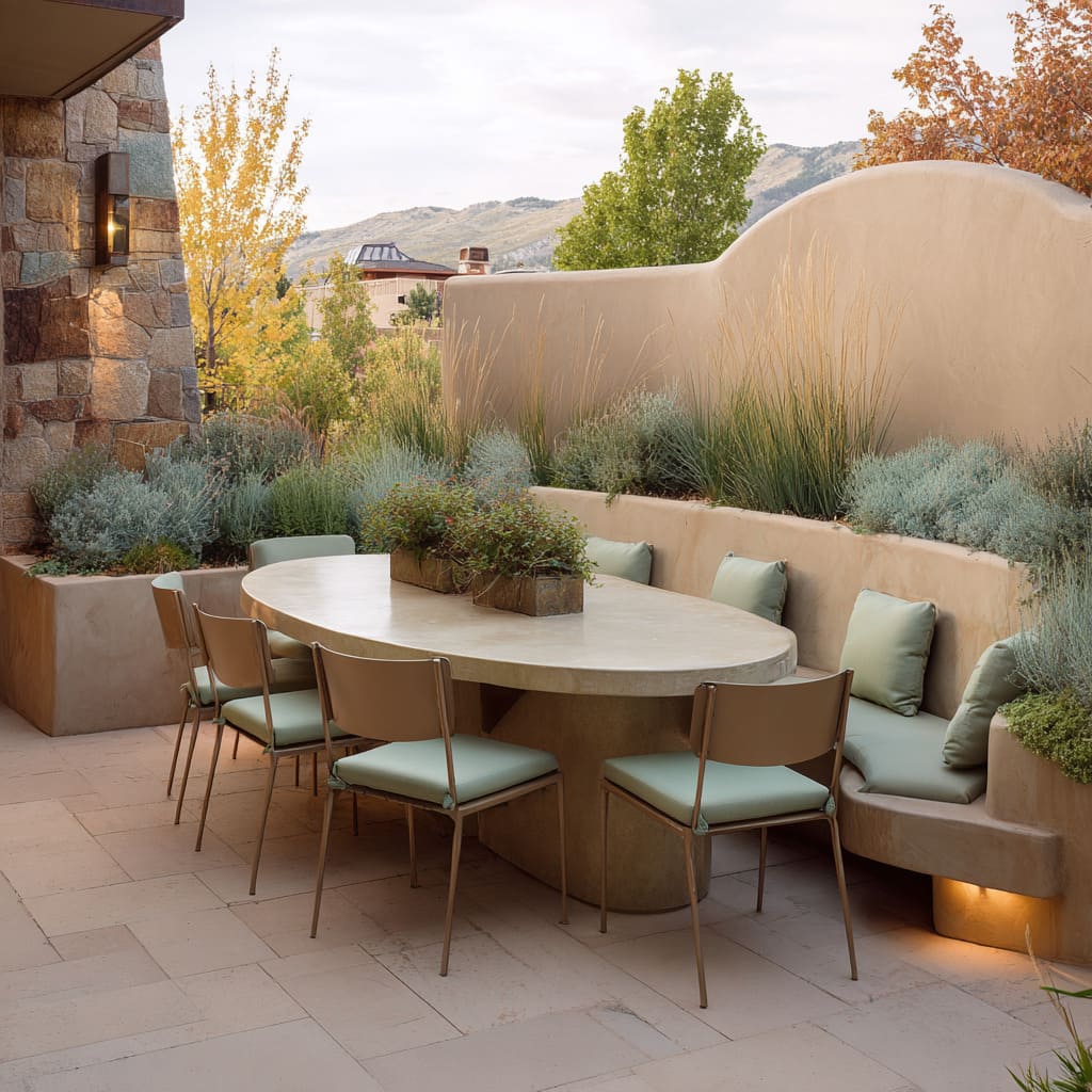
In many modern al fresco dining design layouts, seating isn’t added—it’s built in. Benches formed directly into planter structures dissolve the usual distinction between furniture and garden.
This design move replaces visual clutter with calm repetition. Instead of placing chairs in front of greenery, the back of the seat is the greenery.
The planted backdrop rises seamlessly behind, acting as a natural cushion of texture and depth.
This technique creates a continuous horizontal flow—a subtle but powerful line that draws the eye across the space rather than breaking it up. The effect works especially well in small spaces, where extra furniture could feel bulky.
With this integrated approach, structure and soft planting share the same footprint, maximizing visual and functional economy in even the tightest alfresco dining area ideas.
Lighting That Lifts Without Being Seen
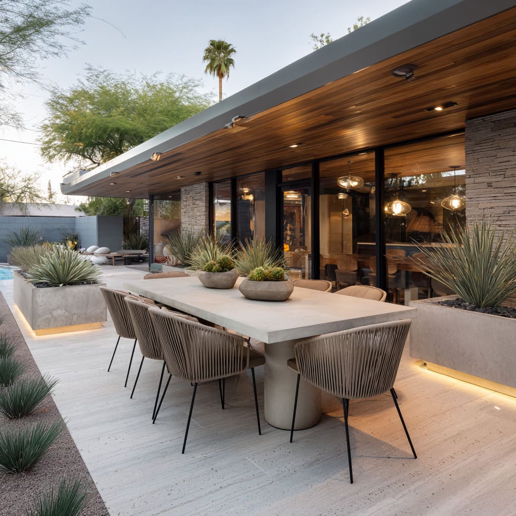
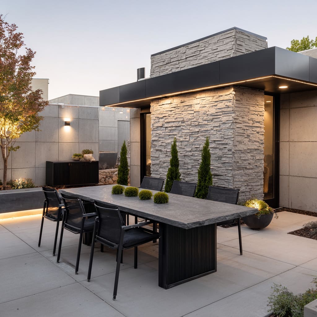
Rather than lighting being treated as a spotlight, it becomes part of the atmosphere. In many modern patios, light is tucked out of view—underneath bench edges, inside wall recesses, or beneath planter lips.
These hidden sources cast a low glow that defines surfaces without overwhelming them.
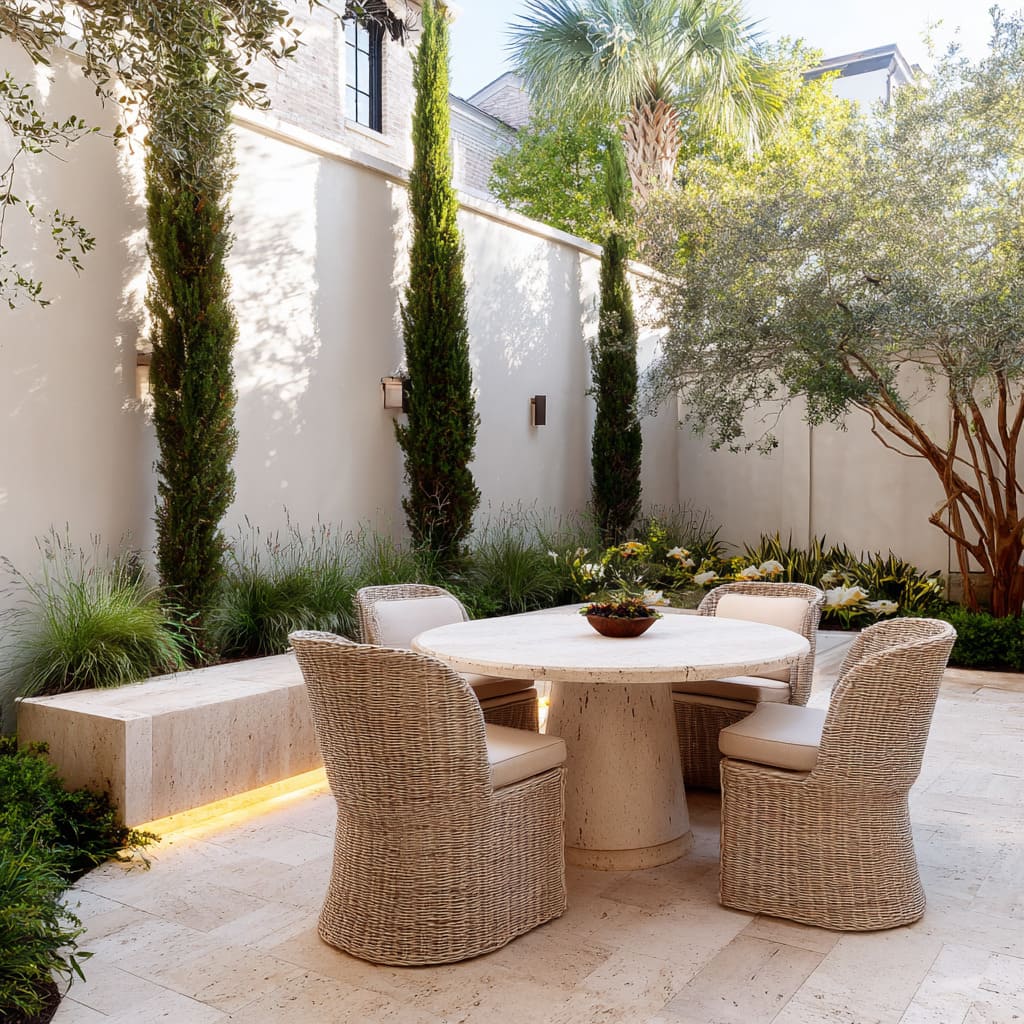
The soft illumination gives stone slabs a lifted look, making heavy materials feel light. At dusk, tables can appear to hover, thanks to how light wraps around their base.
Vertical walls wash gently in warm gradients, while planted zones gain depth from upward shadows that bring leaf textures into focus.
This method of lighting doesn’t just highlight—it allows surfaces to speak through tone and contrast. Used carefully, it gives al fresco dining design its signature twilight rhythm, where every element stays in place but feels subtly activated.
Surface Texture That Invites Closer Look
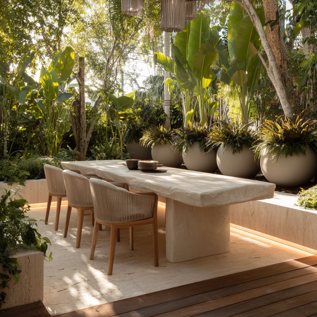
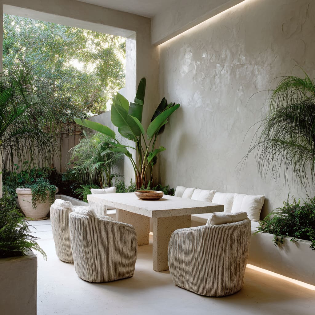
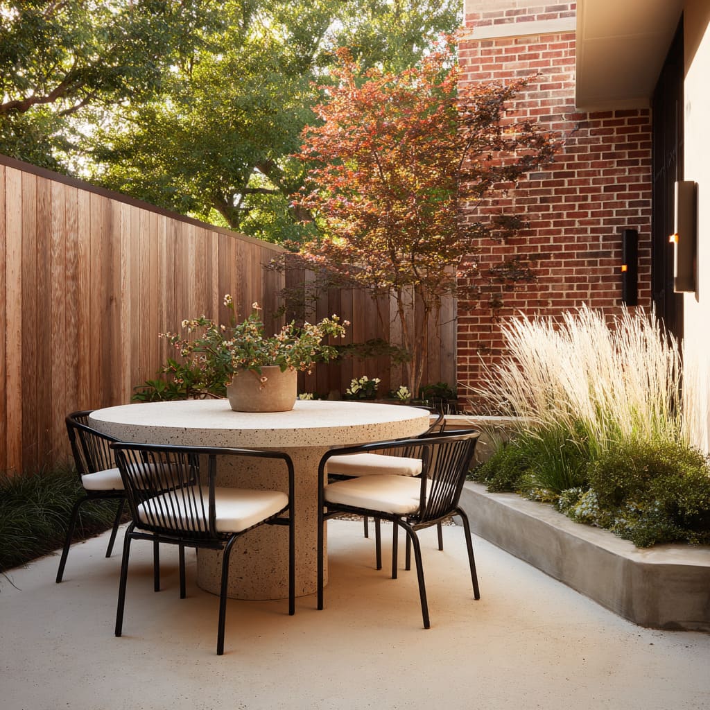
Across many al fresco spaces, surface treatment goes beyond simple smoothness. Stone, terrazzo, and concrete finishes often include subtle flaws—small pits, fine veining, and brushed-in flecks—that give material its visual life.
These details are quiet, but they matter: they stop the light, catch shadows, and make each plane shift slightly as the sun moves. Without needing bold pattern or contrast, these micro-textures hold the eye’s interest, especially at close range.
The restraint in material choices doesn’t flatten the design—it gives it a quiet rhythm. In daylight, pale stone can sometimes feel lifeless unless it carries these irregularities; but when surfaces show a slight difference in tone or grain, even neutral colors appear more layered.
These finishes work especially well in alfresco dining design ideas that aim for understatement without feeling dull.
Chair Structures That Keep Spaces Open
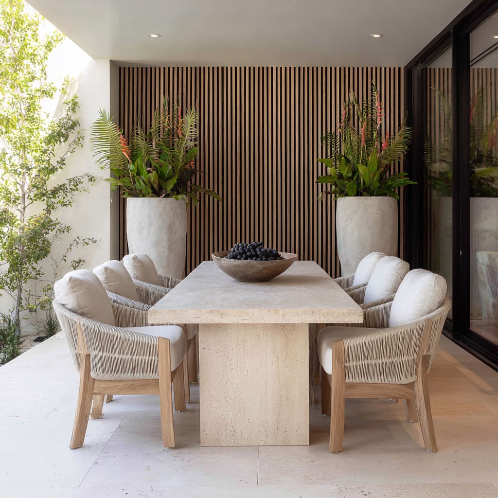
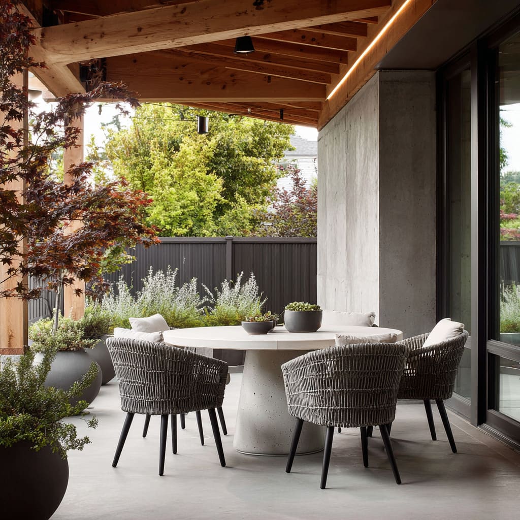
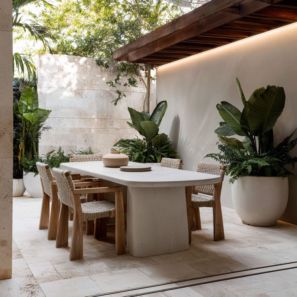
Many successful outdoor space designs use chair frames that seem to disappear without losing presence. Mesh panels, rope backs, and open slatted forms allow light and sightlines to pass through, which makes the overall space feel larger and more breathable.
These choices still provide weight and shape, but without visual blockage.
In compact al fresco layouts, this is especially useful—chairs with solid backs or chunky arms would dominate the scene, whereas these lighter forms offer comfort while staying visually quiet. The look pairs well with layered planting, letting the greenery remain in full view behind and around the seating.
This approach also adds subtle motion, as light filters through gaps and shadows shift throughout the day, giving even still objects a sense of change.
Color Temperature as Climate Indicator
In outdoor spaces built for al fresco dining, color often speaks through tone rather than bold hue. Palettes tend to stay close—sand, chalk, limestone, pale clay, taupe—yet the effect shifts depending on climate.
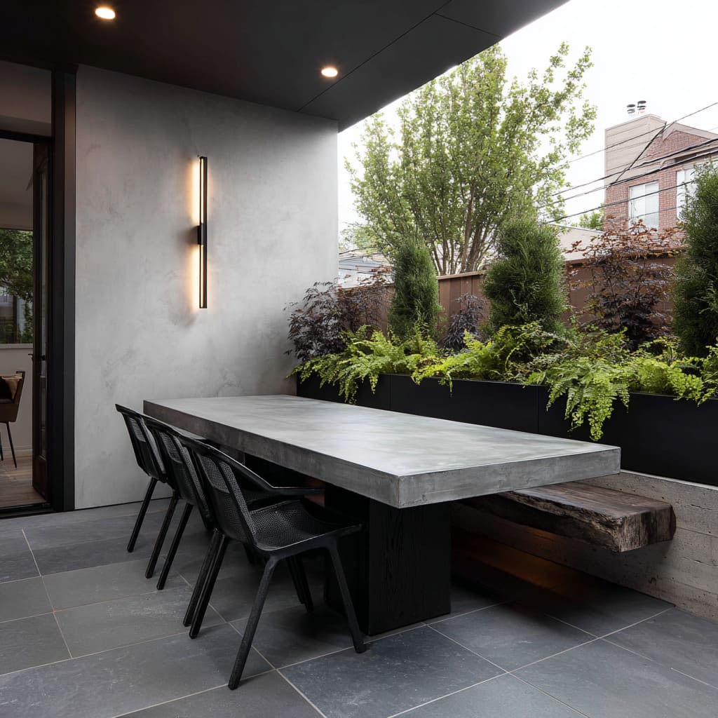
In warmer regions, materials lean toward soft limestone or cream-finished concrete, catching low sun and radiating warmth. In cooler zones, the palette pulls slightly cooler—gray slate or light concrete with bluish undertones—subtly reflecting the environment around it.
These differences aren’t loud, but they register in atmosphere. Color temperature becomes a quiet translator of climate, letting visitors feel the location through how surfaces absorb and reflect light.
The restraint in shade variety keeps the look cohesive, while the nuance in undertone adds depth that doesn’t rely on high contrast or decoration.
Vertical Elements as Visual Rhythm
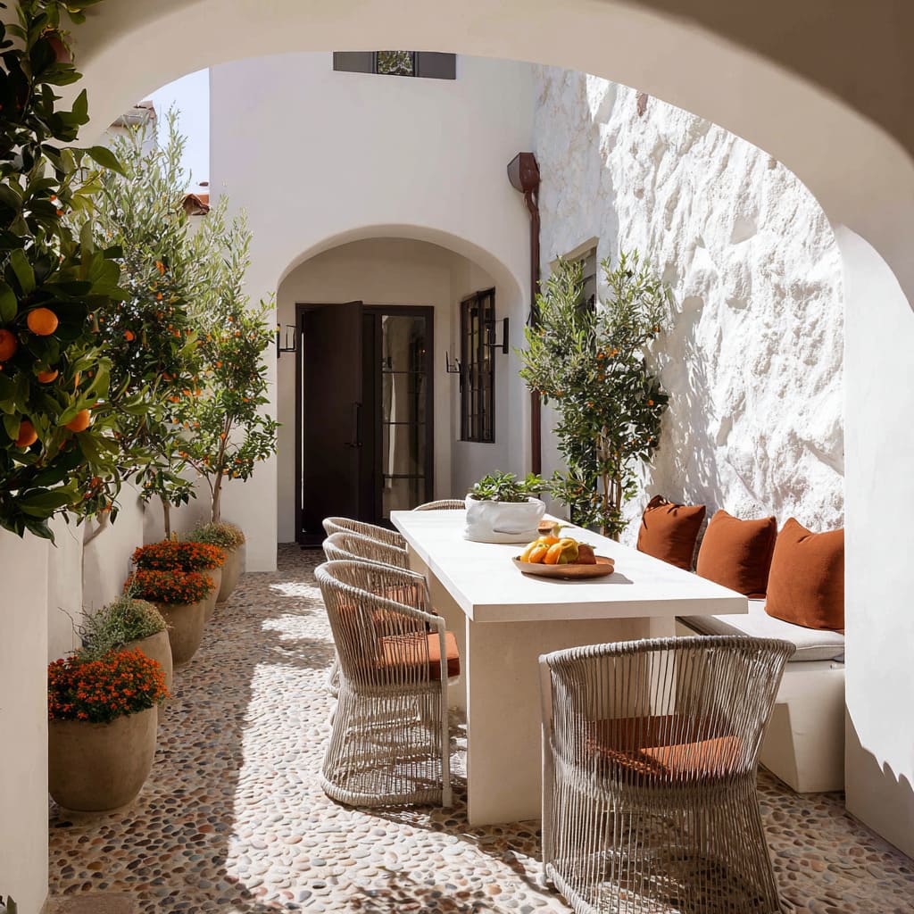
Against long horizontal walls or fences, vertical plants serve more than a botanical role—they create breaks in visual pacing. Slim upright trees, columnar shrubs, or tall blooming stalks work like punctuation, dividing space with natural rhythm.
Instead of overwhelming the background, they stand at intervals—measured, balanced, and spaced with care.
These elements guide the eye without interrupting flow. Whether it’s a row of cypress aligned with seating or bursts of ginger breaking up a wall, they introduce structure without hardness.
In smaller layouts, this effect matters even more: by adding lift and rhythm, these verticals help prevent flatness and keep the space readable. This is one of the more quietly effective tools in shaping refined, layered al fresco layouts.
Off-Center Layouts That Loosen the Grid
In compact al fresco layouts, perfect symmetry can feel rigid—especially when space is tight. This is where controlled asymmetry becomes valuable.
A long bench on one side of a table and standalone chairs on the other opens movement while keeping the space grounded. Similarly, pushing a seating group slightly off-center avoids crowding without breaking the visual rhythm.
It’s a balancing act between structure and ease—by not forcing furniture into mirror-image arrangements, circulation stays fluid and the zone feels less staged.
The table may still be the anchor, but the surroundings flex just enough to feel lived-in. These subtle shifts also help guide foot traffic in narrow patios or side yards, where straight lines might otherwise box people in.
It’s one of the simplest tools for shaping small al fresco zones with a light touch.
Overhead Structures That Shape the Scene
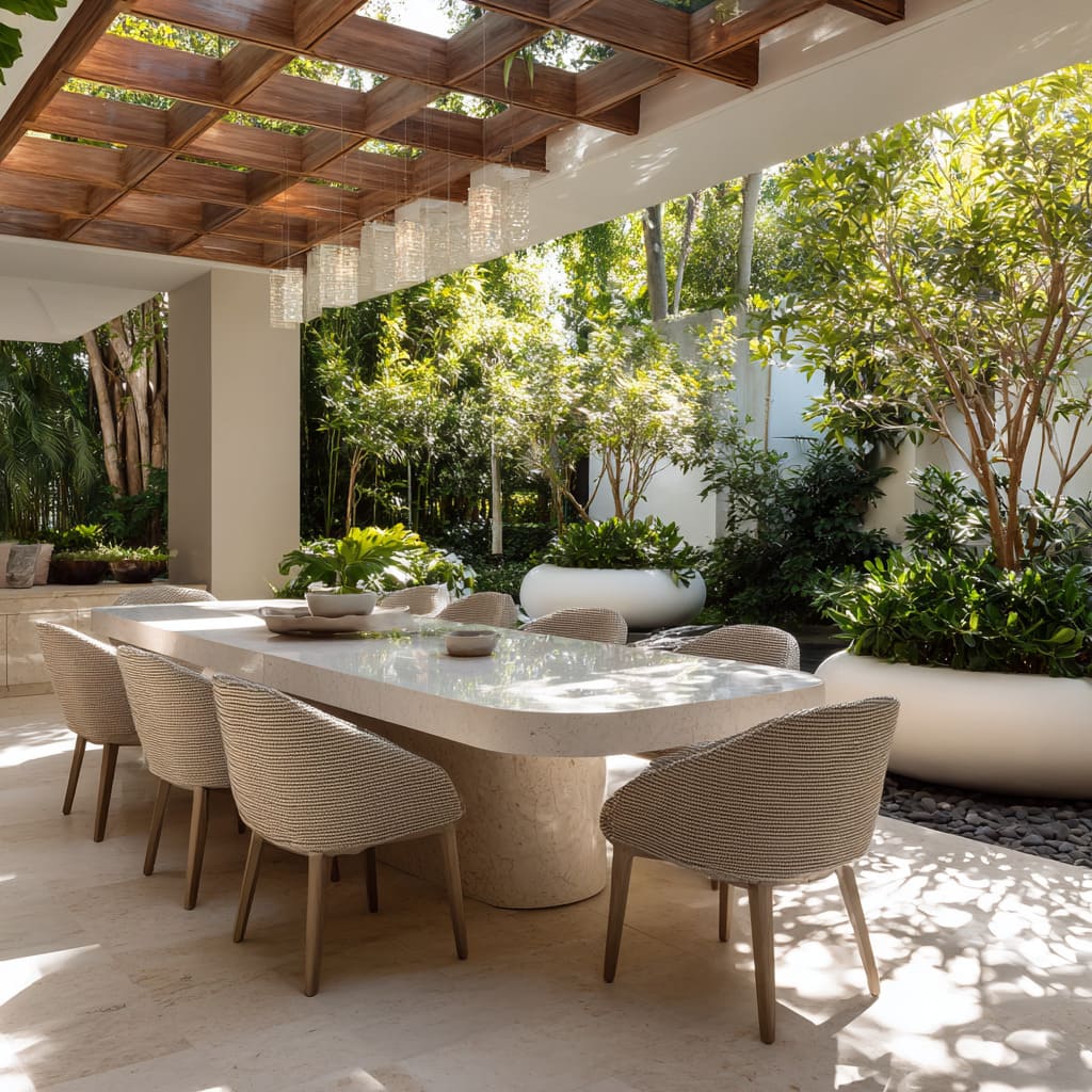
Above many outdoor dining setups, the ceiling isn’t just for shelter—it becomes part of the layout itself. Pergolas, sailcloth canopies, or soffit extensions bring shape and texture to the airspace above, casting shadows that echo what’s happening at floor level.
Wood slats filter light in stripes, matching the lines of stone tiles below. Sail fabric curves or angles in soft contrast to the grid underfoot, adding tension without heaviness.
This top-down framing creates a subtle connection between ground and sky, making even modest-sized spaces feel more composed. The repetition between ceiling and floor elements isn’t always exact, but it creates harmony.
In many al fresco scenes, this upper layer is what holds the whole composition together without being obvious—another quiet thread in the overall rhythm.
Layering That Builds Visual Depth
In many al fresco layouts, scale doesn’t come from square footage—it comes from how layers are built across short distances. A dense planter of tall foliage rising behind a bench, a glowing light strip set at the floor line, or a chair placed in front of textured walls—all of these add a subtle sense of distance.
Foreground, midground, and background work together to create a visual tiering, which makes even the smallest dining area feel more spacious. This is a quiet trick with strong results: instead of stretching outward, the space stretches inward.
The planting softens the backdrop, the furniture grounds the middle, and the lighting or surface details give the eye a near point of focus. The depth created isn’t dramatic—it’s composed through repetition and balance, tuned carefully to enhance atmosphere in compact outdoor spaces.
Tabletop Restraint That Lets Materials Speak
At the center of every setup is the table—but the centerpiece rarely steals the show. Instead, most use a restrained touch: a matte ceramic bowl, a single bunch of fresh herbs, or a stone vessel with soft texture.
These items quietly reinforce the tone of the furniture rather than compete with it. By keeping the surface mostly clear, the focus stays on the shape, weight, and material of the table itself.
This approach fits especially well with al fresco setups where texture and tone carry the visual identity. In spaces defined by raw stone, layered planting, and filtered light, there’s little need for cluttered decoration.
The table remains the anchor, and its material—whether honed concrete, light terrazzo, or sand-washed stone—becomes the visual statement.
Conclusion: Composition Through Restraint
Each move—curves that loosen edges, benches that blend into walls, lighting that lifts without showing itself, and plants used as rhythm rather than filler—adds up to a space that feels deliberate without being overdone. The best al fresco dining zones don’t rely on size or flash.
They lean into softness, flow, and clarity. Every element serves a visual role, whether guiding the eye, grounding the scene, or stretching the space without expanding it.

