White bathrooms have long been seen as clean and uncomplicated, but in today’s high-end design, they carry far more nuance than that. The latest all-white bathroom ideas used in contemporary homes aren’t about sterility or simplicity—they’re about refining light, material, and structure so precisely that even the quietest elements carry weight.
These spaces are shaped by balance: soft shadows against polished floors, textured walls that hold daylight, and cabinetry that floats without fuss. From subtle tile rhythms to nearly invisible storage, the visual calm is carefully composed.
What seems effortless on the surface often hides layers of thought beneath.
Light as the Prime Material
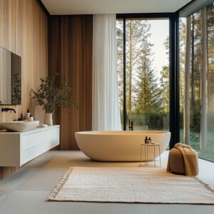
In today’s most thoughtfully composed all-white bathroom spaces, light isn’t simply a background element—it becomes a leading shape-maker. One of the most quietly powerful techniques is the vertical cut of skylights placed directly above a shower bench or freestanding tub.
These overhead openings bring natural light in with a sharp drop, pulling attention downward in a soft, time-shifting spotlight. The effect changes by the hour, creating subtle movement without a single object having to change place.
Designers often leave surrounding walls plain or lightly textured so the shifting light has something to graze across—allowing the architecture to breathe without interruption.

Another refined detail showing up in high-end residential work is the use of ultra-thin black window frames around narrow openings that frame greenery as if it were mounted art. These slivers of outdoor view, especially in areas with mature landscaping, become calm focal points.
After dusk, a quiet tier of concealed LED lighting—often tucked behind mirrors or inside ceiling coves—gently brings back clarity without flooding the room. This second layer helps soften shadows and prevents strong reflections from hitting wet surfaces directly.

Even small ceiling decisions follow a tightly controlled visual alignment. Recessed lighting, air returns, and mirror backlights are all carefully planned along tile lines or architectural joints.
This directional thinking creates a rhythm across surfaces, avoiding scattered placement that can disrupt the calm visual order. It’s not about showcasing technology—it’s about letting the lines speak clearly without interruption.

Sheen Gradients Instead of Color Contrast
Without relying on color shifts, a polished all-white tile bathroom can still offer depth and variety when designers lean into subtle changes in surface finish. One of the most effective approaches is to play glossy against matte: a soft-polished microcement floor might reflect light like pressed wax, while the vertical walls stay dry and low-sheen.
This difference in texture doesn’t break the color language, but it introduces a line that the eye can follow—essential in keeping the space readable without needing trim or paint changes.

Careful selection of stone also plays a big part in controlling how movement is perceived. Some spaces feature marble or quartz slabs with faint horizontal veining, always chosen with intention.
If a slab has more pronounced patterning, it’s often used in isolation—perhaps only for the countertop or a single wall—so it doesn’t interfere with the quiet geometry of the space. Keeping the rest of the room still allows that one patterned area to carry visual weight without taking over.

Another refined move is pairing high-gloss ceramic or glass tile walls with a matte floor, or the reverse. Glossy walls bounce ambient light down onto walking surfaces, brightening the room’s lower half naturally.
These surfaces work almost like hidden uplights, casting glow without any visible fixture. The contrast isn’t in color—it’s in how surfaces behave under light.
And it’s this quiet shift in reflection that gives each surface its own role in the larger design composition.

Texture Rhythms: Ribbed, Shiplap, and Mosaic
One of the defining features of thoughtful all-white bathroom tile design today is how much texture speaks in place of color. Vertical ribbed panels—whether crafted from ceramic, gypsum, or routed wood—introduce a continuous flow from floor to ceiling, visually stretching height while performing double duty.
These surfaces don’t only animate the room—they cleverly conceal storage doors, HVAC grilles, and hinge lines by dissolving them into the rhythm of the panel lines. It’s a clean solution that hides complexity behind a calm surface.

Horizontal shiplap adds a different kind of balance. Applied to taller walls, the wide-set horizontal grooves flatten vertical dominance and visually stretch the room sideways.
In newer homes with references to farmhouse language, this approach keeps the visual memory intact without overplaying rustic themes. When used in bright white, the boards reflect light softly along each groove, subtly shifting brightness through the day depending on how the light moves.

Underfoot, mosaic tiling—especially ultra-small formats in the 5 to 10 mm range—offers both tactile traction and a surprisingly cohesive read from above. From eye level, the many tiny joints dissolve into one soft, nearly solid-looking floor, which lets the walls take over the job of visual storytelling.
These floors also prevent slipping without looking technical. In rooms where all the surfaces are light in color, having that fine grain at the ground level adds quiet energy without needing bold accents or color blocks.

Floating Masses and “Cut-from-Stone” Elements
Visual weight in modern all-white bathroom design is often handled like sculpture—mass is never placed flatly but instead appears to hover, pierce, or carve. One of the most refined examples is the shadow-gap vanity.
A thin recess—typically around 3 to 6 centimeters—is cut under the cabinet’s bottom edge. When paired with a gentle light wash underneath, the stone or stone-look top appears to float, lifting itself off the floor and giving breathing space to the volume without changing any dimension.

Benches take on similar architectural ambition. In several high-end bathrooms, slab benches extend wall-to-wall and pass through side walls like structural beams.
The illusion is sharpened by pre-cutting the wall tile so grout lines align perfectly around the penetration. No trimming or patching is done after the fact, which keeps the grid consistent and the mass believable as part of the room’s core build.

Another move seen more frequently is the raised tub plinth. Instead of placing freestanding tubs directly on the main flooring, designers now form a subtle base—often 5 to 10 cm high—to lift the piece off the plane.
This tiny elevation adds presence, protects surrounding tilework from frequent splash zones, and creates a visual platform for the tub without resorting to color change or pedestal molding. The move is quiet but powerful, and when set against a textured backdrop wall, the result feels settled rather than placed.

Invisible Hardware & Trim Discipline
Many all-white bathroom designs rely not on what’s added, but on what quietly disappears. A common move in these refined spaces is to shift faucets away from the countertop and mount them directly onto the wall.
This keeps the vanity surface free of clutter and allows the stone or solid surface to read as one continuous plane. The length of the faucet projection is trimmed to the bare functional minimum, so even the plumbing avoids visual noise.

Shower enclosures in these bathrooms take a similar approach. Though described as frameless, their refinement goes beyond the absence of metal framing.
These panes are detailed so that their edges vanish into surrounding surfaces—sunk into ceiling recesses or let down into floor channels carved into stone. There’s no need for visible brackets, clips, or gaskets; the pane simply reads as a floating sheet of glass with no beginning or end.
The goal is clarity, not absence. Airflow gets a quiet upgrade too.
Instead of standard ceiling grilles or wall-mounted vents, designers shift airflow outlets to door headers or millwork panels. Painted to match and hidden within architectural lines, these openings still perform but leave no trace.
It’s a precise technique that keeps attention where it belongs—on material and form rather than mechanical systems.

Geometry Games That Quietly Guide the Eye
One of the most striking things seen across high-end all-white bathroom images is how much structure is built from proportion and rhythm. Mirror shapes don’t shout for attention but carry subtle connections to nearby elements.
A round mirror might hover above a softly contoured sink, while a tall oval version might echo the rise of a ribbed wall panel. Long, low mirrors often trace the line of the vanity beneath, stretching space horizontally.
These forms always carry a relationship—but never repeat so literally that they become visual clichés.

Spatial alignment plays a quiet but firm role. In many cases, tubs are set along the same axis as windows, letting natural light frame the shape.
Built-in benches match window sill heights or tile transition lines, and in wet areas, the change from smooth flooring to a pebble-tile entry becomes a threshold the eye can register without any trim or signage. These visual connections guide the body and the gaze without needing to explain themselves.
Rooms also resist the urge for perfect balance. Tubs may sit off-center, or dual sinks may be placed asymmetrically across a long slab.
These arrangements never feel random—what might be off-center below is gently counterweighted by a lighting strip, ceiling line, or niche above. The whole scene stays calm, but alive, because nothing is over-aligned or overly corrected.

Organic Interruptions Without Color Noise
In a visually restrained room, contrast doesn’t need to come from color. Thoughtful decorating an all-white bathroom often involves introducing subtle breaks in texture and shape instead.
The use of greenery, for example, focuses less on hue and more on structure. Designers often choose upright plants beside long floating vanities or place small spiky planters beneath mirrors—not to create visual impact through color, but to gently shift silhouette and volume inside a tight visual palette.

Wood, when used, is handled with equal restraint. The grain is usually left pale, dry, and unsaturated—more tactile than tonal.
In most cases, it appears in small surfaces only: a floating bench, a drawer pull, or the back of a mirror frame. These details rarely exceed ten to fifteen percent of the overall visual field, which keeps the room from tipping into warmth or color but still offers a sense of natural variation.
To further expand the tactile experience, designers often reach for everyday textures with high visual softness. Pebble-stone shower thresholds, soft woven linen Roman shades, or matte ribbed ceramic vessels all introduce a hand-feel variety.
These objects don’t clash with the dominant whiteness—they simply give it more dimension, quietly layering in a sense of touch inside the narrow chromatic frame.

Classical References Made Weightless
The most refined all-white master bath doesn’t abandon tradition—it simply refines it until it floats. Instead of painting trims or wainscoting in contrasting tones, the panel moldings, crown edges, and door frames are finished in the same shade as the walls.
This allows the room’s detailing to speak through shadow and relief rather than through contrasting color, giving depth without heaviness. Flooring often nods to heritage as well, but in a measured way.

One method gaining popularity is the use of herringbone layouts with soft marble or marble-look porcelain. These patterns, traditionally associated with more ornate interiors, are translated into wide, sweeping angles and laid with minimal grout lines.
The result brings rhythm underfoot, but avoids feeling too busy or ornamental. It adds motion, not narrative.

A similar restraint appears in lighting. Instead of overhead fixtures or large decorative pendants, wall sconces are placed between mirrors—drawing from early 20th-century dressing rooms where side lighting was used for clarity.
This arrangement also keeps the ceiling clean and quiet, which is especially valuable in rooms where architectural lines are intended to speak uninterrupted. It’s a small shift that helps classical references sit lightly, adapted to the stillness of modern space.

Storage That Disappears
In the most refined all-white modern bathroom, storage isn’t announced—it’s absorbed. One of the most effective techniques for concealing function is the use of full-height ribbed or fluted panels.
These surface treatments stretch across walls uninterrupted, hiding doors to linen closets or mechanical panels without breaking the visual rhythm. Handle lines, if present at all, are reduced to shadow grooves at the very edge or routed into the panel’s underside—leaving no visual trace from across the room.

Shower niches, often a visual interruption in tile-heavy rooms, are now sized and placed in harmony with the tile grid itself. Designers calculate proportions so that a 2×3 tile joint opening sits flush within the wall layout.
If the wall carries a natural stone pattern, the veining is carried straight through the niche with no offset, allowing the niche to sit quietly inside the surface rather than pop out as an accessory.

Another subtle but impactful tactic involves how water is managed. Benches and tub platforms now include narrow recessed slots or linear drains integrated along the edge, replacing the old round covers or grates.
These elements disappear into shadow gaps or tile joints, letting the surface plane remain continuous while still delivering full function.

Key Takeaways
Many of the best all-white bathrooms succeed not because of what they show, but because of what they choose to hold back. These spaces are composed of decisions that lean into quiet clarity—light, texture, shape, and mass all arranged with restraint.
And while trends shift, certain moves bring depth without distraction:
- Let daylight shape form. A skylight or tall window over a tub does more than brighten—it introduces motion through the day.
- Use finish variation instead of contrast. Layers of gloss, satin, and matte guide the eye more subtly than color shifts ever could.
- Keep only one dominant texture per surface. Whether it’s ribbed tile, micro-mosaic, or brushed wood, too much layering weakens clarity.
- Float your mass. Cabinets and benches lifted off the ground give volume without heaviness.
- Minimize visible function. Hidden vents, edge-mount lighting, and seamless plumbing calm the visual field.
- Use plant life for silhouette, not pigment. A leaf’s shape can do more than its color.
- Let classic forms sit lightly. Framed millwork or patterned floors can bring memory without pulling focus.
- Sound control matters. Hard surfaces don’t have to echo—texture and curves can quiet them down.
The best examples of these ideas don’t announce themselves. They operate through precision and silence.
A successful white bathroom isn’t blank—it’s tuned. And when each choice is made with this kind of subtle control, the room stops feeling plain and starts feeling exact.
Disclaimer: This article is intended for design inspiration and visual analysis. It does not serve as construction advice or product endorsement. For installation, material selection, or compliance with local building codes, consult with a qualified professional.