There’s something quietly compelling about a breakfast nook—its compact scale often holds more design intent than much larger spaces. These are not just corners with a table and a bench.
They are precise compositions where volume, contrast, rhythm, and negative space all interact in ways that guide how a room feels. What looks effortless often comes from dozens of small adjustments: how surfaces meet, how light settles across a curve, or how texture repeats in subtle cycles.
Rather than relying on loud statement pieces, modern breakfast nook ideas rely on shape, alignment, and visual pacing to define their character.
In well-composed layouts, small shifts—one object slightly off-center, or a bench edge lifted just above the floor—can change the entire reading of the space. Soft transitions in tone, echoes between materials, or a single plant placed to reflect a window view all contribute to a layered effect that feels measured without feeling static.
These spaces are defined not by how much they show, but by how well they hold their structure through restraint, contrast, and repetition. The following analysis looks closely at how those qualities come together—how design choices, even the quiet ones, shape more than just appearance.

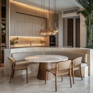
Spatial Carving & Monolithic Illusion
In many standout breakfast nook ideas, what makes the space compelling isn’t size or color—but the way volume is treated. Some benches appear less like furniture and more like an extension of the wall itself.
This visual effect happens when materials wrap seamlessly from vertical to horizontal surfaces—bench into wall, table into floor—with no visible framing or leg structures breaking the rhythm. What results is a carved-out presence that feels closer to sculpture than seating.

Even when made from plaster, wood, or cement board, the illusion suggests stone—massive and permanent—yet softened by quiet detailing and light play. The absence of visible seams allows shadows to outline form instead of materials, letting light define where shape begins and ends.
These spaces don’t declare themselves; they withdraw into the architecture and appear found rather than placed. In compact layouts, this blending approach removes furniture clutter, giving the nook a grounded identity while preserving flow.
The overall sense is that of a recess cut into the home’s surface—a place that feels part of the structure, not added to it. In several modern breakfast nook design examples, this visual strategy reinforces calm through continuity rather than decoration.

Curvature Versus Geometric Tension
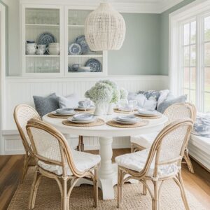
In smaller interior spaces, one of the most effective ways to soften the atmosphere is through shape. Curves—especially those used in seating—create motion without movement.
The continuous arc of a bench or the gentle oval of a tabletop doesn’t stop the eye, it circles it. This kind of visual loop prevents the corner from feeling like an endpoint and instead turns it into an active field of form and light.
The language of curves naturally relaxes the sharpness often found in grid-based architecture, and when paired with softly rounded cushions, the result is cohesive without needing much layering. But softness alone would fall flat.

That’s why the most successful layouts contrast this motion with at least one crisp, grounded detail—a linear pendant suspended with exact precision, a square window framing a view, or a straight-backed chair that slices through the composition. The contrast between the flowing and the fixed adds quiet rhythm, avoiding monotony while keeping the look measured.
This combination of arcs and edges doesn’t feel decorative—it builds spatial awareness. Even in neutral palettes, this pairing becomes the subtle engine behind the visual order, turning simple materials into a spatial conversation that’s felt more than seen.

Tonal Restraint & Micro-Texture
Some of the most compelling breakfast nook design ideas use very few colors—and still manage to feel layered and visually full. These spaces rely not on color contrast but on surface contrast.
Smooth against coarse, matte beside faint sheen, woven paired with polished—each pairing builds quiet depth without noise. In nooks built around a limited palette, this restraint doesn’t limit the space; it sharpens it.
A soft boucle seat cushion beside a raw plaster wall holds attention longer than a bright pop of color ever could.

Terrazzo with nearly invisible speckles, a linen weave catching daylight just slightly, or the dry softness of pale wood grain—these are the kinds of material combinations that reward a closer glance. It’s this focus on micro-texture that lets a quiet breakfast setting feel immersive.
There’s an almost tactile rhythm at play: the eye reads texture where the hand might expect it. And the absence of bold shifts gives the entire space a slower, more cohesive presence.
In many of the most restrained breakfast area ideas, this kind of texture layering becomes the real draw—color stays in the background, while material character takes the lead.

Light as Sculptor
What shapes a nook isn’t always the furniture—it’s often how light interacts with it. A subtle LED strip tucked beneath a floating bench doesn’t just brighten the floor—it cuts the weight of the seat in half.
What looks solid in daylight appears to levitate in evening light. This quiet separation adds dimension, letting the bench hover just enough to lighten the whole scene.
The same idea repeats above the table: pendants hung with precision often match the scale and form of the tabletop below. This isn’t coincidence—it’s visual balance.

A round dome pendant over a round table, or a slim bar over a rectangle, anchors the setting without adding clutter. These light choices do more than illuminate—they clarify the space, defining zones without building walls.
And beyond form, they highlight material finishes: a soft cast of light over a fluted surface creates shadow lines that read like texture. Whether it’s the glow beneath a seat or the overhead accent mirroring a table, light sculpts the space by revealing edges, separating volumes, and turning flat areas into floating elements.
In many breakfast nook design ideas, this precise use of light is what makes the corner feel complete without crowding.

Floating Versus Grounding Tactics
One of the quietest yet most impactful moves in modern breakfast nook composition is the use of visual weight shifting—where one part of the space appears to lift, while another firmly settles. Designers often anchor one surface while letting a nearby element float, creating a deliberate imbalance that keeps the eye alert.
A bench base might seem to hover an inch above the floor thanks to a concealed light strip, but the wall behind—paneled in dark wood or tile—carries full mass. Or, a brass plinth under a seat might glow faintly, while the table it supports appears planted and unmoving.

This contrast produces a low-key tension that animates a still corner without loud materials or shapes. The mix of grounded and lifted lines turns even compact layouts into visually layered scenes.
For small breakfast nook ideas especially, this method expands perception. One detail appears to drift; another locks things down.
That contrast—between the grounded and the airborne—makes the whole space feel more structured, even if its actual footprint stays minimal. Without needing bold moves, this balance of gravity and lightness allows the nook to hold presence in a quiet, assured way.

Object Placement & Relaxed Asymmetry
In many modern dining nook ideas, there’s a subtle discipline behind what looks casual. Look closer at the tabletop or pillow layout—items rarely land at the center.
A single vase might lean slightly left. A trio of cushions might rise in height from one side to the other.
This minor irregularity signals comfort, not carelessness. It breaks any showroom-like polish and instead brings in the feeling that someone actually lives here.
Even tabletop accessories—branches in a vessel, a shallow bowl with visible grain—often drift off the midpoint, offering small cues that the space is shaped for slow mornings or long chats, not rigid symmetry. The skill is in the balance: nothing feels overly styled, but nothing appears random either.

These micro-adjustments give rhythm without needing color or pattern, helping neutral-toned spaces feel less static. And in tight corners or alcove settings, these gestures also stretch the composition: by moving attention off-center, the space feels more expansive than its dimensions suggest.
The best of these relaxed arrangements create a sense of breath—space between items, slight tension in placement—that invites you to look longer without even realizing why.

Nature Echoes & Exterior Continuity
Many breakfast nook designs gain their depth not from bold design gestures, but from a quiet dialogue with what’s outside the window. The inclusion of natural elements inside—olive trees, dried branches, or grasses—is rarely decorative for its own sake.
These elements are often chosen because they repeat a shape, tone, or movement already present outdoors. If there’s a grove of vertical trees, a tall branch arrangement inside might mirror that line.

If the view features windswept desert plants, a spiky dried grass bundle can echo that wild, low gesture. This kind of visual link dissolves the edge between interior and exterior.
It makes even compact corners feel as though they stretch further than they do. In some breakfast nook ideas for small space, this approach expands the sense of scale without touching the layout.
Light filtered through garden trees feels more integrated when similar leaf textures or silhouettes appear inside. Rather than blocking the outside, the nook becomes an extension of it.
The impact is subtle, but it deepens the mood of the space and makes it feel less contained. Even a single vase placed to reflect a viewline can shift the reading of a room from enclosed to open-ended.

Material Echo & Rhythmic Repetition
Patterns don’t need to shout to be felt. In many modern breakfast nook compositions, repetition appears through vertical elements—slatted walls, fluted bench fronts, grooved table bases—subtly coordinating across surfaces without duplication.
This repetition at varied scales builds rhythm. One surface might feature thick wooden battens, while a nearby pendant light uses finer vertical ribbing.
Your brain reads this continuity even before you consciously notice it. It works like a beat—not musical, but visual—tying together tones that might otherwise feel unrelated.

These rhythms also offer structure to a neutral palette: even when color is restrained, a room can feel rich through movement and echo. The best part is how these elements shift in different light; grooves catch shadows throughout the day, changing the feel of the room without rearranging anything.
This layering becomes especially effective in breakfast nook inspiration drawn from clean, modern styles—where fewer objects mean the pattern itself does more of the work. A slatted bench, for instance, might visually “talk to” a grooved planter or ribbed ceramic, linking every element into a slow, quiet pulse that supports the space from within.

Color Pulse Through Cushions
In many modern setups, cushions play a much larger role than simple comfort—they guide how the eye reads space. One often-overlooked tactic is the use of gradual color transitions, especially along curved or extended bench seating.
A quiet fade from soft ivory to muted clay or from warm sand to deeper rust doesn’t just bring tonal interest; it introduces motion. The eye follows this subtle color shift, making the bench feel longer, deeper, or more wrapped around than it physically is.
This technique works particularly well because fabric absorbs and reflects light more gently than hard surfaces.

There’s no abrupt edge or stark contrast—just a slow layering of tone that feels built into the scene. The result is a visual movement that reads as relaxed but structured.
Even in very compact layouts, these cushion-based fades can suggest contour or wraparound effects that would otherwise require built-in shaping. In some kitchen breakfast area setups, this approach brings warmth and depth without changing the footprint, simply by sequencing soft tones with care.
A well-tuned lineup of pillows can define rhythm, edge, and even light flow—all through hue and placement alone.

Chair-Bench Interplay
A well-built bench may anchor the room, but it’s often the freestanding chair that changes how the space breathes. Chairs are rarely an exact match to the bench, and that contrast is a visual advantage.
Placing a cane-back chair with a soft weave next to a sleek black bench creates a break in surface language that’s subtle but noticeable. These pairings function like punctuation—a pause, a shift, a gentle counterweight to the built-in’s structure.
The materials speak in contrast: one matte, one textured; one grounded, one airy.

Sometimes, the chair is placed just off-center—not far enough to feel off, but enough to disrupt symmetry and keep the space from feeling static. This asymmetry has a purpose.
It improves flow, but also frames the table more naturally, making the seating layout look lived-in rather than staged. The chair doesn’t need to dominate; it needs to create a soft interruption in the rhythm of solid shapes.
Whether it’s light wood set against dark plaster, or a looped boucle seat in a structured nook, the chair gives the eye a place to rest before continuing the line. These quiet contrasts keep the room from flattening into uniformity—and that’s what gives many nooks their visual longevity.

Reflective Versus Absorbent Surfaces
A space can shift mood entirely depending on how surfaces react to light. Glossy, mirrored, or metallic accents—especially brass or polished stone—play a unique role in softening or redirecting visual weight without dominating the material palette.
Unlike bold colors, metal doesn’t force contrast. Instead, it borrows from the environment, pulling in subtle tones from nearby walls, floors, and furnishings.
A brass table base, for instance, might pick up warm undertones from nearby wood or cast a faint golden sheen onto an otherwise matte black bench. These materials act as visual connectors—bridging cool and warm elements without needing pattern or ornament.
By bouncing even the faintest light or color, they insert movement into a space that might otherwise feel too static or flat. The placement matters: a reflective element positioned low will lift the gaze upward, while one overhead, like a pendant, will echo nearby shadows with warmth.
And because these finishes react throughout the day, they give the room a slow-shifting tone that stays engaging. Rather than feeling flashy, the best uses of reflective finishes in modern interiors are subtle—more like a soft blur than a sharp gleam.

Composed Voids & Negative Space
A breakfast nook doesn’t need to be filled corner to corner to feel finished. Sometimes the most effective visual tool is space itself—space that is left open, quiet, and untouched.
Designers often shape this emptiness with precision: a niche shelf might hold only one small ceramic; a blank stretch of wall behind a curved bench might remain unadorned. These voids aren’t accidental—they are structural pauses.
They allow textured surfaces, sculptural shapes, and materials to stand apart rather than compete. Without them, visual rhythm flattens and everything starts to blur.
In compact spaces especially, letting parts of the wall or shelf go unused helps the eye rest and gives each surrounding object more presence. A simple black bowl on an otherwise empty table draws more attention than a cluttered centerpiece.
A lone dried branch in a corner niche creates more dimension than a packed display. These decisions give room for shape, light, and line to be read clearly.
In many thoughtful interiors, the absence of content is what holds everything together. It’s not about minimalism as style—it’s about giving form and texture room to speak without being drowned out.

Subtle Time-Period References
Many breakfast nook designs carry quiet nods to the past, but do so without leaning into nostalgia. The historical cues are present, but stripped down to their core components—shape, texture, or joinery.
A tulip base might bring mid-century geometry, but without the sheen or pattern that typically defines the period. A cane-backed chair may recall Nordic craftsmanship, yet it blends into the composition through its pale tone and soft curvature.
These gestures are more about structure than story. Nothing feels theme-driven or frozen in time.
Instead, the space folds historical memory into the present through a kind of visual editing—preserving proportions or techniques while muting their expression. This restraint lets different influences coexist in one nook without clashing.
A Craftsman-style bay window may frame the view, while nearby details pull from 1980s minimalism or contemporary materials. For the viewer, this creates a layered reading.
The references are there—but only if you’re looking for them. And even if you’re not, the room still holds balance.
That’s the value in subtle referencing: it builds design depth without demanding explanation.

Conclusion
What these ideas reveal, beyond materials and shapes, is that small spaces can carry visual weight through careful choice and tension. It isn’t the amount of furniture or the boldness of color that makes a nook compelling.
It’s the slow buildup of decisions—light direction, cushion scale, where a branch is placed, how a bench appears to lift from the floor. These moves shape the atmosphere without calling attention to themselves.
Tone-on-tone layering creates volume without mass. Repetition builds rhythm.
Asymmetry adds softness. Voids give the space room to breathe.
Even the quietest gestures—an off-center chair, a fine groove in a wood panel—contribute to the whole. Each nook becomes less about furniture and more about how that furniture settles into its surroundings.
Together, they show how understated choices carry the power to define a space completely. Every corner becomes a study in contrast, restraint, and rhythm—where composition does the work that decoration often tries to do.