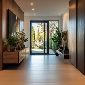
Long hallways often face the risk of visual repetition or flatness, but the most refined designs don’t try to overpower the format—they work with it. Through subtle use of line, tone, and light, these spaces can become some of the most visually controlled and quietly expressive parts of a home.
The focus is not on filling every inch, but on composing it—using rhythm, restraint, and material shifts to create movement and pause.
Texture plays a large role—soft plaster finishes, wood grains, matte ceramics—all chosen for how they interact with surrounding surfaces and lighting. Placement matters too.
A shelf set at the right height, a mirror that reflects only part of a pattern, or an object that interrupts too much order—each one changes the feel of the corridor without needing to announce itself. In this article, the spotlight is on long narrow hallway design ideas that rely on fine control instead of decoration overload.
Every section explores a different way these tight, linear spaces can carry more than just function—they can hold rhythm, tension, softness, and tone, one step at a time.

Rhythm as a Silent Guide
Visual rhythm in long hallway design often begins before one even notices it. Consistent spacing—between lights, niches, mirrors, or architectural grooves—acts like a quiet metronome, pulling the gaze forward at a measured pace.
This structured repetition isn’t about decoration for its own sake; it’s about tempo. A hallway with evenly spaced sconces or floating shelves, for example, builds a kind of visual cadence that supports calm movement.
But the rhythm doesn’t have to remain constant—small shifts, like grouping lights closer together near the entrance and farther apart near the end, can subtly shift how fast or slow the space feels without changing the structure itself. In long hallway ideas, this control over perception is what gives a narrow passageway its sense of depth, guiding the eyes more than the feet.
The hallway becomes less of a path and more of a composed space, where even silence seems paced.

Quiet Contrast Over Drama
Rather than bold visual clashes, many thoughtful long hallway designs rely on a single tone—deep and grounded—to create contrast with surrounding pale surfaces. The effect of placing one darker surface, such as a charcoal wall or a walnut ceiling plane, within an otherwise soft palette, is visual compression and expansion working at once.
This method doesn’t crowd the corridor. Instead, it frames it.
The deep tone recedes slightly, making adjacent neutrals appear brighter and wider, giving the illusion of added volume in a confined space.

Crucially, the accent is kept on one surface—wall, floor, ceiling, or shelf—never across too many zones, so the contrast feels intentional but never forced. This restrained approach keeps the palette clear and helps keep attention where it matters, like a framed artwork or a sculptural bench.
Subtle, layered, and anchored—this kind of quiet contrast defines many of the most effective long hallway ideas seen in high-end interior settings.

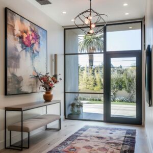
Objects as Pause Marks
In many long hallways, spatial pacing can become too continuous—visually stretched without interruption. That’s where objects step in as subtle pause points, acting almost like punctuation in a long sentence.
A raw-edged bench placed mid-length, a console table with grounded texture, or a sculptural vessel on a shelf can shift the rhythm of movement without needing to block it. These aren’t simply additions; their proportions, placement, and materials serve a deeper purpose.
Weight and tactile surface—for example, rough wood grain or matte ceramics—create contrast against smooth walls, encouraging a visual pause. This momentary stop changes how the hallway feels—less like a tunnel and more like a space with chapters.
Especially in longer layouts, these interventions help define scale, making the eventual room feel more like an intentional arrival than an afterthought. They play a key role in the kind of long hallway wall decor ideas that avoid repetition and instead introduce pace through physical presence.

Reflections That Edit Reality
Mirrored surfaces in hallways rarely work like windows—they aren’t there to show the full space, but to quietly echo pieces of it. Whether it’s a narrow vertical mirror repeating a line of ceiling lights or a framed photo bouncing a slatted wood pattern, these reflections introduce rhythm without full exposure.
The idea isn’t to widen the corridor dramatically, but to edit the view, reflecting just enough to suggest more without showing all. This partial mirroring creates depth with restraint.
Full-height panels might duplicate the sense of grid or symmetry, while frameless sections seem to extend the wall’s material rather than contrast it. What matters most is that the reflections stretch patterns, not scenes—making the mirrored elements feel like extensions of architecture, not decoration.
Used thoughtfully, these techniques make long hallways feel more layered, and more dimensional, without ever relying on overt tricks. It’s this quiet manipulation of rhythm and repetition that often separates flat from dynamic.

Indirect Light as Surface Makeup
In modern hallway composition, light becomes part of the material palette, not just a tool for visibility. By hiding the light source—whether inside ceiling coves, behind shelf lips, or within wall gaps—the glow emerges without glare.
This diffused wash glides across walls, pulling out detail without spotlighting it. Plaster takes on depth as subtle strokes catch the light; brushed finishes start to show their grain without needing contrast.
Instead of relying on bold tones or glossy coatings, these surfaces gain identity through how the light skims across them.

It’s a way of shifting focus—texture becomes the statement, not color. For anyone observing long narrow hallway decorating ideas, this technique builds atmosphere without clutter, letting the walls speak softly through surface nuance rather than color or shape.
The effect is especially noticeable in quiet spaces where every surface is tuned for subtle response, and the light behaves more like a fabric draped across the room than a beam from a bulb.

Soft Geometry Over Hard Lines
In layouts that tend to run tight and straight, introducing gentle curves brings relief—a visual softness that shifts the mood without crowding the space. Arches framing a hallway’s end, a rounded mirror against a flat wall, or the elliptical outline of a wall sconce—all these shapes cut across the dominance of straight lines.
They don’t have to repeat over and over; often, showing a curve just twice—one architectural, one decorative—is enough to balance the linear energy.

This kind of subtle repetition forms a quiet link, almost like a whispered rhyme within the layout. Especially in efforts to decorate long narrow hallway spaces, rounded elements help ease the flow without changing the structure.
They temper the rigidity of panels, planks, and ceiling trims, letting softness edge into the visual language without calling attention to itself. It’s this slight bend in geometry—not overused, but precisely placed—that can carry the entire tone of the corridor.

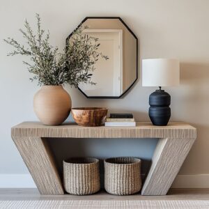
Tone-on-Tone Depth Play
Working within a single color family—like variations of cream, taupe, or gray—creates depth that doesn’t rely on obvious contrast. Instead of shifting hues, the difference comes from surface quality and how each one handles light.
A matte plaster wall might sit beside a soft-sheen runner rug, and both in the same tone will read differently depending on how light hits them. One absorbs and flattens; the other reflects gently and sharpens detail.
This play of reflection, texture, and finish invites the eye to read layers, even if everything appears to be one tone from a distance. For those exploring decor ideas for a long hallway, this method keeps the space calm while still giving it definition.
By avoiding high-contrast color splits, the focus turns to material transitions and rhythm, making even a narrow layout feel rich and resolved without feeling overworked.

Floating Elements to Lighten Mass
In narrow hallways, the placement of heavier elements like benches or shelves can make or break the balance of space. Floating them—by using cantilevers or hiding their support—visually removes their weight, helping the layout feel breathable.
Even a solid oak bench, once lifted slightly off the floor and given a shadow gap beneath, seems lighter and more sculptural. Under-lighting plays a crucial role too; it separates the object from the floor without making it glow.

This visual lift creates a sense of motion and depth that can stretch a tight corridor visually. In the context of decorating ideas for a long narrow hallway, the idea of mass without heaviness is central.
It keeps the eye moving, lets the floor remain uninterrupted, and builds visual transparency without resorting to mirrors or excessive lighting. The outcome is subtle but impactful—each element doing just enough to belong, but never enough to weigh the space down.

Organic Interruptions in Ordered Grids
Clean lines and perfect symmetry often define long hallways, but too much order can create visual stiffness. That’s where natural irregularities step in—branches, aged wood pieces, clay artifacts, and rough ceramics—quietly breaking the perfection.
These raw elements hold shape and story, especially when placed against rigid backdrops like vertical paneling or grid-like marble cladding. The effect is deliberate contrast.
Sharp lines serve as a frame; natural forms become the focal point within that structure.

The texture shift alone can carry weight—one cracked bowl beside a mirror can shift the energy of the entire corridor. It’s this push and pull between polish and rawness that keeps long spaces from going cold.
If every element is smooth and measured, the space flattens. But inserting just one or two raw materials in tension with the structure opens up room for pause.
This approach is frequently seen in curated ideas for long narrow hallways, where small moments of irregularity are used to punctuate a steady architectural rhythm.

Ceiling as Fifth Wall
In most hallways, the ceiling is forgotten. But in refined interiors, it becomes the missing surface that completes the spatial envelope.
Cladding the ceiling in warm pine, walnut, or slatted oak panels transforms the overhead plane into a feature as essential as the floor. This upper layer stretches the corridor’s direction, creating a sense of motion and depth—especially when it mirrors tones or materials already found in benches, shelves, or trim.

The match doesn’t need to be exact; even tonal similarity is enough to link surfaces vertically. What this does is turn a simple corridor into a volume, where every side carries intention.
The visual wrap creates cohesion and warmth without any added clutter. It’s not decorative excess—it’s alignment of surfaces for atmosphere.
For those exploring interior design for long hall layouts, using the ceiling in this way adds identity and enclosure, giving the space character without relying on wall color or furniture placement. The fifth wall becomes the quiet anchor holding the rest together.

Framing Depth With Niches
In hallways where floor space is tight, depth doesn’t need to project outward—it can be drawn inward. Recessed wall niches lit from above introduce controlled shadow and depth without interrupting the walkway.
These cutouts do more than hold objects—they reshape how the wall itself feels. A niche backed in darker wood or hand-troweled clay subtly recedes, making the wall appear thicker and more layered.
The result is architectural without being bulky.

This type of built-in composition allows visual interest without adding furniture or external decor. And because the lighting comes from within, the objects in the niche appear quiet and grounded—more sculpture than accessory.
Especially in refined layouts that explore ideas for a long hallway, this technique adds dimension and drama while keeping the physical corridor clean and passable. It’s not just about what’s placed in the recess, but how the pocket shifts the perception of solid versus void across the wall.

Controlled Asymmetry for Subtle Tension
Perfect symmetry has its place, but in long hallway design, too much of it can make a space feel overly rigid. Slight shifts—like placing a mirror off-center from a bench or aligning artwork just outside a doorway’s vertical line—create soft tension that draws the eye.
This isn’t imbalance for the sake of breaking rules. It’s measured irregularity, used to keep the space from feeling like it was laid out by formula.
The viewer may not immediately notice that things aren’t perfectly aligned, but the hallway feels more alive because of it. The technique works well in narrow formats, where a direct axis down the center dominates; an offset wall sconce or art grouping can bend that axis without forcing a turn.
This type of gentle composition is one of the subtler long hall way ideas—a method that whispers rather than shouts, bringing movement and curiosity into a format that could otherwise feel too straight.

Conclusion
What defines a refined hallway isn’t a long list of additions—it’s how every element is tuned to respond to the next. Light, repetition, texture, and placement are all measured quietly, so the space speaks without pushing.
A hallway like this doesn’t demand attention—it earns it slowly, through rhythm, soft material shifts, and forms that guide the eye gently forward. Whether through a curve echoed in just two features, or a bench that seems to float, these design ideas rely on subtlety over spectacle.
Every line is considered, every finish chosen for how it reacts to surrounding surfaces and changing light. In these interiors, nothing overwhelms and nothing fades.
The experience changes depending on time of day, angle of approach, or even mood, offering a kind of long hallway inspiration that isn’t rooted in trend, but in awareness. This approach makes even the most narrow or minimal corridor feel complete—quietly structured, visually paced, and texturally rich.