Modern reception desk design has taken a confident step forward, moving well beyond generic counters and into a space where materials, lighting, and architectural forms come together in sharply refined ways. What might first appear as a clean surface or simple curve is often backed by intentional decisions about texture, grain direction, and light response.
This article looks closer at what makes contemporary office reception design stand out today. It’s not only about what meets the eye, but also about how different design moves work in relation to each other—wood detail echoing fabric folds, concrete masses softened by foliage, or a metal surface that seems to shift tone under changing light.
These are the things that shape how a space feels, often without a visitor realizing why. Below, we dig into the first big idea shaping standout reception areas today.
Material Juxtapositions and Texture Play
One of the strongest visual strategies in reception desk design right now is pairing refined materials in a way that highlights their surface character—grain, texture, and even imperfection—rather than masking it. The combinations often look subtle, but they reveal a lot on closer inspection.
It’s not about flash; it’s about control and balance. Let’s start with stone.
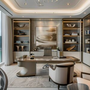
Whether carved or cladded, curved desks made of limestone, travertine, or concrete are dominating modern spaces. These desks are often shaped to look monolithic, but the trick is in how the veins of the stone follow the curve with almost zero disruption.
Grain continuity around a corner or down a side panel might seem like a small detail, but it sets a high bar for craftsmanship. It’s this kind of subtle control that makes the piece look like it belongs, not like it was assembled.

In contrast, brushed metals like aluminum or aged bronze are showing up more frequently—not to add flash, but to bring warmth and variation. These metals are left with visible streaks, oxidized tones, or slight panel shifts, giving them character without noise.
When paired with honed stone tops or matte lacquer finishes, they play a supporting role while still anchoring the overall tone. Wood also has its own approach here.
Vertical or horizontal fluting on reception fronts creates a rhythm—both visual and tactile—that changes how a desk interacts with light. Instead of a flat panel, you get a surface that subtly moves as the viewer shifts position.
Designers are matching these ridges to surrounding elements—like wall paneling, window treatments, or even the vertical folds in sheer curtains—tying materials together without repeating them outright. What links all of these decisions is intention.
Whether it’s the grain of a walnut board wrapping a desk edge or the quiet patina of a bronze panel catching morning sun, each material is used in a way that respects its raw qualities. That’s the key to how these reception desks move from being service counters to core parts of the space’s identity.

Emphasis on Floating and Lightness
A strong theme across today’s reception areas is the idea of removing visual weight from what is often a large, solid object. Through carefully placed lighting, lifted bases, and shadow lines, even the most substantial desk can feel balanced and easy on the eyes.
One of the most recognizable techniques is under-lighting. By tucking warm LED strips underneath a desk—especially along stone or metal bases—designers are able to create a subtle glow that lifts the entire structure off the floor.
It’s not just for show. That soft edge of light creates separation between the furniture and the ground, which lightens the entire zone visually.
It makes even heavy materials appear as if they’re floating, which works especially well in offices where the goal is to convey calm control rather than brute permanence. You’ll also see shadow reveals built into bases and paneling.
These narrow voids or cutouts around the base of the desk or between wall segments are clean and precise. What they do is introduce a crisp border that helps define shape without drawing attention to itself.
In polished spaces, this is a move that speaks louder than decoration. This kind of lighting approach is a key part of modern reception desk design.
It balances mass and scale, especially in open lobbies where too much bulk can overpower the space. And while it looks effortless, it depends on exact lighting placement and a good eye for where the glow should fall.
The end result? A desk that has presence, but doesn’t overpower.

Sculptural Geometry and Asymmetry
Reception desks have moved far beyond the rectangle. You’ll now find designs that take cues from sculpture—carved forms, unexpected angles, and shifting planes that invite a second look.
Asymmetry is no longer a risk; it’s a smart design move that gives a space character without needing bold color or flashy features. Curves meeting straight lines is one of the most effective design contrasts in recent projects.
A rounded front edge paired with a clean, straight backside doesn’t just look good—it controls the visitor’s flow. It draws people in from one angle and defines boundaries at another.
That subtle cue is something people respond to instinctively, even if they can’t point to what makes the space feel comfortable. Some desks go sharper, using concrete or wood with jagged or angled surfaces that look almost digital in shape.
These “low-poly” inspired pieces have no right angles, and instead rely on faceted cuts that catch light and throw shadows throughout the day. They carry references to brutalist styles, but in a cleaner, more refined way that suits a forward-thinking office.
Then there’s offset placement. Not every desk needs to be centered.
In fact, pushing a desk slightly to one side and aligning it with a curved wall or slanted backdrop can energize the space and prevent that “waiting room” stiffness. These office reception desk design ideas are often inspired by studios working in West Coast cities, where open floorplans and exposed structures call for creativity in flow and positioning.
The most interesting part? These irregular shapes don’t feel random.
They respond to how people move, where they pause, and how they interact. It’s about sculpting space that works harder without feeling forced.

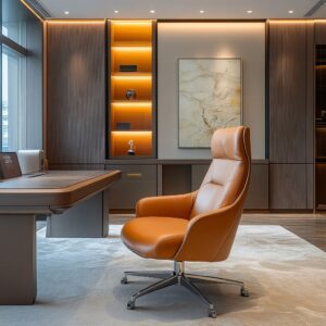
Controlled Lighting Techniques
Lighting does more than illuminate—it shapes how a space feels. In the context of reception areas, the move away from strong overhead spotlights has opened up far more refined techniques.
Today, lighting is being used like a design tool—highlighting materials, guiding sightlines, and adding depth without overpowering the space. One of the most effective approaches is recessed cove lighting.
Instead of pointing beams straight down, designers tuck warm LEDs into hidden ceiling edges or behind panels. The light grazes textured walls or traces around the desk’s edges, casting quiet highlights and soft shadows.
It’s a subtle but impactful way to make a modern front desk design feel sculptural without relying on bold shapes.

Concealed linear lighting is another go-to—thin strips of LED tucked under desk planes, integrated into shelving, or behind frosted glass panels. These bands produce even light that glows rather than shines, which is especially important when working with reflective materials like polished stone or lacquered wood.
There’s also a strong shift toward ambient, low-glare lighting that keeps the space comfortable and warm. Harsh downlights can bounce off marble, glass, or brushed metal, creating an unpleasant glare.
Instead, reception areas now rely on indirect light sources, which help control mood and highlight surface textures. It also helps the desk remain the visual anchor without being over-lit.
This type of lighting doesn’t grab attention—it focuses it. It supports the visual tone of the space, helping important details stand out while creating a clean, grounded atmosphere around the reception zone.

Organic vs. Refined Contrasts
One of the most compelling themes in today’s reception design is the mix of rough and smooth surfaces—raw textures set beside high-finish materials. This balance creates both visual tension and richness, drawing on natural elements without losing control over the final look.
Exposed materials like board-formed concrete, coarse stucco, and unfinished timber bring character and texture. They’re not covered up or sanded out—instead, they’re used as part of the story.
These surfaces are often paired with honed marble, polished metal, or sleek glass to create a clean break in texture. The contrast is sharp, but it works because each material plays to its strength.
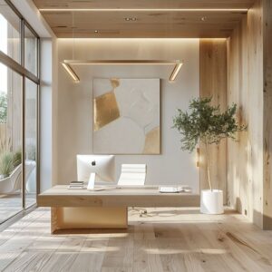
In many newer office reception area ideas, greenery is also integrated right into the design, not just added after the fact. You’ll see tropical plants and ferns in built-in terrazzo planters, or tall branches spilling out of minimal vases.
These organic forms—wild and a little unpredictable—balance out the geometric precision of desks, shelving, and wall panels. This is especially effective in spaces with colder surfaces like concrete or steel, where foliage adds softness without requiring bright color.
The key here is intention. Raw textures show age and process, while refined surfaces signal precision.
Together, they give the space layers. It’s a contrast that feels current—clean and polished, but grounded in natural tone and material honesty.

Subtle Narrative Through Art and Objects
In modern reception areas, it’s often the smallest pieces that shape the tone of the space. Rather than overloading a lobby with décor, designers now focus on a few carefully placed objects that speak through form, material, or alignment.
These items don’t compete with the architecture—they complete it. Sculptural pieces are one of the most effective tools for this.
Whether abstract or raw in texture, they often mirror shapes found in the desk or wall detailing. A sharp metal twist may echo a faceted concrete desk.
A rounded ceramic form might reflect the soft curve of a stone counter. These echoes—whether deliberate or intuitive—help hold the space together.
Botanical touches are handled the same way. One branch in a tall vase can bring vertical balance to a desk with strong horizontal grain.
A subtle change in leaf color or stem structure can connect with nearby materials—whether the warmth of walnut or the coolness of limestone. Designers use these plant elements like punctuation marks, not paragraphs.

Art follows suit. Instead of using wall pieces as focal points, they’re selected to work in tandem with the desk’s visual weight.
An abstract canvas with rough brushwork can soften a monolithic desk. A simple framed sketch might bring calm to a textural wall.
The goal here is not to decorate but to layer the space with quiet cues that make everything feel connected. The best reception desk design ideas often leave room for these moves.
It’s about restraint—choosing objects that feel natural in the space, not added to it.

Concealed Hardware and Seamless Function
In high-end reception design, what you don’t see often matters more than what you do. The smooth flow of lines, the crisp meeting point between materials, and the absence of visual clutter all signal careful thinking behind the scenes.
Function hasn’t been erased—it’s been tucked away. Many modern desks now use push-latch doors, finger grooves, or soft-cut pulls to avoid handles altogether.
These features keep surfaces clean and let the form of the desk stand on its own. In places using bold materials—like patterned stone, brushed metal, or fluted wood—this approach allows the texture to shine without interruption.

Material transitions are another area where the smallest decisions make the biggest difference. Stone slabs are bookmatched so their veins run perfectly across seams.
Metal cladding lines up precisely with wood panels. Even LED strips are recessed with care so the glow looks soft and intentional rather than forced.
Behind the desk, acoustic treatment has become a standard feature. Slatted wood walls or fabric-covered panels help keep noise under control, especially in areas with concrete floors and high ceilings.
The added texture these panels bring is a bonus—it softens both sound and visuals. All these quiet adjustments build a more polished space.
You may not notice every move at first glance, but you feel the difference. It’s the kind of refinement that doesn’t need to call attention to itself.

Color Palette Restraint and Monochromatic Warmth
There’s a noticeable shift in how color is handled in modern lobbies. Rather than leaning on bold shades, designers are creating warmth and depth through layers of tone-on-tone neutrals.
The effect is subtle but impactful—it lets the materials and finishes do the talking. Layered neutrals like soft taupe, warm beige, pale oak, and creamy off-white dominate the scene.
These tones stretch across stone surfaces, slatted wood walls, and upholstery. When placed next to each other, they don’t flatten the space—they build a quiet rhythm, especially when some surfaces are matte while others reflect a bit more light.

To balance the softness, dark accents are showing up in controlled doses. Think blackened oak, deep bronze paneling, or soft-black steel.
Used on desk fronts or as framing elements, they give shape and structure to lighter surroundings. It’s a clean way to define geometry without making the palette feel heavy.
Some spaces also use terrazzo to break the calm with purpose. While most of the setting stays neutral, terrazzo with bold chips—in colors like rust, navy, or dusty green—can introduce small jolts of energy without disrupting the balance.
It’s especially effective in reception counter design where the desk is a focal point but doesn’t need to dominate the entire mood. This kind of color work is smart.
It allows for a consistent visual language while giving designers room to play with texture, grain, and subtle contrasts that unfold slowly rather than jump out at first glance.

Integration of Greenery and Biophilia
Nature is no longer an afterthought in reception design. It’s now part of the desk, the wall, even the floor plan.
The cleanest interiors today often rely on greenery to soften the mood and bring some visual looseness to what can otherwise be very structured settings. Built-in planter zones are one of the strongest examples of this trend.
You’ll see terrazzo desks with cutout corners holding ferns, or stone reception benches that spill into planter beds with thick-leafed tropicals. These aren’t accessory pieces—they’re designed as part of the furniture itself.
Then there are vertical gardens, built into adjacent walls. Often set in narrow channels or tucked between wood slats, these moss or succulent gardens add texture and color without taking up floor space.
They’re quiet but refreshing, especially in spaces with a lot of polished concrete or matte finishes. And even a single sculptural vase filled with branches or long stems can do the job.
It draws the eye upward, connects with surrounding lines in the architecture, and introduces that bit of unpredictability that makes the room feel more human. This push for nature isn’t just about softness—it’s also about contrast.
It helps balance out all the straight edges, solid surfaces, and clean forms. And it makes reception areas feel more welcoming without adding clutter.

Evocation of Boutique Hospitality Sensibilities
The line between hotel lounge and reception lobby is starting to blur—and that’s by design. Many contemporary reception desks are pulling direct inspiration from boutique hospitality spaces, where the experience is carefully shaped from the moment you walk in.
Lighting plays a major role. Instead of general overhead brightness, architectural lighting is used to highlight texture and create atmosphere.
Walls clad in plaster, fluted wood, or brushed metal are softly washed in warm tones, often mimicking the quiet ambiance you’d expect in a luxury lounge. Material combinations follow a similar path.
You’ll often see rich mixes like stone with patinated metal, or warm wood paired with large-format tile or mosaic. These combinations give depth and help avoid the sterile feel that older lobbies often had.
Everything is composed, but relaxed.

And then there’s the furniture. Gone are the days of stiff upright chairs in rows.
Now it’s low-set leather loungers, built-in benches, and plush stools with throw pillows—all signals that visitors are meant to pause and feel comfortable. Some offices even add hospitality gestures like soft music, curated scent, or a well-placed book stack.
This influence brings something important: a shift in tone. Lobbies aren’t just pass-through zones.
They’re extensions of the brand, places to create mood. The best spaces don’t feel like waiting rooms—they feel like part of the full experience.

Ongoing Popularity of Minimalist Detailing
Even with all the textural layering and material interest in modern design, minimalism still plays a key role—especially in how details are handled. At its best, this approach clears away the visual noise, allowing strong lines and solid forms to stand confidently without distraction.
The edges are sharp, the forms are uninterrupted, and everything feels composed. Large wall tiles or floor patterns aren’t just for effect—they often line up with desk outlines or ceiling details, reinforcing spatial logic.
It’s these kinds of decisions that make a space feel clear and intentional, even if the viewer doesn’t realize why.

Storage is another area where this mindset comes through. Cabinets, drawers, and file storage are fully integrated.
Some desks hide everything behind push-release panels or built-in millwork so the whole piece reads as one continuous block. Nothing pulls focus.
Branding follows the same rule. In many office front desk design examples, you’ll see a small brass logo plate, a soft-etched emblem, or nothing at all.
The space speaks for the brand, rather than spelling it out. Minimalist detail doesn’t mean empty.
It means every line has purpose, and every surface has been considered. This quiet control is one of the things that makes today’s reception areas feel polished without needing layers of decor.

Recurring Trends Worth Highlighting
Some design moves are quietly showing up again and again—and they’re worth watching. These recurring choices aren’t just aesthetic—they’re functional cues that show where reception design is headed and why it works.
- Curved forms and softened edges are everywhere. Whether it’s the front of the desk or the corners of the walls, rounded elements are being used to make reception zones feel more open and less formal. They remove the sharpness and invite a more comfortable flow through the space.
- Precise craftsmanship is doing the heavy lifting behind the scenes. You’ll find flawless seams, tight mitered joints, and uninterrupted surfaces that show the level of care going into modern builds. There’s no over-styling here—just quiet precision that lets the materials speak clearly.
- Raw textures are staying in the spotlight. Designers are leaning into natural imperfections—like faint air pockets in concrete, subtle grain shifts in wood, or gentle patina in aged metals. These elements bring human texture into otherwise polished rooms, making them feel more grounded.
- Accent lighting is replacing spotlights. Instead of blasting down from above, light is being used to skim across surfaces or frame key forms. A warm glow at the base of the desk or a hidden strip grazing a fluted wall does more than just light the space—it builds atmosphere.
- Color remains tight and simple. A restrained palette—neutral tones, soft grays, warm whites—gives the space calm, while one standout material or texture (like an onyx panel or a slanted slab of stone) provides all the needed contrast.
Together, these elements create a clear identity without saying too much. Whether you’re working with wood, metal, terrazzo, or plaster, the newest reception table design trends are based on restraint and quiet confidence.

Final Thoughts
What makes today’s front desks stand out isn’t flash—it’s clarity. These designs don’t shout; they’re shaped with intention, using material depth, thoughtful lighting, and sculptural form to build a message from the ground up.
A great desk now sets the tone for the entire space. It’s not treated like a checkout counter.
It’s part of the environment—a physical reflection of the values, style, and care that went into the space around it. This shift is especially noticeable in front desk design ideas that pull from hospitality, boutique retail, and even gallery settings.
From how greenery wraps around terrazzo, to the way acoustic panels are hidden behind wood slats, every move is purposeful. Clean silhouettes, tight seams, and subtle lighting give these reception zones the kind of polish that feels both calm and serious.
The result? A desk that’s no longer just functional.
It anchors the room, sets the tone, and quietly carries the whole design without needing to explain itself. That’s the new standard—and it’s setting the bar higher across office interiors everywhere.