Beige may look neutral at first glance, but it reacts to color more than most exterior tones. Its warmth, softness, or depth can shift entirely depending on what sits beside it—especially at the front door.
In recent design trends, that door isn’t picked just to contrast. It’s selected to reshape how the facade feels under different light, textures, and materials.
Subtle hues like sage, mauve, sky blue, or clay bring out different traits in beige—cooling it down, lifting it brighter, or pulling golden undertones forward. And more than the color itself, how the door is framed, finished, and placed within the entry composition defines how bold or quiet the entire elevation reads.
A sharp trim can harden a soft pastel. A matte finish can mute a saturated tone until sunset.
The design isn’t limited to the paint. Plants echoing the same hue in their leaves or lighting that shifts color temperature by night add layers to what otherwise might seem like a flat pairing.
Texture, contrast weight, and color temperature all interact with beige in ways that can’t be guessed from a sample card alone. This article looks deeper into those moments—where color doesn’t perform loudly, but where it shapes everything around it with almost silent precision.

Contextual Warmth vs. Cooled Contrast
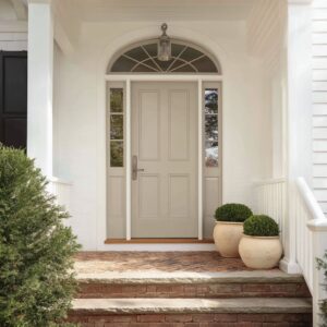
Beige exteriors don’t behave neutrally—they shift in tone depending on what color stands near them. Certain front door colors for beige houses act like filters, changing the way the walls appear without physically altering the surface.
A soft yellow door, for instance, doesn’t just brighten the entry—it activates the subtle golden traces inside sandy limestone or chalky stucco, giving the whole wall a faint toasted tint. In contrast, doors in cool shades like powdered blue, silvery mint, or muted lavender introduce a visual cool-down that moves the viewer’s attention toward the shaded parts of the structure.
These shifts are subtle and slow—they emerge through repeated glances and daylight movement.

What’s compelling is how these shifts can reverse across the same façade depending on time of day. A wine-red door might intensify the warmth of beige around noon, creating a sunlit flush, while later in the evening, a minty or violet-toned door casts the same surface into cooler, oat-like tones.
This back-and-forth of color temperature isn’t technical—it’s perceptual. That’s why well-chosen door colors for a beige house don’t fight for attention, but instead, amplify what’s already present in the structure.
The best combinations feel like they’ve been pulled out of the wall itself, not dropped onto it.

The Boundary Effect: Frame, No-Frame, Reverse-Frame
How a door is framed defines how it reads. A black, razor-fine trim gives even the softest pastel door a sense of clarity—it pulls the eye to the shape and gives the impression of crispness, even when the color is muted.
This technique can make a light sage or chalky peach door feel more grounded and deliberate. On the opposite end, a white frame around a bold tone—say, terracotta or amber—has the opposite result: it softens the intensity and lets the surrounding wall leak its lightness into the door edge, muting contrast and rounding off any visual harshness.

Sometimes, no visible frame is used at all. That’s when things get more nuanced.
Exterior door colors for beige house facades that match or nearly match the wall color lean on texture and finish to separate themselves. In these cases, the line between door and siding is more like a shadow or faint boundary—it depends on whether the surface is matte, satin, or includes paneling detail.
The eye doesn’t immediately lock onto color contrast. Instead, the gaze follows surface rhythm, tiny shadows, and material variation.
This approach works especially well in modern facades where front door colors for beige houses are kept close in value to their surroundings. Instead of standing out through saturation, the door becomes part of a layered visual plane, making space feel quieter, cleaner, and more connected.

Botanical Mirrors and Tonal Shadows
Plants can echo door colors in ways that feel subtle, natural, and quietly calculated. A sage-toned entry becomes more visually anchored when flanked by olive trees with silver-dusted leaves.
A dusty lavender door gains soft rhythm when surrounded by purple mums, their tone softened by exposure and leaf variation. Even a chalky blue-green door finds visual companions in the haze of juniper needles or grasses tipped with pale frost.

The effect works because foliage doesn’t compete—it reflects. Unlike painted materials, greenery has texture, irregularity, and matte finishes that break up light.
This lets it carry fragments of a color without pushing the scene into repetition. Most observers wouldn’t consciously connect a plant’s hue to the door—but that quiet repetition is what creates visual ease.
It’s color echo, not color match, and it brings cohesion without predictability. In modern porch design, this layering often supports the choice of color for a front door on a beige house, where warmth in the wall can be softened or sharpened by the surrounding green.
The entry doesn’t stand isolated—it reads as part of a longer visual rhythm that includes structure, planting, and shadow.

The Quiet Power of Matte
Matte finishes do something gloss never can: they slow the eye down. On a sunlit surface, shine invites speed—light bounces, detail blurs.
But matte, especially on deeper or rare tones like blush clay, greige, or mauve-taupe, turns each surface into a subtle field of tone variation. These finishes don’t shout.
They rest. In high light, a matte mauve door can all but vanish into a pale stone backdrop.
Then, later in the day or under indirect light, its true undertone returns, lifting from the surface as though newly painted. This kind of variability makes the entry feel like a live surface—not static paint, but a moving part of the composition.
That’s why exterior front door colors for beige house facades often look more resolved in matte. There’s no battle between wall and entry.
The absence of glare makes even soft tones feel sculptural—without needing boldness to be noticed.

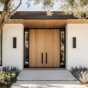
Brass: The One-Stroke Connector
A slim vertical pull in warm brass can do more for a door than most full-color changes. This single gesture crosses the door’s plane, standing upright like a punctuation mark—and it ties multiple palettes together.
Brass glows under sunlight and deepens in shadow, holding both warm and cool tones at once. In practice, this means a brass handle can bridge a graphite door and a beige wall without making either one feel out of place.
The metal picks up the gold of step lighting, the warmth of nearby stone, or the edge of a wood soffit. And because it changes subtly with angle and light, it never pulls too much focus—it shifts tone rather than adding one.
This makes brass more than decoration. It functions like a connector that links otherwise contrasting surfaces through light and temperature, and always along the vertical axis, where the eye naturally pauses before entering.

Shadow Play on Vertical Paneling
Paneling isn’t flat—it’s a light-catcher. When vertical board-and-batten siding surrounds the entry, it adds more than architecture—it adds rhythm.
As sunlight shifts across the day, the narrow battens project fine shadows across the beige wall, forming a second, softer pattern over the paint. This striped shadow banding introduces depth, even on pale surfaces that otherwise might feel still.

The effect is especially striking when deep, low-sheen colors are used on the front door. A dark navy might appear flat and nearly black on a smooth surface.
But apply it on a vertical panel with sun breaking over the battens, and the color releases bright glimmers of true blue, tucked into the ridges. This mix of hard geometry and soft light play gives the entryway a subtle visual pulse that changes hour by hour.
Even beige siding isn’t static here. With shadows weaving through it, it feels more like a layered surface than a painted wall.
The door stops being a separate object and instead becomes part of the pattern—a moving tone inside a surface that never stands still.

Color Weight vs. Mass Perception
Color alone doesn’t set the tone—material scale and shadow do the heavy lifting. A saturated entry color might sound bold in theory, but when framed by thick brickwork, deep overhangs, or oversized planters, it often reads as calm, secure, even quiet.
A graphite or oxblood door placed inside a structure with visual heft won’t leap forward—it’ll settle in. By contrast, a soft or pastel shade placed on a flat surface with little shadow support can feel louder than expected.
A pale peach or chalky pink might seem modest, but surrounded by smooth walls, glossy trim, and minimal porch architecture, the same light color becomes the most vocal part of the elevation. In this setting, lightness becomes the anchor, and all attention lands on it.
The contrast isn’t always about dark vs. light—it’s about visual weight vs.
emptiness. This interplay explains why some homes with darker doors feel relaxed and composed, while others with very light doors can look assertive or high-key.
The background defines how strong the foreground appears.

Pastel on Pastel: The Slow Palette
Low-contrast entries unfold slowly. A door in soft mauve or faded peach against an off-white or shell-toned wall doesn’t grab the eye—it waits for the eye to catch it.
These combinations don’t rely on clash. Instead, they use undertone shifts to create movement.
What seems like one color pairing from a distance starts to reveal layers on closer look. Peach might start to lean coral in warm light.
Mauve might edge closer to silver-gray under cloud cover. These are not fast colors—they are time-based.
They ask the viewer to stay, to notice change. This kind of palette doesn’t aim for a headline look—it draws attention by soft degrees, through daylight change, wall reflection, and material proximity.
Pairing soft-on-soft creates an atmosphere instead of a focal point. It’s not about declaring a color—it’s about letting it live within the wall, revealing itself only when the light, the time, and the viewer’s attention line up.

Directional Lighting as Color Modifier
Light changes everything, even when the surface doesn’t. After dusk, colors take on a different behavior—not because they’re repainted, but because the temperature of lighting shifts how the eye receives them.
A soft amber LED strip tucked under a step can do more than mark elevation—it casts a golden layer that warms whatever color sits above. This matters especially with graphite, blue-black, or powder mint doors, which might otherwise turn cold or harsh under low light.
That subtle glow adds a faint warmth that makes these deeper tones feel grounded instead of sharp.

On the flip side, cooler lighting has its own influence. Crisp white sconces placed overhead can clean up rich or warm tones, reducing the visual thickness of yellows, terracotta, or clay rose entries.
The same door that feels sunbaked at noon can look minimal and polished by evening, simply due to how the light skims across it. This shift shows how a front door color with beige house settings doesn’t remain static—it moves with the day.
And if the lighting is tuned right, the whole entry reads as more cohesive, not because of one choice, but because of how different elements borrow from each other once night arrives.

Foliage vs. Hardware: Balancing Saturation
What catches the eye isn’t always the hardware—it’s where contrast lives. If a black door handle sits on a black door, or a brass one on a brass-toned frame, it tends to disappear.
That visual quiet opens space for plants to speak louder. Ferns set beside a deep graphite entry, for example, interrupt the heavy tone with wide, layered green shapes.
Likewise, feathery desert grasses next to a pale sky-blue door can make the soft color feel sharper—without changing the paint itself.

This trade-off creates visual equilibrium. Hardware steps back.
Foliage steps forward. And in that exchange, the color story stays balanced—not dominated by a single element but shared across textures and forms.
The effect is particularly clear in entries where the hard lines of architecture need soft interruption. It’s a quiet design rhythm that allows planting to guide mood, rather than decoration.
The idea becomes even more pronounced in cases where front door colors for a beige house are understated. Neutral tones get their strength from surroundings—so letting plants carry a bit of saturation helps prevent the design from feeling flat or pale.

Texture as a Surrogate for Hue
Even with minimal color shifts, surfaces can still feel layered—if texture is present. Slight trowel marks on stucco, soft vertical brushing in wood siding, or a light chalk wash over brick introduce micro-patterns that alter how we perceive depth.
These irregularities create soft shadows that move with the sun, giving walls or entryways a faint tonal range even if the actual paint color never changes.

This effect becomes crucial when the main door is the only strong color in the facade. If the wall is smooth and flat, the contrast might feel abrupt.
But when the wall carries depth through texture, it adds a neutral bridge between bold and soft. The eye moves across the surface more slowly, picking up the layers rather than snapping straight to the color.
What happens, then, is that the wall starts acting like a gradient background, helping the door settle into place. On a beige exterior, this becomes especially valuable—because it allows light, shade, and grain to act like extra tones in a limited palette.

Seasonal Elasticity of Mid-Neutrals
Some door colors shift character depending on the season—without ever changing their formula. Greige, soft taupe-green, and pale sandstone live in a visual in-between space.
In summer sun, they take on warmth, reflecting golden daylight and blending with sunlit stucco or beige siding. But under a winter sky, those same colors pull cooler, reading closer to stone or fogged gray.
This visual flexibility is quiet but effective. What makes these tones work is their balance—they hover between color families.
They’re never quite warm enough to feel heavy, and never cool enough to feel stark. The result is a door that always sits slightly apart from the wall but never pushes against it.
Over time, these shades create a kind of rhythm across seasons. A visitor might not notice the change on a single day, but across a year, the shift becomes part of the home’s identity.
The door remains familiar, yet never fixed—which is why these choices tend to hold visual interest longer than strong, static hues.

Trimless Doors as Negative Space
A door doesn’t always have to be the statement—it can also be the pause. When the color of the front door nearly matches the wall, and the trim is either minimal or missing, the result is a visual cut-out: a space that feels carved, not placed.
This approach doesn’t reduce presence; it amplifies it through contrast of form, not color. The effect works best on facades with quiet texture—beige brick, pale stone, smooth concrete—where the subtle difference between surface and door is picked up in shadow, not pigment.
In these cases, the absence of trim sharpens the outline, giving the opening a deliberate shape without calling attention to the frame. This trick gives standard construction a visual weight that feels more crafted.
Brick looks thicker, siding feels deeper, and the overall structure reads as one continuous surface. The door isn’t hiding—it’s defining the edge of space through restraint.

Strategic Asymmetry
Visual balance doesn’t always come from perfect symmetry—it often comes from small shifts. A single offset planter, one tall tree on the left, or a sidelight only on one side—all these create movement.
But for the eye to settle, the entry still needs a fixed point. That’s where the door color steps in.
When the composition sways, the door becomes the anchor. And the more neutral the tone—say, muted mauve, soft clay, or chalk green—the easier it is to hold that central role without demanding attention.
The contrast between symmetry and asymmetry plays out quietly, letting the layout feel dynamic without going off balance. This design move is subtle, but its effect is immediate.
The eye scans across, notes the irregularity, and then returns to the center—where the door sits with calm weight. It’s a visual pause that keeps the entry engaging without becoming chaotic.

Conclusion: Subtle Elements, Lasting Effect
Color choices for the front door do more than decorate—they reshape how a beige exterior is perceived. Certain tones act like filters, warming or cooling the entire elevation by their presence alone.
A soft mint or pale clay doesn’t simply sit on the surface; it nudges the wall’s tone in a new direction, creating visual temperature that shifts with daylight.
- Framing plays its part too. Black edges sharpen the outline of lighter doors, giving them clarity and strength. White trim, on the other hand, lets stronger colors ease into the wall with less contrast, softening their visual footprint. These edge decisions guide how bold or quiet the door reads—without ever changing the hue itself.
- Matte finishes give these colors depth, not gloss. By absorbing rather than bouncing light, they create fields that respond to shadow and reflection, turning quiet neutrals like greige or mauve-taupe into forms with presence and movement. A surface doesn’t have to shine to feel dimensional.
- Foliage becomes part of the palette when its undertones echo the door. Silvery greens, dusty purples, or low-saturation grasses help carry the door color into the surrounding space without making the scene feel repetitive. This soft mirroring builds cohesion without needing exact matches.
- And finally, metal accents and lighting details connect the temperature zones. A brass pull can stretch from warm brick to cool stone. Amber light beneath steps can lift a dark door out of shadow. These touches don’t ask for attention—they hold the composition together in ways that are felt before they’re noticed.
These choices, though subtle, explain why some front door colors for a beige house feel composed at every hour of the day. They aren’t loud—but they hold the structure in balance, making the whole facade read with more clarity and calm than color alone could ever offer.