Television walls have changed. The flat screen no longer dominates by default—it shares space with texture, shape, and quiet rhythm.
One thing stands out: the rise of the gallery wall behind tv as a defining design move. It’s no longer just about watching something; it’s about what surrounds the screen, how it’s framed, and what kind of story the full wall tells.
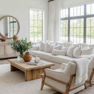
Some homes lean into contrast—matte black televisions paired with rough lime plaster or soft, chalky wood grain. Others layer artworks in soft grids, line shelves with hand-shaped ceramics, or balance the display with tall sculptural objects set just slightly off-center.
From wide desert spaces with terracotta tones to coastal rooms styled with maritime prints, each layout offers a different approach to balancing stillness, utility, and visual rhythm.

What’s most interesting is how little of this feels accidental. Frames are placed with intention.
Materials are chosen to speak to one another. Furniture and lighting follow the same unspoken grid.
There’s no single formula—but within the details, a set of patterns quietly emerges. This article takes a closer look at those choices—not just the art, but the spacing, the lighting, the texture, and the echo between objects—that make a tv wall part of a fuller, more layered composition.

Reframing the Screen through Spatial Arithmetic
| Strategy | What’s happening beneath the surface |
|---|---|
| Offset centering | By shifting the screen just a few inches off the true midpoint, the eye stops treating it as the sole anchor. Designers then “correct” the weight imbalance with art, shelving, or sculptural items on the open side. The mind interprets the whole field—not the TV—as center. |
| “Staggered thirds” rule | Art grids built on thirds—three by two or six by two—echo classic photographic framing. The television often sits on one third line, letting the grid dictate rhythm rather than the appliance. |
| Negative-space corridors | Screens are hemmed in by slim but deliberate breathing gaps—sometimes only a hand-width. These corridors mimic matting inside an art frame, so the black rectangle feels curated, not intrusive. |

Material Dialogue: Screen vs. Surround
There’s a quiet logic in the way surfaces interact around a TV—more about texture than color. Instead of trying to match the screen, many gallery tv wall compositions lean into resonance through contrast.
A matte-black television against a soft, chalky plaster wall reads like a visual sigh. In other cases, a polished screen finds echo in marble veining just below, where the faint gloss of stone catches light in a similar register.
This coordination isn’t about matching tones—it’s about setting a rhythm that calms the screen into its setting.

Soft elements are often introduced close to these hard backdrops, creating tension that soothes rather than agitates. In rooms with raw concrete or limestone panels, the nearby appearance of boucle pillows, jute-wrapped floor poufs, or chunky knit throws adds depth.
These items don’t pull focus, but their presence shifts the mood away from anything purely mechanical. Woodwork contributes another dimension.
Vertical oak panels, walnut shelving, or rattan-faced credenzas hum gently beneath the sharper edges of a flat screen. Their grain runs vertically or diagonally, pacing the eye in a way that slows the pace of the black rectangle above.
These lines never try to fight the display—they soften it by placing it inside a larger, more natural rhythm. This approach creates a gallery wall around a TV that feels fully integrated without ever needing to hide the screen entirely.

Light as Curator
Lighting rarely grabs attention directly in tv gallery wall ideas, but it plays one of the most refined roles in shaping the room. Small directional fixtures, recessed or track-mounted, are aimed with care—not at the TV, but at the objects that surround it.
The screen becomes part of a larger field, less a spotlighted center and more a low note in a wider arrangement. Some walls use narrow gallery lights to wash drawings or prints with a focused beam, carving out visual importance for what sits above or beside the TV.
Other designs harness time—selecting metallic-finished artworks that subtly shift throughout the day. When sunlight strikes at an angle in the afternoon, those pieces catch a glimmer, animating the display without needing any added movement.
More subtly, directional lighting is used to control shadow. Track heads aimed at rattan benches or textured shelving can coax out detail while letting the black of the screen fall into quiet contrast.
This reversal—where the television becomes the least highlighted surface—lets the surrounding textures tell the stronger story. Every beam, wash, and glint contributes not to brightness, but to structure.
The result isn’t dramatic; it’s composed.

Artwork Selection Codes
Art in a gallery tv wall is rarely hung for symmetry alone. There’s a hidden structure at work—a rhythm in how scale, subject, and position interact with the TV and each other.
Some pieces serve as visual “spines”—tall landscapes or slim drawings placed just beside the screen. These don’t shout, but they stretch the gaze upward or outward, opening space in what could feel like a compressed zone.
In rooms that reference desert or mountain settings, abstract works often mimic the earth beneath them. Swaths of ochre, dusty rose, or sediment-colored brushstrokes speak not only in color but in strata.
These pieces are chosen because they read as soft terrain, turning the black screen into a still point in a landscape rather than a break in the wall.

There are also subtle relationships in how colors and materials loop through a room. One gallery grid might include a rust-toned canvas that quietly repeats in a leather armchair nearby.
Another might place botanical sketches opposite a stack of ocean-themed prints, creating a side-to-side dialogue between flora and water. These arrangements reward slow looking—revealing thoughtful pairings that often go unnoticed at first glance.
What ties these galleries together isn’t the format—it’s the undercurrent of connection. Every frame, texture, and object is part of a silent architecture of meaning, guiding the viewer without ever asking for full attention.

Shelving as Silent Score Lines
Shelves in a tv gallery wall layout aren’t simply there to hold pottery or books—they act more like structural markers within the composition, guiding the eye and setting tempo. These ledges function the way staff lines do in music: thin, steady elements that allow a wide variety of notes to feel unified, even if they vary wildly in form or tone.
In many spaces, a slim floating shelf creates a soft band that stretches horizontally beneath a group of artworks. Whether made of pale oak, dark-stained walnut, or painted to match the wall, it quietly links everything above it.
The shelf doesn’t announce itself. Instead, it draws a calm line that makes the varied shapes of prints, drawings, and objects feel grounded.
In other rooms, the long bench beneath the display takes on the role of a visual ledger. Artwork is often arranged to “sit” on this line, even when hung on the wall—its base aligned with the bench edge or just above.
This keeps compositions that might otherwise feel chaotic in check. No matter how abstract or textured the picture wall around tv becomes, the presence of a clear horizontal base makes it feel anchored and intentional.

Three-Dimensional Breakaways
Flat walls aren’t always enough. In the most layered compositions, the gallery wall around mounted tv spills into the room itself—through depth, texture, and sculptural presence.
This break from two-dimensional arrangements makes the whole space feel more tactile and alive. Fiber works are one of the most frequent tools for this.
Coiled jute, woven palm, or structured macramé adds volume without bulk. These pieces are often placed close to the screen, bringing softness right into the viewer’s field.
Their height on the wall is no accident—it meets the seated eye, encouraging interaction not through function but through form.

At the edges of the wall, unexpected punctuation marks appear. A driftwood sculpture leaning near the baseboard or a stacked stone column at the edge of the layout becomes a pause—an intentional disruption in rhythm that resets the gaze before it circles back to the center.
These breakaway elements don’t need scale to matter. A small relief panel or low bowl in carved stone can be enough to give the wall a physical presence beyond its surface.

Color: Neutrals with Micro-Accents
Even in rooms where everything seems to live in beige, taupe, cream, and soft gray, the most deliberate color moves often happen in the smallest details. It’s this controlled restraint that gives many tv gallery wall ideas their quiet power.
A single warm object—a terracotta vase, an amber-toned glass vessel, or a rust-colored textile—often appears more than once, echoing subtly in an artwork or across the room in a leather chair. This creates a soft circuit for the eye to follow, closing a loop without needing loud contrast.
Sage, in particular, plays an unusual role. In some rooms, walls painted in muted green-gray tones balance the space between light and dark.
The black screen and white artwork mats each have sharp contrast, but sage steps in as the middle note—softening the division and keeping the room cohesive. What appears at first glance to be a calm, neutral palette often reveals carefully placed accents that act like signposts—quiet, intentional, and deeply tied to the overall atmosphere of the space.

Furniture Choreography with the Wall
The role of furniture in a gallery wall composition often goes unnoticed, yet it follows a visual rhythm that echoes the wall behind it. This isn’t about matching styles—it’s about aligning forms, textures, and movements so that the entire room feels like one continuous layout rather than disconnected layers.
The coffee table often mirrors motifs that already live on the wall. A ribbed black table might echo the texture of nearby plaster art with similar vertical channels, while a thick, cut-log table base repeats the round coiled forms found in fiber installations.
These aren’t coincidences—they’re quiet pairings that root the gallery deeper into the space by repeating shapes in physical objects.

Sofas and chairs take cues from the shelving and artwork grids. In rooms where gallery wall around tv ideas rely on strong linear anchors—like a long shelf or a clean console line—the seating follows suit.
An L-shaped sectional might extend its long return exactly parallel to the shelving, reinforcing the horizontal pull of the composition. This keeps movement directed not toward the screen itself, but across the field of artwork and textures, allowing the viewer to engage with the full width of the wall rather than one focal point.
Every angle, curve, and height in the room is part of the choreography. Together, these choices turn the space into a layered conversation between function and form.

Hidden Rules of Scale
Behind many gallery wall ideas with a tv is a quiet adherence to ratios that shape the way the composition feels. These rules are rarely spoken, but they appear across rooms with very different styles—offering the same sense of calm balance through precise scaling.
One of the most common techniques is matching the width of the television to the shelf or console that sits beneath it. Whether it’s a floating oak bench or a painted storage unit, the visual alignment is deliberate.
If the console is two inches wider or narrower than the screen, it still creates a mathematical echo that steadies the surrounding field of varied artwork sizes.

Another recurring choice is capping the height of nearby artwork at about eighty percent of the screen’s height. Taller pieces exist, but they’re rarely allowed to tower over the display.
If art climbs too high, it drags the visual center upward and causes the television to feel low and off balance. Keeping most art within this quiet limit ensures that the screen stays visually grounded while still being framed by larger-scale works.
These ratios give shape to gallery wall around tv compositions in ways most viewers don’t consciously notice—but they feel the result. Everything clicks into place without effort, because the proportions are tuned to work together, even in the presence of varied shapes and textures.

Design Storylines by Region
Regional influence doesn’t shout—it lingers quietly in texture, material, and scale. Many tv gallery wall compositions subtly borrow from their surroundings, reflecting the climate and building traditions of their location without needing a map or a label.
In dry desert regions, walls often show a sculpted softness. Plaster curves, pale stone benches, and color palettes pulled from clay and sand dominate.
These spaces lean into warmth with finishes that absorb light instead of reflecting it, giving the display a softened edge. Ochre, sienna, and washed terracotta don’t just show up in art—they appear in cushions, ceramics, and ledges, creating full-body color continuity.

In mountain and foothill homes, the palette shifts. Limestone walls, exposed and bleached ceiling rafters, and thick ledges that hug one side of the TV offer a grounded, vertical weight.
These choices mirror the nearby terrain—firm, quiet, and never polished too bright. Artwork here tends to lean or layer, never too symmetrical, leaving space for light to play unevenly.
Further south, especially in modern farmhouse layouts, texture takes the lead. Craft-inspired details like fiber wall hangings or coiled sculptural pieces echo quilting traditions—but arranged in radial forms around the screen.
It’s a style that’s tactile and relaxed, often mixing subtle white-on-white layering with natural materials like oak and sisal.

In New England-inspired homes, the references are sharper and more graphic. Stacked maritime prints, framed botanical etchings, and shelving hung with leather straps suggest boat rigging and ship cabinetry, without needing to name it.
These gallery wall around tv ideas rely on symmetry, tight spacing, and restraint, grounding the composition with muted tones and heritage detail. Every one of these layouts connects place to composition.
They don’t announce geography—they translate it into form and finish.

Takeaway Patterns
The difference between a screen that floats awkwardly and one that disappears into its setting often comes down to how the space is measured, structured, and finished. Think like a framer first.
A good layout starts with the art. Grids, clusters, or layered arrangements are mapped out as the priority, with the TV then finding its place within the system—not above it, not outside it.
Texture wins over color. Soft plaster, woven rattan, looped fabrics—these choices shape the tone of the room without needing contrast or saturation.
They support the display by offering depth without distraction. Shelves play rhythm.
They aren’t simply storage. Used correctly, a thin ledge can break a tall wall into readable segments, giving artworks and objects a place to settle.
The line becomes as important as anything sitting on it.
Pair the screen with something nearby. Whether it’s a stone console with a similar width or a glossy vase with matching reflection, aligning the TV to another element makes it feel placed, not suspended.
Add one sculptural interruption. A low ceramic, a tall stacked object, a fiber disc—something that pushes off the wall.
This move breaks the grid and invites the eye to engage with the space as a whole. A successful gallery wall around a tv doesn’t depend on the number of frames or how centered the screen is.
It relies on quieter, structural choices: how voids are balanced, how textures repeat, how each item feels placed, not stuck. These moves turn arranging pictures around a tv from a design task into a visual rhythm—measured, grounded, and full of quiet intention.