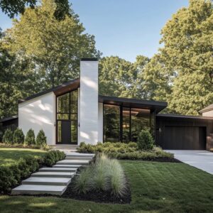
The front of a modern grey house doesn’t ask for high drama—it asks for precision. That’s why today’s visually balanced entrance designs rely less on contrast and more on subtle temperature shifts and layered tonal strategies.
The use of color here isn’t about bold statements—it’s about tuning the surface to feel calm, grounded, or slightly lifted, depending on how light, texture, and saturation interact.
Across current trends, muted reds, faded blues, powdered greens, and chalky pastels are used with care—not to overpower the architecture, but to redirect how the grey reads from a distance. From framing treatments and material pairing to lighting and surface finish, every detail is part of how front door colors for gray house exteriors shape the full impression.
These choices build atmosphere, not spectacle—drawing strength from restraint, rhythm, and the quiet role of thoughtful coordination.

Color as a Temperature Tool, Not a Volume Knob
Door colors for grey house exteriors aren’t chosen to shout—they’re tuned like an instrument. The most visually interesting combinations today don’t depend on extreme brightness.
Instead, they tilt the mood of the facade by a few careful degrees. A burnt orange brings out the earthy undertones in stone; mustard leans warmer, while dusty blue adds a quiet, cooler note.
These choices aren’t loud—they carry weight. The point isn’t to compete with grey, but to adjust its feel, letting the door act as a mood-setter rather than a focal scream.
The shift is subtle but effective, showing that hue saturation, not boldness, controls whether the space feels anchored or lifted.

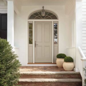
Why Black Framing Holds Everything Together
In many modern gray house front door colors, what surrounds the door matters just as much as what’s painted on it. The use of black framing acts like a visual border, turning soft shades into defined shapes.
Even the lightest coral or butter yellow can hold its ground when it’s framed in clean black.

This trick turns a quiet pastel into a graphic element without needing to boost the tone itself. Thin lines offer sharp contrast; wider surrounds add mass and give the entrance extra gravity.
The frame controls how the door color is perceived, making it feel deliberate and dimensional, no matter how subtle the shade. It’s a structure that guides the eye before it ever lands on the color.

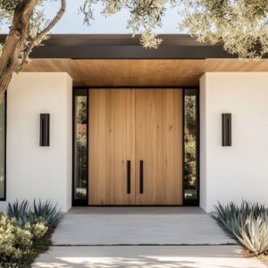
Vertical Handles and Their Role in Visual Stretching
The choice of handle placement is rarely accidental. Tall pulls—especially in dark bronze, brass, or matte black—stretch the perception of the door’s height and echo the geometry of vertical siding or shiplap.
These lines introduce visual rhythm, reinforcing the language already established by the facade. But beyond alignment, there’s a small design maneuver that creates tension: placing the handle slightly off-center.

This asymmetry plays with the brain’s need for balance, making the door appear broader than it is. In the context of front door colors for gray house styles, this detail often goes unnoticed, but its effect is immediate—a quiet shift in visual scale that changes how the entry is read.
Small adjustments like these carry the visual language forward without overwhelming it.

Timber Overhead as a Soft Visual Mediator
The ceiling above the entry often plays a quiet but crucial role in how the front door reads against a grey exterior. Wood soffits in cedar, oak, or walnut introduce a natural glow that can gently nudge the entire palette into harmony.
This isn’t about creating contrast—it’s about bridging temperature. A burnt-clay or brick-red door gains warmth when the grain above reflects similar undertones.
Cool-toned entries, like sage or slate blue, take on a more inviting tone when paired with golden or honeyed wood above.

The eye registers the warmth subtly, balancing the coolness of the wall and concrete below. In many compositions, this overhead wood strip becomes the quiet link holding everything together—an ambient layer that makes a front door color on gray house exteriors feel more rooted and less abrupt.

Foliage as Echo, Not Accessory
Planters in these designs serve a purpose far beyond filling space—they work like low-volume echoes of the main color, repeating it softly through natural elements. A lilac door might be paired with lavender-toned grasses; burnt orange finds a quiet twin in golden foxtail or ochre-tipped sedge.
This method doesn’t replicate the door hue—it diffuses it.

By keeping the color family present in organic forms, the transition between manmade surfaces and the landscape feels continuous. Even the containers—matte black, stone grey, or aged terracotta—follow the tone set by the siding or path, reinforcing unity.
With this layering, colored doors on gray houses never feel like isolated gestures—they settle into a pattern where architecture and greenery speak the same visual language.

Geometry as Discipline for Soft Tones
Soft door hues—muted peach, dusty violet, chalky sage—require firm surroundings to avoid falling into decorative sweetness. Crisp architecture makes pastel behave like structure rather than sugar.
The success of these palettes often depends on siding choice: vertical paneling, board-and-batten, tight horizontal shiplap. Flush glazing, clean-framed sidelights, and clear boundaries around the door prevent any sense of visual drift.
Without that discipline, pale tones risk looking flat or juvenile.

But when the lines hold, those same shades become architectural materials in their own right. This makes pastel tones among the most quietly effective front door colors for a grey house, not because they contrast loudly, but because they reinforce design order while shifting mood.

Light as Outline, Not Just Illumination
In many modern designs, light doesn’t simply brighten—it shapes. Vertical LED strips placed beside a door or recessed soffit glows above an entry become part of the composition itself, working like drawn lines that sharpen the overall form.
Especially in the evening, when color begins to fade into the low light, these glows carry the visual weight.

A violet or muted lilac door might become almost neutral at dusk, but the framing light preserves the contour, giving the structure presence even without strong contrast. This trick is particularly effective for front door colors for gray house settings, where warm and cool tones can flatten in certain light.
The illumination doesn’t scream for attention—it guides the eye in silence, making sure the entry holds its space no matter the hour.

Breaking Balance to Avoid Predictability
Perfect symmetry can feel lifeless. A subtle off-balance detail—like a planter only on one side, or a handle offset from center—breaks the rhythm enough to hold interest.
These decisions aren’t messy; they’re measured. They give the entrance a sense of spontaneity without clutter.

The human brain registers the order, but the variation softens it, creating something that feels less showroom, more grounded. This quiet refusal to line up everything perfectly keeps the viewer from scanning and forgetting.
Asymmetry, when done in small degrees, creates focus without formality, especially when paired with structured materials like flush siding or stone steps. It allows modern front entries to remain clean without becoming sterile.

Surface Softness That Lets Color Speak Clearly
Glare can flatten even the most thoughtful color choice. That’s why matte and satin finishes dominate across many design-forward entries.
Flat surfaces absorb rather than reflect, letting pigments stay true even against bright concrete or pale stucco. A coral door under direct light keeps its tone intact because its finish resists shine.

The same logic shows up on planters, sconces, and house numbers: instead of reflecting random light, these pieces become part of the cohesive tone structure. Gloss is reserved for specific accents like brass handles or glass panes, which stand out because everything else stays visually quiet.
In controlled palettes, this finish strategy helps create depth by contrast, not brightness. The result is a surface where color isn’t distorted—it’s respected.

Metal Details as a Subtle Tempo Setter
Small accents in metal carry more weight than they appear to. A narrow copper inlay running the length of a slate-blue door, or a single brass pull on a cream-toned panel, introduces warmth without changing the palette.
These touches set a rhythm—metallic tones appear again in stair edging, around planter rims, or within light fittings. It’s not a repetition that shouts, but a controlled echo that keeps the entire entry visually linked.

Instead of adding more color, these finishes add contrast through temperature and texture, tying every detail together. Even the tiniest shift in material—like a bronze-toned hinge or a warm metal sconce base—can quietly steer how cool or warm the whole setup feels, making the door part of a broader tonal conversation.

Color Blocking Beyond the Door Panel
Extending color onto the sidelight surround is a move that changes proportion, not just tone. By painting the framing glass in the same tone as the door, a narrow entrance suddenly stretches wider visually, as if the panel and glass were one large element.
This is particularly effective with saturated shades like brick red, clay, or burnt orange. The effect isn’t only about brightness—it’s about area.
The eye stops seeing individual components and begins to read the door as a centered mass with extended reach, giving it more weight without going darker. It’s a trick often overlooked but impactful, especially in modern compositions where the facade depends on tight geometry and deliberate spacing.

Grey as a Temperature Chameleon
Grey doesn’t sit still—it tilts. That’s why door color choices play a temperature game more than a contrast game.
Place a coral or clay-toned panel into a cool grey stucco, and the wall starts to feel warmer. Set a dusty teal or muted navy into timber siding with gold tones, and the overall feel deepens, even cools.
These shifts are often hard to isolate at first glance, yet they completely change how the entrance is perceived.

The goal isn’t to make the door stand out as an object—it’s to shift the whole visual temperature with one move. That’s why front door color ideas aren’t only about selecting a bold shade—they’re about knowing how that shade will behave once it sits against the specific grey it’s paired with.
It’s subtle, but once noticed, hard to forget.

Conclusion: Why Every Shade Works Harder on Grey
Grey surfaces are rarely empty—they collect tone from every element around them. A single door color can shift the perception of warmth or coolness across an entire wall.
That’s why the most successful combinations don’t rely on trend alone—they work because they make everything else feel more intentional. Whether it’s a copper detail echoing in planter rims, a sidelight frame extending the door’s presence, or a soft hue anchored by tight architectural lines, these adjustments let color act as a structural part of the entry—not decoration.
The current direction in design doesn’t favor extremes—it favors control. And with grey as the backdrop, every pigment choice carries more responsibility and, when done well, creates a space that feels cohesive without feeling rigid.