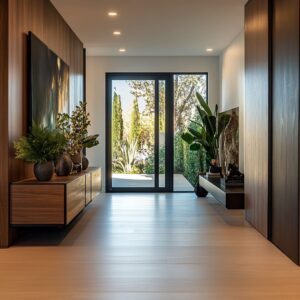
In current hallway design, color is no longer an afterthought—it’s the backbone of how space is felt and interpreted. Blue, in particular, is proving to be one of the most versatile choices for shaping hallways with precision and mood.
Rather than coating surfaces for effect, blue is being applied with intent, used to guide light, direct movement, and define proportion. From ceilings painted in dusty pale tones to walls wrapped in rich textured materials, the color carries weight and delicacy in equal measure.
What sets today’s blue hallway compositions apart is how surface, shadow, and detail work together quietly. Paneling systems, recessed niches, gradient finishes, and soft lighting methods all contribute to a layered approach that turns transitional spaces into destinations.
Whether applied in cool powder tones, dramatic navy, or softly tinted finishes, the focus remains on creating harmony without repetition. Such spaces aren’t loud—but they hold attention, revealing more depth the longer the eye lingers.
In the world of hallway design, blue has stepped forward as a visual method—subtle, deliberate, and quietly powerful.

Color That Behaves Like Architecture
Modern blue hallway design has moved far from surface treatment. Blue no longer sits passively on a wall—it shapes how space is perceived.
In hallways framed by ceiling-height mirror grids or resin-inlaid doors, blue appears not as a fixed color but as something that hovers and shifts. Tinted mirror panels softly blur reflections, and ribbed translucent inserts allow light to pass through blue as if filtered by water.

These surfaces don’t simply reflect—they bend the atmosphere. The effect is immersive but weightless, especially in tight corridors where flat color might feel heavy.
In these compositions, blue isn’t an accent or a backdrop—it behaves more like a living element in motion. These types of blue hall ideas aren’t about decorating the corridor but rethinking what the corridor feels like in the first place.
With light grazing these smooth or textured blue fields, every step through the hallway subtly rewrites the visual experience.

Turning the Ceiling or Floor into the Focal Point
Some of the most refined effects come from placing blue where it’s least expected—above or below eye level. By shifting blue to the ceiling, the space takes on an upward lightness.
A pale tone like robin’s egg or sky blue, especially when applied to a coffered or recessed ceiling, behaves like a quiet suggestion of daylight overhead. Paired with clean white crown or a narrow reveal, the color appears to hover.

It stretches the vertical scale without relying on bold contrasts. The same reversal plays out on the floor: wide porcelain bands or linear tiles in cobalt or muted teal guide the gaze horizontally.
These floors function as moving fields of color, especially in white-walled corridors where everything else stays subdued. In both ceiling and floor treatments, blue becomes a design tool that shifts attention without adding bulk or busyness.

These placements work particularly well in narrow or transitional areas, where subtle optical moves reshape the space without clutter. This kind of approach fits naturally within light blue hallway ideas, where tone is used to suggest softness, not spectacle.

Surface That Feels Alive
In modern hallway design, texture speaks louder than intensity. What appears subtle at first glance becomes increasingly rich the longer one looks, especially when finishes like grasscloth or limewash are involved.
A blue-grey grasscloth wallcovering, for example, reveals its complexity only through movement and side lighting—its fine ribs catching threads of light like fabric under a soft breeze. The surface doesn’t glitter, but it gleams in passing moments, with each thread behaving differently depending on angle and brightness.

Meanwhile, limewashed finishes in faded denim tones behave more like cloud cover than pigment. Gentle brushwork and barely-there tonal shifts form depth that looks hand-formed rather than applied, offering softness where a solid blue would feel flat.
These textures do more than coat the surface—they activate it, allowing blue to behave like shadow, not decoration. This approach reflects the quieter side of hallway ideas with blue, where the impact comes from light grazing across fiber and finish rather than from saturated color blocks.

The Accent That Doesn’t Fade
There’s a kind of confidence in using blue as a visual interruption rather than a base layer. In some interiors, a cobalt doorway or deep-tinted glass insert doesn’t blend—it slices through the quiet with purpose.
These touches operate like punctuation marks in a minimalist sentence, giving shape and rhythm without crowding the space.

A corridor wrapped in plaster or painted timber becomes the neutral backdrop, and the blue object—whether a framed panel or sculptural door—takes on a role closer to artwork than architecture. The trick is in restraint: surrounding surfaces remain pale, texture-rich, or tonally silent, allowing the blue to stay intense without overwhelming the space.

The result is focus—not drama, not noise, just clarity. This is one of the more refined moves seen in modern hallway design, where color becomes a spatial tool, not a filler.
These moments of saturation are brief but memorable, marking transitions with quiet precision.

Atmosphere Through Gradual Color Shifts
Where flat color might feel abrupt, layering similar hues into a barely-there gradient brings visual softness without losing clarity. In some hallways, this is achieved through ombré techniques that shift from pale blue near the baseboard to an airier, nearly white tone near the ceiling.
Other variations reverse the flow, placing deeper blues overhead that fade as they drop down the wall.

These transitions avoid the banded look of traditional two-tone schemes. Instead of creating borders, they imply changing daylight—soft like passing clouds or shaded corners.
This kind of treatment alters how depth is perceived. A gradient can visually stretch a narrow corridor, pulling the eye through the space in a way that feels longer than it is.
It’s particularly effective in tighter interiors, where a flat wall treatment might have boxed in the space. These subtle moves add quiet complexity to blue and white hallway ideas, where boundaries fade and color becomes more about atmosphere than contrast.

Balanced Contrast with Warm Accents
One of the most refined moves in blue hallway design is the controlled introduction of warmth. Cool blue tones take on more depth when they’re placed beside rich, grounded textures like wood or softened metals.
Pale oak benches, natural walnut cabinets, and softly aged brass lighting fixtures aren’t accessories—they’re counterweights. They keep the space from cooling too far.
This balance is especially powerful when the blues are on the deeper end of the scale—think slate, ink, or deep storm.

The contrast between those dark shades and warm wood grain brings a sense of natural control. The look becomes quiet and calibrated, like a composed still life rather than a themed room.
In some cases, placing a navy blue accent wall beside aged wood surfaces reads like a dialogue between depth and earthiness. These navy hall ideas avoid drama by staying grounded, and that contrast gives them their distinct polish.
Cool and warm don’t clash—they pause and play off one another.

Carved Depth Through Wrapped Niches
A more sculptural approach emerges in hallways where recessed niches are treated as standalone environments. When every surface inside a built-in is wrapped in matte blue—from back wall to side returns and even the bench below—it gives the space a carved, weighty feel, almost as if the void was formed from solid material rather than created from drywall framing.
Textiles like sky-blue grasscloth or deep-toned paint in navy read as continuous volume, not color application.

These inset areas don’t need extra ornament—they glow from within when fitted with hidden shelf lighting, the illumination brushing across texture and bringing out tonal depth that feels mineral rather than decorative. The effect draws the eye inward, creating a calm focal pocket that holds its own against the surrounding wall.

These types of navy blue hallway ideas work especially well in minimalist layouts where detail comes through material, not pattern. The niche becomes a pause, both visually and spatially, and it holds presence without demanding attention.

Softened Reflections That Add Without Repeating
In narrow hallway layouts, reflection can expand the sense of space—but only when handled with restraint. Blue-tinted or lightly mirrored panels offer a quieter take on reflectivity, diffusing the bounce of objects and softening direct glare.
This technique avoids over-brightening the corridor and instead creates a cool echo of furnishings, lighting, and structure. A panel mirror opposite a bench doesn’t simply duplicate it—it veils it in tone, turning the reflection into a shadowed memory of the real thing.

Larger mirrors, especially those with gentle arch forms and warm frames, work almost like windows into the palette. They reflect the blue but warm it back up through framing in walnut, brass, or patina-finished metal.
The result is that blue never repeats with exactness—it shifts slightly with every surface it touches, keeping the space visually engaging without overload. Rather than enlarging the hallway, these mirrors deepen it, adding rhythm and softness that works quietly alongside the color.

Light That Moves With the Surface
Lighting in modern blue hallways doesn’t announce itself—it reveals what’s already there. Rather than casting direct beams, most of these layouts rely on concealed or skimming light sources.
LEDs hidden inside ceiling coves, architectural coffers, or edge recesses illuminate walls and ceilings in a way that emphasizes texture over shape. This grazing technique turns materials like grasscloth, limewash, or ribbed plaster into active surfaces, their raised fibers and soft irregularities catching highlights that shift with each step.

Recessed pin spots are often angled with precision, aiming their light across a panel’s length rather than down onto it. As a result, even small textures—like a seam in slate blue panelling or the subtle thread of a woven wallcovering—catch momentary shine, then disappear.
It’s this type of light choreography that gives blue depth without weight. Nothing is lit evenly, and that’s the point: the shadows, gleams, and micro-variations bring more shape to the color than brightness ever could.

Conclusion: Blue as Spatial Language
Every detail throughout these blue hallway designs builds toward a quiet mastery. Blue is treated less like a color and more like an active participant in shaping space—it slides across floors, floats above ceilings, hides in recesses, and wraps around sculptural volumes.
These aren’t backdrops; they’re rooms tuned with clarity and restraint. Through soft texture, temperature contrast, careful use of reflectivity, and precise lighting, blue can feel taller, wider, cooler, or warmer—all without changing the room’s size.

What appears calm at first reveals layers: brushmarks, light shifts, material grain, all carefully balanced to keep the eye moving without distraction. In the best examples, nothing feels loud, yet nothing is passive.
The modern luxury blue hallway succeeds through this tension—controlled color used with discipline, creating spaces that feel edited, focused, and alive with subtle shifts. Every surface participates in the design, and every choice is made to support the quiet strength of the blue.