The most thoughtful home office interiors today are moving in a quieter direction—away from decorative statements and toward carefully structured visual rhythm, refined texture, and restrained material layering. These spaces rely less on loud focal points and more on how elements like shadow, thickness, or repetition are handled.
What looks effortless often comes from a set of precise design tactics that shape how the eye moves, where it pauses, and how the atmosphere feels over time.
Instead of chasing contrast, many of these interiors build depth through tone-on-tone decisions—matte next to satin, wood grain running against plaster, or soft curves inserted into boxy layouts. There’s also a growing preference for integrating the furniture into the architectural language, where desks float, shelves recess, and storage vanishes into wall planes.
Lighting is tucked away rather than exposed, highlighting surface rather than object.

This article explores the less obvious desing and decorating techniques behind these spaces—the visual mechanics that make them feel grounded, layered, and lasting. It’s about the decisions that don’t shout but continue to hold attention the longer you stay in the room.

Shadow as a compositional line rather than a by-product
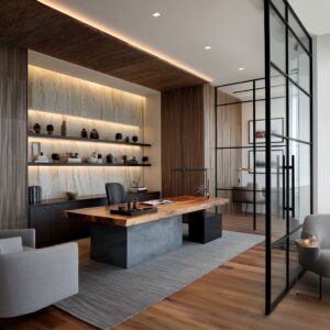
In many examples of modern home office design, shadow isn’t treated as an afterthought—it becomes part of the drawing. Edges aren’t left to chance; they are carved, thickened, or layered so they produce a deliberate trace of darkness.
You see this where shelf boxes extend deeper than expected, where a ceiling insert dips just enough to catch a rim of light, or where a stepped ledge carves a thin horizontal band of shade across a stone wall. These gestures create visual structure without the need for ornament.

The darkened edges act like graphic strokes, outlining volumes in soft contrast. This is a visual rhythm that relies less on color or surface detail and more on how light behaves around form.
It’s a way of designing that lets depth replace decor—letting the room shape itself through layers of tone rather than layers of stuff.

Thickness is used to slow perception
Thickness isn’t just about mass; it’s a pacing device. The slabs used for desks, benches, and shelves often appear more substantial than usual—designed not for show, but to control how quickly the eye moves.
A thick stone desk with raw edges, a wood bench with softly squared proportions, or a travertine base that’s clearly weighty—all of these demand a pause. The viewer doesn’t skim past them.
The mass holds attention long enough that subtler qualities—grain alignment, subtle joint lines, even the way a bevel catches light—can surface.

Only after settling into this slower reading does the mind catch the finer moves: a shelf bracket so slim it vanishes, a desk lip shaved to a sharp taper, or a lighting detail hidden so precisely it feels atmospheric rather than mechanical. This visual strategy appears again and again in contemporary home office ideas, where thickness is not excess—it’s clarity through tempo.

Negative space is curated, not accidental
In many of today’s thoughtful workspace designs, what’s left blank matters as much as what’s put in place. Shelves aren’t overfilled, and display surfaces often hold only one or two quiet objects—spaced intentionally, not due to a lack of items, but because absence is part of the structure.
This type of restraint gives a home office with modern ideas a grounded visual rhythm. You can see it in how stones are arranged in recessed niches, or how ceramics sit alone with room to breathe.
Emptiness isn’t a void here—it’s a solid part of the material palette. It balances mass.
It draws the eye back to the line of the shelf, or the shadow on the wall behind. These gaps become intervals in the visual composition, like rests in music.
They add quiet without removing impact.

Subtle misalignment creates gentle tension
A space doesn’t have to be centered to feel composed. In many rooms shaped by contemporary home office design, perfect symmetry is avoided on purpose.
Instead, there are quiet shifts: a desk set slightly to one side, an artwork dropped lower than expected, a chair rotated gently out of alignment. These aren’t oversights—they are refinements.
They make the room feel like it’s been lived in before being styled. They pull the viewer’s attention a few inches away from center, softening the whole layout.
That tension, faint as it is, introduces a sense of pause. The room doesn’t snap into a grid—it unfolds over a second look.
And that sense of informal balance, where everything is steady without being still, is part of what gives these spaces their quiet depth.

Material gradients replace color contrast
Instead of using bold color switches to separate surfaces, modern home office design ideas often rely on texture shifts and tonal layering within a narrow palette. This creates depth that doesn’t compete for attention.
A lime-washed wall that moves from matte to soft sheen depending on where the light touches it; rough-cut stone placed next to smooth plaster so that texture alone becomes the separator—these are the quiet moves that build a richer visual field. The plaster might seem flat at first glance, but across the day, as shadows stretch and bounce, it gains unexpected dimension.
With no sharp hue changes, the entire room feels continuous, but never flat. Every surface participates, even when it seems still.

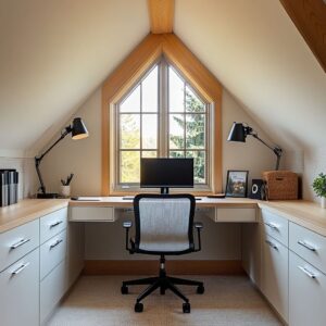
Landscape is framed as a moving artwork
In contemporary home office design ideas, the window is not an opening—it’s part of the composition. Frames are reduced in size, finishes are kept quiet, and curtains are often absent, allowing the natural view to speak.
Trees, shifting light, or a cloudy sky become the most active design elements in the room. Furniture doesn’t float randomly—it lines up with the horizon, the windowsill, or the distant tree line.
That alignment pulls outside rhythm into the layout. It’s not about controlling the view—it’s about letting the view shape how the interior feels.
A passing branch shadow or a wash of blue sky becomes part of the texture vocabulary, without needing to be styled. This gives the space a quiet shift throughout the day, without ever moving a single item indoors.

Curves are introduced as counters to rectilinear mass
In many modern designs, straight lines dominate—shelving is grid-based, desks stretch in firm horizontals, and built-ins follow sharp logic. But curves are often slipped in with precision.
A rounded-edge desk, a bowed stretch of ceiling, or the soft arc of a barrel-back chair breaks the grid just enough to guide the eye. These elements don’t interrupt—they adjust the tempo.

And what’s interesting is that curves are rarely scattered; they’re placed where light touches them best. A ceiling arch might be positioned where daylight bends around it, or a soft chair form placed near a window where shadows shift across its surface.
This method doesn’t aim to contrast the room—it catches light in a different way. It gives the space dimension without forcing drama.
When used with control, a single curve can do more than a wall of décor.

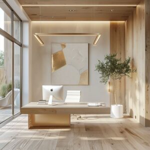
Single accent tones provide a compass point
Muted palettes give calm, but they also invite something to lead. In spaces built on quiet colors, one intentional accent—a terracotta leather chair, a clay-red vase, or a deep ochre cushion—can become the focal element without trying to compete.
Because the background holds steady in shades of cream, wood, or soft stone, the eye finds the accent immediately and lingers.

These tones aren’t loud, but they hold weight. They offer balance and orientation in a visual field that otherwise stays neutral.
The placement matters too: often low, near seating height or anchored in one quadrant of the room, as if they were dropped into the layout as punctuation. It’s a simple move, common across refined interiors, but it works because the rest of the space steps back.
The accent becomes the fixed point the room breathes around.

Furniture merges with architecture to erase clutter
In the most visually balanced workspaces, you often can’t tell where furniture stops and the room begins. Desks float directly out from the wall, built-in benches run flush with cabinetry, and shelving is embedded instead of applied.
Legs disappear. Handles vanish.
Storage fronts line up so tightly with their surroundings that they feel more like surfaces than compartments.

This technique is especially useful in modern office design ideas for small spaces, where keeping the floor clear and the visual field unbroken can make the room feel twice as spacious. It’s not only about minimalism—it’s about alignment.
These built elements don’t call attention to themselves, and that silence allows other textures—stone, wood grain, soft fabric—to step forward without being overwhelmed by functional clutter.

Rhythm outranks ornament
Where one might expect art or decor to lead the visual impression, it’s often the repeated structure that does the heavier lifting. Slatted wood walls, ceiling battens, and evenly spaced shelving all create a pattern the eye follows naturally.
These repetitions establish movement that feels calm but steady—like visual pacing. It’s not decoration in the traditional sense; it’s form doing the job that detail used to do.

And because these rhythmic elements are built into the construction, they hold their ground as trends shift. A grid of panels or evenly spaced niches doesn’t fade over time—it stays current by staying clear.
These design choices shape the room in ways that feel deliberate without ever turning theatrical. Movement happens without motion.

Light is sculpted to graze, not spotlight
In the most carefully constructed workspaces, light behaves less like a tool and more like a texture in itself. Instead of spotlighting objects, it slides across surfaces—grazing the edge of wood grain, catching the grain of plaster, deepening the gaps in stone or slatted walls.
The lighting sources are almost always hidden: tucked behind a ceiling reveal, folded beneath a floating shelf, or embedded under a desk edge. This kind of placement keeps the fittings invisible while giving form to the materials.
The result is a room that doesn’t glow evenly but pulses with contrast—narrow beams pool under shelves, warm strips cut horizontally under cabinets, and fine shadows stretch across texture. These elements shape mood and dimension more effectively than any overhead fixture ever could.
What makes the light feel rich is how it behaves—not how bright it is.

Nature-coded objects echo the palette but resist literal themes
There’s a difference between decorating with nature and letting it quietly inform the tone. In many rooms shaped with this thinking, dry branches, stone bowls, rough ceramics, and mineral forms aren’t added as features—they’re folded into the atmosphere.
Their color matches the surrounding surfaces almost exactly, so they blend rather than stand out. These elements don’t create a theme—they reinforce a material logic.
They’re chosen not because they look like nature, but because they behave like the materials already present: matte, irregular, unpolished. A clay vase on a plaster ledge, or a chunk of travertine on a floating shelf, reads less like decor and more like a continuation of the wall.
It’s not styling—it’s anchoring. That quiet repetition builds weight without visual clutter.

Conclusion
What sets such interiors apart is their refusal to rely on noise. Instead of bold graphics or heavy styling, they work through quiet control—shadow lines that sketch the room’s edges, measured gaps that guide the eye, and rhythms that don’t shout but still hold form.
Even the slightest offset—an artwork placed low, a chair angled away from the desk—adds life without disrupting balance. Texture becomes structure, and light draws the shape of objects rather than spotlighting them.
These are rooms that unfold slowly, built on repetition, thickness, restraint, and natural alignment.

None of the moves feel temporary. There’s no leaning on trend cycles or digital flash.
These home office designs remain visually clear because they’re constructed around lasting habits of perception, not surface-level novelty. By letting materials speak and proportions lead, they manage to stay relevant by staying calm—anchored in choices that continue to feel grounded long after the details of the moment pass.