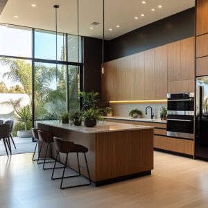
In today’s kitchens, where layout, texture, and materials matter as much as function, the mix of white finishes with natural wood tones continues to evolve in fresh, smart ways. This pairing isn’t new, but the way designers now handle proportions, grain direction, finish contrasts, and spatial balance brings out unexpected results.
Instead of relying on color contrast alone, the best kitchens quietly play with surface rhythm, reflectivity, and the grain movement of real wood—often down to the millimeter.
Across different styles—from mid-century ranch homes to urban lofts and contemporary cottages—this approach flexes to match the vibe of the space. In some homes, pale oak slats are lined up like architectural ribs across an island.
In others, high-gloss white doors float above bleached ash bases, with push-to-open mechanics hiding any sign of hardware. And it’s not only about visuals—many kitchens use these materials to shape light, manage reflections, or even mute acoustics.
These wood and white kitchen ideas work especially well in homes that value natural texture and clean lines. Whether inspired by coastal ease, Southwest minimalism, or soft transitional design, the kitchens pushing this trend forward all share a sense of control.
Every panel, reveal, and stone edge tells you something about how the space was planned—not overdone, not overly stylized, but tuned with care.

Elevated Precision Through Grain Matching and Veneer Selection
A recurring motif is the perfect alignment of wood grain across door and drawer fronts, sometimes wrapping continuously around corners. In standard cabinet production, each panel is cut from separate pieces with inconsistent grain flows.
In these examples, designers appear to plan the veneer layout in a “sequence matching” approach. Entire sheets of veneer are carefully mapped so that each drawer front continues the same grain lines as the adjacent front.
Corners and edges show coherent transitions, which suggests either:.
- Bookmatching or Slipmatching: Consecutive slices of veneer are placed side by side.
- Pre-lamination mapping: Panels are cut from a large veneer piece after its pattern has been measured, ensuring design cohesion.

Such efforts imply advanced planning, often involving 3D model projections before fabrication. This level of detail frequently requires specialized veneer suppliers and a millwork shop that is adept at cutting edge-banding, grain orientation, and matching patterns to door sizes.
Veneer grains create illusions of depth and continuity. Horizontal lines in wood visually stretch a room’s perceived width, while consistent vertical lines can make it seem taller.
By orchestrating these lines within small sections (drawers, doors), designers can shape how the eye perceives the kitchen proportions.

Crafting Optical Depth Through Lighting and Reflection
Many kitchens integrate high-gloss white cabinetry, sometimes contrasted with matte wood bases. High-gloss lacquer, acrylic, or glass-faced cabinetry reflects both daylight and ambient interior lighting.
This reflection strategy achieves:.
- Amplification of Natural Light: Glossy surfaces bounce daylight deeper into the space, aiding rooms without multiple windows.
- Perception of Greater Volume: Surfaces act like subtle mirrors, tricking the eye into feeling more openness.

Simultaneously, the wood surfaces often have matte or satin finishes, which absorb some light and offer a calm counterpart to the reflective white. It’s a classic push-pull effect that gives the entire composition balance, ensuring the space doesn’t become glaringly bright or clinically sterile.
Measuring the Light Reflectance Value (LRV) of different surfaces can quantify these design effects. Gloss finishes have higher LRV, significantly boosting brightness.
Wood species with open pores (like oak or ash) and matte sealers have lower reflectivity but add tactile warmth, balancing glare from the gloss panels.

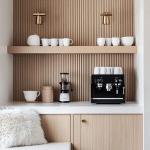
Advanced Millwork Techniques: Slats, Fluting, and Reeded Panels
Often, wood and white kitchen designs emphasize vertically slatted wood or reeded panels. Traditional paneling might have flutes spaced a centimeter or more apart, but these kitchens show extremely tight spacing, sometimes just millimeters between channels.
Achieving a flawless slat surface demands:.
- Precision CNC Routing or Custom Knife Blades: Each groove must be consistent to maintain parallel lines.
- Careful Edge Sealing: Slatted panels increase exposed end-grain, which is susceptible to moisture unless sealed meticulously.
In reeded or fluted white islands, the grooves add dimension without relying on color contrast. In wood slats, the shadows shift as natural light moves through the day, turning the kitchen into a dynamic environment.
This continuous shift in micro-shadows is visually subtle but deeply engaging when observed carefully. Slatted surfaces function like miniature brise-soleil, influencing how light scatters or is absorbed.
The tiny recesses increase the total surface area exposed to air, potentially affecting finishing and long-term expansion/contraction of the wood under humidity changes.

Strategic Hardware Minimization and Edge Pull Designs
Many of two tone wood and white kitchens reduce visible hardware in favor of push-to-open doors, recessed channels, or integrated wood pull strips. By removing decorative handles:.
- Cabinetry Becomes a Monolithic Volume: Horizontal or vertical lines remain unbroken.
- Material Expression Dominates: With no hardware to interrupt, the grain patterns, lacquer reflections, or fluted details become the main focus.

When hardware does appear—such as thin matte black linear pulls—designers deliberately align them with the cabinetry’s lines, either reinforcing horizontality or accentuating vertical partitions. Varying pull orientations can be a functional choice (horizontal for drawers, vertical for tall pantry doors) but also an aesthetic mechanism to distribute visual weight.
Push-latch systems rely on magnetized or spring-loaded push mechanisms. In heavier solid-wood doors, the internal tension must be finely tuned.
Over time, repeated use can cause misalignment if hinges and push-latches aren’t robust or if humidity changes warp the door. Designers who embrace these systems must account for precise tolerances in the cabinetry’s construction.

Floating Shelves as Structural and Compositional Elements
Floating shelves appear in nearly every layout in modern kitchens, often installed where upper cabinets might traditionally be. This approach does more than create open display areas:.
- Visual Breathing Room: Upper sections feel less dense, letting the backsplash or window framing stand out.
- Intentional Weight Placement: Dense wood or chunkier floating shelves can anchor the eye toward a specific focal point, balancing large masses of white cabinetry.

Crucially, the engineering behind sturdy floating shelves is intricate. Properly embedding steel or solid wood mounting brackets into wall studs is key, especially if the shelf will hold dinnerware or heavier objects.
The thicker the shelf, the more hidden bracing is possible, giving the illusion they’re simply “hovering. ” The cantilever principle applies here.
The longer the shelf extends, the greater the torque on the internal supports. Designers must calculate load capacity based on length, shelf depth, bracket distribution, and the expected weight (dinnerware, small appliances, etc).
The margin for error is small if the goal is a truly seamless bracket-free appearance.

White and Wood Coordination via Undertones and Color Temperature
An underlying thread is the careful tuning of wood’s undertone (cool, neutral, or warm) to complement the chosen white shade. Not all whites mesh well with every wood species.
Oak, ash, walnut, and rift-cut veneers exhibit distinct base hues:.
- Oak: Often leans golden or slightly amber unless bleached or given a driftwood wash.
- Walnut: Typically deep brown with cooler undertones or even purplish cast if not stained.
- Ash: More neutral, can easily take on white or gray washes.
Meanwhile, whites range from stark optical white to creamy tones. Designers calibrate the color temperature to prevent clashing.
For instance, warm oak often pairs best with an off-white or creamy paint, while bleached oak merges smoothly with cooler bright-white lacquers. Color temperature (measured in Kelvins) and a material’s spectral reflectance can cause mismatched “vibes” if not synced.
Designers sometimes use color reference samples in various lighting conditions (morning sun, LED, halogen) to ensure the wood’s undertone and the white paint or lacquer remain harmonious.

Integration of Stone and Quartz for Unified Surfaces
Many white and wood kitchens emphasize waterfall edges, continuous backsplash slabs, or minimal transitional lines between countertop and backsplash. This approach:
- Creates a Continuous Plane: Stone or quartz that extends from counter to backsplash eliminates busy grout lines.
- Allows Pattern Showcasing: When the same slab’s veining runs upward, it forms a near-artistic display of pattern continuity.
Certain examples even place outlets flush within the stone, requiring precision stone milling. This advanced approach demands CNC stone cutting or waterjet processes to achieve crisp cutouts.
Matching the stone’s pattern across corners (bookmatching or slipmatching) is equally precise. Quartz and engineered stone typically have consistent composition, making them easier to match.
Natural marble or quartzite, however, displays random veining, so designers sometimes order extra slabs from the same lot. The likelihood of matching veining from slab to slab can vary with each quarry block.
Digital templating (laser scanning the slab) assists in alignment before cuts.

Coordinated Ceiling and Floor Treatments
Several kitchens tie their millwork to overhead or underfoot design choices:.
- Ceiling Coffers or Inset Panels: Some ceilings mirror the cabinetry’s lines, using concealed LED strips or shadow reveals. This approach frames the kitchen as a distinct architectural space within an open floor plan.
- Floorboard Orientation: Running hardwood planks in the same direction as cabinetry lines elongates or narrows the kitchen’s visual dimension. Galley kitchens often see boards aligned with the long axis to emphasize length.

These strategies exhibit advanced design thinking: the kitchen isn’t an isolated cluster of cabinets but part of a broader architectural envelope. The floor, ceiling planes, and cabinetry lines form a consistent system.
Human visual perception is heavily influenced by lines that converge or run parallel. By aligning the floorboards with the cabinetry’s main direction, the user’s gaze follows the same path, reinforcing the sense of length or width.
This synergy can be measured via psychophysical testing, where angled lines might break continuity and prompt the space to feel disjointed.

Hidden Complexity in Panel and Appliance Integration
Many wood and white kitchen cabinets camouflage appliances behind matching wood or white panels. Achieving a seamless look means appliance tolerances must align with cabinet door thicknesses and overlay allowances:.
- Refrigerator Panel Fit: Requires specialized hinges that can handle heavier overlay panels without sagging.
- Wall Ovens and Warming Drawers: Must be installed flush and spaced so that wood edges do not scorch near high-heat sections.

Integrating vents, range hoods, and HVAC returns in near-invisible ways is another advanced move. Designers sometimes route ventilation behind wood facades or match vent covers to the cabinetry color.
The net result is a “hidden technology” approach, where function remains but does not interfere with the aesthetic clarity. To ensure panels and doors don’t warp under heat or humidity, manufacturers often use multi-ply construction with alternating grain directions, limiting expansion.
Appliance specs also require precise airflow to avoid overheating. That is why some integrated panels have small gap reveals or discreet vents for air circulation.

Materials: Warmth, Comfort, and Calm
Though each kitchen is visually distinct, all harness the interplay between wood’s organic feel and the crisp clarity of white. This combination is psychologically strategic:.
- Wood Surfaces: Evoke a sense of comfort and natural calm. Some species like oak or ash with gentle grain patterns can lower perceived stress levels in an otherwise modern interior.
- White Surfaces: Convey cleanliness and brightness, often associated with hygiene and spaciousness.

When combined, they balance each other. The wood moderates the sterility of all-white, while the white highlights the wood’s natural variations.
In some designs, additional accent elements (faucets in black or brass, open shelves with décor) add even more layers to that balance, but never overshadow the fundamental dialogue between wood tone and white finishes. Wood surfaces can increase perceived well-being in interior settings, partly because the brain registers subtle organic patterns as “nature-like.
” Contrasting white surfaces provide the sense of order and light. Together, these qualities can create a kitchen environment that feels both hygienic and welcoming.

Sculptural Elements That Challenge Conventional Layouts
From walnut blocks protruding at island corners to integrated shelves forming semi-furniture “hutches,” there is a consistent drive toward shaping the kitchen in ways that transcend mere cabinetry rows. Designers insert bold volumes or geometric breaks:.
- Chunky floating shelves that read as a piece of freestanding furniture.
- Island corners that reveal mitered transitions from stone to wood, almost like a piece of sculpture.
- Interlocking boxes: White cabinet boxes set into a wood backdrop or vice versa, giving a puzzle-like composition.
Such elements go well beyond typical off-the-shelf designs, implying a close collaboration between architects, interior designers, and skilled millworkers.

Why These Kitchens Reflect Advanced Trends
Wood-and-white kitchens have been around for decades, they show an evolved approach that merges high-end millwork, precise color management, and integrated architecture. Instead of simply mixing two finishes, these designs:
- Place wood and white in deliberate tension, using each to underscore the other’s qualities.
- Employ advanced paneling and veneer matching to achieve sleek continuity.
- Use lighting, shadow lines, and minimal hardware to underscore geometry.
- Align with the home’s broader style context, whether farmhouse, loft, or desert contemporary.

The collective effect is a set of kitchens that transcend a basic two-tone scheme. They demonstrate thorough synergy between surface, structure, and user experience—resulting in spaces that appear calm, well-proportioned, and subtly detailed when examined closely.
By analyzing these examples in depth, one understands how far beyond mere “contrast” these kitchens go. They showcase tight manufacturing tolerances, engineered lighting effects, and nuanced color harmony that everyday observers might not immediately register but certainly sense at a subconscious level.
Concluding Thought
What truly shapes current trends in wood-and-white kitchens is the attention to micro-details—things like exact alignment of veneer patterns, flush integration of stone edges, and the interplay of reflectivity. These advanced tactics transform a time-honored color pairing into a precise and carefully calibrated design statement.
Each design puzzle piece has structural and aesthetic implications, revealing the level of expertise needed to produce a space that looks both natural and elevated beyond the standard.