This article is an exploration of kitchens without upper cabinets. These ideas highlight how different design approaches work with space, materials, lighting, and overall composition.
The intent is to identify strategies that can be applied in various types of homes, styles, and dimensions—always with the goal of creating a fresh sense of openness and visual intrigue.
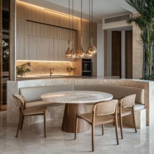
Thinking of the Wall Surface as a Full-Height Feature
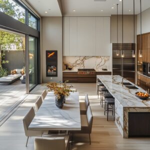
When designers choose to forgo upper cabinetry, the wall from countertop to ceiling becomes a continuous backdrop. This significant open canvas invites new forms of expression: large-scale stone slabs, textured plaster, stacked brick, or full-tile treatments.

Examples:
- Stone veining or textured blocks span the entire height, commanding attention.
- Textured plaster designs demonstrate that subtle tonal shifts can be more compelling than a loud color.
- Exposed brick or limestone conveys a structural or rustic character, transforming what would have been cabinet space into a strong architectural statement.

Benefit:
A tall, continuous wall surface can define the entire ambiance of the room. Without upper cabinetry breaking it up, there’s a sense of vertical emphasis that can either elongate the room visually or focus attention on certain architectural details, like a sloped ceiling or tall windows.

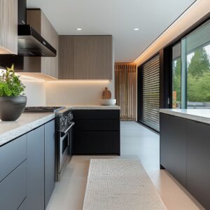
Allowing Light to Spread Across the Upper Zone
With no cabinets, upper walls capture natural and artificial light more fully. Sunbeams or recessed lighting can wash over materials, highlighting textures or finishes that would otherwise be hidden by cabinets.
Seen in These Designs:
- Kitchens with big windows or clerestory glazing benefit from the unobstructed path of daylight.
- Those featuring reflective or lightly glossy tiles multiply the effect of even modest amounts of sunlight or sconce illumination.
- When beams or angled ceilings exist, the absence of upper cabinets keeps the entire ceiling plane in view, making the space feel larger and more dynamic.
Why It Works Quietly:
Natural light hitting the upper wall can amplify the mood of a space, especially if the surface has variation (plaster, brick, stone). This can shift the atmosphere throughout the day, creating nuanced changes without repainting or rearranging.

Using Open Shelves to Replace Traditional Upper Cabinets—But with Intent
Open shelving offers some storage while maintaining spaciousness. Designers often place shelves in carefully chosen locations rather than lining the entire wall.
The specific alignment, number, and spacing of shelves can dramatically alter the vibe.

Kitchens That Use This:
- Floating shelves integrated into a uniform background seem to blend in, almost like a sculptural extension of the wall.
- Contrasting shelves, as in reclaimed wood against smooth plaster or black metal against bold marble, create a striking interplay of color and texture.
- Asymmetric shelf arrangements break from predictable layouts to give the eye multiple stopping points.

Behind the Design:
Rather than being purely decorative, well-placed open shelves can also function like horizontal lines that complement or balance strong vertical elements (range hoods, windows, ceiling beams). The space between shelves can be used to display day-to-day items in a pleasing arrangement, turning practical objects into part of the decor.

Maximizing Architectural Features and Views
The wall that could otherwise be a closet can be replaced with large windows or full glass walls. This direct connection to the outdoors reshapes the kitchen’s relationship to light, ventilation, and mood.
Used Here:
- Corner kitchens with wraparound glazing rely on the open feel to highlight outside scenery, effectively drawing the exterior into the interior.
- Tall windows in smaller kitchens can prevent a cramped sensation, allowing the eye to move beyond the walls.
- In some designs, the upper zone is dominated by glazing and frames, providing a pattern that replaces the void where cabinets might have been.

Advantage:
Large or strategically placed windows can move the focal point outward, freeing the interior design to remain minimal and material-driven. It also helps keep the kitchen from feeling closed off, especially in homes that integrate kitchen, dining, and living areas into one open layout.

Using Negative Space to Emphasize Key Elements
Eliminating upper cabinetry frees up visual real estate. Designers then shift focus to a main feature: a stone range hood, a statement backsplash, or an architectural light fixture.
Pattern:
- Distinctive plaster or stone hoods become the visual anchor.
- Oversized marble slabs grab the eye, with swirling veins or dramatic coloration.
- Industrial metal hoods in loft kitchens stand out against weathered brick.
Takeaway:
By removing the usual blocky cabinets, a single bold feature can command more attention. It can also prevent the space from appearing too busy—particularly important when a strongly patterned surface (like heavily veined marble) might otherwise feel chaotic if surrounded by upper cabinetry.

Capitalizing on Shelf Styling as a Design Statement
When shelves are open, the objects on them must be curated. Designers often select items in coordinated shades or materials (ceramics, glass, metal).
The arrangement is sometimes symmetrical, sometimes more free-form, but usually mindful of scale and negative space.

Examples:
- Color-coordinated dishware can reinforce the kitchen’s palette, turning everyday plates and bowls into a cohesive display.
- Light or neutral ceramics ensure the textures of the walls remain the primary focus.
- Intentional groupings: tall items on one side, shorter stacks on the other. Subtle variation in heights keeps it interesting without feeling disordered.
Less Visible Value:
Styled open shelving can make a kitchen feel more personal and lived-in. It also adapts over time: items might shift as homeowners add or replace dishware, giving the kitchen a dynamic quality that closed cabinets don’t provide.

Crafting Unity Among Surfaces, Textures, and Fixtures
With fewer cabinets and fewer hardware elements on the walls, consistency in finish and color among the hood, backsplash, windows, shelves, lighting, and counters becomes more critical. Designers often use matching tones or subtle contrasts to maintain harmony.

As Demonstrated In:
- Some spaces conceal the hood in the same finish as the wall to maintain an unbroken sweep.
- Others repeat wood tones in beams, shelves, and base cabinetry to tie the upper and lower halves of the kitchen together.
- Metallic finishes—brass, black iron, stainless—tend to echo in faucets, sconces, or pendant lights.
Outcome:
Fewer elements competing on the vertical surface means each detail carries more weight. Designers can coordinate these details so that everything feels aligned and balanced.
This goes beyond matching colors—sometimes it’s about repeating shapes or lines (square windows and square tiles, repeating horizontal or vertical lines).

Designing for Visual Rhythm Rather Than Storage
A recurring theme is that the upper area in these kitchens becomes a zone of repeated patterns, grid lines, or continuous textures—often referencing the geometry of windows, beams, or tile layouts.

Examples:
- Horizontal brick courses that echo the lines of floating shelves.
- The interplay of vertical shiplap or tongue-and-groove paneling with the horizontal orientation of shelves or counters.
- Large format tile grids that continue behind a hood or around windows.
Benefit:
Patterns that stretch across a broad surface can guide the eye in a pleasing way and reinforce the architectural identity of the home—be it modern, farmhouse, loft, or ranch. The “void” left by no cabinets becomes a structured tapestry of lines and textures instead of an empty plane.

Using Lighting Fixtures as Sculptural Elements
With no cabinets overhead, pendant lights or sconces can occupy the upper space, shaping the ambiance. They might be placed to highlight specific textures or to create an interplay of shadow and highlight on the backsplash.
Examples:
- Uplighting or downlighting to graze textured stone or plaster.
- Small sconces installed directly on tile or shiplap that create focal points where there would otherwise be empty wall.
- Pendant lights that line up across wide islands, forming a visual canopy.
Advantage:
Light fixtures become more than functional objects. They act as part of the design composition, sometimes echoing the lines or metals of the hood or hardware.
Where upper cabinets once might have been, lighting can now accentuate textures or surfaces that wouldn’t otherwise be noticed.

Emphasizing the Role of the Ceiling
Without cabinets bridging the gap between counter and ceiling, that overhead plane becomes more prominent. Beams, angled roofs, or special ceiling finishes can become defining characteristics of the space.
Illustration:
- Exposed wood beams that run the length of the room, turning the kitchen ceiling into a showpiece.
- Sloped or vaulted ceilings that create a rising sense of volume.
- Painted or plank ceilings that align with the color strategy of the walls.
How It Works:
A well-featured ceiling can lend a sense of grandeur or warmth, depending on how it’s styled. Sometimes the biggest shift in eliminating upper cabinets is how your eye travels upward to notice ceiling elements that would otherwise be overshadowed by bulky cabinet boxes.

Material Contrasts That Would Overwhelm If Upper Cabinets Were Present
Strong contrasts—like black steel shelves on white stone—might look too busy if stacked above cabinets. But in these kitchens, no cabinets means more breathing room, so bold choices can work well.
Examples:
- Dark framed windows or shelves against white tile.
- Metallic hoods or thick wooden beams against pale plaster.
- Highly patterned or veined marble taking center stage.
Bonus:
Negative space can calm what might otherwise feel visually heavy. Designers can safely use dramatic materials when there’s enough open area around them for balance.

Subtle Functional Solutions Without Traditional Upper Cabinets
While upper cabinets are often used for everyday storage, these kitchens prove that alternative forms of functionality can exist. Recessed ledges, concealed pantries, base-cabinet expansions, or tall units at the periphery can handle practical needs without crowding the walls.

Cases:
- A slim horizontal ledge carved into the stone wall holds coffee essentials.
- Kitchen can include stone-built niches on either side, doubling as display and storage.
- Some designs rely heavily on large islands or full-height cabinetry on adjacent walls.
- Shelves that act as easy-access dish stations.

Function Behind the Look:
The approach can improve workflow. Frequently used items are immediately visible or in an accessible nook.
And with more base cabinets or hidden pantry solutions, the overall aesthetic remains streamlined, free from overhead bulk.

Adaptation to Different Styles—From Rustic to Ultra-Modern
One might assume no-upper-cabinet kitchens always look modern, but the designs show wide stylistic range. The concept adapts to everything from farmhouse and craftsman to sleek, minimal spaces.
Examples:
- Rustic or craftsman-leaning homes incorporate textural wood shelves and rough stone or brick.
- Minimalist farmhouses maintain open walls with refined materials or plaster.
- Highly contemporary designs combine glossy surfaces, metal, and strongly geometric lines.
A Good Side:
A no-upper-cabinet design can be personalized to suit nearly any aesthetic. It’s not limited to one narrow category; the unifying trait is open wall space, which then gets shaped by the home’s broader style cues.

Creating an Intentional Composition vs. Filling Space
Traditional cabinetry can sometimes lead to fill everything mindsets. In these kitchens, designers intentionally choose what to place on the wall—be it shelves, art, windows, or lighting—so that the composition feels carefully planned.

Where This Shows Up:
- A large piece of art hung on the exposed brick or next to the hood adds personal flair.
- Exact shelf spacing around windows or corners suggests a more architectural approach, rather than just following standard cabinet modules.
- Some kitchens leave sections completely blank , trusting the material alone to be enough.
Bonus:
By resisting the urge to fill every inch, the designer can create a sense of relief and clarity. Each item has “room to breathe,” and the space doesn’t feel overburdened by function.

New Trends and Emerging Directions


Concluding Thoughts
Kitchens without upper cabinets offer more than just a clean look. They create new opportunities for:.
- Architectural Emphasis: Ceilings, beams, large windows, and statement hoods come alive when uninterrupted by cabinetry.
- Material Drama: Bold surfaces—stone, plaster, brick—have the space to shine.
- Careful Styling: Open shelving or curated objects turn storage into a display.
- Enhanced Light and Views: Windows and natural light become focal points, often making the kitchen seem bigger and more inviting.
- Spatial Balance: Negative space can highlight certain areas while preventing visual overload.
Though it requires thoughtful planning to ensure there’s enough practical storage, this approach aligns well with a mindset that favors uncluttered openness, honest materials, and a strong connection to natural light. By examining how kitchens handle surfaces, shelving, lighting, and overall composition, one can see that the empty wall actually becomes the most impactful design choice in the room.