Luxury downstairs toilet designs read like miniature galleries—small footprints carrying concentrated style. Stone, wood, light, and metal are actors arranged to express calm, order, and a quiet glow.
The most striking designs keep to one main idea: a stone “shell” that feels carved, a timber band that warms the composition, or a single light line that draws the eye through the space. The result is a compact scene with a clear voice: restrained color, disciplined veining, soft silhouettes, and staged negative space so the floor and lower walls feel airy rather than crowded.
In this lens, the smallest room becomes a thesis for the whole home’s taste—concise, intentional, and surprisingly memorable.
Light That Draws Lines
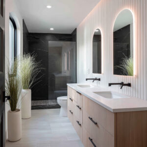
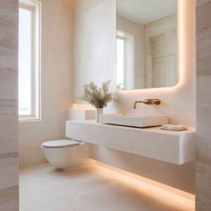
Light acts like a ruler on the wall—marking heights, cutting horizons, and separating materials with soft gradients. A ceiling cove drops a halo that makes stone read velvety instead of glossy.
A mid-height band of glow can trace behind a timber panel, turning wood into a lantern. Low under-vanity light turns mass into a floating plane and leaves a soft reflection on the floor.
Stacked together—high, mid, and low—these lines stop the space from feeling like a tunnel and instead cue vertical rhythm. Because the glow is indirect, the eye reads brightness as part of the architecture.
It’s less “lighting effect,” more “drawn geometry,” and it quietly sets the hierarchy: feature wall, focal band, and supporting planes.

Stone As Story: Direction, Density, and Value
Stone is edited. Direction comes first.
Long, lengthwise veins pull the gaze forward to a basin wall or a hero slab at the back. Horizontal strata calm and widen a narrow footprint.
A single centered slab with energetic movement can behave like art, while adjacent surfaces dial back to let it breathe. Density is then balanced with value: busier marbles meet matte cabinets in a single calm color; pale stones pair with warm timber to avoid sterility; darker shells wrap the room like a jewelry box and allow warm metal notes to glow.
The trick is choosing where the eye should rest and where it should move—stone becomes choreography, not just surface.

Wood As Warm Counterpoint
Timber arrives as a social layer that makes hard surfaces feel welcoming. A ribbed insert frames a mirror; a chevron face turns a flat wall into a subtle pattern; a single vertical plank zone takes a flush plate and accessories into a warm field so functional items feel absorbed, not stuck on.
Scale matters: ribs stay fine; chevrons stay tight; grain flows in one direction to avoid visual noise. Where wood meets stone, a narrow reveal or backlit shelf adds a soft line of separation.
Timber’s role is less “feature wall” and more “temper the mood”—quiet, tactile, and placed where hands and eyes naturally pause.

Shape Language
Fixtures speak a shape dialect. Soft-square WC designs and basins align with the rectilinear logic of stone slabs while avoiding harsh shadows.
In designs with active veining, rounded silhouettes act like punctuation that calms the view. Basins often read as carved: thick stone drawers, wafer-thin stone beams, or cantilevered blocks with tray-like wings for small objects.
Color is tuned: warm biscuit or almond tones keep attention on wood and stone; crisp white is reserved for calmer palettes so it feels deliberate rather than shouty. The unspoken goal is harmony—geometry that completes the composition without asking for applause.

The Luxury of Nothing: Void, Float, and Shadow
Negative space behaves like a finish. Floating vanities pull mass off the floor, leaving a shaded slot that reads elegant rather than empty.
Wall-hung WCs keep the floor unbroken so stone veins run like continuous lines. Toe-kicks and shadow gaps turn darkness into a thin border that clarifies edges.
In small room layouts, these voids are powerful: they imply control, sharpen silhouettes, and give breathing room to objects that could otherwise feel bulky. The eye reads “lightness” even when the materials are heavy.

The difference between composed and chaotic is often a few millimeters. Pendants land on grout centers; flush plates sit inside timber bands, not crossing edges; vanity fronts align with panel joints; light slots pick up the same horizon as a shelf three feet away.
Even tiny props sit on the room’s datum—tissue holders, vases, and rail ends repeating a single height. Visitors rarely point to these alignments, yet they feel the result as calm.
This is the invisible layer of luxury: nothing random, no drifting edges, every decision echoing an axis set somewhere else.

Metals As Stitching, Not Sparkle
Metal finishes act like thread binding materials together. One tone is the norm: matte black as graphic punctuation; brushed champagne as a warm foil to timber; stainless where the palette leans cool and stone-driven.
Repetition happens in small beats—tap, flush plate, pendant stem, thin reveal—so the story feels continuous without glare. Because the rooms favor matte stone and ribbed timber, sheen changes are subtle: brushed beside satin, never mirror against mirror.
Metal reads steady and quiet, giving the eye familiar notes to follow from wall to wall.

Emotional Registers: Four Common Moods
Pale Gallery Calm
Pale stone envelopes, warm oak bands, and soft lines of light produce a room that feels airy and composed. The glow is even, the grain restrained, and the accessories sparse.
Earthy and Grounded
Stones with brown, taupe, or mauve notes mix with timber ledges and black or warm-metal accents. The palette feels lived-in without slipping into rustic.
Dark-Box Intimacy
A darker shell with a warm ribbed stripe and a few pinpoint metals make an intimate, cocooned experience. The glow is concentrated, and the materials feel weighty yet soft.
Stone-as-Art Minimalism
One heroic slab with lively veining becomes the subject. Everything else is pared back so the surface reads as a curated piece.

Composition Playbook: Typologies That Keep Reappearing
- The Lantern Wall
A vertical timber field backlit at two edges so ribs or fins glow softly; fixtures and flush plate live inside the warm zone. - The Stone Beam Vanity
A wafer-thin stone plane cantilevered from the wall, reading carved rather than assembled; a low underglow turns mass into a floating bar. - The Continuous Horizon
One cove or ledge wraps the room at seat height, turning function into a luminous belt that organizes everything else. - The Hero Slab Gallery
A centered, high-drama marble panel framed by calmer neighbors; twin light lines—one high, one low—flatten the tunnel effect. - The Timber Belt
A continuous ledge that wraps the room and stops just short of a waterfall slab; the gap becomes a charged pause that highlights the stone.
Each typology is a way to simplify decision-making: pick the driver (light line, slab, ribbed face), then let the rest fall into a supporting role.

Material Dialogues That Work
- Pale Marble × Light Oak × Champagne Metal
Soft and luminous; the oak warms the marble while champagne ties both without glare. - Graphite Stone × Ribbed Walnut × Black Metal
Intimate and graphic; black reads as ink lines against deep materials. - Taupe-Limestone × Smooth Lacquer × Brushed Steel
Calm and architectural; steel keeps the mix cool and tight. - Veiny Hero Marble × Quiet Cabinetry × Slim Brass Notes
Stone does the talking; metal repeats as fine punctuation.
These pairings are less about color trends and more about balance—movement next to stillness, warm beside cool, matte against a discreet sheen.

The Role of Scale: Ribs, Fins, and Veins
Fine ribs and tight chevrons bring movement without noise; wide planks can feel heavy in small footprints. Vein scale matters too: sweeping diagonals want breathing room; faint, feathery patterns can wrap around corners and stay calm.
Light strengthens these decisions: grazing a rib reads crafted; washing a big vein reads cinematic. Thoughtful scale turns a miniature plan into a room with depth.
A consistent horizon—set by a ledge, flush plate, or underside of a cabinet—turns scattered objects into a composition. Mirrors echo the proportions of the wall panels beneath them; pendants double in the mirror to create balance without doubling fixtures; small tools (brush set, roll holder) land on the same line as a vanity reveal.
These micro-symmetries aren’t theatrical, but they change the way a guest reads the room: ordered, considerate, and calm.
The Power of a Single Gesture
The most memorable designs often pivot on one disciplined move. A thin vertical light slot carved into oak becomes a quiet beacon that organizes everything else on the wall.
A stone drawer block with a razor return looks cut from a single piece, so lines stay crisp even at close range. A pendant aligned precisely on a grout center stops the eye and gives the mirror a symmetrical twin.
One decision, placed with intention, lets the rest of the room relax.

Finishing the Story: Texture Hierarchies and Sheen
Luxury often comes from how surfaces behave with light, not from loud finishes. Matte stone holds glow; ribbed timber breaks light into fine shadows; brushed metal scatters brightness along edges; porcelain or composite basins keep a soft highlight instead of a glare.
A good hierarchy feels like layers: architecture (stone), warmth (wood), stitch (metal), and whisper (textiles). Each layer carries a consistent sheen so there’s no visual noise.

Closing View
The best examples are exercises in editing. A slim set of decisions repeats with care: one stone story, one warm timber move, one metal family, one light line (or a stacked trio at considered heights), and objects that hover to keep the floor quiet.
The styling stays spare, alignment is cared for, and every seam lands with purpose. That is why such designs read as luxurious without leaning on scale: the look is composed, the palette is disciplined, and the glow feels like it belongs to the architecture rather than sitting on top of it.