In contemporary interiors, the skirting board has quietly evolved from a technical finish into a visual instrument. Once hidden in plain sight, it now defines rhythm, light, and proportion across walls and floors.
The latest skirting board color ideas reveal that this small element can completely shift how a space feels—acting as a horizon, a connector, or even a sculptural outline.
The Power of the Line: How Skirting Color Shapes a Room
Across many modern ideas, the baseboard has become part of the architectural linework. Instead of blending into the wall, a coloured skirting board often defines how light flows and where the eye pauses.
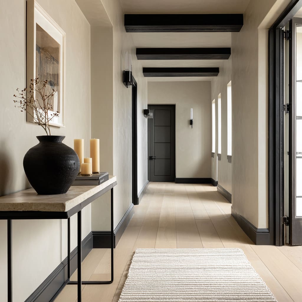
Metallic tones like brushed nickel or burnished gold create low horizontal reflections that guide light along the floor. Meanwhile, matte blacks or charcoals trace sharp edges, giving corridors and living areas a clean, graphic rhythm.
In spaces with tall or minimal walls, the balance between ceiling and floor color is crucial. Designers often mirror the brightness of the baseboard with a subtle ceiling cove or rail in a similar tone.
This pairing forms a dual horizon effect—one bright line above, one below—that holds broad wall planes calm and proportional.
Natural Warmth and Structural Harmony
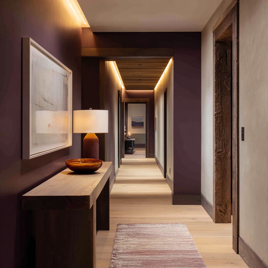
Wood tones remain among the most timeless skirting colour ideas. Walnut, cinnamon-brown, or copper-toned timber baseboards visually tie the floor and ceiling structure together.
When these hues match beams or floating shelves, the baseboard stops being trim and starts acting like part of the architecture. A narrow gap beneath consoles or benches lets this wood band slide underneath uninterrupted, adding lightness instead of weight.
Natural wood skirting also changes the perception of scale. Light oak or walnut versions can warm pale walls that might otherwise appear sterile, while slightly darker bases like smoked oak or deep brown add grounding in rooms flooded with daylight.
The Rise of Grey: The Quiet Neutral that Defines
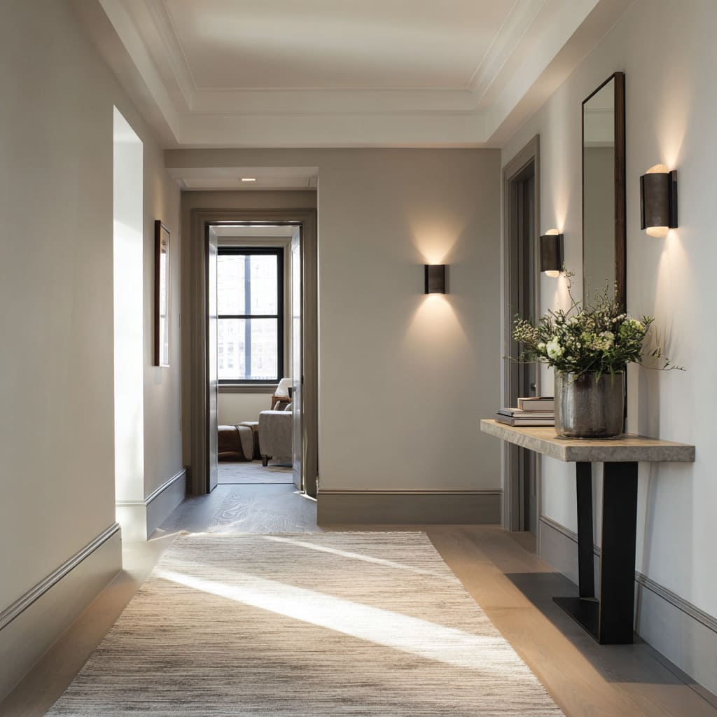
Among the most versatile grey skirting board ideas, soft pewter and warm putty shades stand out for their subtlety. They sit one step darker than taupe or greige walls, creating a thin but clear outline that separates vertical and horizontal planes without harsh contrast.
This quiet banding works especially well with limewashed or plaster textures, allowing shadows and light to blend seamlessly.
Grey also behaves like a mediator between materials: it calms strong wood grain, complements marble veining, and keeps metal fixtures from appearing too reflective.
In corridors and living rooms with art displays, grey skirting board paint ideas often become the backbone of the visual composition, linking frames, flooring, and door trims into a unified system.
Color Stories: From Deep Teal to Dusty Terracotta
Color-driven baseboards are no longer reserved for historic homes. Modern skirting board paint ideas include rich and complex hues that carry emotional tone.
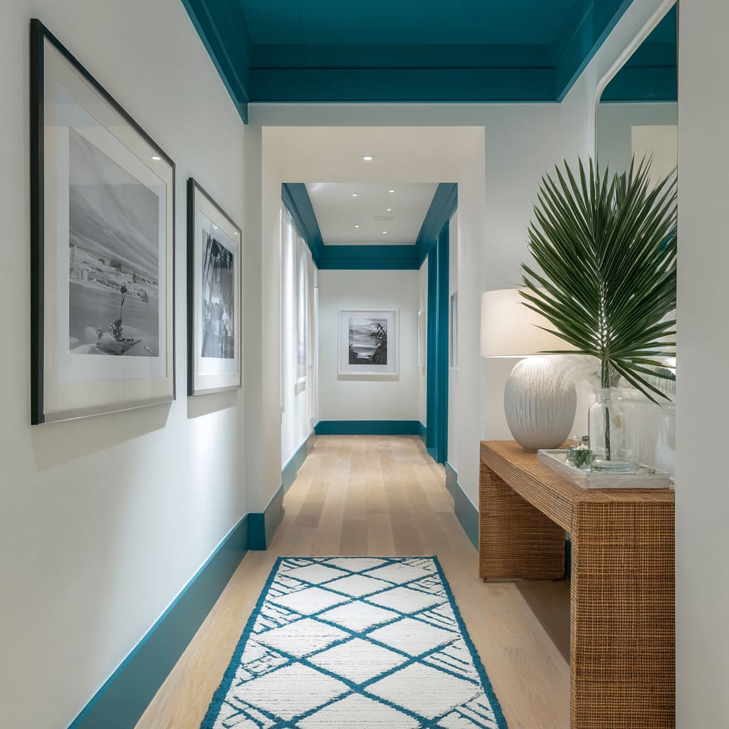
- Deep teal bands evoke coastal freshness when paired with off-white walls and pale oak floors, framing the space with a calm, oceanic precision
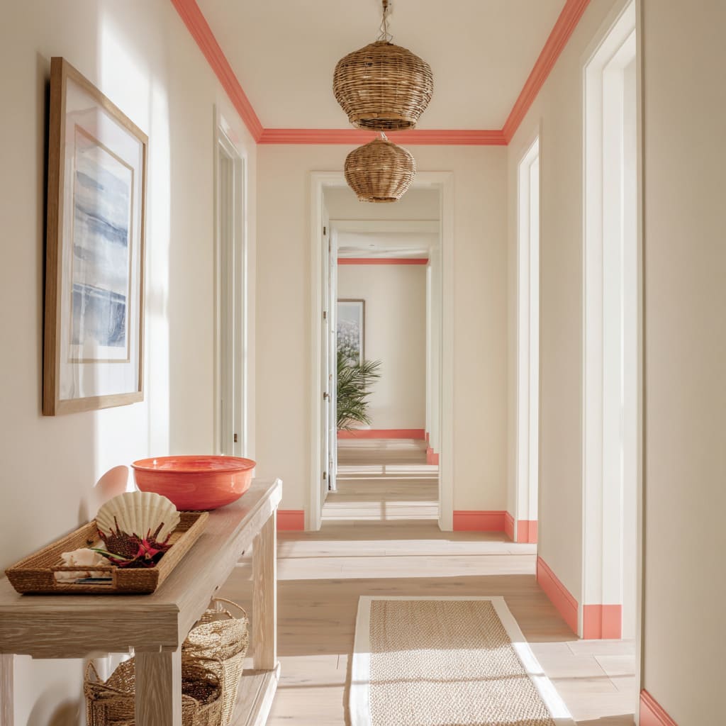
- Dusty terracotta or muted coral trims introduce warmth with restraint, grounding gray plaster walls like soil beneath stone
- Warm mustard and powder blue reinterpret traditional contrast: they energize neutral spaces while keeping proportions controlled through repetition at crown or chair rail height
These shades often work best when repeated sparingly—perhaps at door casings, ceiling troughs, or runner borders—to create a visual loop that feels deliberate rather than decorative.
Metallic Clarity and the Light Effect
Metallic skirting, once considered too industrial, is now seen as a refined detail in contemporary corridors and living rooms. Burnished gold, dark bronze, or brushed nickel versions sit just between the tone of the floor and wall, catching ambient light like a low reflective guide.
This isn’t about shine—it’s about glow. When paired with textured surfaces such as troweled plaster or natural stone, metal skirting balances softness with precision.
A gold baseboard paired with soft white walls creates a continuous warm line of light, while darker metals like bronze introduce quiet definition in minimalist, tonal interiors.
Coordination, Rhythm, and Light Balance
In the newest coloured skirting board ideas, the relationship between base color, floor, and ceiling matters as much as the tone itself. They use repetition and proportion to organize rhythm:
- Matching heights between consoles and baseboards build visual harmony
- Echoing color at both floor and ceiling levels keeps tall spaces visually anchored
- Runner borders in matching hues outline the center zone, creating an interior frame within a frame
- Light gradients—where cove lighting grazes walls and softens shadows—help skirting bands appear luminous rather than hard-edged
Such subtle choreography makes color function as structure. Instead of decoration, skirting becomes a way to manage light and proportion through tone and placement.
Modern Palettes and Their Visual Roles
Current trends group skirting board paint colour ideas into distinctive mood families:
- Dark neutrals (black, charcoal, ink): Provide sharp edges and depth; ideal for defining pale oak floors and greige walls
- Soft neutrals (taupe, warm gray, beige): Offer calm definition and pair effortlessly with stone, plaster, and natural linen
- Greens (olive, pistachio, forest): Bring botanical softness that shifts beautifully with daylight, ideal for serene or nature-inspired interiors
- Blues (powder, navy, teal): Range from crisp and coastal to deep and architectural; they frame lighter surfaces with precision
- Warm hues (terracotta, coral, mustard): Inject personality while maintaining modern restraint when paired with soft neutrals and raw materials
- Metallics (gold, nickel, bronze): Function as low reflectors of light, guiding the eye horizontally and adding quiet sophistication
Each group operates less as contrast and more as a tonal system, defining where color begins and where it should end.
Beyond Color: How Skirting Integrates into Modern Design
Modern interiors use skirting as a compositional element that collaborates with furniture, art, and lighting. Floating consoles echo its thickness, art frames repeat its tone, and even ceiling coves mirror its brightness.
When color appears at both low and mid heights—on a console edge, a door frame, or a picture rail—the room gains a measured rhythm that feels purposeful yet effortless.
Light also plays a critical role. Diffused cove lights or side sconces allow soft gradients that reveal the skirting’s tone without glare.
Metals prefer gentle reflection, while matte paints thrive under grazing light that accentuates texture. The interaction of color and illumination is what gives modern baseboards their quiet authority.
The Modern Language of the Baseboard
Today’s skirting board color ideas are not about contrast for contrast’s sake.
They form part of an architectural language—lines that carry emotion, define material transitions, and make space legible. Whether in soft pewter, deep teal, or burnished gold, the baseboard now acts as punctuation in interior design grammar.
This design shift reflects a broader movement: valuing subtle detailing over ornament, proportion over pattern, and harmony over hierarchy. Within this quiet framework, even a few centimeters of color at floor level can orchestrate an entire room’s atmosphere.

